Tag Archives: feedback

A Window Into the IPCC Process

I thought this article by Steve McIntyre was an interesting window on the IPCC process.  Frequent readers of this site know that I believe that feedbacks in the climate are the key issue of anthropogenic global warming, and their magnitude and sign separate mild, nearly unnoticeable warming from catastrophe.  McIntyre points out that the IPCC fourth assessment spent all of 1 paragraph in hundreds of pages on the really critical issue:

As we’ve discussed before (and is well known), clouds are the greatest source of uncertainty in climate sensitivity. Low-level (“boundary layer”) tropical clouds have been shown to be the largest source of inter-model difference among GCMs. Clouds have been known to be problematic for GCMs since at least the Charney Report in 1979. Given the importance of the topic for GCMs, one would have thought that AR4 would have devoted at least a chapter to the single of issue of clouds, with perhaps one-third of that chapter devoted to the apparently thorny issue of boundary layer tropical clouds.

This is what an engineering study would do – identify the most critical areas of uncertainty and closely examine all the issues related to the critical uncertainty. Unfortunately, that’s not how IPCC does things. Instead, clouds are treated in one subsection of chapter 8 and boundary layer clouds in one paragraph.

It turns out that this one paragraph was lifted almost intact from the work of the lead author of this section of the report.  The “almost” is interesting, though, because every single change made was to eliminate or tone down any conclusion that cloud feedback might actually offset greenhouse warming.  He has a nearly line by line comparison, which is really fascinating.  One sample:

Bony et al 2006 had stated that the “empirical” Klein and Hartmann (1993) correlation “leads” to a substantial increase in low cloud cover, which resulted in a “strong negative” cloud feedback. Again IPCC watered this down: “leads to” became a “suggestion” that it “might be” associated with a “negative cloud feedback” – the term “strong” being dropped by IPCC.

Remember this is in the context of a report that generally stripped out any words that implied doubt or lack of certainty on the warming side.

Its all About the Feedback

If frequent readers get any one message from this site, it should be that the theory of catastrophic global warming from CO2 is actually based on two parallel and largely unrelated theories:

  1. That CO2 acts as a greenhouse gas and can increase global temperatures as concentrations increase
  2. That the earth’s climate is dominated by strong positive feedback that multiplies the effect of #1 3,4,5 times or more.

I have always agreed with #1, and I think most folks will accept a number between 1-1.2C for a doubling of CO2 (though a few think its smaller).  #2 is where the problem with the theory is, and it is no accident that this is the area least discussed in the media.  For more, I refer you to this post and this video.  (higher resolution video here, clip #3).

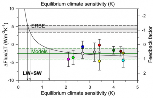
In my video and past posts, I have tried to back into the feedback fraction f that models are using.  I used a fairly brute force approach and came up with numbers between 0.65 and 0.85.  It turns out I was pretty close.  Dr Richard Lindzen has this chart showing the feedback fractions f used in models, and the only surprise to me is how many use a number higher than 1 (such numbers imply runaway reactions similar to nuclear fission).

lindzen_graph_icccjune09

Lindzen thinks the true number is closer to -1, which is similar to the number I backed into from temperature history over the last 100 years.  This would imply that feedback actually works to reduce the net effect of greenhouse warming, from a sensitivity of 1.2 to one something like 0.6C per doubling.

It’s Not Zero

I have been meaning to link to this post for a while, but the Reference Frame, along with Roy Spencer, makes a valuable point I have also made for some time — the warming effect from man’s CO2 is not going to be zero.  The article cites approximately the same number I have used in my work and that was used by the IPCC:  absent feedback and other second order effects, the earth should likely warm about 1.2C from a doubling of CO2.

The bare value (neglecting rain, effects on other parts of the atmosphere etc.) can be calculated for the CO2 greenhouse effect from well-known laws of physics: it gives 1.2 °C per CO2 doubling from 280 ppm (year 1800) to 560 ppm (year 2109, see below). The feedbacks may amplify or reduce this value and they are influenced by lots of unknown complex atmospheric effects as well as by biases, prejudices, and black magic introduced by the researchers.

A warming in the next century of 0.6 degrees, or about the same warming we have seen in the last century, is a very different prospect, demanding different levels of investment, than typical forecasts of 5-10 degrees or more of warming from various alarmists.

How we get from a modest climate sensitivity of 1.2 degrees to catastrophic forecasts is explained in this video:

The Dividing Line Between Nuisance and Catastrophe: Feedback

I have written for quite a while that the most important issue in evaluating catastrophic global warming forecasts is feedback.  Specifically, is the climate dominated by positive feedbacks, such that small CO2-induced changes in temperatures are multiplied many times, or even hit a tipping point where temperatures run away?  Or is the long-term stable system of climate more likely dominated by flat to negative feedback, as are most natural physical systems?  My view has always been that the earth will warm at most a degree for a doubling of CO2 over the next century, and may warm less if feedbacks turn out to be negative.

I am optimistic that this feedback issue may finally be seeing the light of day.  Here is Professor William Happer of Princeton in US Senate testimony:

There is little argument in the scientific community that a direct effect of doubling the CO2 concentration will be a small increase of the earth’s temperature — on the order of one degree. Additional increments of CO2 will cause relatively less direct warming because we already have so much CO2 in the atmosphere that it has blocked most of the infrared radiation that it can. It is like putting an additional ski hat on your head when you already have a nice warm one below it, but your are only wearing a windbreaker. To really get warmer, you need to add a warmer jacket. The IPCC thinks that this extra jacket is water vapor and clouds.

Since most of the greenhouse effect for the earth is due to water vapor and clouds, added CO2 must substantially increase water’s contribution to lead to the frightening scenarios that are bandied about. The buzz word here is that there is “positive feedback.” With each passing year, experimental observations further undermine the claim of a large positive feedback from water. In fact, observations suggest that the feedback is close to zero and may even be negative. That is, water vapor and clouds may actually diminish the already small global warming expected from CO2, not amplify it. The evidence here comes from satellite measurements of infrared radiation escaping from the earth into outer space, from measurements of sunlight reflected from clouds and from measurements of the temperature the earth’s surface or of the troposphere, the roughly 10 km thick layer of the atmosphere above the earth’s surface that is filled with churning air and clouds, heated from below at the earth’s surface, and cooled at the top by radiation into space.

When the IPCC gets to a forecast of 3-5C warming over the next century (in which CO2 concentrations are expected to roughly double), it is in two parts.  As professor Happer relates, only about 1C of this is directly from the first order effects of more Co2.  This assumption of 1C warming for a doubling of Co2 is relatively stable across both scientists and time, except that the IPCC actually reduced this number a bit between their 3rd and 4th reports.

They get from 1C to 3C-5C with feedback.  Here is how feedback works.

Lets say the world warms 1 degree.  Lets also assume that the only feedback is melting ice and albedo, and that for every degree of warming, the lower albedo from melted ice reflecting less sunlight back into space adds another 0.1 degree of warming.  But this 0.1 degree extra warming would in turn melt a bit more ice, which would result in 0.01 degree 3rd order warming.  So the warming from an initial 1 degree with such 10% feedback would be 1+0.1+0.01+0.001 …. etc.   This infinite series can be calculated as   dT * (1/(1-g))  where dT is the initial first order temperature change (in this case 1C) and g is the percentage that is fed back (in this case 10%).  So a 10% feedback results in a gain or multiplier of the initial temperature effect of 1.11 (more here).

So how do we get a multiplier of 3-5 in order to back into the IPCC forecasts?  Well, using our feedback formula backwards and solving for g, we get feedback percents of 67% for a 3 multiplier and 80% for a 5 multiplier.  These are VERY high feedbacks for any natural physical system short of nuclear fission, and this issue is the main (but by no means only) reason many of us are skeptical of catastrophic forecasts.

[By the way, to answer past criticisms, I know that the models do not use this simplistic feedback methodology in their algorithms.  But no matter how complex the details are modeled, the bottom line is that somewhere in the assumptions underlying these models, a feedback percent of 67-80% is implicit]

For those paying attention, there is no reason that feedback should apply in the future but not in the past.  Since the pre-industrial times, it is thought we have increased atmospheric Co2 by 43%.  So, we should have seen, in the past, 43% of the temperature rise from a doubling, or 43% of 3-5C, which is 1.3C-2.2C.  In fact, this underestimates what we should have seen historically since we just did a linear interpolation.  But Co2 to temperature is a logarithmic diminishing return relationship, meaning we should see faster warming with earlier increases than with later increases.  Never-the-less, despite heroic attempts to posit some offsetting cooling effect which is masking this warming, few people believe we have seen any such historic warming, and the measured warming is more like 0.6C.  And some of this is likely due to the fact that the solar activity was at a peak in the late 20th century, rather than just Co2.

I have a video discussing these topics in more depth:

This is the bait and switch of climate alarmism.  When pushed into the corner, they quickly yell “this is all settled science,”  when in fact the only part that is fairly well agreed upon is the 1C of first order warming from a doubling.  The majority of the warming, the amount that converts the forecast from nuisance to catastrophe, comes from feedback which is very poorly understood and not at all subject to any sort of consensus.

The Plug

I have always been suspicious of climate models, in part because I spent some time in college trying to model chaotic dynamic systems, and in part because I have a substantial amount of experience with financial modeling.   There are a number of common traps one can fall into when modeling any system, and it appears to me that climate modelers are falling into most of them.

So a while back (before I even created this site) I was suspicious of this chart from the IPCC.  In this chart, the red is the “backcasting” of temperature history using climate models, the black line is the highly smoothed actuals, while the blue is a guess from the models as to what temperatures would have looked like without manmade forcings, particularly CO2.
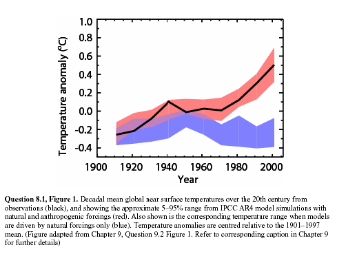
ipcc1

As I wrote at the time:

I cannot prove this, but I am willing to make a bet based on my long, long history of modeling (computers, not fashion).  My guess is that the blue band, representing climate without man-made effects, was not based on any real science but was instead a plug.  In other words, they took their models and actual temperatures and then said “what would the climate without man have to look like for our models to be correct.”  There are at least four reasons I strongly suspect this to be true:

  1. Every computer modeler in history has tried this trick to make their models of the future seem more credible.  I don’t think the climate guys are immune.
  2. There is no way their models, with our current state of knowledge about the climate, match reality that well.
  3. The first time they ran their models vs. history, they did not match at all.  This current close match is the result of a bunch of tweaking that has little impact on the model’s predictive ability but forces it to match history better.  For example, early runs had the forecast run right up from the 1940 peak to temperatures way above what we see today.
  4. The blue line totally ignores any of our other understandings about the changing climate, including the changing intensity of the sun.  It is conveniently exactly what is necessary to make the pink line match history.  In fact, against all evidence, note the blue band falls over the century.  This is because the models were pushing the temperature up faster than we have seen it rise historically, so the modelers needed a negative plug to make the numbers look nice.

As you can see, the blue band, supposedly sans mankind, shows a steadily declining temperature. This never made much sense to me, given that, almost however you measure it, solar activity over the last half of the decade was stronger than the first half, but they show the natural forcings to be exactly opposite from what we might expect from this chart of solar activity as measured by sunspots (red is smoothed sunspot numbers, green is Hadley CRUT3 temperature).
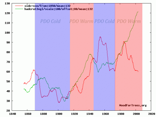
temp_spots_with_pdo

By the way, there is a bit of a story behind this chart.  It was actually submitted by a commenter to this site of the more alarmist persuasion  (without the PDO bands), to try to debunk the link between temperature and the sun  (silly rabbit – the earth’ s temperature is not driven by the sun, but by parts per million changes in atmospheric gas concentrations!).  While the sun still is not the only factor driving the mercilessly complex climate, clearly solar activity in red was higher in the latter half of the century when temperatures in green were rising.  Which is at least as tight as the relation between CO2 and the same warming.

Anyway, why does any of this matter?  Skeptics have argued for quite some time that climate models assume too high of a sensitivity of temperature to CO2 — in other words, while most of us agree that Co2 increases can affect temperatures somewhat, the models assume temperature to be very sensitive to CO2, in large part because the models assume that the world’s climate is dominated by positive feedback.

One way to demonstrate that these models may be exaggerated is to plot their predictions backwards.  A relationship between Co2 and temperature that exists in the future should hold in the past, adjusting for time delays  (in fact, the relationship should be more sensitive in the past, since sensitivity is a logarithmic diminishing-return curve).  But projecting the modelled sensitivities backwards (with a 15-year lag) result in ridiculously high predicted historic temperature increases that we simply have never seen.  I discuss this in some depth in my 10 minute video here, but the key chart is this one:
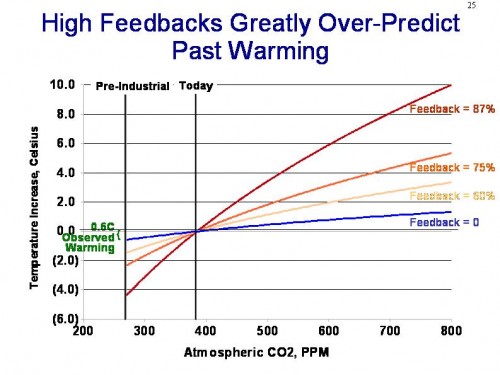
feedback_projection

You can see the video to get a full explanation, but in short, models that include high net positive climate feedbacks have to produce historical warming numbers that far exceed measured results.  Even if we assign every bit of 20th century warming to man-made causes, this still only implies 1C of warming over the next century.

So the only way to fix this is with what modelers call a plug.  Create some new variable, in this case “the hypothetical temperature changes without manmade CO2,” and plug it in.  By making this number very negative in the past, but flat to positive in the future, one can have a forecast that rises slowly in the past but rapidly in the future.

Now, I can’t prove that this is what was done.  In fact, I am perfectly willing to believe that modelers can spin a plausible story with enough jargon to put off most layman, as to how they created this “non-man” line and why it has been decreasing over the last half of the century.   I have a number of reasons to disbelieve any such posturing:

  1. The last IPCC report spent about a thousand pages on developing the the “with Co2” forecasts.  They spent about half a page discussing the “without Co2” case.  These is about zero scientific discussion of how this forecast is created, or what the key elements are that drive it
  2. The IPCC report freely admits their understanding of cooling factors is “low”
  3. The resulting forecasts is WAY to good.  We will see this again in a moment.  But with such a chaotic system, your first reaction to anyone who shows you a back-cast that nicely overlays history almost exactly should be “bullshit.”  Its not possible, except with tuning and plugs
  4. The sun was almost undeniably stronger in the second half of the 20th century than the first half.  So what is the countervailing factor that overcomes both the sun and CO2?

The IPCC does not really say what is making the blue line go down, it just goes down (because, as we can see now, it has to to make their hypothesis work).  Today, the main answer to the question of what might be offsetting warming  is “aerosols,” particularly sulfur and carbon compounds that are man-made pollutants (true pollutants) from burning fossil fuels.  The hypothesis is that these aerosols reflect sunlight back to space and cool the earth  (by the way, the blue line above in the IPCC report is explicitly only non-anthropogenic effects, so at the time it went down due to natural effects – the manmade aerosol thing is a newer straw to grasp).

But black carbon and aerosols have some properties that create some problems with this argument, once you dig into it.  First, there are situations where they are as likely to warm as to cool.  For example, one reason the Arctic has been melting faster in the summer of late is likely due to black carbon from Chinese coal plants that land on the ice and warm it faster.

The other issue with aerosols is that they disperse quickly.  Co2 mixes fairly evenly worldwide and remains in the atmosphere for years.  Many combustion aerosols only remain in the air for days, and so they tend to be concentrated regionally.   Perhaps 10-20% of the earth’s surface might at any one time have a decent concentration of man-made aerosols.  But for that to drive a, say, half degree cooling effect that offsets CO2 warming, that would mean that cooling in these aerosol-affected areas would have to be 2.5-5.0C in magnitude.  If this were the case, we would see those colored global warming maps with cooling in industrial aerosol-rich areas and warming in the rest of the world, but we just don’t see that.  In fact, the vast, vast majority of man-made aerosols can be found in the northern hemisphere, but it is the northern hemisphere that is warming much faster than the southern hemisphere.  If aerosols were really offsetting half or more of the warming, we should see the opposite, with a toasty south and a cool north.

All of this is a long, long intro to a guest post on WUWT by Bill Illis.  He digs into one of the major climate models, GISS model E, and looks at the back-casts from this model.  What he finds mirrors a lot of what we discussed above:
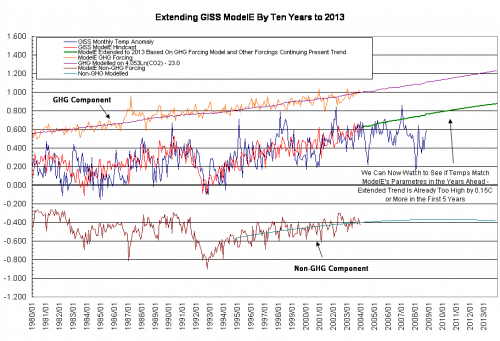
modeleextraev0

Blue is the GISS actual temperature measurement.  Red is the model’s hind-cast of temperatures.  You can see that they are remarkably, amazingly, staggeringly close.  There are chaotic systems we have been modelling for hundreds of years (e.g. the economy) where we have never approached the accuracy this relative infant of a science seems to achieve.

That red forecasts in the middle is made up of a GHG component, shown in orange, plus a negative “everything else” component, shown in brown.  Is this starting to seem familiar?  Does the brown line smell suspiciously to anyone else like a “plug?”  Here are some random thoughts inspired by this chart:

  1. As with any surface temperature measurement system, the GISS system is full of errors and biases and gaps.  Some of these their proprietors would acknowledge, and such have been pointed out by outsiders.  Never-the-less, the GISS metric is likely to have an error of at least a couple tenths of a degree.  Which means the climate model here is perfectly fitting itself to data that isn’t even likely correct.  It is fitting closer to the GISS temperature number than the GISS temperature number likely fits to the actual world temperature anomaly, if such a thing could be measured directly.  Since the Hadley Center or the satellite guys at UAH and RSS get different temperature histories for the last 30-100 years, it is interesting that the GISS model exactly matches the GISS measurement but not these others.  Does that make anyone suspicious?  When the GISS makes yet another correction of its historical data, will the model move with it?
  2. As mentioned before, the sum total of time spent over the last 10 years trying to carefully assess the forcings from other natural and man-made effects and how they vary year-to-year is minuscule compared to the time spent looking at CO2.  I don’t think we have enough knowledge to draw the Co2 line on this chart, but we CERTAINLY don’t have knowledge to draw the “all other” line (with monthly resolution, no less!).
  3. Looking back over history, it appears the model is never off by more than 0.4C in any month, and never goes more than about 10 months before re-intersecting the “actual” line.  Does it bother anyone else that this level of precision is several times higher than the model has when run forward?  Almost immediately, the model is more than 0.4C off, and goes years without intercepting reality.