What He Said

John Atkinson, via Tom Nelson, mirrors many of my thoughts on climate models:

The scientists who interest me in this field are those who can draw on the experience of a lot of people who have come before them. And uniformly in these areas I find scepticism. People who write mathematical models of complex systems for a living tend to find the climate models very unconvincing. Geologists find the arguments very unconvincing. Engineers find the arguments unconvincing. And astrophysicists find the arguments unconvincing….

The climate models seem to be largely driven by over-fitting to a small sample set and positive feedback. The small sample set – at most 30 years of accurate data – might be enough to try and predict one or two years, but 50 year predictions? Ignoring the biggest effect on global warming – water vapour – is surely going to cause problems.

Positive feedback in engineering invariably results in unstable systems – so we have to ask why do most if not all of the climate models rely on it to get doomsday predictions? For the Earth to have survived as long as it has with a stable climate, through major events like ice-ages or volcanic eruptions, there is little doubt that a degree of negative climate feedback is essential.

This Explains a Lot

The following is about a study on Marijuana use, but it could easily be about the media treatment of you-know-what:

The saddest part of Mirken’s article is this response from an American editor to his suggestion that reporters should have asked about the possible influence of confounding variables, such as dental hygiene and use of other drugs, on the link between marijuana and bad gums:

We are dealing with a peer-reviewed journal study, and I don’t feel at all comfortable going beyond what they are publishing. That is not our role.

Any journalist who doesn’t feel comfortable going beyond what appears in a medical journal to put a study’s findings in context and offer caveats where appropriate has no business writing about science. Reporters can’t be experts on everything, but they can ask smart questions and seek informed comments regarding a study’s potential weaknesses. If news organizations refuse to do so on the grounds that the study was peer reviewed and therefore must be faultless, they might as well just reprint researchers’ press releases. Which is pretty much what they do, all too often.

Trees Make Bad Thermometers

OK, I would have assumed that the title for this post was obvious to all:  There are a lot of reasons that trees don’t make very good thermometers.  Now, that is not a criticism of climate archaeologists who use tree rings to infer the historical temperature record.  Sometimes, we have to work with what we have.  Historians are the first to admit that coins are not the best way to deduce history, but sometimes coins are all we have.

But when historians rely on imperfect evidence, there generally is an understanding that the historical record created from this evidence is tentative and subject to error.  Unfortunately, some climate scientists have lost this perspective when it comes to tree-ring analyses, such as Mann’s hockey stick.  They tend to bury the fact that:

“There are reasons to believe that tree ring data may not capture long-term climate changes (100+ years) because tree size, root/shoot ratio, genetic adaptation to climate, and forest density can all shift in response to prolonged climate changes, among other reasons.” Furthermore, Loehle notes “Most seriously, typical reconstructions assume that tree ring width responds linearly to temperature, but trees can respond in an inverse parabolic manner to temperature, with ring width rising with temperature to some optimal level, and then decreasing with further temperature increases.” Other problems include tree responses to precipitation changes, variations in atmospheric pollution levels, diseases, pest outbreaks, and the obvious problem of enrichment that comes along with ever higher levels of atmospheric carbon dioxide. Trees are not simple thermometers!

When the tree-ring folks like Mann first did their analyses, they calibrated tree ring growth over recent decades with the recent historical temperature record, and then projected this calibration backwards on history.  But, as noted in the quote above, there is a lot of evidence that these calibration factors may not be linear over time.  And in fact, the few people that have gone back and resampled Mann’s trees have found that their growth diverges substantially from predicted values – in other words, the relationship between tree ring growth and temperature is not constant. 

Now, this does not make Mann and his peers bad scientists.  They were trying their best to reconstruct history, they tried one methodology, but then evidence mounted that this methodology is flawed.  What makes them potentially bad scientists is their reaction to the negative evidence.  Once evidence of the divergence problem was raised, scientists have simply ceased resampling trees.  Their focus hs become defending their original approach, rather than improving it based on new information.

Often, new approaches require new people, as in this case:

Loehle gathered as many non-tree ring reconstructions as possible for places throughout the world (Figure 1). There are dozens of very interesting ways to peer into the climatic past of a location, and Loehle included borehore temperature measurements, pollen remains, Mg/Ca ratios, oxygen isotope data from deep cores or from stalagmites, diatoms deposited on lake bottoms, reconstructed sea surface temperatures, and so on. Basically, he grabbed everything available, so long as it did not rely on trees.

And he got this plot for a temperature reconstruction:

Loehle_fig3

Only time will tell if this approach holds up better than tree rings, but it does better match the annecdotal history we have, including a Medieval warm period where Greenland was, you  know, green and a little ice age in the 17th century.  Like Mann, Loehle’s first version had some statistical and procedural errors.  Unlike Mann, Loehle reworked the whole analysis when these errors were pointed out.

Some General Thoughts

I have been getting a lot of new readers of late, including a number of commenters who disagree with me fairly strongly.  Welcome.  Here are some general thoughts:

  1. Excepting some ads for Viagra and cell phones, I have never and will never delete a comment on this site.  Folks are welcome to fill up the comment threads with contrary opinions. For those distrustful of the motives of skeptics, may I observe that sites like RealClimate cannot make this claim and routinely flush comments that don’t agree with the local prevailing doctrine, so make of that what you will.
  2. I almost never respond to comments in the comment thread itself.  I like to think about and digest the comments for a while, and then incorporate them or respond to them in later posts.  Trying to respond in real time in comment threads results in flame wars, not reasoned discussion. 
  3. Unlike many skeptics, I accept that atmospheric CO2 produced by man can warm the earth.  The IPCC and most climate scientists believe that the greenhouse gas effect alone may warm the earth about a degree over the rest of this century, an amount that would be a nuisance rather than catastrophic, and likely lost in the random noise of natural variations.
  4. However, I do not believe the earth’s climate is dominated by strong positive feedbacks and tipping points.  It is this feedback hypothesis in climate models that multiplies warming to 3-4-5 degrees or more over the next century.  In climate models, the catastrophe comes from feedback, not greenhouse effects, and I think this is a bad hypothesis.  Believers in catastrophic warming have an interesting problem reconciling Mann’s hockey stick, which points to incredible stability in temperatures, with a hypothesis of very high positive feedback, which should make temperatures skittish and volatile.  I also think that the hypothesis that aerosols are masking substantial amounts of warming is weak, and appears to be more wishful thinking to bail out model builders than solid science (while there is some cooling effect, the area of effect is local and shouldn’t have a substantial effect on global averages).
  5. I think the surface temperature record as embodied in the GISS analysis is a joke.  I cannot respect scientists who eschew obviously superior satellite measurements for the half-assed surface temperature record just because it doesn’t give them the answer they want to here.  The fact that the leader in fighting for surface temeprature measurement over satellites is James Hansen of NASA’s Goddard Institute for Space Studies is the ultimate dark irony.  It’s like Bill Gates campaiging for increased abacus use in schools.
  6. I have built models of complex systems for years.  I have been guilty many times of allowing seamingly reasonable assumptions to compound into meaningless results.  Unfortunately and embarassingly, I have also been guilty of tweaking, plugging, and tuning models to better match history in order to build confidence in their future predictions.  I see all too many of these same behaviors amoung climate modellers. 

More on Chartsmanship

A week or so ago, I had an extended post on a number of issues I had with this chart from the GISS, showing "areas in 2007 that were warmer (reds) and colder (blues) than the mean annual temperature from 1951-1980:"

Giss1

I had many issues with this chart, not the least of which was the fact that it fills in data for large swaths of the earth for which we have no data.  However, another point I made was that the GISS is essentially fibbing here by using a straight cylindrical projection of the Earth.  We all know from junior high school that there are a lot of ways to project the globe onto a flat sheet of paper, all of which are imperfect. 

However, for a chart like this, one really needs an equal area projection.  In an equal area projection, a square inch at the equator represents the same surface area as a square inch at the poles.  The GISS is NOT using an equal area projection.  In fact, in the projection they are using, the area at the poles is wildly exaggerated.  Since the north pole is the area of the earth with the most anomolous measured warming, the chart visually overstates the amount of global warming.

In my post, I did not know how to reproject the map, so I took a wild stab at it using manual skews in Photoshop.  I thought maybe the GISS did not show the map correctly because it was hard to reproject the data.  It turns out, though, that there are some good free tools available to do just this kind of task.  With these tools I was able to convert the chart above to an equal-area projection (using the Eckert IV method):

Giss2

One can see that the visual message is certainly different when projected correctly.

This tool was so simple it took me less than 10 seconds to make this reprojection.  But here is the hilariously ironic part:  The source of this fabulous tool that the GISS should have used is … the GISS! Here is the tool on the GISS site.  Its free and a lot of fun.

Warmer and Richer

It is finally good to see someone making this point:  That even if one accepts the worst of the IPCC scenarios (which I do not) the cost of CO2 abatement, particularly in terms of lost economic growth, is far higher than the cost of rising temperatures — ESPECIALLY for the poor.

“The surprising conclusion using the Stern Review’s own estimates,” Dr. Goklany writes, “is that future generations will be better off in the richest but warmest” of the I.P.C.C.’s scenarios. He concludes that cutting emissions will do much less good than encouraging sustainable development in poor countries and policies of “focused adaptation” to deal with disease and environmental problems like coastal flooding. For a fifth the cost of the Kyoto Protocol, he calculates, these adaptation policies could yield more immediate and also long-term benefits than would a policy that entirely halted global warming (which would cost far, far more than Kyoto). He argues that this path isn’t merely an economic but also a moral imperative:

For the foreseeable future, people will be wealthier—and their well-being higher—than is the case for present generations both in the developed and developing worlds and with or without climate change. The well-being of future inhabitants in today’s developing world would exceed that of the inhabitants of today’s developed world under all but the poorest scenario. Future generations should, moreover, have greater access to human capital and technology to address whatever problems they might face, including climate change. Hence the argument that we should shift resources from dealing with the real and urgent problems confronting present generations to solving potential problems of tomorrow’s wealthier and better positioned generations is unpersuasive at best and verging on immoral at worst.

He also makes a point I have made for a long time — that the case for strong abatement is more of an aesthetic choice than a practical one.  There are a core of people who don’t like the fact, aesthetically, that man has somehow modified Gaia.

Here is a link to the report itself

Brrrrrrr

Via Anthony Watt:

Of course we already have had a heads up from all the wire reports around the world talking about the significant winter weather events that have occurred worldwide in the last month, but until now, there hasn’t been a measure of how the planet was doing for the winter of 2007/2008.

Remote Sensing Systems of Santa Rosa just posted the latest MSU (Microwave Sounder Unit) data.

January posted a -.08°C near global anomaly between -70S and 82.5N latitude (the viewshed of the satellite sounder). That makes it the coldest month since January 2000, and the 2nd coldest January for the planet in 15 years. Both northern and southern hemispheres posted negative anomalies of -012°C and -.038°C respectively, happening for the first time since January 2000.

The United States posted a -.557°C anomaly for January 2008 and a -0.196°C anomaly for December 2007.

One can reasonably argue that this is a La Nina event and therefore cyclical rather than a sign of cooling or not-warming  (January 2000 was also in a La Nina).  Which is all well and good except for a couple of things.  First, scientists used to think that El Nino’s and La Nina’s didn’t heat or cool the world so much as redistribute it across the surface.  Now, with satellites being able to watch the whole world at the same time, they are being forced to rething this proposition. 

Second, while climate scientists can reasonably argue that current cold temperatures are cyclical rather than part of a longer trend because they are an La Nina, they did NOT make this same argument when the 1998 El Nino produced cyclically hotter temperatures.  All I remember about 1998 is Mann, Gore, Hansen and company all saying 1998 was the hottest year on record and proof of global warming.

Chartmanship — A Picture that Sparked A Thousand Words (of Criticism)

Note this chart used by Andrew Revkin:

Temperature_533b

The description of the chart is as follows:

Map shows areas in 2007 that were warmer (reds) and colder (blues) than the mean annual temperature from 1951-1980. (Credit: NASA/GISS)

It is said that a picture is worth a thousand words.  Let me see if I can come up with a thousand words as to what is wrong with this picture.

  • Every school kid knows that this sort of projection of the world greatly exaggerates the size of the poles and Greenland.  Since most of the red here is at the poles, then visually its impact is exaggerated.  For example, the top row of pixels at the top which constitute a fair percentage of the map actually represent a tiny plot of land at the pole.  That row of pixels represents an area at least 10x smaller than does the row of pixels at the equator.  I don’t have with me at work a good graphical tool to apply a spherical transform to the map, so I approximated it with a couple of linear skews.  This would be a more realistic map, except it still  exaggerates the area at the pole (see here to confirm it is a decent approximation)

Temperature_skewed3

Flip your eyes between the two of them — already we see a huge visual difference in impression.  (Update:  better version here, using a tool from the GISS no less!)

  • The coloring in and of itself makes a point.  The whole world has warmed a half degree or less in this period, but the dark red makes it look sizzling
  • Here is the next trick — if you want to make a strong impression of growth, make sure to find the low point in the historical record and compare to that.  So, lets look at history:

Temperatureline

Hey, what do you know?  1950 to 1980 represents a low point in the trend.  Since they were trying to make a point about warming accelerating, then it might have made more sense to look at the warming since, say, 1998 — ie over the last decade.   Unfortunately, that chart would be all blue, since temperatures throughout this century have been lower than 1998.

  • There are four most frequently cited academic rollups of world-wide temperature anomaly.  They are:  GISS (surface), HadCrut3 (surface), RSS (satellite) and UAH (satellite).  Their current values are all shown here.  So, does the NY Times (and other catastrophists) take the average?  The median value?  No, silly.  They take the outlier which shows far more warming than the other three, which is the GISS.
  • The GISS surface measurement system is rife with errors.  But the one I want to mention here is that, outside of the US, the temperature measurement points are very spotty.  Some points in the ocean are over 1000 miles from a thermometer, but still are colored on this chart  (yes, there is some grey I suppose for "no data" but that gray should be a lot more prevalent. )  If you only plotted data for 250km squares where the GISS actually has the data do make this comparison, without the mythical extrapolation into unmeasured areas, the chart should look like this:

Ghcn_giss_250km_trnd0112_1950_2000

How did they fill in all that grey area?  You tell me because Hansen certainly isn’t talking.

  • I am no longer going to accept any climate scientist as a serious scientist (and not just a biased mouthpiece) who insists on using the faulty and patchy surface temperature record over satellite measurement.  As I said previously:

Satellite temperature measurement makes immensely more sense – it has full coverage (except for the poles) and is not subject to local biases.  Can anyone name one single reason why the scientific community does not use the satellite temps as the standard EXCEPT that the "answer" (ie lower temperature increases) is not the one they want?  Consider the parallel example of measurement of arctic ice area.  My sense is that before satellites, we got some measurements of arctic ice extent from fixed observation stations and ship reports, but these were spotty and unreliable.  Now satellites make this measurement consistent and complete.  Would anyone argue to ignore the satellite data for spotty surface observations?  No, but this is exactly what the entire climate community seems to do for temperature.

  • Some of the data is just plain bogus on the chart, part of the GISS/Hansen "higher must be right" approach to measuring temperature.  The Satellites show Antarctica cooling:

South_pole_temperatures

The surface temperature record shows the same thing

Antarc34Antarc33_2

There is one area warming – the relatively small Antarctic Peninsula.  It should be orange in the map above (and is) but the rest of the orange in Antarctica is a mystery.  Though this would not be the first time people tried to extrapolate Antarctic trends from the tip of this peninsula (Gore did it in his movie and 60 minutes did it the other day).  This is a bit like measuring US temperature trends from Key West.  More on Antarctica here.  By the way, the GISS chart without all the extrapolation that I show only has the hot area on the penninsula.  All the other hot zones comes from, where?  James Hansen’s imagination?

Update:  Here is a similar map by satellite, which avoids the coverage issues as well as urban and other surface measurement biases.  The story here is much more interesting, particularly the very different experience between north and south, something not predicted by greenhouse gas theory.  One can see that there has definitely been warming, but mostly concentrated at the north pole.

25yearbig

Here is the last monthly image, for December, 2007:

1207

Update:  I have been getting a lot of new readers of late, including a number of commenters who disagree with me fairly strongly.  Welcome.  Here are some general thoughts:

  1. Excepting some ads for Viagra and cell phones, I have never and will never delete a comment on this site.  Folks are welcome to fill up the comment threads with contrary opinions. For those distrustful of the motives of skeptics, may I observe that sites like RealClimate cannot make this claim and routinely flush comments that don’t agree with the local prevailing doctrine, so make of that what you will.
  2. I almost never respond to comments in the comment thread itself.  I like to think about and digest the comments for a while, and then incorporate them or respond to them in later posts.  Trying to respond in real time in comment threads results in flame wars, not reasoned discussion. 
  3. Unlike many skeptics, I accept that atmospheric CO2 produced by man can warm the earth.  The IPCC and most climate scientists believe that the greenhouse gas effect alone may warm the earth about a degree over the rest of this century, an amount that would be a nuisance rather than catastrophic, and likely lost in the random noise of natural variations.
  4. However, I do not believe the earth’s climate is dominated by strong positive feedbacks and tipping points.  It is this feedback hypothesis in climate models that multiplies warming to 3-4-5 degrees or more over the next century.  In climate models, the catastrophe comes from feedback, not greenhouse effects, and I think this is a bad hypothesis.  Believers in catastrophic warming have an interesting problem reconciling Mann’s hockey stick, which points to incredible stability in temperatures, with a hypothesis of very high positive feedback, which should make temperatures skittish and volatile.  I also think that the hypothesis that aerosols are masking substantial amounts of warming is weak, and appears to be more wishful thinking to bail out model builders than solid science  (while there is some cooling effect, the area of effect is local and shouldn’t have a substantial effect on global averages).
  5. I think the surface temperature record as embodied in the GISS analysis is a joke.  I cannot respect scientists who eschew obviously superior satellite measurements for the half-assed surface temperature record just because it doesn’t give them the answer they want to here.  The fact that the leader in fighting for surface temeprature measurement over satellites is James Hansen of NASA’s Goddard Institute for Space Studies is the ultimate dark irony.  It’s like Bill Gates campaiging for increased abacus use in schools.
  6. I have built models of complex systems for years.  I have been guilty many times of allowing seamingly reasonable assumptions to compound into meaningless results.  Unfortunately and embarassingly, I have also been guilty of tweaking, plugging, and tuning models to better match history in order to build confidence in their future predictions.  I see all too many of these same behaviors amoung climate modellers. 

I’m Glad Global Warming Catastrophists Have Science on their Side, Or Else I Might Suspect This Was Ridiculous

A Reuters story a couple of weeks ago said "Carbon Dioxide pollution kills hundreds a Year."  Wow.  To give one a sense of scale, cold weather kills about 700 people a year in the US alone.  So let me see, we want to hamstring the world’s economy and keep hundreds of millions of people in poverty to save fewer people than those who are killed in turn by cold weather? 

But the silliness does not end here.  This is what the story says:

The deaths were due to lung and heart ailments linked to ozone and polluting particles in the air, which are spurred by carbon dioxide that comes from human activities, according to the study’s author, Mark Jacobson of Stanford University.

As the planet warms due to carbon dioxide emissions, the annual death rate is forecast to climb, with premature deaths in the United States from human-generated carbon dioxide expected to hit 1,000 a year when the global temperature has risen by 1.8 degrees F (1 degree C).

By the way, don’t expect a better explanation of the mechanism of death further in the story, because it is not there, nor should you expect any counter-vailing opinions in this patented Adcocay-press-release-masquerading-as-a-Reuters-story.  Here is a big hint for everyone, though:  Ozone and some particulate pollution can cause health problems.  However, they have nothing to do with CO2 and global warming except that they are coincidently both created by burning fossil fuels.  Warmer weather can increase ground ozone levels, but it is absurd to say that this is any kind of substantial mechanism, and nowhere do we see any evidence of how ozone related health problems may scale with temperature.  But we can be suspicious because the author is saying deaths go from 700 at 0.8 degrees C increase (which he says is the current level) to 1000 at 1.0 degrees C.  So there are 300 more annual deaths just from 0.2C rise?  If so, why, when temperatures rise 20C or more in the Phoenix summer, then, aren’t people dropping like flies?

This is just another great example of how incentives work.  Funding for academic studies is always hard.  A professor who wants to study ozone effect on heath may not get funding.  But there is much more available if he pitches it as global warming effect on health, focusing on ozone. 

Update to My Best Skeptic’s Argument

Based on a lot of comment activity to this post, I wanted to add a bit of an update.  It is sometimes hard to summarize without losing important detail, and I think I had that happen here.

Commenters are correct that positive feedback dominated systems can be stable as long as the feedback percentage is less than 100%.  By trying to get too compact in my arguments, I combined a couple of things.  First, there are many catastrophists that argue that climate IS in fact dominated by feedback over 100% — anyone who talks of "tipping points" is effectively saying this.  The argument about instability making stable processes impossible certainly applies to these folks’ logic.  Further, even positive feedback <100% makes a system highly subject to dramatic variations.  But Mann et. al. are already on the record saying that without man, global temperatures are unbelievably stable and move in extremely narrow ranges.   It is hard to imagine this to be true in a climate system dominated by positive feedback, particularly when it is beset all the time with dramatic perturbations, from volcanoes to the Maunder Minimum.

To some extent, climate catastrophists are in a bind.  If historic temperatures show a lot of variance, then a strong argument can be made that a large portion of 20th century warming is natural occilation.  If historic temperatures move only in narrow ranges, they have a very difficult time justifying that the climate is dominated by positive feedbacks of 60-80%.

The point to remember, though, is that irregardless of likelihood, the historical temperature record simply does not support assumptions of feedback much larger than zero.  Yes, time delays and lags make a small difference, but all one has to do is compare current temperatures to CO2 levels 12-15 years ago to account for this lag and one still gets absolutely no empirical support for large positive feedbacks.

Remember this when someone says that greenhouse gas theory is "Settled."  It may or may not be, but the catastrophe does not come directly from greenhouse gasses.  Alone, they cause at most nuisance warming.  The catastrophe comes from substantial positive feedback (it takes 60-80% levels to get climate sensitivities of 3-5C) which is far from settled science.

Even Shorter Version of Climate Video

After finding out about this contest, I wanted to enter.  However, having very little time, I had to work with something I already had on the shelf.  So I chose to edit this 9+ minute video critiquing catastrophic global warming forecasts to create a three minute version (per the contest rules).

I am pretty sure this is not what the folks running the contest really are looking for, but I had fun trying.   So here is my most edited effort yet, Don’t Panic — The Case Against Catastrophic Global Warming Forecasts

I had to just assert some things given the time constraints without presenting the evidence (particularly in the aerosol discussion).  The more complete 9 minute version critiquing global warming forecasts is here.   And the big boy, the 50-minute video covering a wide range of climate change topics, is here.

Taking the World’s Temperature

I have gotten a couple of emails lately from people relatively new to the global warming topic who would just like to find a site that has updates on the earth’s actual temperature and CO2.  Unfortunately, that’s not quite as straightfoward as one might expect.  Measuring temperature, for example, is quite similar to the old proverb "he who has one clock always knows what time it is;  he who has two is never sure."

That being said, this is an excellent summary of temperature and CO2 from several sources, as well as a good overview of how these sources differ.  The person who puts the site together is a skeptic but the data sources are the actual data and he is careful to include even those data sources (such as the GISS) that skeptics think are exaggerated.

I Don’t Think it Mattered

A while back, the US Congress decided it was important to be seen as carbon neutral:

As government waste goes, $89,000 will barely register on the meter. However, it did provide a relatively inexpensive demonstration on the costliness of political fads and the vacuousness of carbon-offset markets…

In November, the Democratic-led House spent about $89,000 on so-called carbon offsets. This purchase was supposed to cancel out greenhouse-gas emissions from House buildings…

Some of the money went to farmers in North Dakota, for tilling practices that keep carbon buried in the soil … farmers were already doing this, for other reasons, before the House paid a cent.

Other funds went to Iowa, where a power plant had been temporarily rejiggered to burn more cleanly. But that test project had ended more than a year before the money arrived…

I don’t think Congress cared one bit where the $89,000 was spent.  They were spending $89,000 for the tag "carbon neutral" — for the name itself.  If the money was [quietly] dumped in a storm sewer or if it the sum had been broken down into $100 bills and used to light the after-dinner cigars at the latest Sierra Club meeting, it wouldn’t matter to Congress one bit.  They were buying an $89,000 fig leaf.

How Did Exxon Manage This?

Somehow, man’s burning of fossil fuels in the late 20th century has caused glaciers to begin melting … starting in the 18th century. 

Courtesy of I Love My CO2, comes this map of the pretty steady retreat of a glacier in Greenland. 

Glacier_retreat_started_269_years_a

Unfortunately, I can’t find his source.  What makes me believe that this is accurate is this similar map of the glaciers at Glacier Bay, Alaska, from Alaska Geographic:

Image054

There is also pretty good evidence that the glaciers of Kilamanjaro were retreating before 1900 and most of their measured retreat has occured before 1950.  More here.

My Best Skeptic’s Argument

Crossposted from Coyote Blog

I began with an 85-page book.  I shortened that to a 50-minute film, and then a 9-minute film.  With that experience, I think I can now pull out and summarize in just a few paragraphs why we should not fear catastrophic global warming.  Here goes:

Climate catastrophists often argue that global warming theory is "settled science."  And they are right in one respect:  We have a pretty good understanding of how CO2 can act as a greenhouse gas and cause the earth to warm.  What is well agreed upon, but is not well communicated in the media, is that a doubling of CO2, without other effects that we will discuss in a moment, will heat the earth about 1 degree Celsius (plus or minus a few tenths).  This is not some skeptic’s hallucination — this is straight out of the IPCC third and fourth assessments.  CO2, acting alone, warms the Earth only slowly, and at this rate we would see less than a degree of warming over the next century, more of a nuisance than a catastrophe.

But some scientists do come up with catastrophic warming forecasts.  They do so by assuming that our Earth’s climate is dominated by positive feedbacks that multiply the initial warming from CO2 by a factor of three, four, five or more.  This is a key point — the catastrophe does not come from the science of greenhouse gases, but from separate hypotheses that the earth’s climate is dominated by positive feedback.  This is why saying that greenhouse gas theory is "settled" is irrelevant to the argument about catastrophic forecasts.  Because these positive feedbacks are NOT settled science.  In fact, the IPCC admits it does not even know the sign of the most important effect (water vapor), much less its magnitude.  They assume that the net effect is positive, but they are on very shaky ground doing so, particularly since having long-term stable systems like climate dominated by positive feedback is a highly improbable.

And, in fact, with the 100 or so years of measurements we have for temperature and CO2, empirical evidence does not support these high positive feedbacks.  Even if we assign all the 20th century warming to CO2, which is unlikely, our current warming rates imply close to zero feedback.  If there are other causes for measured 20th century warming other than CO2, thereby reducing the warming we blame on CO2, then the last century’s experience implies negative rather than positive feedback in the system.  As a result, it should not be surprising that high feedback-driven forecasts from the 1990 IPCC reports have proven to be way too high vs. actual experience (something the IPCC has since admitted).

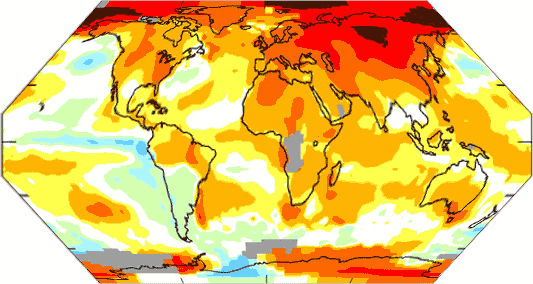
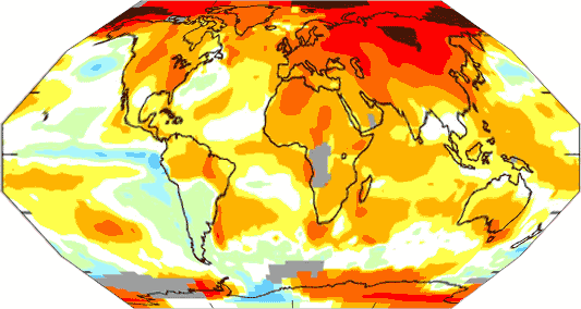
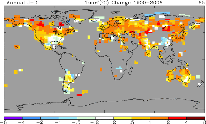
However, climate scientists are unwilling to back down from the thin branch they have crawled out on.  Rather than reduce their feedback assumptions to non-catastrophic levels, they currently hypothesize a second man-made cooling effect that is masking all this feedback-driven warming.  They claim now that man-made sulfate aerosols and black carbon are cooling the earth, and when some day these pollutants are reduced, we will see huge catch-up warming.  If anything, this cooling effect is even less understood than feedback.  What we do know is that, unlike CO2, the effects of these aerosols are short-lived and therefore localized, making it unlikely they are providing sufficient masking to make catastrophic forecasts viable.  I go into several reality checks in my videos, but here is a quick one:  Nearly all the man-made cooling aerosols are in the northern hemisphere, meaning that most all the cooling effect should be there — but the northern hemisphere has actually exhibited most of the world’s warming over the past 30 years, while the south has hardly warmed at all.

In sum, to believe catastrophic warming forecasts, one has to believe both of the following:

  1. The climate is dominated by strong positive feedback, despite our experience with other stable systems that says this is unlikely and despite our measurements over the last 100 years that have seen no such feedback levels.
  2. Substantial warming, of 1C or more, is being masked by aerosols, despite the fact that aerosols really only have strong presence over 5-10% of the globe and despite the fact that the cooler part of the world has been the one without the aerosols.

Here’s what this means:  Man will cause, at most, about a degree of warming over the next century.  Most of this warming will be concentrated in raising minimum temperatures at night rather than maximum daytime temperatures  (this is why, despite some measured average warming, the US has not seen an increase of late in maximum temperature records set).  There are many reasons to believe that man’s actual effect will be less than 1 degree, and that whatever effect we do have will be lost in the natural cyclical variations the climate experiences, but we are only just now starting to understand.

To keep this relatively short, I have left out all the numbers and such.  To see the graphs and numbers and sources, check out my new climate video, or my longer original video, or download my book for free.

Update:  Commenters are correct that positive feedback dominated systems can be stable as long as the feedback percentage is less than 100%.  By trying to get too compact in my arguments, I combined a couple of things.  First, there are many catastrophists that argue that climate IS in fact dominated by feedback over 100% — anyone who talks of "tipping points" is effectively saying this.  The argument about instability making stable processes impossible certainly applies to these folks’ logic.  Further, even positive feedback <100% makes a system highly subject to dramatic variations.  But Mann et. al. are already on the record saying that without man, global temperatures are unbelievably stable and move in extremely narrow ranges.   It is hard to imagine this to be true in a climate system dominated by positive feedback, particularly when it is beset all the time with dramatic perturbations, from volcanoes to the Maunder Minimum.

To some extent, climate catastrophists are in a bind.  If historic temperatures show a lot of variance, then a strong argument can be made that a large portion of 20th century warming is natural occilation.  If historic temperatures move only in narrow ranges, they have a very difficult time justifying that the climate is dominated by positive feedbacks of 60-80%,

The point to remember, though, is that irregardless of likelihood, the historical temperature record simply does not support assumptions of feedback much larger than zero.  Yes, time delays and lags make a small difference, but all one has to do is compare current temperatures to CO2 levels 12-15 years ago to account for this lag and one still gets absolutely no empirical support for large positive feedbacks.

Remember this when someone says that greenhouse gas theory is "Settled."  It may or may not be, but the catastrophe does not come directly from greenhouse gasses.  Alone, they cause at most nuisance warming.  The catastrophe comes from substantial positive feedback (it takes 60-80% levels to get climate sensitivities of 3-5C) which is far from settled science.

Where “Consensus” Comes From

Via Tom Nelson:

I hate to burst the bubble here, but the American Geophysical Union’s (AGU) climate ‘consensus’ statement does not hold up to even the lightest scrutiny.

It appears that the AGU Board issued a statement on climate change without putting it to a vote of the group’s more than 50,000 members. Its sweeping claims were drafted by what appears to be only nine AGU committee members. The statement relies heavily on long term computer model projections, cherry-picking of data and a very one-sided view of recent research. As with the recent statements by the American Meteorological Society (AMS) and the National Academy of Sciences (NAS), the AGU statement is the product of a small circle of scientists (again apparently a 9 member panel according to AGU) who all share the same point of view, and who failed to put their statement to a vote of the AGU members on whose behalf they now claim to speak. As such it amounts to nothing more than a restatement of the opinion of this small group, not a ‘consensus’ document.

New Climate Short: Don’t Panic — Flaws in Catastrophic Global Warming Forecasts

After releasing my first climate video, which ran over 50 minutes, I had a lot of feedback that I should aim for shorter, more focused videos.  This is my first such effort, setting for myself the artificial limit of 10 minutes, which is the YouTube limit on video length.

While the science of how CO2 and other greenhouse gases cause warming is fairly well understood, this core process only results in limited, nuisance levels of global warming. Catastrophic warming forecasts depend on added elements, particularly the assumption that the climate is dominated by strong positive feedbacks, where the science is MUCH weaker. This video explores these issues and explains why most catastrophic warming forecasts are probably greatly exaggerated.


You can also access the YouTube video here, or you can access the same version on Google video here.

If you have the bandwidth, you can download a much higher quality version by right-clicking either of the links below:

I am not sure why the quicktime version is so porky.  In addition, the sound is not great in the quicktime version, so use the windows media wmv files if you can.  I will try to reprocess it tonight.  All of these files for download are much more readable than the YouTube version (memo to self:  use larger font next time!)

This is a companion video to the longer and more comprehensive climate skeptic video "What is Normal — a Critique of Catastrophic Man-Made Global Warming Theory."