Some Day Climate May Be A Big-Boy Science

In big-boy science, people who run an experiment and arrive at meaningful findings will publish not only those findings but the data and methodology they used to reach those findings.  They do that because in most sciences, a conclusion is not really considered robust until multiple independent parties have replicated the finding, and they can’t replicate the finding until they know exactly how it was reached.  Physics scientists don’t run around talking about peer review as the be-all-end-all of scientific validation.  Instead of relying on peers to read over an article to look for mistakes, they go out and see if they can replicate the results.  It is expected that others in the profession will try to replicate, or even tear down, a controversial new finding.  Such a process is why we aren’t all running around talking about the cold fusion "consensus" based on "peer-reviewed science."  It would simply be bizarre for someone in physics, say, to argue that their findings were beyond question simply because it had been peer reviewed by a cherry-picked review group and to refuse to publish their data or detailed methodology. 

Some day climate science may be all grown up, but right now its far from it.

1990: A Year Selected Very Carefully

Most of you will know that the Kyoto Treaty adopted CO2 reduction goals referenced to a base year of 1990.  But what you might not know is exactly how that year was selected.  Why would a treaty, negotiated and signed in the latter half of the 90’s adopt 1990 as a base year, rather than say 1995 or 2000?  Or even 1980.

Closely linked to this question of base year selection for the treaty is a sort of cognitive dissonance that is occurring in reports about compliance of the signatories with the treaty.  Some seem to report substantial progress by European countries in reducing emissions, while others report that nearly everyone is going to miss the goals by a lot and that lately, the US has been doing better than signatory countries in terms of CO2 emissions.

To answer this, lets put ourselves back in about 1997 as the Kyoto Treat was being hammered out.  Here is what the negotiators knew at that time:

  • Both Japan and Europe had been mired in a recession since about 1990, cutting economic growth and reducing emissions growth.  The US economy had been booming.  From 1990-1995, US average real GDP growth was 2.5%, while Japan and Europe were both around 1.4% per year (source xls). 
  • The Berlin Wall fell in 1989, and Germany began unifying with East Germany in 1990.  In 1990, All that old, polluting, inefficient Soviet/Communist era industry was still running, pumping out incredible amounts of CO2 per unit produced.  By 1995, much of that industry had been shut down, though even to this day Germany continues to reap year over year efficiency improvements as they restructure old Soviet-era industry, transportation infrastructure, etc.
  • The UK in the late 1980’s had embarked on a huge campaign to replace Midlands coal with natural gas from the North Sea.  From 1990-1995, for reasons having nothing to do with CO2, British substituted a lot of lower CO2 gas combustion in place of higher CO2 coal production.

Remember, negotiators knew all this stuff in 1997.  All the above experience netted to this CO2 data that was in the negotiators pocket at Kyoto (from here):

CO2 Emissions Changes, 1990-1995

EU -2.2%
Former Communist -26.1%
Germany -10.7%
UK -6.9%
Japan 7.2%
US 6.4%

In the above, the categories are not mutually exclusive.  Germany and UK are also in the EU numbers, and Germany is included in the former communist number as well.  Note that all numbers exclude offsets and credits.

As you can see, led by the collapse of the former communist economies and the shuttering of inefficient Soviet industries, in addition to the substitution of British gas for coal, the European negotiators knew they had tremendous CO2 reductions already in their pocket, IF 1990 was chosen as a base year.  They could begin Kyoto already looking like heroes, despite the fact that the reductions from 1990-1997 were almost all due to economic and political happenings unrelated to CO2 abatement programs.

Even signatory Japan was ticked off about the 1990 date, arguing that it benefitted the European countries but was pegged years after Japan had made most of their improvements in energy efficiency:

Jun Arima, lead negotiator for Japan’s energy ministry, said the 1990 baseline for CO2 cuts agreed at Kyoto was arranged for the convenience of the UK and Germany. …

Mr Arima said: "The base year of 1990 was very advantageous to European countries. In the UK, you had already experienced the ‘dash for gas’ from coal – then in Germany they merged Eastern Germany where tremendous restructuring occurred.

"The bulk of CO2 reductions in the EU is attributable to reductions in UK and Germany."

His other complaint was that the 1990 baseline ruled inadmissible the huge gains in energy efficiency Japan had made in the 1980s in response the 1970s oil shocks.

"Japan achieved very high level of energy efficiency in the 1980s so that means the additional reduction from 1990 will mean tremendous extra cost for Japan compared with other countries that can easily achieve more energy efficiency."

So 1990 was chosen by the European negotiators as the best possible date for their countries to look good and, as an added bonus, as a very good date to try to make the US look bad.  That is why, whenever you see a press release from the EU about carbon dioxide abatement, you will see them trumpet their results since 1990.  Any other baseline year would make them look worse.

One might arguably say that anything that occured before the signing of the treaty in 1997 is accidental or unrelated, and that it is more interesting to see what has happened once governments had explicit programs in place to reduce CO2.  This is what you will see:

Just let me remind you of some salutary statistics. Between 1997 and 2004, carbon dioxide emissions rose as follows:

Emissions worldwide increased 18.0%;

Emissions from countries that ratified the protocol increased 21.1%;

Emissions from non-ratifiers of the protocol increased 10.0%;

Emissions from the US (a non-ratifier) increased 6.6%;

A lot more CO2 data here.

Postscript:  One would expect that absent changes in government regulations, the US has probably continued to do better than Europe on this metric the last several years.  The reason is that increases in wholesale gas prices increase US gas retail prices by a higher percentage than it does European retail prices.   This is because fixed-amount taxes make up a much higher portion of European gas prices than American.  While it does not necesarily follow from this, it is not illogical to assume that recent increases in oil and gas prices have had a greater effect on US than European demand, particularly since, with historically lower energy prices, the US has not made many of the lower-hanging efficiency investments that have already been made in Europe.

Climate Re-Education Program

  A reader sent me a heads-up to an article in the Bulletin of the American Meteorological Society ($, abstract here) titled "Climate Change Education and the Ecological Footprint".  The authors express concern that non-science students don’t sufficiently understand global warming and its causes, and want to initiate a re-education program in schools to get people thinking the "right" way.

So, do climate scientists want to focus on better educating kids in details of the carbon cycle?  In the complexities in sorting out causes of warming between natural and man-made effects?  In difficulties with climate modeling?  In the huge role that feedback plays in climate forecasts?

Actually, no.  Interestingly, the curriculum advocated in the Journal of American Meteorology has very little to do with meteorology or climate science.  What they are advocating is a social engineering course structured around the concept of "ecological footprint."  The course, as far as I can tell, has more in common with this online kids game where kids find out what age they should be allowed to live to based on their ecological footprint.

Like the Planet Slayer game above, the approach seems to be built around a quiz (kind of slow and tedious to get through).  Like Planet Slayer, most of the questions are lifestyle questions – do you eat meat, do you buy food from more than 200 miles away, how big is your house, do you fly a lot, etc.  If you answer that yes, you have a good diet and a nice house and travel a bit and own a car, then you are indeed destroying the planet.

I could go nuts on a rant about propoganda in government monopoly schools, but I want to make a different point [feel free to insert rant of choice here].  The amazing thing to me is that none of this has the first thing to do with meteoroogy or climate science.  If there were any science at all in this ecological footprint stuff, it would have to be economics.  What does meteorology have to say about the carrying capacity of the earth?  Zero.  What does climate science have to say about the balance between the benefits of air travel and the cost of the incremental warming that might result from that air travel?  Zero. 

Take one example – food miles.  I live in Phoenix.  The cost to grow crops around here (since most of the agricultural water has to be brought in from hundreds of miles away) is high.  The cost is also high because even irrigated, the soil is not as productive for many crops as it is in, say, Iowa, so crops require more labor, more fertilizer, and more land for the same amount of yield.  I could make a really good argument that an ear of corn trucked in from Iowa probably uses less resources than an ear of corn grown withing 200 miles of where I live.  Agree or disagree, this is a tricky economics question that requires fairly sophisiticated analysis to answer.  How is teaching kids that "food grown within 200 miles helps save the planet" advancing the cause of climate science?  What does meteorology have to say about this question?

I am sorry I don’t have more excerpts, but I am lazy and I have to retype them by hand.  But this is too priceless to miss:

Responding to the statement "Buying bottled water instead of drinking water from a faucet contributes to global warming" only 21% of all [San Jose State University] Meteorology 112 students answered correctly.  In the EF student group, this improved to a 53% correct response….  For the statement, "Eating a vegetarian diet can reduce global warming," the initial correct response by all Meteorology 112 students was 14%, while the EF group improved to 80%.

Oh my god, every time you drink bottled water you are adding 0.0000000000000000000000000001C to the world temperature.  How much global warming do I prevent if I paint flowers on my VW van?  We are teaching college meteorology students this kind of stuff?  The gulf between this and my freshman physics class is so wide, I can’t even get my head around it.  This is a college science class?

In fact, the authors admit that their curriculum is an explicit rejection of science education, bringing the odd plea in a scientific journal that science students should be taught less science:

Critics of conventional environmental education propose that curriculum focused solely on science without personal and social connections may not be the most effective educational model for moving toward social change.

I think it is a pretty good sign that a particular branch of science has a problem when it is focused more on "social change" than on getting the science right, and when its leading journal focuses on education studies rather than science.

If I were a global warming believer, this program would piss me off.  Think about it.  Teaching kids this kind of stuff and then sending them out to argue with knowlegeable skeptics is like teaching a bunch of soldiers only karate and judo and then sending them into a modern firefight.  They are going to get slaughtered. 

Hockey Stick: RIP

I have posted many times on the numerous problems with the historic temperature reconstructions that were used in Mann’s now-famous "hockey stick."   I don’t have any problems with scientists trying to recreate history from fragmentary evidence, but I do have a problem when they overestimate the certainty of their findings or enter the analysis trying to reach a particular outcome.   Just as an archaeologist must admit there is only so much that can be inferred from a single Roman coin found in the dirt, we must accept the limit to how good trees are as thermometers.  The problem with tree rings (the primary source for Mann’s hockey stick) is that they vary in width for any number of reasons, only one of which is temperature.

One of the issues scientists are facing with tree ring analyses is called "divergence."  Basically, when tree rings are measured, they have "data" in the form of rings and ring widths going back as much as 1000 years (if you pick the right tree!)  This data must be scaled — a ring width variation of .02mm must be scaled in some way so that it translates to a temperature variation.  What scientists do is take the last few decades of tree rings, for which we have simultaneous surface temperature recordings, and scale the two data sets against each other.  Then they can use this scale when going backwards to convert ring widths to temperatures.

But a funny thing happened on the way to the Nobel Prize ceremony.  It turns out that if you go back to the same trees 10 years later and gather updated samples, the ring widths, based on the scaling factors derived previously, do not match well with what we know current temperatures to be. 

The initial reaction from Mann and his peers was to try to save their analysis by arguing that there was some other modern anthropogenic effect that was throwing off the scaling for current temperatures (though no one could name what such an effect might be).  Upon further reflection, though, scientists are starting to wonder whether tree rings have much predictive power at all.  Even Keith Briffa, the man brought into the fourth IPCC to try to save the hockey stick after Mann was discredited, has recently expressed concerns:

There exists very large potential for over-calibration in multiple regressions and in spatial reconstructions, due to numerous chronology predictors (lag variables or networks of chronologies – even when using PC regression techniques). Frequently, the much vaunted ‘verification’ of tree-ring regression equations is of limited rigour, and tells us virtually nothing about the validity of long-timescale climate estimates or those that represent extrapolations beyond the range of calibrated variability.

Using smoothed data from multiple source regions, it is all too easy to calibrate large scale (NH) temperature trends, perhaps by chance alone.

But this is what really got me the other day.  Steve McIntyre (who else) has a post that analyzes each of the tree ring series in the latest Mann hockey stick.  Apparently, each series has a calibration period, where the scaling is set, and a verification period, an additional period for which we have measured temperature data to verify the scaling.  A couple of points were obvious as he stepped through each series:

  1. Each series individually has terrible predictive ability.  Each were able to be scaled, but each has so much noise in them that in many cases, standard T-tests can’t even be run and when they are, confidence intervals are huge.  For example, the series NOAMER PC1 (the series McIntyre showed years ago dominates the hockey stick) predicts that the mean temperature value in the verification period should be between -1C and -16C.  For a mean temperature, this is an unbelievably wide range.  To give one a sense of scale, that is a 27F range, which is roughly equivalent to the difference in average annual temperatures between Phoenix and Minneapolis!  A temperature forecast with error bars that could encompass both Phoenix and Minneapolis is not very useful.
  2. Even with the huge confidence intervals above, the series above does not verify!  (the verification value is -.19).  In fact, only one out of numerous data series individually verifies, and even this one was manually fudged to make it work.

Steve McIntyre is a very careful and fair person, so he allows that even if none of the series individually verify or have much predictive power, they might when combined.  I am not a statistician, so I will leave that to him to think about, but I know my response — if all of the series are of low value individually, their value is not going to increase when combined.  They may accidentally in mass hit some verification value, but we should accept that as an accident, not as some sort of true signal emerging from the data. 

Why Does NASA Oppose Satellites? A Modest Proposal For A Better Data Set

One of the ironies of climate science is that perhaps the most prominent opponent of satellite measurement of global temperature is James Hansen, head of … wait for it … the Goddard Institute for Space Studies at NASA!  As odd as it may seem, while we have updated our technology for measuring atmospheric components like CO2, and have switched from surface measurement to satellites to monitor sea ice, Hansen and his crew at the space agency are fighting a rearguard action to defend surface temperature measurement against the intrusion of space technology.

For those new to the topic, the ability to measure global temperatures by satellite has only existed since about 1979, and is admittedly still being refined and made more accurate.  However, it has a number of substantial advantages over surface temperature measurement:

  • It is immune to biases related to the positioning of surface temperature stations, particularly the temperature creep over time for stations in growing urban areas.
  • It is relatively immune to the problems of discontinuities as surface temperature locations are moved.
  • It is much better geographic coverage, lacking the immense holes that exist in the surface temperature network.

Anthony Watt has done a fabulous job of documenting the issues with the surface temperature measurement network in the US, which one must remember is the best in the world.  Here is an example of the problems in the network.  Another problem that Mr. Hansen and his crew are particularly guilty of is making a number of adjustments in the laboratory to historical temperature data that are poorly documented and have the result of increasing apparent warming.  These adjustments, that imply that surface temperature measurements are net biased on the low side, make zero sense given the surfacestations.org surveys and our intuition about urban heat biases.

What really got me thinking about this topic was this post by John Goetz the other day taking us step by step through the GISS methodology for "adjusting" historical temperature records  (By the way, this third party verification of Mr. Hansen’s methodology is only possible because pressure from folks like Steve McIntyre forced NASA to finally release their methodology for others to critique).  There is no good way to excerpt the post, except to say that when its done, one is left with a strong sense that the net result is not really meaningful in any way.  Sure, each step in the process might have some sort of logic behind it, but the end result is such a mess that its impossible to believe the resulting data have any relevance to any physical reality.  I argued the same thing here with this Tucson example.

Satellites do have disadvantages, though I think these are minor compared to their advantages  (Most skeptics believe Mr. Hansen prefers the surface temperature record because of, not in spite of, its biases, as it is believed Mr. Hansen wants to use a data set that shows the maximum possible warming signal.  This is also consistent with the fact that Mr. Hansen’s historical adjustments tend to be opposite what most would intuit, adding to rather than offsetting urban biases).  Satellite disadvantages include:

  • They take readings of individual locations fewer times in a day than a surface temperature station might, but since most surface temperature records only use two temperatures a day (the high and low, which are averaged), this is mitigated somewhat.
  • They are less robust — a single failure in a satellite can prevent measuring the entire globe, where a single point failure in the surface temperature network is nearly meaningless.
  • We have less history in using these records, so there may be problems we don’t know about yet
  • We only have history back to 1979, so its not useful for very long term trend analysis.

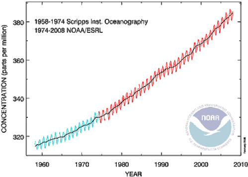
This last point I want to address.  As I mentioned above, almost every climate variable we measure has a technological discontinuity in it.  Even temperature measurement has one between thermometers and more modern electronic sensors.  As an example, below is a NOAA chart on CO2 that shows such a data source splice:

Atmosphericcarbondioxide

I have zero influence in the climate field, but I would never-the-less propose that we begin to make the same data source splice with temperature.  It is as pointless continue to rely on surface temperature measurements as our primary metric of global warming as it is to rely on ship observations for sea ice extent. 

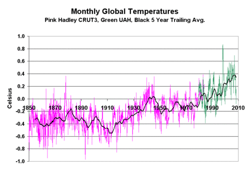
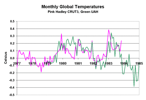
Here is the data set I have begun to use (Download crut3_uah_splice.xls ).  It is a splice of the Hadley CRUT3 historic data base with the UAH satellite data base for historic temperature anomalies.  Because the two use different base periods to zero out their anomalies, I had to reset the UAH anomaly to match CRUT3.  I used the first 60 months of UAH data and set the UAH average anomaly for this period equal to the CRUT3 average for the same period.  This added exactly 0.1C to each UAH anomaly.  The result is shown below (click for larger view)

Landsatsplice

Below is the detail of the 60-month period where the two data sets were normalized and the splice occurs.  The normalization turned out to be a simple addition of 0.1C to the entire UAH anomaly data set.  By visual inspection, the splice looks pretty good.

Landsatsplice2

One always needs to be careful when splicing two data sets together.  In fact, in the climate field I have warned of the problem of finding an inflection point in the data right at a data source splice.  But in this case, I think the splice is clean and reasonable, and consistent in philosophy to, say, the splice in historic CO2 data sources.

A Reminder

As we know, alarmists have adopted the term "climate change" over "global warming," in large part since the climate is always changing for all manner of reasons, one can always find, well, climate change.   This allows alarmists in the media to point to any bit of weather in the tails for the normal distribution and blame these events on man-made climate change.

But here is a reminder for those who may be uncomfortable with their own grasp of climate science (don’t feel bad, the media goes out of its way not to explain things very well).  There is no mechanism that has been proven, or even credibly identified, for increasing levels of CO2 in the atmosphere to "change the climate" or cause extreme weather without first causing warming.  In other words, the only possible causality is CO2 –> warming –> changing weather patterns.  If we don’t see the warming, we don’t see the changing weather patterns. 

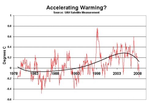
I feel the need to say this, because alarmists (including Gore) have adopted the tactic of saying that climate change is accelerating, or that they see the signs of accelerating climate change everywhere.  But for the last 10 years, we have not seen any warming.  Uah

So if climate change is in fact somehow "accelerating," then it cannot possibly be due to CO2.  I believe that they are trying to create the impression that somehow CO2 is directly causing extreme weather, which it does not, under any mechanism anyone has ever suggested.   

Antarctic Sea Ice

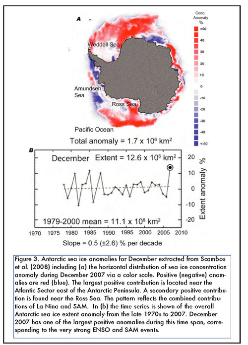
I have written a number of times that alarmists like Al Gore focus their cameras and attention on small portions of the Antarctic Peninsula where sea ice is has been shrinking  (actually, it turns out Al Gore did not focus actual cameras but used special effects footage from the disaster movie Day after Tomorrow).  I have argued that this is disingenuous, because the Antarctic Peninsula is not representative of climate trends in the rest of Antarctica, much less a good representative of climate trends across the whole globe.  This map reinforces my point, showing in red where sea ice has increased, and in blue where it has decreased  (this is a little counter-intuitive where we expect anomaly maps to show red as hotter and blue as colder).

Clivarvariations6n1

The Cost of the Insurance Policy Matters

Supporters of the precautionary principle argue that even if it is uncertain that we will face a global warming catastrophe from producing CO2, we should insure against it by abating CO2 just in case.  "You buy insurance on your house, don’t you," they often ask.  Sure, I answer, except when the cost of the insurance is more than the cost of the house.

In a speech yesterday here in Washington, Al Gore challenged the United States to "produce every kilowatt of electricity through wind, sun, and other Earth-friendly energy sources within 10 years. This goal is achievable, affordable, and transformative." (Well, the goal is at least one of those things.) Gore compared the zero-carbon effort to the Apollo program. And the comparison would be economically apt if, rather than putting a man on the moon—which costs about $100 billion in today’s dollars—President Kennedy’s goal had been to build a massive lunar colony, complete with a casino where the Rat Pack could perform.

Gore’s fantastic—in the truest sense of the word—proposal is almost unfathomably pricey and makes sense only if you think that not doing so almost immediately would result in an uninhabitable planet. …

This isn’t the first time Gore has made a proposal with jaw-dropping economic consequences. Environmental economist William Nordhaus ran the numbers on Gore’s idea to reduce carbon emissions by 90 percent by 2050. Nordhaus found that while such a plan would indeed reduce the maximum increase in global temperatures to between 1.3 and 1.6 degrees Celsius, it did so "at very high cost" of between $17 trillion and $22 trillion over the long term, as opposed to doing nothing. (Again, just for comparative purposes, the entire global economy is about $50 trillion.)

I think everyone’s numbers are low, because they don’t include the cost of storage (technology unknown) or alternative capacity when it is a) dark and/or b) not windy.

A while back I took on Gore’s suggestion that all of America’s electricity needs could be met with current Solar technology with a 90 mile x 90 mile tract of solar.  Forgetting the fact that Al’s environmental friends would never allow us to cover 8100 square miles of the desert in silicon, I got a total installation cost of $21 trillion dollars.  And that did not include the electrical distribution systems necessary for the whole country to take power from this one spot, nor any kind of storage technology for using electricity at night  (it was hard to cost one out when no technology exist for storing America’s total energy needs for 12 hours).  Suffice it to say that a full solution with storage and distribution would easily cost north of $30 trillion dollars.

This Too Shall Pass (By Popular Demand)

In perhaps the largest batch of email I have ever gotten on one subject, readers are demanding more coverage of the effect of trace atmospheric gasses on kidney function.  So here you go:

In early July, when a former government employee accused Dick Cheney’s office of deleting from congressional testimony key statements about the impact of climate change on public health, White House staff countered that the science just wasn’t strong enough to include. Not two weeks later, however, things already look different. University of Texas researchers have laid out some of the most compelling science to date linking climate change with adverse public-health effects: scientists predict a steady rise in the U.S. incidence of kidney stones — a medical condition largely brought on by dehydration — as the planet continues to warm.

I am certainly ready to believe that this is "the most compelling science to date" vis a vis the negative effects of global warming, though I thought perhaps the study about global warming increasing acne was right up there as well.

Here are 48,900 other things that "global warming will cause."  More from Lubos Motl.  And here is the big list of global warming catastrophe claims.

Update:  I am not sure I would have even bothered, but Ryan M actually dives into the "science" of the kidney stone finding

Working on New Videos

Sorry posting has been light, but I am working on starting a new series of videos.  At some point I want to update the old ones, but right now I want to experiment with some new approaches — the old ones are pretty good, but are basically just powerpoint slides with some narration.  If you have not seen the previous videos, you may find them as follows:

  • The 6-part, one hour version is here
  • The 10-minute version, which is probably the best balance of time vs. material covered, is here.
  • The short 3-minute version I created for a contest (I won 2nd place) is here.

Combined, they have over 40,000 views.

Another Dim Bulb Leading Global Warming Efforts

Rep. Edward Markey (D-Mass.) is chairman of the House (Select) Energy Independence and Global Warming Committee.  He sure seems to know his stuff, huh:

A top Democrat told high school students gathered at the U.S. Capitol Thursday that climate change caused Hurricane Katrina and the conflict in Darfur, which led to the “black hawk down” battle between U.S. troops and Somali rebels….

“In Somalia back in 1993, climate change, according to 11 three- and four-star generals, resulted in a drought which led to famine,” said Markey.

“That famine translated to international aid we sent in to Somalia, which then led to the U.S. having to send in forces to separate all the groups that were fighting over the aid, which led to Black Hawk Down. There was this scene where we have all of our American troops under fire because they have been put into the middle of this terrible situation,” he added.

Ugh.

Yes, It’s Another Antarctic Ice Post

From a reader, comes yet another article claiming micro-climate variations on the Antarctic Peninsula are indicative of global warming.

New evidence has emerged that a large plate of floating ice shelf attached to Antarctica is breaking up, in a troubling sign of global warming, the European Space Agency (ESA) said on Thursday.

Images taken by its Envisat remote-sensing satellite show that Wilkins Ice Shelf is "hanging by its last thread" to Charcot Island, one of the plate’s key anchors to the Antarctic peninsula, ESA said in a press release.

"Since the connection to the island… helps stabilise the ice shelf, it is likely the breakup of the bridge will put the remainder of the ice shelf at risk," it said.

Wilkins Ice Shelf had been stable for most of the last century, covering around 16,000 square kilometres (6,000 square miles), or about the size of Northern Ireland, before it began to retreat in the 1990s.

No, No, No.  The Antartic Peninsula’s climate is not indicative of the rest of Antarctica or the rest of the Southern Hemisphere, much less of the globe.  Here, one more time, is the missing context:

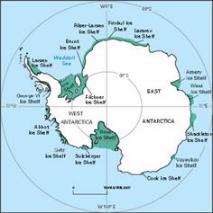
    1. The Antarctic Peninsula is a very small area that has very clearly been warming substantially over the last decades, but it represents only 2% of Antarctica 

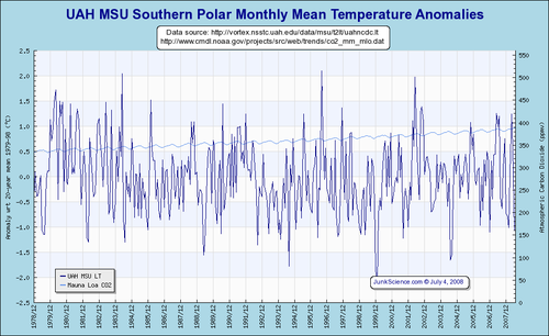
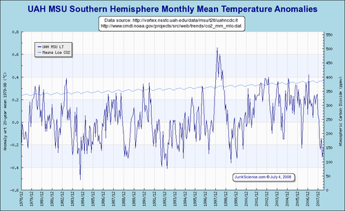
    2. The rest of Antarctica has seen flat and even declining temperatures, as has the entire southern hemisphere.  In fact, the Antarctic Peninsula is a very small area that is anomalous within the entire Southern Hemisphere, which makes it incredible that it so often is used as indicative of a global climate trend.

      Uahmsuspol

      Uahmsushem

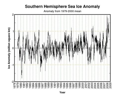
    3. Antarctic sea ice extent is actually at the highest levels observed since we started watching it via satellite around 1979.  Ice may be shrinking around the Peninsula, but is net growing over the whole continent
      Currentanomsouth
    4. We have no clue how ice shelves behave over time spans longer than the 100 years we have watched them.  It may well be they go through long-term natural growth and collapse cycles.

Much more here.

In Search of Honesty

Both major presidential candidates have endorsed CO2 abatement targets for the US, with Obama advocating for the most stringent — the "20 by 50" target by which the US would reduce CO2 emissions by 80% in the next 40 years.

Given that they support such targets, the candidates’ public positions on gasoline prices should be something like this:

Yeah, I know that $4 gas is painful.  But do you know what?  Gas prices are going to have to go a LOT higher for us to achieve the CO2 abatement targets I am proposing, so suck it up.  Just to give you a sense of scale, the Europeans pay nearly twice as much as we do for gas, and even at those levels, they are orders of magnitude short of the CO2 abatement I have committed us to achieve.  Since late 2006, gas prices in this country have doubled, and demand has fallen by perhaps 5%.  That will probably improve over time as people buy new cars and change behaviors, but it may well require gasoline prices north of $20 a gallon before we meet the CO2 goal I have adopted.  So get ready.

You have heard Obama and McCain say this?  Yeah, neither have I.  At least Obama was consistent enough not to adopt McCain’s gas tax holiday idea.  But it’s time for some honesty here, not that I really expect it. 

We need to start being a lot clearer about the real costs of CO2 abatement and stop this mindless "precautionary principle" jargon that presupposes that there are no costs to CO2 abatement.  When proponents of the precautionary principle say "Well, CO2 abatement is like insurance — you buy insurance on your house, don’t you," I answer, "Not if the insurance costs more than the cost to replace the house, I don’t."

Climate Blogs That Don’t Necessarily Accept “The Consensus”

Via Tom Nelson and Climate Debate Daily

William M. Briggs
Climate Audit
Climate Change Facts
Climate Change Fraud
Climate Police
Climate Resistance
Climate Scam
Climate Science
CO2 Science
Friends of Science
Global Climate Scam
Global Warming Heretic
Global Warming Hoax
Global Warming Skeptic
GlobalWarming.org
Greenie Watch
Bruce Hall
Warwick Hughes
Lucia Liljegren
Jennifer Marohasy
Warren Meyer
Maurizio Morabito
Luboš Motl
Tom Nelson
Newsbusters climate
Planet Gore
Roger Pielke Sr.
Fred Singer
David Stockwell
Philip Stott
Anthony Watts
World Climate Report

Map of Pain Created by CO2 Abatement Efforts

Government treaties and legislation will of necessity increase the cost of energy substantially.  It will also indirectly increase the cost of food and other staples, as fertilizer, equipment, and transportation costs rise.  This is not to mention the substantial rise in food costs that will continue as long as governments continue their misguided efforts to promote and subsidize food-based ethanol as a global warming solution. 

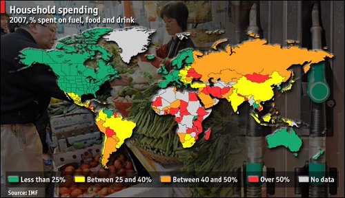
I found the map below in another context at economist Mark Perry’s site.  It shows the percentage of the average person’s income that is spent on food, fuel, and drink, with low percentages in green and high percentages in red.  However, this could easily be a map of the pain created by CO2 abatement efforts, with the most pain felt in red and the least in green.  In fact, this map actually underestimates the pain in yellow-red areas, as is does not factor in the lost development potential and thus lost future income from CO2 abatement efforts.

Foodfuelmap

Update on food prices:

Biofuels have caused a 75 per cent increase in world food prices, a new report suggests.

The rise is far greater than previous estimates including a US Government claim that plant-derived fuels contribute less than three per cent to food price hikes.

According to reports last night, a confidential World Bank document indicates the true extent of the effect of biofuels on prices at a crucial time in the world’s negotiations on biofuel policy.

Rising food prices have been blamed for pushing 100 million people beneath the poverty line. The confidential report, based on a detailed economic analysis of the effect of biofuels, will put pressure on the American and European governments, which have turned to biofuels in attempts to reduce the greenhouse gases associated with fossil fuels and to reduce their reliance on oil imports.

The report says: "Without the increase in biofuels, global wheat and maize stocks would not have declined appreciably and price increases due to other factors would have been moderate."

Extrapolating From One Data Point

Years ago, when I was studying engineering in college, I had a professor who used to "joke"  (remember, these are engineers, so the bar for the word "joke" is really low) that when he wanted to prove something, it was a real benefit to have only one data point.  That way, he said, you could plot a trend in any direction with any slope you wanted through the point.  Once you had two or three or more data points, your flexibility was ruined.

I am reminded of this in many global warming articles in the press today.  Here is one that caught my eye today on Tom Nelson’s blog.  There is nothing unusual about it, it just is the last one I saw:

Byers said he has decided to run because he wants to be able to look at his children in 20 or 30 years and be able to say that he took action to try to address important challenges facing humanity. He cited climate change as a “huge” concern, noting that this was driven home during a trip he took to the Arctic three weeks ago.

“The thing that was most striking was how the speed of climate change is accelerating—how it’s much worse than anyone really wants to believe,” Byers said. “To give you a sense of this, we flew over Cumberland Sound, which is a very large bay on the east coast of Baffin Island. This was three weeks ago; there was no ice.”

Do you see the single data point:  Cumberland Sound three weeks ago had no ice.  Incredibly, from this single data point, he not only comes up with a first derivative (the world is warming) but he actually gets the second derivative from this single data point (change is accelerating).  Wow!

We see this in other forms all the time:

  • We had a lot of flooding in the Midwest this year
  • There were a lot of tornadoes this year
  • Hurricane Katrina was really bad
  • The Northwest Passage was navigable last year
  • An ice shelf collapsed in Antarctica
  • We set a record high today in such-and-such city

I often criticize such claims for their lack of any proof of causality  (for example, linking this year’s floods and tornadoes to global warming when it is a cooler year than most of the last 20 seems a real stretch). 

But all of these stories share another common problem – they typically are used by the writer to make a statement about the pace and direction of change (and even the acceleration of this change), something that is absolutely scientifically impossible to do from a single data point.  As it turns out, we often have flooding in the Midwest.  Neither tornadoes nor hurricanes have shown any increasing trend over the past decades.  The Northwest Passage has been navigable a number of years in the last century.  During the time of the ice shelf collapse panic, Antarctica was actually setting 30-year record highs for sea ice extent.  And, by simple math, every city on average should set a new 100-year high temperature record every 100 days, and this is even before considering the urban heat island effect’s upward bias on city temperature measurement.

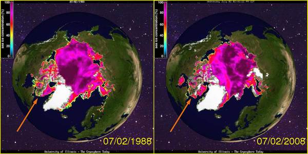
Postscript:  Gee, I really hate to add a second data point to the discussion, but from Cyrosphere Today, here is a comparison of the Arctic sea ice extent today and exactly 20 years ago (click for a larger view)

Deetmp7873arrow

The arrow points to Cumberland Sound.  I will not dispute Mr. Byers personal observations, except to say that whatever condition it is in today, there seems to have been even less ice there 20 years ago.

To be fair, sea ice extent in the Arctic is down about a million square kilometers today vs. where it was decades ago (though I struggle to see it in these maps), while the Antarctic is up about a million, so the net world anomaly is about zero right now. 

The Date You Should Die

A while back I wrote about a disgusting little online game sponsored by the Australian government via the ABC.  It appears that this game is being promoted in the public schools as well:

Professor Schpinkee’s “date one should die” exercise is meant to be a “fun” experience for primary students of public schools associated with the Australian Sustainability Schools Initiative.” According to a 2007 Schools Environment newsletter, written by the government sustainability officer in New South Wales and sent to schools in this program, teachers are encouraged to lead children to the Australian Broadcasting Corporation’s Planet Slayer website and use Professor Schpinkee’s Greenhouse Calculator. The newsletter refers to the calculator as a “great game for kids.”

My original post has screenshots and more description.  Via Tom Nelson

Another Assessment of Hansen’s Predictions

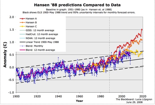
The Blackboard has done a bit more work to do a better assessment of Hansen’s forecast to Congress 20 years ago on global warming than I did in this quick and dirty post here.  To give Hansen every possible chance, the author has evaluated Hansen’s forecast against Hansen’s preferred data set, the surface temperature measurements of the Hadley Center and his own GISS  (left to other posts will be irony of a scientist at the Goddard Institute of Space Studies at NASA preferring klunky surface temperature measurements over satellite measurements, but the surface measurements are biased upwards and so give Hansen a better shot at being correct with his catastrophic warming forecasts).

Here is the result of their analysis:

Hansenlineartrend

All three forecasts are high. 

Don’t be too encouraged at Hansen’s prediction power when you observe the yellow line is not too far off. The yellow line represented a case where there was a radical effort to reduce CO2, something we have not seen.  Note that these are not different cases for different climate sensitivities to CO2 — my reading of Hansen’s notes is that these all use the same sensitivity, just with different CO2 production forecast inputs. In fact, based on our actual CO2 ouput in the last 20 years, we should use a case between the orange and the red to evaluate Hansen’s predictive ability.

Great Moments In Alarmism

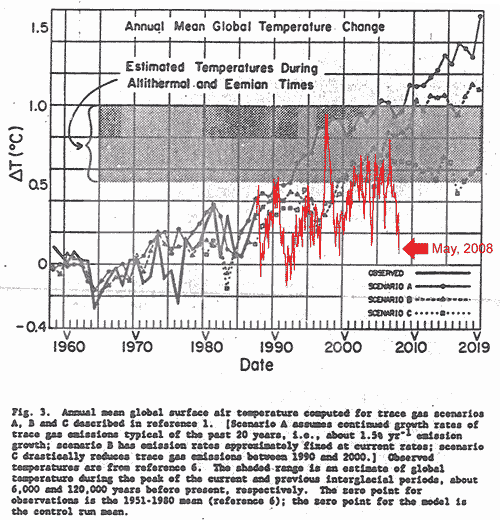
Apparently a number of papers are "commemorating" today the 20th anniversary of James Hansen’s speech before Congress warning of catastrophic man-made global warming.  So let’s indeed commemorate it.  Here is the chart from the appendices of Hansen’s speech showing his predictions for man-made global warming:

Hansencheck

I have helpfully added in red the actual temperature history, as measured by satellite, over the last 20 years (and scale-shifted to match the base anomaly in Hansens graph).  Yes, 2008 has been far colder than 1988.  We have seen no warming trend in the last 10 years, and temperatures have undershot every one of Hansen’s forecasts.  He thought the world would be a degree C warmer in 20 years, and it is not.  Of course, today, he says the world will warm a degree in the next 20 years — the apocalypse never goes away, it just recesses into the future.

This may explain why Hansen’s GISS surface temperature measurements are so much higher than everyone else’s, and keep getting artificially adjusted upwards:  Hansen put himself way out on a limb, and now is using the resources of the GISS to try to create warming in the metrics where none exist to validate his forecasts of Apocalypse. 

By the way, if you want more insight into the "science" led by James Hansen, check out this post from Steve McIntyre on his trying to independently reproduce the GISS temperature aggregation methodology. 

Here are some more notes and scripts in which I’ve made considerable progress on GISS Step 2. As noted on many occasions, the code is a demented mess – you’d never know that NASA actually has software policies (e.g. here or here . I guess that Hansen and associates regard themselves as being above the law. At this point, I haven’t even begum to approach analysis of whether the code accomplishes its underlying objective. There are innumerable decoding issues – John Goetz, an experienced programmer, compared it to descending into the hell described in a Stephen King novel. I compared it to the meaningless toy in the PPM children’s song – it goes zip when it moves, bop when it stops and whirr when it’s standing still. The endless machinations with binary files may have been necessary with Commodore 64s, but are totally pointless in 2008.

Because of the hapless programming, it takes a long time and considerable patience to figure out what happens when you press any particular button. The frustrating thing is that none of the operations are particularly complicated.

Hansen, despite being paid by US Taxpayers and despite all regulations on government science, refused for years to even release this code for inspection by outsiders and to this day resists helping anyone trying to reproduce his mysterious methodologies.

Which in some ways is all irrelevent anyway, since surface temperature measurement is flawed for so many reasons (location biases, urban heat islands, historical discontinuities, incomplete coverage) that satellite temperature measurement makes far more sense, which is why I used it above.  Of course, there is one person who fights hard against use of this satellite methodology.  Ironically, this person fighting use of space technology is … James Hansen, of the Goddard Institute for Space Studies of NASA!  In our next episode, the head of the FCC will be actively fighting for using the telegraph over radio and TV.