New Typepad Editor Bugged

I am working on several new posts, but the new Typepad editor is really buggy.  For some reason, Typepad put this particular blog (but not my others) on the new editor, probably as an involuntary beta.  The new editor is much, much slower, and has fatal bugs that make use of images in posts virtually impossible.

This is actually a problem with online applications I had not considered before.  When I heard iTunes 8 was initially bugged or learned to hate Vista, I would just avoid making the "upgrade."  But with online services, I have no choice but to accept the new version, even if I consider it worse (as is so often the case nowadays in software).

Arctic and Greenland Ice

Arctic Sea ice and Greenland glaciers have been on a slow retreating trend for decades, perhaps centuries (at least since the little ice age).  This should not be surprising.  First, glaciers all around the world have been steadily retreating since 1800:

Glacier_length_2_2

Also, the Arctic has been the hot spot of the world over the last 30 years or so:

Uahmsunpol

Increasing far more than global averages:

Uahmsuglobe

So the question is not necessarily why Arctic Sea ice continues to retreat – this appears part of a long term trend that in fact pre-dates things like, say, man’s production of substantial amounts of CO2.  But the more worrisome question has been, why has this retreat seemed to have accelerated the past several years:

Currentanom

Its hard to fully correlate recent activity with Arctic temperatures.  In fact, in the last three or four years (see above) we have seen decreasing Attic temperatures, not increasing ones.  But never-the-less, this ice picture is often used as exhibit #1 to prove anthropogenic warming.  The "tipping point is near" cry supporters of the theory that Earth’s climate, unlike nearly every other long-term stable natural system, is dominated by positive feedback (and ignoring anecdotal evidence that the Arctic experienced similar melting in the 1930s).

Well, last year, there was some preliminary findings form NASA that said that the unusual low ice pack in 2008 may have been due to shifting wind patterns.  Now, Anthony Watts points us to two new studies that both conclude something other than global warming and CO2 may be behind recent ice pack trends in the Arctic.

Observations over the past decades show a rapid acceleration of several outlet glaciers in Greenland and Antarctica1. One of the largest changes is a sudden switch of Jakobshavn Isbræ, a large outlet glacier feeding a deep-ocean fjord on Greenland’s west coast, from slow thickening to rapid thinning2 in 1997, associated with a doubling in glacier velocity3. Suggested explanations for the speed-up of Jakobshavn Isbræ include increased lubrication of the ice-bedrock interface as more meltwater has drained to the glacier bed during recent warmer summers4 and weakening and break-up of the floating ice tongue that buttressed the glacier5. Here we present hydrographic data that show a sudden increase in subsurface ocean temperature in 1997 along the entire west coast of Greenland, suggesting that the changes in Jakobshavn Isbræ were instead triggered by the arrival of relatively warm water originating from the Irminger Sea near Iceland. We trace these oceanic changes back to changes in the atmospheric circulation in the North Atlantic region. We conclude that the prediction of future rapid dynamic responses of other outlet glaciers to climate change will require an improved understanding of the effect of changes in regional ocean and atmosphere circulation on the delivery of warm subsurface waters to the periphery of the ice sheets.

When Computer Models Are Treated Like Reality

On April 28, 2004, the SEC made a significant change in policy in the regulation of large investment banks.  On that day, they "decided to allow the five largest US investment banks to substitute advanced mathematical risk models for traditional capital requirements."  Al Gore has touted the "success" of such models as a reason to feel confident that computer models can accurately predict long-term climate trends.

But it turns out, as everyone is discovering this week, that computer models are not reality.  In fact, computer models are extraordinarily sensitive to their inputs, and small changes in their inputs, or the narrowing of models to ignore certain factors, can make them worse than useless.  Computer models are also very easy to force to a preferred conclusion.

Why Kyoto Used 1990 as a Base Year

I have made this point several times, but the 1990 reference date for Kyoto was not just picked randomly.  In fact, on its face, it was a bit odd for a treaty negotiated in 1997 to use a 1990 base year.   But 1990 allowed signatory countries to claim credit for alot of improvements in CO2 output that had nothing to do with the treaty.  For example, in Germany, 1990 was after unification but before wildly inefficient east German factories had been shut down.  In England, 1990 was just before a concerted effort to substitute North Sea oil and nuclear to shut down Midlands coal use.  In France and Japan, 1990 was the beginning of a period of slow economic growth (and, as an added special bonus, punished the US because it was the beginning of strong economic growth here).

Here is further proof:

In an odd twist on market economics, Europe’s ex-communist states are starting to exploit a new market. Thanks to the Kyoto climate-change agreement, they can, in effect, now make money off the pollution their onetime central planners were willing to tolerate as the price for rapid industrialization and universal employment.

Ukraine, Hungary, the Czech Republic and other countries of the region not exactly renowned for clean air have made or are close to signing deals to sell the rights to emit greenhouse gases, and their main customer is environmentally friendly Japan.

This carbon windfall dropped into Central and East Europe’s lap because the Kyoto Protocol sets 1990 as the reference year for future reductions in greenhouse gas emissions. The socialist states at that time were producing gargantuan amounts of CO2 and other gases implicated in global warming from unfiltered coal-fired power plants and factories; when those unprofitable industries withered, countless thousands of workers went on the dole — but the air got cleaner. In the coming years, in line with European Union mandates, would-be members gradually adopted better environmental policies. It’s the difference between the often unspeakably bad air of 1990 and the comparatively clean air of today that allows them to sell "carbon credits" potentially worth billions of euros.

In effect, signatory countries are still making their Kyoto goals with actions that had nothing to do with Kyoto, in this case the modernization and/or shut down of communist-era industry.  This continues the charade that a) Europe is actually making real progress on CO2 emissions, which it is not and b) emissions reductions are cheap.

Update:  Before the treaty, but for which the treaty supporters claim credit by selecting 1990 as the base year, signatory countries had large CO2 reductions due to the forces at work detailed above:

CO2 Emissions Changes, 1990-1995

EU -2.2%
Former Communist -26.1%
Germany -10.7%
UK -6.9%
Japan 7.2%
US 6.4%

Since the treaty was actually signed, from 1997 to 2005, countries that ratified the treaty had emissions rise 21%.  When the treaty was signed in 1997, they signatories knew they had this pool of 1990-1995 emissions reductions to draw on to claim victory.  To this day, this is the only improvement they can show, improvement that occured before the treaty and through steps unrelated, in the main, to CO2 abatement.

RCRC Climate Presentation

I made a 30-minute presentation to the California Regional Council of Rural Counties yesterday.   The audience was mainly county supervisors and other officials from about 30 rural counties.  The presentation was the skeptical counterpoint to a presentation by Joe Nation, who among other accomplishments was an author of AB32, the California global warming abatement law.  Download RCRC_Global_Warming_Presentation_update_Sept-25-2008.ppt .  Some of the charts may not be self-explanatory, so I am working on a YouTube video with my speech overlaid on the slides.

It was an interesting experience for me because the audience was hugely sympathetic to my pitch, but frustrated because, for them, it was beside the point:  They were already committed by AB32 to take drastic and expensive action under AB32.  The only policy recommendation I made in my speech was to lament the obsession with cap-and-trade and make a plea for a carbon tax.  The discussion afterward pretty much made my point for me, with every member lamenting the absurdities that are emerging in the CARB regulation process.  Even Mr. Nation admitted that the CARB is setting up programs that are preferentially regulating those with the least political muscle and pushing policies which make no sense in any kind of cost-benefit analysis for fighting CO2.  Mr. Nation said that when he was in the legislature, he tried a carbon tax first but could not get it out of committee, even a small one that would have raised gas taxes about 5 cents.  It seems politicians have no problem enacting huge taxes (which is what AB32 does) as long as those taxes are not called a tax and are hidden from the view of the general public (at least until prices start to rise and businesses start to exit the state).

I thought Mr. Nation did a perfectly reasonable job, and I agreed with much of what he presented.  I differed only, of course, in the amount of past warming I was willing to ascribe to CO2 and the amount of future warming from CO2 that we might expect.  However, this was the first time I have ever seen a global warming catastrophist be explicit that CO2 only causes a bit of future warming, and that most is from positive feedbacks multiplying the greenhouse effect.  Kudos for him for highlighting this, and this certainly fed into my pitch well.

The one area where I thought he made an explicit factual mistake in his presentation was in evaluating Hansen’s forecast to Congress in 1988.  He argued that one shouldn’t judge Hansen by his "A" scenario (which is WAY off) because Hansen said at the time that this was based on unrealistically high assumptions.  But in Hansen’s appendix, he says that the A scenario is based on 1.5% a year future growth in CO2 output.  In fact, the world has grown CO2 output by 1.75 % a year in the last 20 (source), so in fact the A scenario is, if anything, low.  The B and C scenarios should be treated as totally irrelevant.  This is a mistake I think Lucia made at the Blackboard, considering B and C at all.  These scenarios differ in their CO2 forecasts, not the model parameters, so the scenario closest to actual CO2 output should be chosen and the rest are irrelevant.  By the way, here is my chart.  As I did with many of my charts, I like to counterpoint the data against media reports (the box in the upper left).  This helps later in the discussion when the disconnect people have between what I have said and what they have heard inevitably crops up.

Hansen_forecast_1988

I was pleased that Russ Steele of NC Media Watch was there to say hi and observe the proceedings.  Thanks Russ — I enjoy your blog and am sorry that I did not recognize you in my pre-presentation stress. 

Update:  Russ has a more complete roundup of the discussion

Update 2:  The actuals in the chart above are UAH satellite numbers, with the anomaly shifted up about 0.1C to match zero values with the Hansen forecast data.

Computer Models

Al Gore has argued that computer models can be trusted to make long-term forecasts, because Wall Street has been using such models for years.  From the New York Times:

In fact, most Wall Street computer models radically underestimated the risk of the complex mortgage securities, they said. That is partly because the level of financial distress is “the equivalent of the 100-year flood,” in the words of Leslie Rahl, the president of Capital Market Risk Advisors, a consulting firm.

But she and others say there is more to it: The people who ran the financial firms chose to program their risk-management systems with overly optimistic assumptions and to feed them oversimplified data. This kept them from sounding the alarm early enough.

Top bankers couldn’t simply ignore the computer models, because after the last round of big financial losses, regulators now require them to monitor their risk positions. Indeed, if the models say a firm’s risk has increased, the firm must either reduce its bets or set aside more capital as a cushion in case things go wrong.

In other words, the computer is supposed to monitor the temperature of the party and drain the punch bowl as things get hot. And just as drunken revelers may want to put the thermostat in the freezer, Wall Street executives had lots of incentives to make sure their risk systems didn’t see much risk.

“There was a willful designing of the systems to measure the risks in a certain way that would not necessarily pick up all the right risks,” said Gregg Berman, the co-head of the risk-management group at RiskMetrics, a software company spun out of JPMorgan. “They wanted to keep their capital base as stable as possible so that the limits they imposed on their trading desks and portfolio managers would be stable.”

Tweaking model assumptions to get the answer you want from them?  Unheard of!

We Can’t Think of Anything Else It Could Be

I am still reading the new Douglas and Christy paper, so I won’t comment on it yet, but you can see Anthony Watts thoughts here.

However, in reading Anthony’s site this morning, I was struck by a quote in another one of his posts.  For a while, I have been telling folks that the main argument behind anthropogenic global warming is "we have looked at everything else, and we can’t think of what else it could be other than man."  Lacking positive correlation between CO2 and major shifts in temperature  (particularly when ice core evidence collapsed under the weight of the 800 year lag), scientists instead argue that they have gone through a long checklist (sun, clouds, volcanoes, etc) and have convinced themselves none of these others have caused late 20th century warming, so it must be man — that’s all that is left.

Here is an example, from Anthony’s site:

Bill Chameides, dean of Duke University’s Nicholas School of the Environment and Earth Sciences, said Spencer’s arguments are what magicians call “ignoratio elenchi” or logical fallacy.”We’ve looked at every possible form of heat, including clouds, and the only source of heat is greenhouse gases,” he said, adding it’s insulting that Spencer would suggest scientists are paid to come to this conclusion. “Scientists make their reputation on debunking theories.”

Well, a number of folks would beg to differ that scientists have truly eliminated every other possible cause, particularly Mr. Sun (more than really eliminating these effects, they seem to be seeking excuses to ignore them).  In fact, climate models of late have admitted that they don’t even include the Pacific Decadal Osculation in their models, or didn’t until recently.  So much for thinking of everything.

But if Mr. Chameides wants to talk in terms of logical fallacies, I will as well:  Just because scientists cannot image another cause does not mean that another cause does not exist.  Can you imagine the first astrophysicists to discover pulsars to say "well, we can’t think of anything else that would cause this phenomenon, so it must be space aliens."  Well, come to think of it, some people did say that.  But it turned out to be absurd, and after some decades of effort, we think we now understand pulsars.  But it is a bizarre form of arrogance to assume that it is not possible in our current degree of climate knowledge that there is some factor we don’t even know about.

Long Postscript:  I am working on a powerpoint presentation for next week on anthropogenic global warming, but here are two charts from that presentation that get at the "we can’t think of anything other than man that might be causing late 20th century warming."  The first is the correlation between 20th century temperature and the PDO cycle  (temperature numbers are Hadley CRUT3 and UAH combined as described here).   By the way, there seems to be some argument over exactly where and how often to call the turns in the PDO early in the 20th century — I have used one frequent estimate but others exist.Pdo 

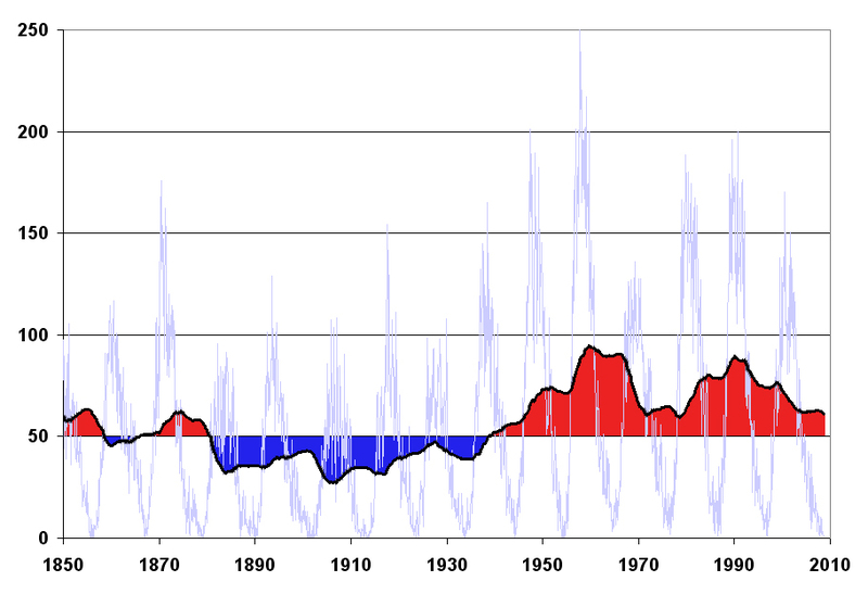
The second interesting analysis is a sunspot number chart.  To highlight recent increases in activity, I have overlaid on the monthly International sunspot numbers (light blue) a 9.8 year moving average (in black) of sunspot numbers (9.8 selected as an average cycle length).  In the chart below, selection of the 50 average sunspot number as a reference value is arbitrary, but serves to visually demonstrate the increase in solar activity over the last 50 years.

Sunspot2

The average monthly sunspot number from 1900-1949 was 48.  The average monthly number from 1950-1999 was 73.1, an increase of 52%.

Some of this increase is real, but some may be a measurement bias related to the ability to better detect smaller spots.  Anyone have any sources on how large this latter effect might be?  We are talking about an enormous percentage increase in the last half of the century, so my guess is that it is not all due to this bias.

Retreating Glaciers

One of the panicky claims of global warming catastrophists is that some sort of "unprecedented" melting and retreat of glaciers is occurring tied to anthropogenic global warming.  I have seen anecdotal evidence for a while that this melting of glaciers began long before the 1950-present "anthropogenic" era, but I had not seen anything systematic on the topic until I discovered this study by  L. Oerlemans et al as published in Science in 2005.  Download Oerlemans 2005 as pdf.  His results look like this (click to enlarge):

Glacier_length_2_2

His data for the last decade is a little squirrelly because the data sets he uses are slow to update, but the overall picture is pretty clear — a pretty steady 150+ year history of steady retreat, with the only change is slope being a flattening rather than an acceleration of the curve.  Here are a few individual glaciers he highlights:

Glacier_length

One is again left in a quandary – if recent glacial retreats are due to anthropogenic warming, then what cased the retreats before 1950 or so?  And, whatever caused the earlier retreats, what made this natural effect "switch off" at the exact same instant that anthropogenic effects took over?   

Update:  Here is a piece of annecdotal evidence to match, a map from Alaska Geogrpahic on the retreat of the glaciers at Glacier Bay

Image054

Light Posting

Sorry for the light posting.  I have not lost interest, I have just been extremely busy.  Relevant to climate, I am working on a 30-minute presentation for a climate debate I am participating in soon at Lake Tahoe.  Once that is done, the material I have developed for it should drive a number of new posts.

Comment Policy

Since it has come up a couple of times in the last few days, here is a reminder of the comment policy on this blog:

1)  I do not edit, moderate or delete comments, except for outright spam.  The reasons for this are many.  First, I don’t have time.  Second, I don’t have the inclination.  Third, I take zero responsibility from an editorial standpoint on what is in the comments.  The comments are an open public forum I offer as a public service.  Even light moderation or isolated bans would break this bright-line rule and might lead some to some confusion as to whether I implicitly support some particular comment because I didn’t delete it.  So I don’t touch anything.

2)  I encourage everyone who agrees with me to remain civil, rational, open-minded, and professional in the comments.  Everyone else is encouraged to discredit his or her own opinions by making as much of an ass of him or herself as they choose. Some of my commenters seem particularly adept at the latter.

3) Commenter names are entirely arbitrary.  It is amazing that I have to remind folks of this nowadays, but if you see a commenter named "Al Gore,"  you should be entirely suspicious as to the person’s true identity (though of course Al would be welcome to hang out here).  Its not like I check everyone’s ID. 

Sucking the Oxygen Out of the Environmental Movement

I have written on a number of occasions that, years from now, folks who would like to see meaningful reductions in man’s negative impacts on the environment are going to look back on the global warming charade as a disaster for their movement — not just in terms of credibility, but in terms of lost focus on real, meaningful improvements.

China is a great example.  Like London in the 19th century or Pittsburgh in the early 20th, China’s air quality is a mess.  Real steps need to be taken to clean up the air, for the health and safety of its residents.  The Olympics might have been a venue for people around the world to apply pressure to China to clean up its act.

But, in fact, there is little real pressure from outside for China to clean up the soot, unburned hydrocarbons, NO2, SO2 and other such pollutants from its vehicles and coal plants.  That is because all the pressure, all the attention, is on China’s CO2 production.  But there is nothing China can do to slow down CO2 growth without killing its economy and probably destabilizing its government in the process.  So, it gives the world a big FU to such admonitions. 

Which is a shame.  Unlike for CO2 abatement, there are real technologies that are proven to be economic that can abate the worst of China’s pollution problems.  Had we instead been spending our moral capital pressuring China to take such steps, there might be real progress. 

This is all the more true as we learn that some of the problems we ascribe to CO2 may in fact be more linked to soot from Chinese industry.  John Goetz recently linked one such story:

Smog, soot and other particles like the kind often seen hanging over Beijing add to global warming and may raise summer temperatures in the American heartland by three degrees in about 50 years, says a new federal science report released Thursday.

These overlooked, shorter-term pollutants — mostly from burning wood and kerosene and from driving trucks and cars — cause more localized warming than once thought, the authors of the report say.They contend there should be a greater effort to attack this type of pollution for faster results.For decades, scientists have concentrated on carbon dioxide, the most damaging greenhouse gas because it lingers in the atmosphere for decades. Past studies have barely paid attention to global warming pollution that stays in the air merely for days.

This is consistent with other recent work that hypothesizes that increase of melting rates of Arctic sea ice may be as much due to Chinese black carbon falling on the ice  (and thereby decreasing its albedo and increasing solar heating) than from rising global temperatures.  This makes sense to me, and may help explain why melting in the Arctic sea ice was nearly as great as last year’s record, despite much lower Arctic temperatures (see below) over the last year.

Uahmsunpol

Lipstick on a Pig

Apparently, Michael Mann is yet again attempting a repackaging of his hockey stick work.  The question is, has he re-worked his methodologies to overcome the many statistical issues third parties have had with his work, or is this more like AirTran changing its name from ValuJet to escape association in people’s mind with its 1996 plane crash?

Well, Steve McIntyre is on the case, and from first glance, the new Mann work seems to be the same old mish-mash of cherry-picked proxies, bizarre statistical methods, and manual tweaking of key proxies to make them look the way Mann wants them to look.  One thing I had never done was look at all the component proxies of the temperature reconstructions all in one place.  At the link above, Steve has all the longer ones in a animated GIF.  It is really striking how a) almost none of them have a hockey stick shape and b) even the few that do have HS shapes typically show the warming trend beginning in 1800, not in the late 19th century CO2 period. 

If you would like to eyeball all 1209 of the proxies Mann begins with (before he starts cherry picking), they are linked here.  I really encourage you to click through to one of the five animations, just to get  a feel for it.  As someone who has done a lot of data analysis, it is just staggering that he can get a hockey stick out of these and claim that it is in some way statistically significant.  It is roughly equivalent to watching every one of your baseball team’s games, seeing them lose each one, and then being told that they have the best record in the league.  It makes no sense.

The cherry-picking is just staggering, though you have to read the McIntyre articles as a sort of 2-3 year serial to really get the feel of it.  However, this post gives one a feel of how Mann puts a thin statistical-sounding veneer to cover his cherry-picking, but at the end of the day, he has basically invented a process that takes about a thousand proxy series and kicks out all but the 484 that will generate a hockey stick.

Update:  William Briggs finds other problems with Mann’s new analysis:

The various black lines are the actual data! The red-line is a 10-year running mean smoother! I will call the black data the real data, and I will call the smoothed data the fictional data. Mann used a “low pass filter” different than the running mean to produce his fictional data, but a smoother is a smoother and what I’m about to say changes not one whit depending on what smoother you use.

Now I’m going to tell you the great truth of time series analysis. Ready? Unless the data is measured with error, you never, ever, for no reason, under no threat, SMOOTH the series! And if for some bizarre reason you do smooth it, you absolutely on pain of death do NOT use the smoothed series as input for other analyses! If the data is measured with error, you might attempt to model it (which means smooth it) in an attempt to estimate the measurement error, but even in these rare cases you have to have an outside (the learned word is “exogenous”) estimate of that error, that is, one not based on your current data.

If, in a moment of insanity, you do smooth time series data and you do use it as input to other analyses, you dramatically increase the probability of fooling yourself! This is because smoothing induces spurious signals—signals that look real to other analytical methods. No matter what you will be too certain of your final results! Mann et al. first dramatically smoothed their series, then analyzed them separately. Regardless of whether their thesis is true—whether there really is a dramatic increase in temperature lately—it is guaranteed that they are now too certain of their conclusion.

and further:

The corollary to this truth is the data in a time series analysis is the data. This tautology is there to make you think. The data is the data! The data is not some model of it. The real, actual data is the real, actual data. There is no secret, hidden “underlying process” that you can tease out with some statistical method, and which will show you the “genuine data”. We already know the data and there it is. We do not smooth it to tell us what it “really is” because we already know what it “really is.”

Update:  I presume it is obvious, but the commenter "mcIntyre" has no relation that I know of to the "mcintyre" quoted and referred to in the post.  As a reminder of my comment policy, 1) I don’t ban or delete anything other than outright spam and 2) I strongly encourage everyone who agrees with me to remain measured and civil in your tone — everyone else is welcome to make as big of an ass out of him or herself as they wish.

By the way, to the commenter named "mcintyre,"  I have never ever seen the other McIntyre (quoted in this post) argue that CO2 does not act as a greenhouse gas.  He spends most of his time arguing that the statistical methods used in certain historic temperature reconstructions (e.g. Mann’s hockey stick but also 20th century instrument rollup’s like the GISS global temperature anamoly) are flawed.  I have read his blog for 3 years now and can honestly say I don’t know what his position on the magnitude of future anthropogenic warming is.  Mr. McIntyre is apparenlty not alone — Ian Jolliffe holds the opinion that the reputation of climate science is being hurt by the statistical sloppiness in certain corners of dendro-climatology.

Be Cool and Prevent Cooling by Reducing Global Warming

I seldom highlight stories like this, because I am more interested in the science than the propoganda of climate issues, but I just couldn’t resist this story.  Via Tom Nelson, from Belleville News Democrat:

Speakers at the public forum also addressed how global warming may directly affect metro-east residents, citing this summer’s flooding and unusually cool weather, and future impact on agriculture.

"These are symptoms of global warming," said Kathy Andria, who represented the American Bottoms Conservancy at the forum.

Andria said she will help organize Belleville residents to work towards being a greener city and become designated by the Sierra Club as a Cool City.

So we want to fight global warming which is causing unusually cool weather.  If we are succesful, then we will be labelled a Cool City so that we won’t have all this cool weather because we will have stopped warming.

Seriously, has there even been a more transparent "heads I win, tails you lose" argument than saying that unusually cool weather is evidence of global warming?

100 Months to the Tipping Point

Wow — it turns out that after hundreds of millions or even billions of years of remaining stable, the world climate will, due to (at most) a few tenths of degrees of man-made warming and an increase of a trace gas composition in the atmosphere by about 0.01%, go past its tipping point or point of no return and run away to catastrophe.  I sure wish there was a prediction market where I could bet against this.  See this end of the world website here (HT to a reader). 

Given a bit more time, I will try to take on in depth the underlying article behind this site.  But for now, suffice it to say that underlying hypothesis is that the world’s climate is dominated by positive feedback, a hypothesis, if true, that would set climate apart from nearly every other natural process that we know of.  In fact, the only major natural process I can think of that is dominated by positive feedback and tipping points is nuclear fission.  Here are many articles on how catastrophic forecasts assume large positive feedbacks and why this assumption is unlikely.

Global Warming “Fingerprint”

Many climate scientists say they see a "fingerprint" in recent temperature increases that they claim is distinctive and makes current temperature increases different from past "natural" temperature increases. 

So, to see if we are all as smart as the climate scientists, here are two 51-year periods from the 20th century global temperature record as provided by the Hadley CRUT3.  Both are scaled the same (each line on the y-axis is 0.2C, each x-axis division is 5 years) — in fact, both are clips from the exact same image.  So, which is the anthropogenic warming and which is the natural? 

  Periodb       Perioda_3

One clip is from 1895 to 1946 (the"natural" period) and one is from 1957 to present  (the supposedly anthropogenic period). 

If you have stared at these charts long enough, the el Nino year of 1998 has a distinctive shape that I recognize, but otherwise these graphs look surprisingly similar.  If you are still not sure, you can find out which is which here.

Measuring Climate Sensitivity

As I am sure most of my readers know, most climate models do not reach catastrophic temperature forecasts from CO2 effects alone.  In these models, small to moderate warming by CO2 is multiplied many fold by assumed positive feedbacks in the climate system.  I have done some simple historical analyses that have demonstrated that this assumption of massive positive feedback is not supported historically.

However, many climate alarmists feel they have good evidence of strong positive feedbacks in the climate system.  Roy Spencer has done a good job of simplifying his recent paper on feedback analysis in this article.  He looks at satellite data from past years and concludes:

We see that the data do tend to cluster along an imaginary line, and the slope of that line is 4.5 Watts per sq. meter per deg. C. This would indicate low climate sensitivity, and if applied to future global warming would suggest only about 0.8 deg. C of warming by 2100.

But he then addresses the more interesting issue of reconciling this finding with other past studies of the same phenomenon:

Now, it would be nice if we could just stop here and say we have evidence of an insensitive climate system, and proclaim that global warming won’t be a problem. Unfortunately, for reasons that still remain a little obscure, the experts who do this kind of work claim we must average the data on three-monthly time scales or longer in order to get a meaningful climate sensitivity for the long time scales involved in global warming (many years).

One should always before of a result where the raw data yield one result but averaged data yields another.  Data averaging tends to do funny things to mask physical processes, and this appears to be no exception here.  He creates a model of the process, and finds that such averaging always biases the feedback result higher:

Significantly, note that the feedback parameter line fitted to these data is virtually horizontal, with almost zero slope. Strictly speaking that would represent a borderline-unstable climate system. The same results were found no matter how deep the model ocean was assumed to be, or how frequently or infrequently the radiative forcing (cloud changes) occurred, or what the specified feedback was. What this means is that cloud variability in the climate system always causes temperature changes that "look like" a sensitive climate system, no matter what the true sensitivity is.

In short, each time he plugged low feedback into the model, the data that emerged mimicked that of a high feedback system, with patterns very similar to what researchers have seen in past feedback studies of actual temperature data. 

Interestingly, the pattern is sort of a circular wandering pattern, shown below:Simplemodelradiativeforcing

I will have to think about it a while — I am not sure if it is a real or spurious comparison, but the path followed by his model system is surprisingly close to that in the negative feedback system I modeled in my climate video, that of a ball in the bottom of a bowl given a nudge (about 3 minutes in).