Global Warming and Ocean Heat

William DiPuccio has a really very readable and clear post on using ocean heat content to falsify current global warming model projections. He argues pretty persuasively that surface air temperature measurements are a really, really poor way to search for evidence of a man-made climate forcing from CO2.

Since the level of CO2 and other well-mixed GHG is on the rise, the overall accumulation of heat in the climate system, measured by ocean heat, should be fairly steady and uninterrupted (monotonic) according to IPCC models, provided there are no major volcanic eruptions.  According to the hypothesis, major feedbacks in the climate system are positive (i.e., amplifying), so there is no mechanism in this hypothesis that would cause a suspension or reversal of overall heat accumulation.  Indeed, any suspension or reversal would suggest that the heating caused by GHG can be overwhelmed by other human or natural processes in the climate system….

[The] use of surface air temperature as a metric has weak scientific support, except, perhaps, on a multi-decadal or century time-scale.  Surface temperature may not register the accumulation of heat in the climate system from year to year.  Heat sinks with high specific heat (like water and ice) can absorb (and radiate) vast amounts of heat.  Consequently the oceans and the cryosphere can significantly offset atmospheric temperature by heat transfer creating long time lags in surface temperature response time.  Moreover, heat is continually being transported in the atmosphere between the poles and the equator.  This reshuffling can create fluctuations in average global temperature caused, in part, by changes in cloud cover and water vapor, both of which can alter the earth’s radiative balance.

One statement in particular really opened my eyes, and made  me almost embarassed to have focused time on surface temperatures at all:

For any given area on the ocean’s surface, the upper 2.6m of water has the same heat capacity as the entire atmosphere above it

Wow!  So oceans have orders of magnitude more heat capacity than the atmosphere.

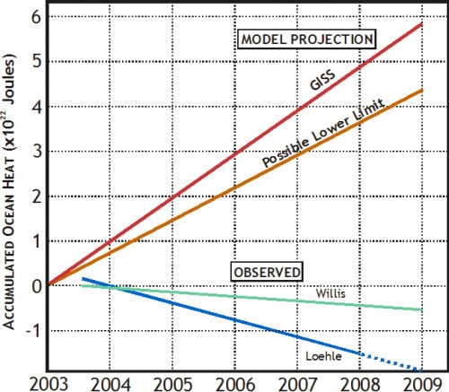
The whole article is a good read, but his conclusion is that estimates of ocean heat content changes appear to be way off what they should be given IPCC models:

dipuccio-2

My only concern with the analysis is that I fear the authors may be underestimating the effect of phase change (e.g. melting or evaporation).  Phase change can release or absorb enormous amounts of heat.  As a simple example, observe how long a pound of liquid water at 32.1F takes to reach room temperature.  Then observe how long a pound of ice at 31.9F takes to reach room temperature.  The latter process takes an order of magnitude more time, because it absorbs an order of magnitude more heat.

The article attached was necessarily a summary, but I am not totally convinced he has accounted for phase change sufficiently.  Both an increase in melting ice as well as an increase in evaporation would tend to cause measured accumulated heat in the oceans to be lower than expected.   He uses an estimate by James Hansen that the number is really small for ice melting (he does not discuss evaporation).  However, if folks continue to use Hansen’s estimate of this term to falsify Hansen’s forecast, expect Hansen to suddenly “discover” that he had grossly underestimated the ice melting term.

Reliability of Surface Temperature Records

Anthony Watt has produced a report based on his excellent work at SurfaceStations.org document siting and installation issues at US surface temperature stations that might create errors and biases in the measurements.  The work is important, as these biases don’t tend to be random — they are much more likely to be upwards rather than downwards biases, so that they can’t be assumed to just average out.

We found stations located next to the exhaust fans of air conditioning units, surrounded by asphalt parking lots and roads, on blistering-hot rooftops, and near sidewalks and buildings that absorb and radiate heat. We found 68 stations located at wastewater treatment plants, where the process of waste digestion causes temperatures to be higher than in surrounding areas.

In fact, we found that 89 percent of the stations – nearly 9 of every 10 – fail to meet the National Weather Service’s own siting requirements that stations must be 30 meters (about 100 feet) or more away from an artificial heating or radiating/ reflecting heat source.

In other words, 9 of every 10 stations are likely reporting higher or rising temperatures because they are badly sited. It gets worse. We observed that changes in the technology of temperature stations over time also has caused them to report a false warming trend. We found major gaps in the data record that were filled in with data from nearby sites, a practice that propagates and compounds errors. We found that adjustments to the data by both NOAA and another government agency, NASA, cause recent temperatures to look even higher.

The conclusion is inescapable: The U.S. temperature record is unreliable. The errors in the record exceed by a wide margin the purported rise in temperature of 0.7º C (about 1.2º F) during the twentieth century. Consequently, this record should not be cited as evidence of any trend in temperature that may have occurred across the U.S. during the past century. Since the U.S. record is thought to be “the best in the world,” it follows that the global database is likely similarly compromised and unreliable.

I have performed about ten surveys for the effort, including three highlighted in the report (Gunnison, Wickenberg and the moderately famous Tucson site).  My son did two surveys, including one in the report (Miami) for a school science fair project.

Irony

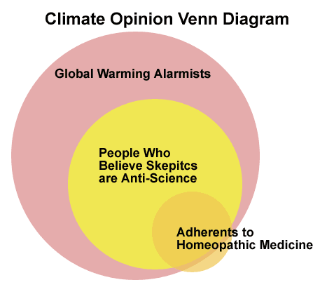
I try really, really hard not to get pulled into the ad hominem attacks that fly around the climate debate.  So the following is just for fun on a Friday, and is not in any way meant to be a real climate argument.  However, since so many alarmists like to attack skeptics as being anti-science, I thought I would have a bit of fun.

venn-diagram

This diagram was spurred by this post from Reason’s Radley Balko:

The Science Blogs are having fun with the “wellness editor” at the Huffington Post, a woman who claims to have a “doctorate in homeopathic medicine.” An odd choice for a lefty website that makes such hay of the right’s hostility to science. I like this comment: “…a doctorate in homeopathic medicine would be a blank piece of paper soaked in a 1:10,000,000 tincture made from the ink of an actual doctor’s diploma.”

Just to head off the obvious, I have no doubt a similar Venn diagram could be created for skeptics and people who believe the world is only 4000 years old.  Both arguments are equally meaningless when it comes down to whether the science is correct.

Ducking the Point

Most skeptics have been clubbed over the head with the “settled science” refrain at one time or another.  How can you, a layman, think you are right when every scientist says the opposite?  And if it is not settled science, how do folks get away unchallenged saying so?

I am often confronted with these questions, so I thought I would print my typical answer.  I wrote this in the comments section of a post at the Thin Green Line.  Most of the post is a typical ad hominem attack on skeptics, but it includes the usual:

The contrarian theories raise interesting questions about our total understanding of climate processes, but they do not offer convincing arguments against the conventional model of greenhouse gas emission-induced climate change.

Here is what I wrote in response:

I am sure there are skeptics that have no comprehension of the science that blindly follow the pronouncements of certain groups, just as I am sure there are probably as high a percentage of global warming activists who don’t understand the science but are following the lead of sources they trust. The only thing I will say is that there is a funny dynamic here. Those of us who run more skeptical web sites tend to focus our attention on deconstructing the arguments of Hansen and Schmidt and Romm, who alarmist folks would consider their top spokesmen. Many climate alarmists in turn tend to focus on skeptical buffoons. I mean, I guess its fun to rip a straw man to shreds, but why not match your best against the best of those who disagree with you?

Anyway, I am off my point. There is a reason both sides can talk past each other. There is a reason you can confidently say “well established and can’t be denied” for your theory and be both wrong and right at the same time.

The argument that manmade CO2 emissions will lead to a catastrophe is based on a three step argument.

  1. CO2 has a first order effect that warms the planet
  2. The planet is dominated by net positive feedback effects that multiply this first order effect 3 or more times.
  3. These higher temperatures will lead to and already are causing catastrophic effects.

You are dead right on #1, and skeptics who fight this are truly swimming against the science. The IPCC has an equation that results in a temperature sensitivity of about 1.2C per doubling of CO2 as a first order effect, and I have found little reason to quibble with this. Most science-based skeptics accept this as well, or a number within a few tenths.

The grand weakness of the alarmist case comes in #2. It is the rare long-term stable natural physical process that is dominated by positive feedback, and the evidence that Earth’s climate is dominated by feedbacks so high as to triple (in the IPCC report) or more (e.g. per Joe Romm) the climate sensitivity is weak or in great dispute. To say this point is “settled science” is absurd.

So thus we get to the heart of the dispute. Catastrophists posit enormous temperature increases, deflecting criticism by saying that CO2 as a greenhouse gas is settled. Though half right, they gloss over the fact that 2/3 or more of their projected temperature increase is based on a theory of Earth’s climate being dominated by strong positive feedbacks, a theory that is most certainly not settled, and in fact is probably wrong. Temperature increases over the last 100 years are consistent with neutral to negative, not positive feedback, and the long-term history of temperatures and CO2 are utterly inconsistent with the proposition there is positive feedback or a tipping point hidden around 350ppm CO2.

So stop repeating “settled science” like it was garlic in front of a vampire. Deal with the best arguments of skeptics, not their worst.

I see someone is arguing that skeptics have not posited an alternate theory to explain 20th century temperatures. In fact, a number have. A climate sensitivity to CO2 of 1.2C combined with net negative feedback, a term to account for ENSO and the PDO, plus an acknowledgment that the sun has been in a relatively strong phase in the second half of the 20th century model temperatures fairly well. In fact, these terms are a much cleaner fit than the contortions alarmists have to go through to try to fit a 3C+ sensitivity to a 0.6C historic temperature increase.

Finally, I want to spend a bit of time on #3.  I certainly think that skeptics often make fools of themselves.  But, because nature abhors a vacuum, alarmists tend to in turn make buffoons of themselves, particularly when predicting the effects on other climate variables of even mild temperature increases. The folks positing ridiculous catastrophes from small temperature increases are just embarrassing themselves.

Even bright people like Obama fall into the trap. Earlier this year he said that global warming was a factor in making the North Dakota floods worse.

Really? He knows this? First, anyone familiar with the prediction and analysis of complex systems would laugh at such certainty vis a vis one variable’s effect on a dynamic system. Further, while most anything is possible, his comment tends to ignore the fact that North Dakota had a colder than normal winter and record snowfalls, which is what caused the flood (record snows = record melts). To say that he knows that global warming contributed to record cold and snow is a pretty heroic assumption.

Yeah, I know, this is why for marketing reasons alarmists have renamed global warming as “climate change.” Look, that works for the ignorant masses, because they can probably be fooled into believing that CO2 causes climate change directly by some undefined mechanism. But we here all know that CO2 only affects climate through the intermediate step of warming. There is no other proven way CO2 can affect climate. So, no warming, no climate change.

Yeah, I know, somehow warming in Australia could have been the butterfly flapping its wings to make North Dakota snowy, but by the same unproven logic I could argue that California droughts are caused by colder than average weather in South America. At the end of the day, there is no way to know if this statement is correct and a lot of good reasons to believe Obama’s statement was wrong. So don’t tell me that only skeptics say boneheaded stuff.

The argument is not that the greenhouse gas effect of CO2 doesn’t exist. The argument is that the climate models built on the rickety foundation of substantial positive feedbacks are overestimating future warming by a factor of 3 or more. The difference matters substantially to public policy. Based on neutral to negative feedback, warming over the next century will be 1-1.5C. According to Joe Romm, it will be as much as 8C (15F). There is a pretty big difference in the magnitude of the effort justified by one degree vs. eight.

Numbers Divorced from Reality

This article on Climate Audit really gets at an issue that bothers many skeptics about the state of climate science:  the profession seems to spend so much time manipulating numbers in models and computer systems that they start to forget that those numbers are supposed to have physical meaning.

I discussed the phenomenon once before.  Scientists are trying to reconstruct past climate variables like temperature and precipitation from proxies such as tree rings.  They begin with a relationship they believe exists based on an understanding of a particular system – ie, for tree rings, trees grow faster when its warm so tree rings are wider in warm years.  But as they manipulate the data over and over in their computers, they start to lose touch with this physical reality.

In this particular example, Steve McIntyre shows how, in one temperature reconstruction, scientists have changed the relationship opportunistically between the proxy and temperature, reversing their physical understanding of the process and how similar proxies are handled in the same study, all in order to get the result they want to get.

McIntyre’s discussion may be too arcane for some, so let me give you an example.  As a graduate student, I have been tasked with proving that people are getting taller over time and estimating by how much.  As it turns out, I don’t have access to good historic height data, but by a fluke I inherited a hundred years of sales records from about 10 different shoe companies.  After talking to some medical experts, I gain some confidence that shoe size is positively correlated to height.  I therefore start collating my 10 series of shoe sales data, pursuing the original theory that the average size of the shoe sold should correlate to the average height of the target population.

It turns out that for four of my data sets, I find a nice pattern of steadily rising shoe sizes over time, reflecting my intuition that people’s height and shoe size should be increasing over time.  In three of the data sets I find the results to be equivical — there is no long-term trend in the sizes of shoes sold and the average size jumps around a lot.  In the final three data sets, there is actually a fairly clear negative trend – shoe sizes are decreasing over time.

So what would you say if I did the following:

  • Kept the four positive data sets and used them as-is
  • Threw out the three equivocal data sets
  • Kept the three negative data sets, but inverted them
  • Built a model for historic human heights based on seven data sets – four with positive coefficients between shoe size and height and three with negative coefficients.

My correlation coefficients are going to be really good, in part because I have flipped some of the data sets and in part I have thrown out the ones that don’t fit initial bias as to what the answer should be.  Have I done good science?  Would you trust my output?  No?

Well what I describe is identical to how many of the historical temperature reconstruction studies have been executed  (well, not quite — I have left out a number of other mistakes like smoothing before coefficients are derived and using de-trended data).

Mann once wrote that multivariate regression methods don’t care about the orientation of the proxy. This is strictly true – the math does not care. But people who recognize that there is an underlying physical reality that makes a proxy a proxy do care.

It makes no sense to physically change the sign of the relationship of our final three shoe databases.  There is no anatomical theory that would predict declining shoe sizes with increasing heights.  But this seems to happen all the time in climate research.  Financial modellers who try this go bankrupt.  Climate modellers who try this to reinforce an alarmist conclusion get more funding.  Go figure.

Sudden Acceleration

For several years, there was an absolute spate of lawsuits charging sudden acceleration of a motor vehicle — you probably saw such a story:  Some person claims they hardly touched the accelerator and the car leaped ahead at enormous speed and crashed into the house or the dog or telephone pole or whatever.  Many folks have been skeptical that cars were really subject to such positive feedback effects where small taps on the accelerator led to enormous speeds, particularly when almost all the plaintiffs in these cases turned out to be over 70 years old.  It seemed that a rational society might consider other causes than unexplained positive feedback, but there was too much money on the line to do so.

Many of you know that I consider questions around positive feedback in the climate system to be the key issue in global warming, the one that separates a nuisance from a catastrophe.  Is the Earth’s climate similar to most other complex, long-term stable natural systems in that it is dominated by negative feedback effects that tend to damp perturbations?  Or is the Earth’s climate an exception to most other physical processes, is it in fact dominated by positive feedback effects that, like the sudden acceleration in grandma’s car, apparently rockets the car forward into the house with only the lightest tap of the accelerator?

I don’t really have any new data today on feedback, but I do have a new climate forecast from a leading alarmist that highlights the importance of the feedback question.

Dr. Joseph Romm of Climate Progress wrote the other day that he believes the mean temperature increase in the “consensus view” is around 15F from pre-industrial times to the year 2100.  Mr. Romm is mainly writing, if I read him right, to say that critics are misreading what the consensus forecast is.  Far be it for me to referee among the alarmists (though 15F is substantially higher than the IPCC report “consensus”).  So I will take him at his word that 15F increase with a CO2 concentration of 860ppm is a good mean alarmist forecast for 2100.

I want to deconstruct the implications of this forecast a bit.

For simplicity, we often talk about temperature changes that result from a doubling in Co2 concentrations.  The reason we do it this way is because the relationship between CO2 concentrations and temperature increases is not linear but logarithmic.  Put simply, the temperature change from a CO2 concentration increase from 200 to 300ppm is different (in fact, larger) than the temperature change we might expect from a concentration increase of 600 to 700 ppm.   But the temperature change from 200 to 400 ppm is about the same as the temperature change from 400 to 800 ppm, because each represents a doubling.   This is utterly uncontroversial.

If we take the pre-industrial Co2 level as about 270ppm, the current CO2 level as 385ppm, and the 2100 Co2 level as 860 ppm, this means that we are about 43% through a first doubling of Co2 since pre-industrial times, and by 2100 we will have seen a full doubling (to 540ppm) plus about 60% of the way to a second doubling.  For simplicity, then, we can say Romm expects 1.6 doublings of Co2 by 2100 as compared to pre-industrial times.

So, how much temperature increase should we see with a doubling of CO2?  One might think this to be an incredibly controversial figure at the heart of the whole matter.  But not totally.  We can break the problem of temperature sensitivity to Co2 levels into two pieces – the expected first order impact, ahead of feedbacks, and then the result after second order effects and feedbacks.

What do we mean by first and second order effects?  Well, imagine a golf ball in the bottom of a bowl.  If we tap the ball, the first order effect is that it will head off at a constant velocity in the direction we tapped it.  The second order effects are the gravity and friction and the shape of the bowl, which will cause the ball to reverse directions, roll back through the middle, etc., causing it to oscillate around until it eventually loses speed to friction and settles to rest approximately back in the middle of the bowl where it started.

It turns out the the first order effects of CO2 on world temperatures are relatively uncontroversial.  The IPCC estimated that, before feedbacks, a doubling of CO2 would increase global temperatures by about 1.2C  (2.2F).   Alarmists and skeptics alike generally (but not universally) accept this number or one relatively close to it.

Applied to our increase from 270ppm pre-industrial to 860 ppm in 2100, which we said was about 1.6 doublings, this would imply a first order temperature increase of 3.5F from pre-industrial times to 2100  (actually, it would be a tad more than this, as I am interpolating a logarithmic function linearly, but it has no significant impact on our conclusions, and might increase the 3.5F estimate by a few tenths.)  Again, recognize that this math and this outcome are fairly uncontroversial.

So the question is, how do we get from 3.5F to 15F?  The answer, of course, is the second order effects or feedbacks.  And this, just so we are all clear, IS controversial.

A quick primer on feedback.  We talk of it being a secondary effect, but in fact it is a recursive process, such that there is a secondary, and a tertiary, etc. effects.

Lets imagine that there is a positive feedback that in the secondary effect increases an initial disturbance by 50%.  This means that a force F now becomes F + 50%F.  But the feedback also operates on the additional 50%F, such that the force is F+50%F+50%*50%F…. Etc, etc.  in an infinite series.  Fortunately, this series can be reduced such that the toal Gain =1/(1-f), where f is the feedback percentage in the first iteration. Note that f can and often is negative, such that the gain is actually less than 1.  This means that the net feedbacks at work damp or reduce the initial input, like the bowl in our example that kept returning our ball to the center.

Well, we don’t actually know the feedback fraction Romm is assuming, but we can derive it.  We know his gain must be 4.3 — in other words, he is saying that an initial impact of CO2 of 3.5F is multiplied 4.3x to a final net impact of 15.  So if the gain is 4.3, the feedback fraction f must be about 77%.

Does this make any sense?  My contention is that it does not.  A 77% first order feedback for a complex system is extraordinarily high  — not unprecedented, because nuclear fission is higher — but high enough that it defies nearly every intuition I have about dynamic systems.  On this assumption rests literally the whole debate.  It is simply amazing to me how little good work has been done on this question.  The government is paying people millions of dollars to find out if global warming increases acne or hurts the sex life of toads, while this key question goes unanswered.  (Here is Roy Spencer discussing why he thinks feedbacks have been overestimated to date, and a bit on feedback from Richard Lindzen).

But for those of you looking to get some sense of whether a 15F forecast makes sense, here are a couple of reality checks.

First, we have already experienced about .43 if a doubling of CO2 from pre-industrial times to today.  The same relationships and feedbacks and sensitivities that are forecast forward have to exist backwards as well.  A 15F forecast implies that we should have seen at least 4F of this increase by today.  In fact, we have seen, at most, just 1F  (and to attribute all of that to CO2, rather than, say, partially to the strong late 20th century solar cycle, is dangerous indeed).  But even assuming all of the last century’s 1F temperature increase is due to CO2, we are way, way short of the 4F we might expect.  Sure, there are issues with time delays and the possibility of some aerosol cooling to offset some of the warming, but none of these can even come close to closing a gap between 1F and 4F.  So, for a 15F temperature increase to be a correct forecast, we have to believe that nature and climate will operate fundamentally different than they have over the last 100 years.

Second, alarmists have been peddling a second analysis, called the Mann hockey stick, which is so contradictory to these assumptions of strong positive feedback that it is amazing to me no one has called them on the carpet for it.  In brief, Mann, in an effort to show that 20th century temperature increases are unprecedented and therefore more likely to be due to mankind, created an analysis quoted all over the place (particularly by Al Gore) that says that from the year 1000 to about 1850, the Earth’s temperature was incredibly, unbelievably stable.  He shows that the Earth’s temperature trend in this 800 year period never moves more than a few tenths of a degree C.  Even during the Maunder minimum, where we know the sun was unusually quiet, global temperatures were dead stable.

This is simply IMPOSSIBLE in a high-feedback environment.  There is no way a system dominated by the very high levels of positive feedback assumed in Romm’s and other forecasts could possibly be so rock-stable in the face of large changes in external forcings (such as the output of the sun during the Maunder minimum).  Every time Mann and others try to sell the hockey stick, they are putting a dagger in teh heart of high-positive-feedback driven forecasts (which is a category of forecasts that includes probably every single forecast you have seen in the media).

For a more complete explanation of these feedback issues, see my video here.

It’s Not Zero

I have been meaning to link to this post for a while, but the Reference Frame, along with Roy Spencer, makes a valuable point I have also made for some time — the warming effect from man’s CO2 is not going to be zero.  The article cites approximately the same number I have used in my work and that was used by the IPCC:  absent feedback and other second order effects, the earth should likely warm about 1.2C from a doubling of CO2.

The bare value (neglecting rain, effects on other parts of the atmosphere etc.) can be calculated for the CO2 greenhouse effect from well-known laws of physics: it gives 1.2 °C per CO2 doubling from 280 ppm (year 1800) to 560 ppm (year 2109, see below). The feedbacks may amplify or reduce this value and they are influenced by lots of unknown complex atmospheric effects as well as by biases, prejudices, and black magic introduced by the researchers.

A warming in the next century of 0.6 degrees, or about the same warming we have seen in the last century, is a very different prospect, demanding different levels of investment, than typical forecasts of 5-10 degrees or more of warming from various alarmists.

How we get from a modest climate sensitivity of 1.2 degrees to catastrophic forecasts is explained in this video:

Seriously?

In study 1, a certain historic data set is presented.  The data set shows an underlying variation around a fairly strong trend line.  The trend line is removed, for a variety of reasons, and the data set is presented normalized or de-trended.

In study 2, researches take the normalized, de-trended data and conclude … wait for it … that there is no underlying trend in the natural process being studied.  Am I really understanding this correctly?  I think so:

The briefest examination of the Scotland speleothem shows that the version used in Trouet et al had been previously adjusted through detrending from the MWP [Medievil Warm Period] to the present. In the original article (Proctor et al 2000), this is attributed to particularities of the individual stalagmite, but, since only one stalagmite is presented, I don’t see how one can place any confidence on this conclusion. And, if you need to remove the trend from the MWP to the present from your proxy, then I don’t see how you can use this proxy to draw to conclusions on relative MWP-modern levels.

Hope and change, climate science version.

Postscript: It is certainly possible that the underlying data requires an adjustment, but let’s talk about why the adjustment used is not correct.  The scientists have a hypothesis that they can look at the growth of stalagmites in certain caves and correlate the annual growth rate with climate conditions.

Now, I could certainly imagine  (I don’t know if this is true, but work with me here) that there is some science that the volume of material deposited on the stalagmite is what varies in different climate conditions.  Since the stalagmite grows, a certain volume of material on a smaller stalagmite would form a thicker layer than the same volume on a larger stalagmite, since the larger body has a larger surface area.

One might therefore posit that the widths could be corrected back to the volume of the material deposited based on the width and height of the stalagmite at the time (if these assumptions are close to the mark, it would be a linear, first order correction since surface area in a cone varies linearly with height and radius).  There of course might be other complicating factors beyond this simple model — for example, one might argue that the deposition rate might itself change with surface area and contact time.

Anyway, this would argue for a correction factor based on geometry and the physics / chemistry of the process.  This does NOT appear to be what the authors did, as per their own description:

This band width was signal was normalized and the trend removed by fitting an order 2 polynomial trend line to the band width data.

That can’t be right.  If we don’t understand the physics well enough to know how, all things being equal, band widths will vary by size of the stalagmite, then we don’t understand the physics well enough to use it confidently as a climate proxy.

Thinking About the Sun

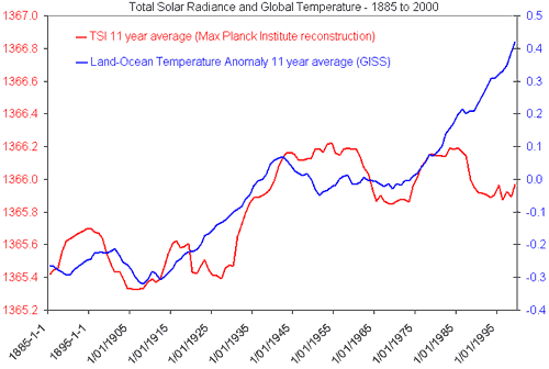
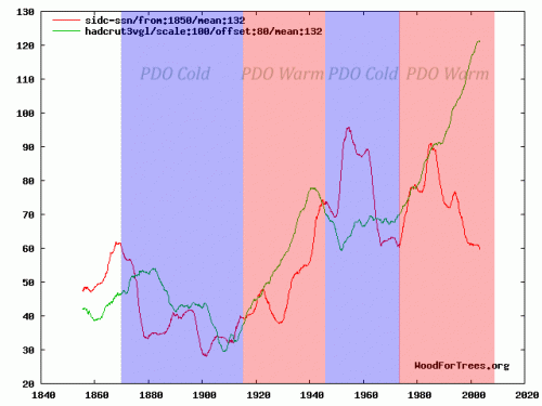
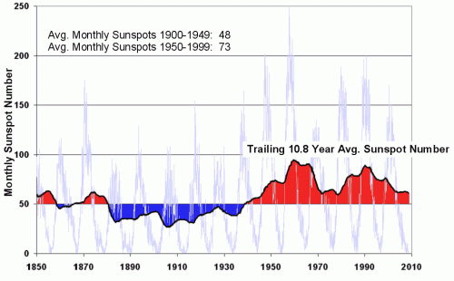
A reader wrote me a while back and asked if I could explain how I thought the sun could be a major driver of climate when temperature and solar metrics appear to have “diverged” as in the following two charts:

unsync

In both charts, red is the solar metric (TSI in the first chart, sunspot number in the second).  The other line, either blue or green, is a global temperature metric.  In both cases, we see a sort of step change in solar output, with the first half of the century at one plateau and the second half on a higher plateau.  This chart of sunspot numbers may better illustrate this:

I had three answers for the reader:

  1. In any sufficiently chaotic and complicated system, no one variable is going to consistently regress perfectly with another variable.  CO2 does not line up with temperature any better.
  2. There are non-solar factors at work.  As I have said on any number of occasions, I agree that the greenhouse effect of CO2 exists and will add about 1C for each doubling of CO2.  What I disagree with is the proposition that the Earth’s climate is dominated by positive feedback that multiplies this temperature increase 3-5 or more times.  The PDO cycle is another example of a process that affects global temperatures.
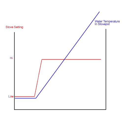
  3. One should not necessarily expect a linear temperature increase to be driven by a linear increase in the sun’s output.   I will illustrate this with a simplistic example, and then invite further comment.   I believe the following is a correct illustration of one heat source -> temperature phenomenon.  If so, wouldn’t we expect something similar with step-change increases in the sun’s output, and doesn’t this chart look a lot like the charts with which I began the post?

water-stove-climate

Missing in Action

I have been pretty remiss in posting here lately.  One reason is that this is the busy season in my business.  The other reason is that there is just so much going on in the economy and the new administration on which I feel the need to comment, that I have spent most of my time at CoyoteBlog.

Steve McIntyre on the Hockey Stick

I meant to post this a while back, and most of my readers will have already seen this, but in case you missed it, here is Steve McIntyre’s most recent presentation on a variety of temperature reconstruction issues, in particular Mann’s various new attempts at resuscitating the hockey stick.  While sometimes his web site Climate Audit is hard for laymen and non-statisticians to follow, this presentation is pretty accessible.

Two Scientific Approaches

This could easily be a business case:  Two managers.  One sits in his office, looking at spreadsheets, trying to figure out if the factory is doing OK.  The other spends most of his time on the factory floor, trying to see what is going on.  Both approaches have value, and both have shortcomings.

Shift the scene now to the physical sciences:  Two geologists.  One sits at his computer looking at measurement data sets, trying to see trends through regression, interpolation, and sometimes via manual adjustments and corrections.  The other is out in the field, looking at physical evidence.   Both are trying to figure out sea level changes in the Maldives.    The local geologist can’t see global patterns, and may have a tendency to extrapolate too broadly from a local finding.  The computer guy doesn’t know how his measurements may be lying to him, and tends to trust his computer output over physical evidence.

It strikes me that there would be incredible power from merging these two perspectives, but I sure don’t see much movement in this direction in climate.  Anthony Watts has been doing something similar with temperature measurement stations, trying to bring real physical evidence to improve computer modellers correction algorithms, but there is very little demand among the computer guys for this help.  We’ve reached an incredible level of statistical hubris, that somehow we can manipulate tiny signals from noisy and biased data without any knowledge of the physical realities on the ground  (“bias” used here in its scientific, not its political/cultural meaning)

Climate Change = Funding

Any number of folks have achnowleged that, nowadays, the surest road to academic funding is to tie your pet subject in with climate change.  If, for example, you and your academic buddies want funding to study tourist resort destinations (good work if you can get it), you will have a better chance if you add climate change into the mix.

John Moore did a bit of work with the Google Scholar search engine to find out how many studies referencing, say, surfing, also referenced climate change.  It is a lot.  When you click through to the searches, you will find a number of the matches are spurious  (ie matches to random unrelated links on the same page) but the details of the studies and how climate change is sometimes force-fit is actually more illuminating than the summary numbers.

Downplaying Their Own Finding

After years of insisting that urban biases have negligible effect on the the historical temperature record, the IPCC may finally have to accept what skeptics have been saying for years — that:

  1. Most long-lived historical records are from measurement points near cities (no one was measuring temperatures reliably in rural Africa in 1900)
  2. Cities have a heat island over them, up to 8C or more in magnitude, from the heat trapped in concrete, asphalt, and other man made structures.  (My 13-year-old son easily demonstrated this here).
  3. As cities grow, as most have over the last 100 years, temperature measurement points are engulfed by increasingly hotter portions of the heat island.  For example, the GISS shows the most global warming in the US centered around Tucson based on this measurement point, which 100 years ago was rural.

Apparently, Jones et al found recently that a third to a half of the warming reported in the Hadley CRUT3 database in China may be due to urban heat island effects rather than any broader warming trend.  This particularly important since it was a Jones et al letter to Nature years ago that previously gave the IPCC cover to say that there was negligible uncorrected urban warming bias in the major surface temperature records.

Interestingly, Jones et al can really hs to be treated as a hostile witness on this topic.  Their abstract states:

We show that all the land-based data sets for China agree exceptionally well and that their residual warming compared to the SST series since 1951 is relatively small compared to the large-scale warming. Urban-related warming over China is shown to be about 0.1°C decade−1 over the period 1951–2004, with true climatic warming accounting for 0.81°C over this period

By using the words “relatively small” and using a per decade number for the bias but an aggregate number for the underlying warming signal, they are doing everything possible to downplay their own finding (see how your eye catches the numbers 0.1 and 0.81 and compares them, even though they are not on a comparable basis — this is never an accident).  But in fact, the exact same numbers restate this way:  .53C, or 40% of the total measured warming of 1.34C was due to urban biases rather than any actual global warming signal.

Since when is a 40% bias or error “relatively small?”

So why do they fight their own conclusion so hard?  After all, the study still shows a reduced, but existent, historic warming signal.  As do satellites, which are unaffected by this type of bias.  Even skeptics like myself admit such a signal still exists if one weeds out all the biases.

The reason why alarmists, including it seems even the authors themselves, resist this finding is that reduced historic warming makes their catastrophic forecasts of future even more suspect.  Already, their models do not back cast well against history (without some substantial heroic tweaking or plugs), consistently over-estimating past warming.  If the actual past warming was even less, it makes their forecasts going forward look even more absurd.

A few minutes looking at the official US temperature measurement stations here will make one a believer that biases likely exist in historic measurements, particularly since the rest of the world is likely much worse.

Making Science Proprietary

I have no idea what is driving this, whether it be a crass payback for campaign contributions (as implied in the full article) or a desire to stop those irritating amateur bloggers from trying to replicate “settled science,” but it is, as a reader said who sent it to me, “annoying:”

There are some things science needs to survive, and to thrive: eager, hardworking scientists; a grasp of reality and a desire to understand it; and an open and clear atmosphere to communicate and discuss results.

That last bit there seems to be having a problem. Communication is key to science; without it you are some nerd tinkering in your basement. With it, the world can learn about your work and build on it.

Recently, government-sponsored agencies like NIH have moved toward open access of scientific findings. That is, the results are published where anyone can see them, and in fact (for the NIH) after 12 months the papers must be publicly accessible. This is, in my opinion (and that of a lot of others, including a pile of Nobel laureates) a good thing. Astronomers, for example, almost always post their papers on Astro-ph, a place where journal-accepted papers can be accessed before they are published.

John Conyers (D-MI) apparently has a problem with this. He is pushing a bill through Congress that will literally ban the open access of these papers, forcing scientists to only publish in journals. This may not sound like a big deal, but journals are very expensive. They can cost a fortune: The Astrophysical Journal costs over $2000/year, and they charge scientists to publish in them! So this bill would force scientists to spend money to publish, and force you to spend money to read them.

I continue to be confused how research funded with public monies can be “proprietary,” but interestingly this seems to be a claim pioneered in the climate community, more as a way to escape criticism and scrutiny than to make money (the Real Climate guys have, from time to time, argued for example that certain NASA data and algorithms are proprietary and cannot be released for scrutiny – see comments here, for example.)

Worth Your Time

I really like to write a bit more about such articles, but I just don’t have the time right now.  So I will simply recommend you read this guest post at WUWT on Steig’s 2009 Antarctica temperature study.  The traditional view has been that the Antarctic Peninsula (about 5% of the continent) has been warming a lot while the rest of the continent has been cooling.  Steig got a lot of press by coming up with the result that almost all of Antarctica is warming.

But the article at WUWT argues that Steig gets to this conclusion only by reducing all of Antarctic temperatures to three measurement points.  This process smears the warming of the peninsula across a broader swath of the continent.  If you can get through the post, you will really learn a lot about the flaws in this kind of study.

I have sympathy for scientists who are working in a low signal to noise environment.   Scientists are trying to tease 50 years of temperature history across a huge continent from only a handful of measurement points that are full of holes in the data.  A charitable person would look at this article and say they just went too far, teasing out spurious results rather than real signal out of the data.  A more cynical person might argue that this is a study where, at every turn, the authors made every single methodological choice coincidentally in the one possible way that would maximize their reported temperature trend.

By the way, I have seen Steig written up all over, but it is interesting that I never saw this:  Even using Steig’s methodology, the temperature trend since 1980 has been negative.  So whatever warming trend they found ended almost 30 years ago.    Here is the table from the WUWT article, showing the Steign original results and several cuts and recalculating their data using improved methods.

Reconstruction

1957 to 2006 trend

1957 to 1979 trend (pre-AWS)

1980 to 2006 trend (AWS era)

Steig 3 PC

+0.14 deg C./decade

+0.17 deg C./decade

-0.06 deg C./decade

New 7 PC

+0.11 deg C./decade

+0.25 deg C./decade

-0.20 deg C./decade

New 7 PC weighted

+0.09 deg C./decade

+0.22 deg C./decade

-0.20 deg C./decade

New 7 PC wgtd imputed cells

+0.08 deg C./decade

+0.22 deg C./decade

-0.21 deg C./decade

Here, by the way, is an excerpt from Steig’s abstract in Nature:

Here we show that significant warming extends well beyond the Antarctic Peninsula to cover most of West Antarctica, an area of warming much larger than previously reported. West Antarctic warming exceeds 0.1 °C per decade over the past 50 years, and is strongest in winter and spring.

Hmm, no mention that this trend reversed half way through the period.  A bit disengenuous, no?  Its almost as if there is a way they wanted the analysis to come out.

The First Rule of Regression Analysis

Here is the first thing I was ever taught about regression analysis — never, ever use multi-variable regression analysis to go on a fishing expedition.  In other words, never throw in a bunch of random variables and see what turns out to have the strongest historical relationship.  Because the odds are that if you don’t understand the relationship between the variables and why you got the answer that you did, it is very likely a spurious result.

The purpose of a regression analysis is to confirm and quantify a relationship that you have a theoretical basis for believing to exist.  For example, I might think that home ownership rates might drop as interest rates rose, and vice versa, because interest rate increases effectively increase the cost of a house, and therefore should reduce the demand.  This is a perfectly valid proposition to test.  What would not be valid is to throw interest rates, population growth, regulatory levels, skirt lengths,  superbowl winners, and yogurt prices together into a regression with housing prices and see what pops up as having a correlation.   Another red flag would be, had we run our original regression between home ownership and interest rates and found the opposite result than we expected, with home ownership rising with interest rates, we need to be very very suspicious of the correlation.  If we don’t have a good theory to explain it, we should treat the result as spurious, likely the result of mutual correlation of the two variables to a third variable, or the result of time lags we have not considered correctly, etc.

Makes sense?  Well, then, what do we make of this:  Michael Mann builds temperature reconstructions from proxies.  An example is tree rings.  The theory is that warmer temperatures lead to wider tree rings, so one can correlate tree ring growth to temperature.  The same is true for a number of other proxies, such as sediment deposits.

In the particular case of the Tiljander sediments, Steve McIntyre observed that Mann had included the data upside down – meaning he had essentially reversed the sign of the proxy data.  This would be roughly equivalent to our running our interest rate – home ownership regression but plugging the changes in home ownership with the wrong sign (ie decreases shown as increases and vice versa).

You can see that the data was used upside down by comparing Mann’s own graph with the orientation of the original article, as we did last year. In the case of the Tiljander proxies, Tiljander asserted that “a definite sign could be a priori reasoned on physical grounds” – the only problem is that their sign was opposite to the one used by Mann. Mann says that multivariate regression methods don’t care about the orientation of the proxy.

The world is full of statements that are strictly true and totally wrong at the same time.  Mann’s statement in bold is such a case.  This is strictly true – the regression does not care if you get the sign right, it will still get a correlation.  But it is totally insane, because this implies that the correlation it is getting is exactly the opposite of what your physics told you to expect.  It’s like getting a positive correlation between interest rates and home ownership.  Or finding that tree rings got larger when temperatures dropped.

This is a mistake that Mann seems to make a lot — he gets buried so far down into the numbers, he forgets that they have physical meaning.  They are describing physical systems, and what they are saying in this case makes no sense.  He is essentially using a proxy that is essentially behaving exactly the opposite of what his physics tell him it should – in fact behaving exactly opposite to the whole theory of why it should be a proxy for temperature in the first place.  And this does not seem to bother him enough to toss it out.

PS-  These flawed Tiljander sediments matter.  It has been shown that the Tiljander series have an inordinate influence on Mann’s latest proxy results.  Remove them, and a couple of other flawed proxies  (and by flawed, I mean ones with manually made up data) and much of the hockey stick shape he loves so much goes away

The Dividing Line Between Nuisance and Catastrophe: Feedback

I have written for quite a while that the most important issue in evaluating catastrophic global warming forecasts is feedback.  Specifically, is the climate dominated by positive feedbacks, such that small CO2-induced changes in temperatures are multiplied many times, or even hit a tipping point where temperatures run away?  Or is the long-term stable system of climate more likely dominated by flat to negative feedback, as are most natural physical systems?  My view has always been that the earth will warm at most a degree for a doubling of CO2 over the next century, and may warm less if feedbacks turn out to be negative.

I am optimistic that this feedback issue may finally be seeing the light of day.  Here is Professor William Happer of Princeton in US Senate testimony:

There is little argument in the scientific community that a direct effect of doubling the CO2 concentration will be a small increase of the earth’s temperature — on the order of one degree. Additional increments of CO2 will cause relatively less direct warming because we already have so much CO2 in the atmosphere that it has blocked most of the infrared radiation that it can. It is like putting an additional ski hat on your head when you already have a nice warm one below it, but your are only wearing a windbreaker. To really get warmer, you need to add a warmer jacket. The IPCC thinks that this extra jacket is water vapor and clouds.

Since most of the greenhouse effect for the earth is due to water vapor and clouds, added CO2 must substantially increase water’s contribution to lead to the frightening scenarios that are bandied about. The buzz word here is that there is “positive feedback.” With each passing year, experimental observations further undermine the claim of a large positive feedback from water. In fact, observations suggest that the feedback is close to zero and may even be negative. That is, water vapor and clouds may actually diminish the already small global warming expected from CO2, not amplify it. The evidence here comes from satellite measurements of infrared radiation escaping from the earth into outer space, from measurements of sunlight reflected from clouds and from measurements of the temperature the earth’s surface or of the troposphere, the roughly 10 km thick layer of the atmosphere above the earth’s surface that is filled with churning air and clouds, heated from below at the earth’s surface, and cooled at the top by radiation into space.

When the IPCC gets to a forecast of 3-5C warming over the next century (in which CO2 concentrations are expected to roughly double), it is in two parts.  As professor Happer relates, only about 1C of this is directly from the first order effects of more Co2.  This assumption of 1C warming for a doubling of Co2 is relatively stable across both scientists and time, except that the IPCC actually reduced this number a bit between their 3rd and 4th reports.

They get from 1C to 3C-5C with feedback.  Here is how feedback works.

Lets say the world warms 1 degree.  Lets also assume that the only feedback is melting ice and albedo, and that for every degree of warming, the lower albedo from melted ice reflecting less sunlight back into space adds another 0.1 degree of warming.  But this 0.1 degree extra warming would in turn melt a bit more ice, which would result in 0.01 degree 3rd order warming.  So the warming from an initial 1 degree with such 10% feedback would be 1+0.1+0.01+0.001 …. etc.   This infinite series can be calculated as   dT * (1/(1-g))  where dT is the initial first order temperature change (in this case 1C) and g is the percentage that is fed back (in this case 10%).  So a 10% feedback results in a gain or multiplier of the initial temperature effect of 1.11 (more here).

So how do we get a multiplier of 3-5 in order to back into the IPCC forecasts?  Well, using our feedback formula backwards and solving for g, we get feedback percents of 67% for a 3 multiplier and 80% for a 5 multiplier.  These are VERY high feedbacks for any natural physical system short of nuclear fission, and this issue is the main (but by no means only) reason many of us are skeptical of catastrophic forecasts.

[By the way, to answer past criticisms, I know that the models do not use this simplistic feedback methodology in their algorithms.  But no matter how complex the details are modeled, the bottom line is that somewhere in the assumptions underlying these models, a feedback percent of 67-80% is implicit]

For those paying attention, there is no reason that feedback should apply in the future but not in the past.  Since the pre-industrial times, it is thought we have increased atmospheric Co2 by 43%.  So, we should have seen, in the past, 43% of the temperature rise from a doubling, or 43% of 3-5C, which is 1.3C-2.2C.  In fact, this underestimates what we should have seen historically since we just did a linear interpolation.  But Co2 to temperature is a logarithmic diminishing return relationship, meaning we should see faster warming with earlier increases than with later increases.  Never-the-less, despite heroic attempts to posit some offsetting cooling effect which is masking this warming, few people believe we have seen any such historic warming, and the measured warming is more like 0.6C.  And some of this is likely due to the fact that the solar activity was at a peak in the late 20th century, rather than just Co2.

I have a video discussing these topics in more depth:

This is the bait and switch of climate alarmism.  When pushed into the corner, they quickly yell “this is all settled science,”  when in fact the only part that is fairly well agreed upon is the 1C of first order warming from a doubling.  The majority of the warming, the amount that converts the forecast from nuisance to catastrophe, comes from feedback which is very poorly understood and not at all subject to any sort of consensus.

A Cautionary Tale About Models Of Complex Systems

I have often written warming about the difficulty of modeling complex systems.  My mechanical engineering degree was focused on the behavior and modeling of dynamic systems.  Since then, I have spent years doing financial, business, and economic modeling.  And all that experienced has taught me humility, as well as given me a good knowledge of where modelers tend to cheat.

Al Gore has argued that we should trust long-term models, because Wall Street has used such models successfully for years  (I am not sure he has been using this argument lately, lol).  I was immediately skeptical of this statement.  First, Wall Street almost never makes 100-year bets based on models (they may be investing in 30-year securities, but the bets they are making are much shorter term).  Second, my understanding of Wall Street history is that lower Manhattan is littered with the carcasses of traders who bankrupted themselves following the hot model of the moment.  It is ever so easy to create a correlation model that seems to back-cast well.  But no one has ever created one that holds up well going forward.

A reader sent me this article about the Gaussian copula, apparently the algorithm that underlay the correlation models Wall Streeters used to assess mortgage security and derivative risk.

Wall Streeters have the exact same problem that climate modelers have.  There is a single output variable they both care about (security price for traders, global temperature for modelers).  This variable’s value changes in a staggeringly complex system full of millions of variables with various levels of cross-correlation.  The modelers challenge is to look at the historical data, and to try to tease out correlation factors between their output variable and all the other input variables in an environment where they are all changing.

The problem is compounded because some of the input variables move on really long cycles, and some move on short cycles.  Some of these move in such long cycles that we may not even recognize the cycle at all.  In the end, this tripped up the financial modelers — all of their models derived correlation factors from a long and relatively unbroken period of home price appreciation.  Thus, when this cycle started to change, all the models fell apart.

Li’s copula function was used to price hundreds of billions of dollars’ worth of CDOs filled with mortgages. And because the copula function used CDS prices to calculate correlation, it was forced to confine itself to looking at the period of time when those credit default swaps had been in existence: less than a decade, a period when house prices soared. Naturally, default correlations were very low in those years. But when the mortgage boom ended abruptly and home values started falling across the country, correlations soared.

I never criticize people for trying to do an analysis with the data they have.  If they have only 10 years of data, that’s as far as they can run the analysis.  However, it is then important that they recognize that their analysis is based on data that may be way too short to measure longer term trends.

As is typical when models go wrong, early problems in the model did not cause users to revisit their assumptions:

His method was adopted by everybody from bond investors and Wall Street banks to ratings agencies and regulators. And it became so deeply entrenched—and was making people so much money—that warnings about its limitations were largely ignored.

Then the model fell apart. Cracks started appearing early on, when financial markets began behaving in ways that users of Li’s formula hadn’t expected. The cracks became full-fledged canyons in 2008—when ruptures in the financial system’s foundation swallowed up trillions of dollars and put the survival of the global banking system in serious peril.

A couple of lessons I draw out for climate models:

  1. Limited data availability can limit measurement of long-term cycles.  This is particularly true in climate, where cycles can last hundreds and even thousands of years, but good reliable data on world temperatures is only available for our 30 years and any data at all for about 150 years.  Interestingly, there is good evidence that many of the symptoms we attribute to man-made global warming are actually part of climate cycles that go back long before man burned fossil fuels in earnest.  For example, sea levels have been rising since the last ice age, and glaciers have been retreating since the late 18th century.
  2. The fact that models hindcast well has absolutely no predictive power as to whether they will forecast well
  3. Trying to paper over deviations between model forecasts and actuals, as climate scientists have been doing for the last 10 years, without revisiting the basic assumptions of the model can be fatal.

A Final Irony

Do you like irony?  In the last couple of months, I have been discovering I like it less than I thought.  But here is a bit of irony for you anyway.  The first paragraph of Obama’s new budget read like this:

This crisis is neither the result of a normal turn of the business cycle nor an accident of history, we arrived at this point as a result of an era of profound irresponsibility that engulfed both private and public institutions from some of our largest companies’ executive suites to the seats of power in Washington, D.C.

As people start to deconstruct last year’s financial crisis, most of them are coming to the conclusion that the #1 bit of “irresponsibility” was the blind investment of trillions of dollars based on solely on the output of correlation-based computer models, and continuing to do so even after cracks appeared in the models.

The irony?  Obama’s budget includes nearly $700 billion in new taxes (via a cap-and-trade system) based solely on … correlation-based computer climate models that predict rapidly rising temperatures from CO2.  Climate models in which a number of cracks have appeared, but which are being ignored.

Postscript: When I used this comparison the other day, a friend of mine fired back that the Wall Street guys were just MBA’s, but the climate guys were “scientists” and thus presumably less likely to err.  I responded that I didn’t know if one group or the other was more capable (though I do know that Wall Street employs a hell of a lot of top-notch PhD’s).  But I did know that the financial consequences for Wall Street traders having the wrong model was severe, while the impact on climate modelers of being wrong was about zero.  So, from an incentives standpoint, I know who I would more likely bet on to try to get it right.