Category Archives: What is Normal?

GCCI #6: A Ridiculously Narrow Time Window – Glaciers

In a number of portions of the report, graphs appear trying to show climate variations in absurdly narrow time windows.  This helps the authors of this scientific report advocacy press release either a) blame long-term climate trends on recent manmade actions or b) convert natural variation on decadal cycles into a constant one-way trend.  In this post we will look at an example of the former, while in the next post we will look at the latter.

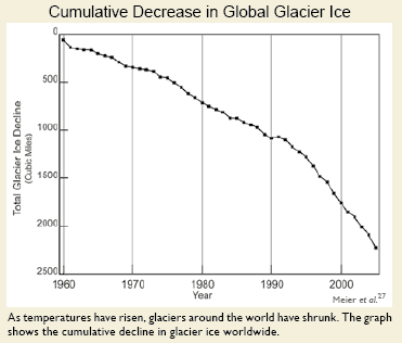
Here is the melting glacier chart from right up front on page 18, in the section on sea level rise (ironic, since if you really read the IPCC report closely, sea level rise comes mainly from thermal expansion of the oceans – glacier melting is offset in most models by increased snow in Antarctica**).

glaciers-recent

Wow, this looks scary.  Of course, it is clever chartsmanship, making it look like they have melted down to zero by choice of scale.   How large is this compared to the total area of glaciers?  We don’t know from the chart — percentages would have been more helpful.

Anyway, I could criticize these minor chartsmanship games throughout the paper, but on glaciers I want to focus on the selected time frame.  What, one might ask, were glaciers doing before 1960?  Well, if we accept the logic of the caption that losses are driven by temperature, then I guess it must have been flat.  But why didn’t they show that?  Wouldn’t that be a powerful chart, showing flat glacier size with this falloff to the right?

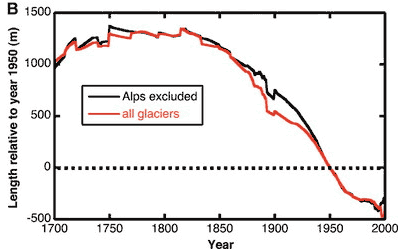
Well, as you may have guessed, the truncated time frame on the left side of this chart is not flat.  I can’t find evidence that Meier et al looted back further than 1960, but others have, including Oerlemans as published in Science in 2005.  (The far right hand side really should be truncated by 5-10 years, as they are missing a lot of datapoints in the last 5 years, making the results odd and unreliable).

glaciers-long

OK, this is length rather than volume, but they should be closely related.  The conclusion is that glaciers have been receding since the early 19th century, LONG before any build-up of CO2, and coincident with a series of cold decades in the last 18th century  (think Valley Forge and Napoleon in Russia).

I hope you can see why it is unbelievably disingenuous to truncate the whole period from 1800-1960 and call this trend a) recent and b) due to man-made global warming.  If it is indeed due to man-made global warming since 1960, then there must have been some other natural effect shrinking glaciers since 1825 that fortuitously shut off at the precise moment anthropogenic warming took over.  Paging William of Occam, call your office please.

Similarly, sea levels have been rising steadily for hundreds, even thousands of years, and current sea level increases are not far off their average pace for the last 200 years.

** The climate models show warming of the waters around Antarctica, creating more precipitation over the climate.  This precipitation falls and remains as snow or ice, and is unlikely to melt even at very high numbers for global warming as Antarctica is so freaking cold to begin with.

GCCI Report #2: Climate Must Be Dead Stable Without Man

The other underlying assumption in the GCCI report is that without man, climate would be dead stable.  Year in and year out, decade after decade, every location would get the same rain it got the year before and the decade before, the same number of storms, the same number of tornadoes, the same start date for Spring, etc.

Now, the authors might object to that and say, “we don’t believe that.”  But in fact they must, since in the report, any US climate trend in the last 20 years (more rain, less rain, more storms, fewer storms, more snow, less snow, etc) is all blamed on man.   Why else discuss a given trend in climate in a report on man-made climate change except to create the impression that each and every trend in climate is due to man, and can therefore be extrapolated a hundred years in to the future?

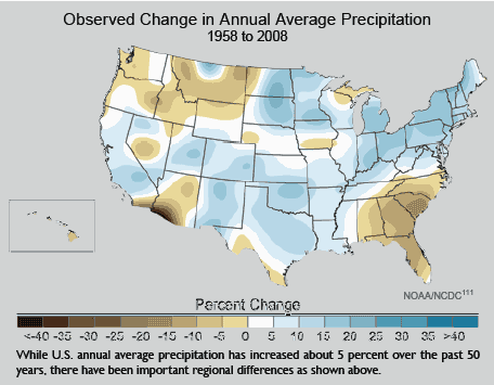
I am going to take on many of these charts in this series, but here is an example from page 30:

precipitation-change

So what?   Do you really think there is a single 50-year period in the history of North America where you wouldn’t see this kind of effect?  Where, sans man, the chart would be all white with no changes?  And even trying to pull regional conclusions out of this is almost impossible — for example, the brown in the Southeast is heavily driven by the 2008 endpoint with a big drought.  Shift the period by even a few years and the chart has the same mixture of blue and brown, but distributed differently.

Of course,this assumption of underlying stability is absurd.  History is full of short, medium, and long-term climate cycles.  An honest scientific discussion would look at the degree of variation over time, say hundreds or thousands of years, and then put recent variations in this context.  Are recent changes unprecedented, or not?  Well, we’ll never know from this report.

The Wrong Tree

I don’t really understand how this discussion at the Reference Frame is relevant to anything.  A study says that the clustering of high temperatures at the end of the last 100 years cannot be just random statistical chance, while Lubos argues that the chance of it happening is low but not nearly as low as the authors state.

I guess this may be an interesting exercise in probability theory for autocorrellated functions, but that is about it.  I mean, does anyone really doubt that there has been some sort of upward trend in world temperatures?

More relevent are the questions

Arctic and Greenland Ice

Arctic Sea ice and Greenland glaciers have been on a slow retreating trend for decades, perhaps centuries (at least since the little ice age).  This should not be surprising.  First, glaciers all around the world have been steadily retreating since 1800:

Glacier_length_2_2

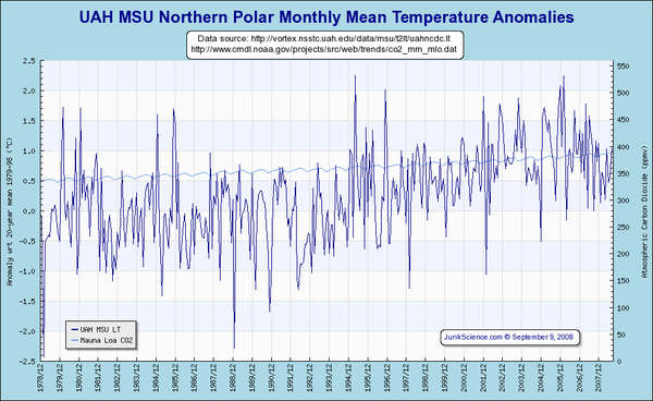
Also, the Arctic has been the hot spot of the world over the last 30 years or so:

Uahmsunpol

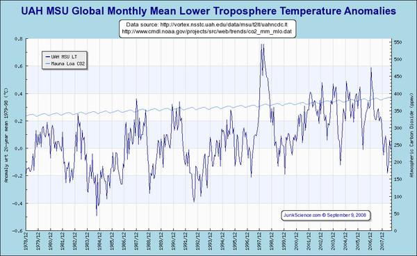
Increasing far more than global averages:

Uahmsuglobe

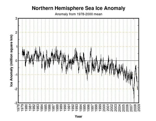
So the question is not necessarily why Arctic Sea ice continues to retreat – this appears part of a long term trend that in fact pre-dates things like, say, man’s production of substantial amounts of CO2.  But the more worrisome question has been, why has this retreat seemed to have accelerated the past several years:

Currentanom

Its hard to fully correlate recent activity with Arctic temperatures.  In fact, in the last three or four years (see above) we have seen decreasing Attic temperatures, not increasing ones.  But never-the-less, this ice picture is often used as exhibit #1 to prove anthropogenic warming.  The "tipping point is near" cry supporters of the theory that Earth’s climate, unlike nearly every other long-term stable natural system, is dominated by positive feedback (and ignoring anecdotal evidence that the Arctic experienced similar melting in the 1930s).

Well, last year, there was some preliminary findings form NASA that said that the unusual low ice pack in 2008 may have been due to shifting wind patterns.  Now, Anthony Watts points us to two new studies that both conclude something other than global warming and CO2 may be behind recent ice pack trends in the Arctic.

Observations over the past decades show a rapid acceleration of several outlet glaciers in Greenland and Antarctica1. One of the largest changes is a sudden switch of Jakobshavn Isbræ, a large outlet glacier feeding a deep-ocean fjord on Greenland’s west coast, from slow thickening to rapid thinning2 in 1997, associated with a doubling in glacier velocity3. Suggested explanations for the speed-up of Jakobshavn Isbræ include increased lubrication of the ice-bedrock interface as more meltwater has drained to the glacier bed during recent warmer summers4 and weakening and break-up of the floating ice tongue that buttressed the glacier5. Here we present hydrographic data that show a sudden increase in subsurface ocean temperature in 1997 along the entire west coast of Greenland, suggesting that the changes in Jakobshavn Isbræ were instead triggered by the arrival of relatively warm water originating from the Irminger Sea near Iceland. We trace these oceanic changes back to changes in the atmospheric circulation in the North Atlantic region. We conclude that the prediction of future rapid dynamic responses of other outlet glaciers to climate change will require an improved understanding of the effect of changes in regional ocean and atmosphere circulation on the delivery of warm subsurface waters to the periphery of the ice sheets.

Antarctic Sea Ice

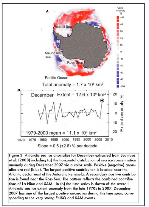
I have written a number of times that alarmists like Al Gore focus their cameras and attention on small portions of the Antarctic Peninsula where sea ice is has been shrinking  (actually, it turns out Al Gore did not focus actual cameras but used special effects footage from the disaster movie Day after Tomorrow).  I have argued that this is disingenuous, because the Antarctic Peninsula is not representative of climate trends in the rest of Antarctica, much less a good representative of climate trends across the whole globe.  This map reinforces my point, showing in red where sea ice has increased, and in blue where it has decreased  (this is a little counter-intuitive where we expect anomaly maps to show red as hotter and blue as colder).

Clivarvariations6n1

Unusual Climactic Stability

Newsbusters found this in a 1993 NY Times article:

The scientists said their data showed that significantly warmer periods and significantly colder periods had occurred during the last interval between glacial epochs, about 115,000 to 135,000 years ago. They said they could not tell whether that meant similar changes were in store. Their findings were reported today in two papers in the journal Nature. […]

The new studies found that the average global temperature can change as much as 18 degrees Fahrenheit in a couple of decades during interglacial periods, [Dr. J. W. C. White of the Institute of Arctic and Alpine Research of the University of Colorado] said. The current average global temperature is 59 degrees Fahrenheit. …

At one point between the last two glacial epochs, the climate melted enough polar ice to raise sea levels some 30 feet. As noted by a member of the drilling team, Dr. David A. Peel of the British Antarctic Survey, it was so warm in England that hippopotamuses wallowed in the Thames and lions roamed its banks….

In his commentary, Dr. White wrote: "We humans have built a remarkable socioeconomic system during perhaps the only time when it could be built, when climate was sufficiently stable to allow us to develop the agricultural infrastructure required to maintain an advanced society. We don’t know why we have been so blessed, but even without human intervention, the climate system is capable of stunning variability.

Who’d Have Believed It? A Natural Process Dominated By Negative Feedback!

Frequent readers will know that I have often criticized climate scientists for assuming, without strong evidence, that climate is dominated by positive feedback.  Such an assumption about a long-term stable system implies that climate is relatively unique among natural processes, and is a real head scratcher when advocated by folks like Michael Mann, who simultaneously claim that past temerpatures are stable within very narrow ranges  (Stability and positive feedback are two great tastes that do not go great together).

Well, it seems that those of use who were offended by the notion of a long-term stable natural process being dominated by positive feedback may have been right after all (via Tom Nelson):

Cirrus clouds are performing a disappearing act which is taking scientists by surprise.

In the global warming debate, it is assumed that temperature rises will lead to more rainfall, which in turn will see an increase in high-altitude cloud cover that will trap infrared heat.

But research on tropical climate systems has found the opposite is happening, with cirrus clouds thinning as the air warms, leading to rapid cooling as infrared heat escapes from the atmosphere to outer space.

HIstoric Cyclones

From the Weather Underground, via Planet Gore.  Please forward this to Al so he can stop embarassing himself.  The twenty deadliest cyclones (that we know about):

Rank: Name / Areas of Largest Loss: Year: Ocean Area: Deaths:
1 Great Bhola Cyclone, Bangladesh 1970 Bay of Bengal 550,000
2 Hooghly River Cyclone, India and Bangladesh 1737 Bay of Bengal 350,000
3 Haiphong Typhoon, Vietnam 1881 West Pacific 300,000
3 Coringa, India 1839 Bay of Bengal 300,000
5 Backerganj Cyclone, Bangladesh 1584 Bay of Bengal 200,000
6 Great Backerganj Cyclone, Bangladesh 1876 Bay of Bengal 200,000
7 Chittagong, Bangladesh 1897 Bay of Bengal 175,000
8 Super Typhoon Nina, China 1975 West Pacific 171,000
9 Cyclone 02B, Bangladesh 1991 Bay of Bengal 140,000
10 Great Bombay Cyclone, India 1882 Arabian Sea 100,000
11 Hakata Bay Typhoon, Japan 1281 West Pacific 65,000
12 Calcutta, India 1864 Bay of Bengal 60,000
13 Swatlow, China 1922 West Pacific 60,000
14 Barisal, Bangladesh 1822 Bay of Bengal 50,000
15 Sunderbans coast, Bangladesh 1699 Bay of Bengal 50,000
16 Bengal Cyclone, Calcutta, India 1942 Bay of Bengal 40,000
17 Canton, China 1862 West Pacific 37,000
18 Backerganj (Barisal), Bangladesh 1767 Bay of Bengal 30,000
19 Barisal, Bangladesh 1831 Bay of Bengal 22,000
20 Great Hurricane, Lesser Antilles Islands 1780 Atlantic 22,000
21 Devi Taluk, SE India 1977 Bay of Bengal 20,000
21 Great Coringa Cyclone, India 1789 Bay of Bengal 20,000

Oddly uncorrelated with atmospheric temperature or CO2, huh?  In fact, three of the four most recent occured in the seventies, a time known for its cooling.  Two of the top five occured around the period of the little ice age.

What is normal?  One other thought.  I have often asked, vis a vis climate, the question "What is Normal?"  Because of the quality of observation by sattelites, we tend to define normal by what we have observed since about 1979, when the first satellites began gathering relevent global climate data.  For example, when news stories last year said the Arctic sea ice was at "an all time low," they actually meant the lowest point since satellites began observing the ice c.1979.  "All time" meant the last 30 years.  Note that only one of these 22 storms occured in the last 30 years.  By defining "normal" as the last 30 years, we would in this case miss over 95% of the severest storms.  Even defining "noral" as the time since 1900 would cause us to miss 7 of the top 10 storms.

Spot the correlation:  Do you see a correlation in this list?  How about with poverty?  When cyclones hit US low-lying coastal areas and drive flooding up river valleys and deltas (think Katrina) we get a few hundred or at most a couple of thousand deaths, at most.   A tragedy for sure, but Katrina did not even kill 10% of the people killed by the bottom storm on this list.  What is the difference?  Poverty.  From this data table, which option makes more sense:

  1. Reduce CO2 and perhaps ocean temperatures by a few tenths of a degree, in the process limiting economic growth and increasing poverty.
  2. Burn all the fossil fuels we can on the path to helping people in Bangladesh and China and India become wealthier.

I am sure I know which would save more lives.

Multi-Decade Climate Cycles

Since I am a bit late on this, you have probably already seen the stories from NASA that apparently the Pacific Decadal Occilation, which switches from warm to cool cycles every thirty to forty years, has just switched from warm to cool.

The Pacific Decadal Oscillation (PDO) is a temperature pattern in the Pacific Ocean that spends roughly 20-30 years in the cool phase or the warm phase.

In 1905, PDO switched to a warm phase.
In 1946, PDO switched to a cool phase.
In 1977, PDO switched to a warm phase.
In 1998, PDO showed a few cool years.

In 2008, PDO seems to be switching to a cool phase. (NASA).

The warm (cool) phase is determined by above-the-average (below-the-average) temperatures along the West Coast of the U.S. and Canada.

At the same time, a longer cycle occilation in the Atlantic called the AMO may also be in the cooling part of its occilation over the next decades.

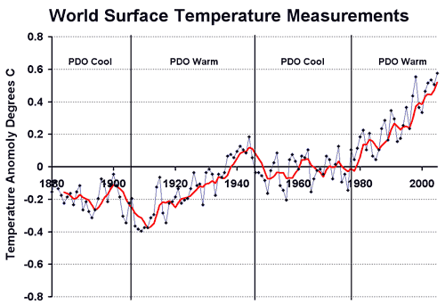
Though from what I read, the PDO mainly affects temperatures around the Pacific Rim, the Pacific is in fact  a very large part of the earth, so I wondered if its cylcling might have some correlation with world temperatures:

Pdohistory

Well, that is kind of interesting.  Note by the way I use the GISS surface data in this chart, so one can assume the warming in the last 20 years is overstated for a variety of reasons we have discussed on this site.  Never-the-less, it is interesting.  A few thoughts:

  • Catastrophists are spinning that the PDO cool cycles just delay or suppress man-made warming signals.  OK.  But if you argue this, you have to also argue for the converse — that the PDO exaggerate what might be man-made warming signals during its warm cycles.  Catastrophists and in particular the IPCC, however, said that all of the post 1977 warming was due to man – I don’t remember anyone mentioning "PDO" in these discussions (In fact, they argue that some additional warming was being masked).  Catastrophists love to point to natural cycles only when they can be claimed to mask man-made warming.
  • I am constantly amazed at how much the 1905-1947 trend on this chart looks like the 1977-2005 trend.  But here is the amazing thing to me:  Catastrophists as well as the IPCC claim that these trends had different causes.  In fact, you MUST believe they had different causes to believe the AGW story (since there was little man-made CO2 in the first period).  In other words, to belive the catastrophic man-made global warming theory, you have to believe some effect, presumably natural but never identified by the IPCC, drove temperatures through 1947 and then switched off, never to return, at the exact same moment that man began producing CO2 in earnest.

Update:  It may be too early to tell if the PDO is doing a major or sort of minor shift, but the past frequency seems to indicate we will see a shift soon.

Mother Nature Will Win

In some crazy violation of Boston Globe editorial policy, this article (via TJIC) discusses weather without mentioning global warming.  But it does demonstrate how crazy it is to declare that the condition of the Earth circa 1950 was "normal,"  and any change is somehow abnormal.  The article highlights that change itself is the norm.

The sea, some in Chatham say, gives to the town as much as it takes away. The Atlantic constantly erodes the coastline, but also replenishes it with sediment washed from elsewhere. The only problem, says Leo Concannon, Chatham assistant harbormaster, is that the giving and taking "is often not where people want or need it." The region so incessantly reshapes itself with new shoals, sandbars, and breaks that Concannon’s office updates navigational charts with pencils and erasers.

In 2006, the ocean deposited enough sand to reconnect mainland Chatham to South Monomoy Island for the first time in 50 years. In 1987, the change was more abrupt: The Atlantic breached North Beach about 2 miles south of the current break. That gap, now more than a mile wide, eventually destroyed 10 houses on the mainland.

Somehow, the Globe seems to have found the last beachfront homeowner in the country who does not think someone else owes him when nature punishes him for building a house on a sandbar.

Thought for the Day

Imagine for a moment that the industrial revolution occured 70 years earlier, and we were having this argument about global warming in the 1930’s rather than the 2000’s.  How would the media have reported the great midwestern US droughts we refer to today as the dust bowl?  Almost certainly, these events would have been blamed on man and CO2 combustion.  Everyone from Al Gore to James Hansen would say that these droughts were most certainly caused by man-made global warming.

We know today that these were entirely natural cyclical events, not caused at all by man (except perhaps to the extent that poor framing practices exacerbated some of the problems).  We know that such an assumption about man’s guilt would have been dead wrong.  So how is it today we can be so sure that unusual events we see today are somehow man-made?  Particularly when these events are much less dire than extremes we have already seen through natural variations over the last century.  For example, despite all the news about global warming and reporting on every single heat wave, we actually are seeing fewer all-time temperature highs today than we have in the past.