Category Archives: Warming Forecasts

Take A Deep Breath…

A lot of skeptics’ websites are riled up about the EPA’s leadership decision not to forward comments by EPA staffer Alan Carlin on the Endangerment issue and global warming because these comments were not consistent with where the EPA wanted to go on this issue.   I reprinted the key EPA email here, which I thought sounded a bit creepy, and some of the findings by the CEI which raised this issue.

However, I think skeptics are getting a bit carried away.  Let’s try to avoid the exaggeration and hype of which we often accuse global warming alarmists.  This decision does not reflect well on the EPA, but let’s make sure we understand what it was and was not:

  • This was not a “study” in the sense we would normally use the word.  These were comments submitted by an individual to a regulatory decision and/or a draft report.  The  authors claimed to only have 4 or 5 days to create these comments.  To this extent, they are not dissimilar to the types of comments many of us submitted to the recently released climate change synthesis report (comments, by the way, which still have not been released though the final report is out — this in my mind is a bigger scandal than how Mr. Carlin’s comments were handled).  Given this time frame, the comments are quite impressive, but nonetheless not a “study.”
  • This was not an officially sanctioned study that was somehow suppressed.  In other words, I have not seen anywhere that Mr. Carlin was assigned by the agency to produce a report on anthropogenic global warming.  This does not however imply that what Mr. Carlin was doing was unauthorized.  This is a very normal activity — staffers from various departments and background submitting comments on reports and proposed regulations.  He was presumably responding to an internal call for comments by such and such date.
  • I have had a number of folks write me saying that everyone is misunderstanding the key email — that it should be taken on its face — and read to mean that Mr. Carlin commented on issues outside of the scope of the study or based document he was commenting on.  An example might be submitting comments saying man is not causing global warming to a study discussing whether warming causes hurricanes.   However, his comments certainly seem relevant to Endangerment question — the background, action, and proposed finding the comments were aimed at is on the EPA website here.  Note in particular the comments in Carlin’s paper were totally relevant and on point to the content of the technical support document linked on that page.
  • The fourth email cited by the CEI, saying that Mr. Carlin should cease spending any more time on global warming, is impossible to analyze without more context.  There are both sinister and perfectly harmless interpretations of such an email.  For example, I could easily imagine an employee assigned to area Y who had a hobbyist interest in area X and loved to comment on area X being asked by his supervisor to go back and do his job in area Y.  I have had situations like that in the departments I have run.

What does appear to have happened is that Mr. Carlin responded to a call for comments, submitted comments per the date and process required, and then had the organization refuse to forward those comments because they did not fit the storyline the EPA wanted to put together.  This content-based rejection of his submission does appear to violate normal EPA rules and practices and, if not, certainly violates the standards we would want such supposedly science-based regulatory bodies to follow.  But let’s not upgrade this category 2 hurricane to category 5 — this was not, as I understand it, an agency suppressing an official agency-initiated study.

I may be a cynical libertarian on this, but this strikes me more as a government issue than a global warming issue.  Government bureaucracies love consensus, even when they have to impose it.  I don’t think there is a single agency in Washington that has not done something similar — ie suppressed internal concerns and dissent when the word came down from on high what the answer was supposed to be on a certain question they were supposed to be “studying.”**  This sucks, but its what we get when we build this big blundering bureaucracy to rule us.

Anyway, Anthony Watt is doing a great job staying on top of this issue.  His latest post is here, and includes an updated version of Carlin’s comments.   Whatever the background, Carlin’s document is well worth a read.  I have mirrored the document here.

**Postscript: Here is something I have observed about certain people in both corporate and government beauracracies.  I appologize, but I don’t really have the words for this and I don’t know the language of psychology.   There is a certain type of person who comes to believe, really believe, their boss’s position on an issue.  We often chalk this up from the outside to brown-nosing or an “Eddie Haskell” effect where people fake their beliefs, but I don’t think this is always true.  I think there is some sort of human mental defense mechanism that people have a tendency to actually adopt (not just fake) the beliefs of those in power over them.  Certainly some folks resist this, and there are some issues too big or fundamental for this to work, but for many folks their mind will reshape itself to the beaucracracy around it.  It is why sometimes organizations cannot be fixed, and can only be blown up.

Update: The reasons skeptics react strongly to stuff like this is that there are just so many examples:

Over the coming days a curiously revealing event will be taking place in Copenhagen. Top of the agenda at a meeting of the Polar Bear Specialist Group (set up under the International Union for the Conservation of Nature/Species Survival Commission) will be the need to produce a suitably scary report on how polar bears are being threatened with extinction by man-made global warming….

Dr Mitchell Taylor has been researching the status and management of polar bears in Canada and around the Arctic Circle for 30 years, as both an academic and a government employee. More than once since 2006 he has made headlines by insisting that polar bear numbers, far from decreasing, are much higher than they were 30 years ago. Of the 19 different bear populations, almost all are increasing or at optimum levels, only two have for local reasons modestly declined.

Dr Taylor agrees that the Arctic has been warming over the last 30 years. But he ascribes this not to rising levels of CO2 – as is dictated by the computer models of the UN’s Intergovernmental Panel on Climate Change and believed by his PBSG colleagues – but to currents bringing warm water into the Arctic from the Pacific and the effect of winds blowing in from the Bering Sea….

Dr Taylor had obtained funding to attend this week’s meeting of the PBSG, but this was voted down by its members because of his views on global warming. The chairman, Dr Andy Derocher, a former university pupil of Dr Taylor’s, frankly explained in an email (which I was not sent by Dr Taylor) that his rejection had nothing to do with his undoubted expertise on polar bears: “it was the position you’ve taken on global warming that brought opposition”.

Dr Taylor was told that his views running “counter to human-induced climate change are extremely unhelpful”. His signing of the Manhattan Declaration – a statement by 500 scientists that the causes of climate change are not CO2 but natural, such as changes in the radiation of the sun and ocean currents – was “inconsistent with the position taken by the PBSG”.

GCCI Report #3: Warming and Feedback

One frequent topic on this blog is that the theory of catastrophic anthropogenic global warming actually rests on two separate, unrelated propositions.  One, that increasing CO2 in the atmosphere increases temperatures.  And two, that the Earth’s climate is dominated by positive feedbacks that multiply the warming from Co2 alone by 3x or more.  Proposition one is well-grounded, and according to the IPCC (which this report does not dispute) the warming from Co2 alone is about 1.2C per doubling of Co2 concentrations.  Proposition two is much, much iffier, which is all the more problematic since 2/3 or more of the hypothesized future warming typically comes from the feedback.

We have to do a little legwork, because this report bends over backwards to not include any actual science.  For example, as far as I can tell, it does not actually establish a range of likely climate sensitivity numbers, but we can back into them.

The report uses CO2 concentrations numbers for “do nothing” scenarios (no global warming legislation) of between 850 and 950 ppm in 2100.  These are labeled as the IPCC A2 and A1F1 scenarios.  For these scenarios, between 2000 and 2100 they show warming of 6F and 7F respectively.   Now, I need to do some conversions.  850 and 950 ppm represent about 1.25 and 1.5 doublings from 2000 levels.  The temperatures for these are 3.3C and 3.9C.  This means that the assumed sensitivity in these charts (as degrees Celsius per doubling) is around 2.6, though my guess is that there are time delays in the model and the actual number is closer to 3.  This is entirely consistent with the last IPCC report.

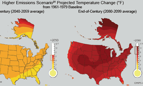
OK, that seems straight forward.  Except having used these IPCC numbers on pages 23-25, they quickly abandon them in favor of higher numbers.    Here for example, is a chart from page 29:

us-future-temps2

Note the map on the right, which is the end of century projection for the US.  The chart shows a range of warming of 7-11 degrees F for a time period centered on 2090  (they boxed that range on the thermometer, not me), but the chart on page 25 shows average warming in the max emissions case in 2090 to be about 7.5F against the same baseline (you have to be careful, they keep moving the baseline around on these charts).  It could be that my Mark I integrating eyeball is wrong, but that map sure looks like more than an average 7.5F increase.  It could be that the US is supposed to warm more than the world average, but the report never says so that I can find, and the US (even by the by the numbers in the report) has warmed less than the rest of the globe over the last 50 years.

The solution to this conundrum may be on page 24 when they say:

Based on scenarios that do not assume explicit climate policies to reduce greenhouse gas emissions, global average temperature is projected to rise by 2 to 11.5°F by the end of this century90 (relative to the 1980-1999 time period).

Oddly enough (well, oddly for a science document but absolutely predictably for an advocacy paper) the high end of this range, rather than the median, seems to be the number used through the rest of the report.  This 11.5F probably implies a climate sensitivity around 5 C/doubling.  Using the IPCC numaber of 1.2 for CO2 alone, means that this report is assuming that as much as 75% of the warming comes from positive feedback effects.

So, since most of the warming, and all of the catastrophe, comes from the assumption that the climate system is dominated by net positive feedback, one would assume the report would address itself to this issue.  Wrong.

I did a search for the word “feedback” in the document just to make sure I didn’t miss anything.  Here are all the references in the main document (outside of footnotes) to feedback used in this context:

  • P15:  “However, the surface warming caused by human-produced increases in other greenhouse gases leads to an increase in atmospheric water vapor, since a warmer climate increases evaporation and allows the atmosphere to hold more moisture. This creates an amplifying “feedback loop,” leading to more warming.”
  • P16:  “For example, it is known from long records of Earth’s climate history that under warmer conditions, carbon tends to be released, for instance, from thawing permafrost, initiating a feedback loop in which more carbon release leads to more warming which leads to further release, and so on.”
  • P17:  “For example, it is known from long records of Earth’s climate history that under warmer conditions, carbon tends to be released, for instance, from thawing permafrost, initiating a feedback loop in which more carbon release leads to more warming which leads to further release, and so on.

That’s it – the entire sum text of feedbacks.  All positive, no discussion of negative feedbacks, and no discussion of the evidence how we know positive feedbacks outweight negative feedbacks.  The first one of the three is particularly disengenuous, since most serious scientists will admit that we don’t even know the sign of the water vapor feedback loop, and there is good evidence the sign is actually negative (due to albedo effects from increased cloud formation).

Its all About the Feedback

If frequent readers get any one message from this site, it should be that the theory of catastrophic global warming from CO2 is actually based on two parallel and largely unrelated theories:

  1. That CO2 acts as a greenhouse gas and can increase global temperatures as concentrations increase
  2. That the earth’s climate is dominated by strong positive feedback that multiplies the effect of #1 3,4,5 times or more.

I have always agreed with #1, and I think most folks will accept a number between 1-1.2C for a doubling of CO2 (though a few think its smaller).  #2 is where the problem with the theory is, and it is no accident that this is the area least discussed in the media.  For more, I refer you to this post and this video.  (higher resolution video here, clip #3).

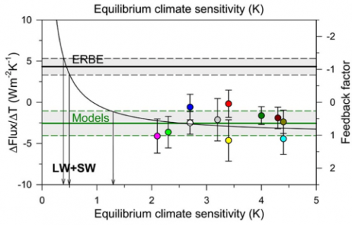
In my video and past posts, I have tried to back into the feedback fraction f that models are using.  I used a fairly brute force approach and came up with numbers between 0.65 and 0.85.  It turns out I was pretty close.  Dr Richard Lindzen has this chart showing the feedback fractions f used in models, and the only surprise to me is how many use a number higher than 1 (such numbers imply runaway reactions similar to nuclear fission).

lindzen_graph_icccjune09

Lindzen thinks the true number is closer to -1, which is similar to the number I backed into from temperature history over the last 100 years.  This would imply that feedback actually works to reduce the net effect of greenhouse warming, from a sensitivity of 1.2 to one something like 0.6C per doubling.

Perils of Modeling Complex Systems

I thought this article in the NY Times about the failure of models to accurately predict the progression of swine flu cases was moderately instructive.

In the waning days of April, as federal officials were declaring a public health emergency and the world seemed gripped by swine flu panic, two rival supercomputer teams made projections about the epidemic that were surprisingly similar — and surprisingly reassuring. By the end of May, they said, there would be only 2,000 to 2,500 cases in the United States.

May’s over. They were a bit off.

On May 15, the Centers for Disease Control and Prevention estimated that there were “upwards of 100,000” cases in the country, even though only 7,415 had been confirmed at that point.

The agency declines to update that estimate just yet. But Tim Germann, a computational scientist who worked on a 2006 flu forecast model at Los Alamos National Laboratory, said he imagined there were now “a few hundred thousand” cases.

We can take at least two lessons from this:

  • Accurately modeling complex systems is really, really hard.  We may have hundreds of key variables, and changes in starting values or assumed correlation coefficients between these variables can make enormous differences in model results.
  • Very small changes in assumptions about processes that compound or have exponential growth make enormous differences in end results.  I think most people grossly underestimate this effect.  Take a process that starts at an arbitrary value of “100” and grows at some growth rate each period for 50 periods.    A growth rate of 1% per period yields an end value of  164.  A growth rate just 1 percentage point higher of 2% per period yields a final value of  269.    A growth rate of 3% yield a final value of 438.  In this case, if we miss the growth rate by just a couple of percentage points, we miss the end value by a factor of three!

Bringing this back to climate, we must understand that the problem of forecasting disease growth rates is grossly, incredibly more simple than forecasting future temperatures.  These guys missed the forecast my miles of a process that is orders of magnitude more amenable to forecasting than is climate.  But I am encouraged by this:

Both professors said they would use the experience to refine their models for the future.

If only climate scientists took this approach to new observations.

Global Warming and Ocean Heat

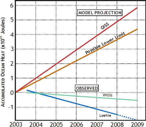
William DiPuccio has a really very readable and clear post on using ocean heat content to falsify current global warming model projections. He argues pretty persuasively that surface air temperature measurements are a really, really poor way to search for evidence of a man-made climate forcing from CO2.

Since the level of CO2 and other well-mixed GHG is on the rise, the overall accumulation of heat in the climate system, measured by ocean heat, should be fairly steady and uninterrupted (monotonic) according to IPCC models, provided there are no major volcanic eruptions.  According to the hypothesis, major feedbacks in the climate system are positive (i.e., amplifying), so there is no mechanism in this hypothesis that would cause a suspension or reversal of overall heat accumulation.  Indeed, any suspension or reversal would suggest that the heating caused by GHG can be overwhelmed by other human or natural processes in the climate system….

[The] use of surface air temperature as a metric has weak scientific support, except, perhaps, on a multi-decadal or century time-scale.  Surface temperature may not register the accumulation of heat in the climate system from year to year.  Heat sinks with high specific heat (like water and ice) can absorb (and radiate) vast amounts of heat.  Consequently the oceans and the cryosphere can significantly offset atmospheric temperature by heat transfer creating long time lags in surface temperature response time.  Moreover, heat is continually being transported in the atmosphere between the poles and the equator.  This reshuffling can create fluctuations in average global temperature caused, in part, by changes in cloud cover and water vapor, both of which can alter the earth’s radiative balance.

One statement in particular really opened my eyes, and made  me almost embarassed to have focused time on surface temperatures at all:

For any given area on the ocean’s surface, the upper 2.6m of water has the same heat capacity as the entire atmosphere above it

Wow!  So oceans have orders of magnitude more heat capacity than the atmosphere.

The whole article is a good read, but his conclusion is that estimates of ocean heat content changes appear to be way off what they should be given IPCC models:

dipuccio-2

My only concern with the analysis is that I fear the authors may be underestimating the effect of phase change (e.g. melting or evaporation).  Phase change can release or absorb enormous amounts of heat.  As a simple example, observe how long a pound of liquid water at 32.1F takes to reach room temperature.  Then observe how long a pound of ice at 31.9F takes to reach room temperature.  The latter process takes an order of magnitude more time, because it absorbs an order of magnitude more heat.

The article attached was necessarily a summary, but I am not totally convinced he has accounted for phase change sufficiently.  Both an increase in melting ice as well as an increase in evaporation would tend to cause measured accumulated heat in the oceans to be lower than expected.   He uses an estimate by James Hansen that the number is really small for ice melting (he does not discuss evaporation).  However, if folks continue to use Hansen’s estimate of this term to falsify Hansen’s forecast, expect Hansen to suddenly “discover” that he had grossly underestimated the ice melting term.

Sudden Acceleration

For several years, there was an absolute spate of lawsuits charging sudden acceleration of a motor vehicle — you probably saw such a story:  Some person claims they hardly touched the accelerator and the car leaped ahead at enormous speed and crashed into the house or the dog or telephone pole or whatever.  Many folks have been skeptical that cars were really subject to such positive feedback effects where small taps on the accelerator led to enormous speeds, particularly when almost all the plaintiffs in these cases turned out to be over 70 years old.  It seemed that a rational society might consider other causes than unexplained positive feedback, but there was too much money on the line to do so.

Many of you know that I consider questions around positive feedback in the climate system to be the key issue in global warming, the one that separates a nuisance from a catastrophe.  Is the Earth’s climate similar to most other complex, long-term stable natural systems in that it is dominated by negative feedback effects that tend to damp perturbations?  Or is the Earth’s climate an exception to most other physical processes, is it in fact dominated by positive feedback effects that, like the sudden acceleration in grandma’s car, apparently rockets the car forward into the house with only the lightest tap of the accelerator?

I don’t really have any new data today on feedback, but I do have a new climate forecast from a leading alarmist that highlights the importance of the feedback question.

Dr. Joseph Romm of Climate Progress wrote the other day that he believes the mean temperature increase in the “consensus view” is around 15F from pre-industrial times to the year 2100.  Mr. Romm is mainly writing, if I read him right, to say that critics are misreading what the consensus forecast is.  Far be it for me to referee among the alarmists (though 15F is substantially higher than the IPCC report “consensus”).  So I will take him at his word that 15F increase with a CO2 concentration of 860ppm is a good mean alarmist forecast for 2100.

I want to deconstruct the implications of this forecast a bit.

For simplicity, we often talk about temperature changes that result from a doubling in Co2 concentrations.  The reason we do it this way is because the relationship between CO2 concentrations and temperature increases is not linear but logarithmic.  Put simply, the temperature change from a CO2 concentration increase from 200 to 300ppm is different (in fact, larger) than the temperature change we might expect from a concentration increase of 600 to 700 ppm.   But the temperature change from 200 to 400 ppm is about the same as the temperature change from 400 to 800 ppm, because each represents a doubling.   This is utterly uncontroversial.

If we take the pre-industrial Co2 level as about 270ppm, the current CO2 level as 385ppm, and the 2100 Co2 level as 860 ppm, this means that we are about 43% through a first doubling of Co2 since pre-industrial times, and by 2100 we will have seen a full doubling (to 540ppm) plus about 60% of the way to a second doubling.  For simplicity, then, we can say Romm expects 1.6 doublings of Co2 by 2100 as compared to pre-industrial times.

So, how much temperature increase should we see with a doubling of CO2?  One might think this to be an incredibly controversial figure at the heart of the whole matter.  But not totally.  We can break the problem of temperature sensitivity to Co2 levels into two pieces – the expected first order impact, ahead of feedbacks, and then the result after second order effects and feedbacks.

What do we mean by first and second order effects?  Well, imagine a golf ball in the bottom of a bowl.  If we tap the ball, the first order effect is that it will head off at a constant velocity in the direction we tapped it.  The second order effects are the gravity and friction and the shape of the bowl, which will cause the ball to reverse directions, roll back through the middle, etc., causing it to oscillate around until it eventually loses speed to friction and settles to rest approximately back in the middle of the bowl where it started.

It turns out the the first order effects of CO2 on world temperatures are relatively uncontroversial.  The IPCC estimated that, before feedbacks, a doubling of CO2 would increase global temperatures by about 1.2C  (2.2F).   Alarmists and skeptics alike generally (but not universally) accept this number or one relatively close to it.

Applied to our increase from 270ppm pre-industrial to 860 ppm in 2100, which we said was about 1.6 doublings, this would imply a first order temperature increase of 3.5F from pre-industrial times to 2100  (actually, it would be a tad more than this, as I am interpolating a logarithmic function linearly, but it has no significant impact on our conclusions, and might increase the 3.5F estimate by a few tenths.)  Again, recognize that this math and this outcome are fairly uncontroversial.

So the question is, how do we get from 3.5F to 15F?  The answer, of course, is the second order effects or feedbacks.  And this, just so we are all clear, IS controversial.

A quick primer on feedback.  We talk of it being a secondary effect, but in fact it is a recursive process, such that there is a secondary, and a tertiary, etc. effects.

Lets imagine that there is a positive feedback that in the secondary effect increases an initial disturbance by 50%.  This means that a force F now becomes F + 50%F.  But the feedback also operates on the additional 50%F, such that the force is F+50%F+50%*50%F…. Etc, etc.  in an infinite series.  Fortunately, this series can be reduced such that the toal Gain =1/(1-f), where f is the feedback percentage in the first iteration. Note that f can and often is negative, such that the gain is actually less than 1.  This means that the net feedbacks at work damp or reduce the initial input, like the bowl in our example that kept returning our ball to the center.

Well, we don’t actually know the feedback fraction Romm is assuming, but we can derive it.  We know his gain must be 4.3 — in other words, he is saying that an initial impact of CO2 of 3.5F is multiplied 4.3x to a final net impact of 15.  So if the gain is 4.3, the feedback fraction f must be about 77%.

Does this make any sense?  My contention is that it does not.  A 77% first order feedback for a complex system is extraordinarily high  — not unprecedented, because nuclear fission is higher — but high enough that it defies nearly every intuition I have about dynamic systems.  On this assumption rests literally the whole debate.  It is simply amazing to me how little good work has been done on this question.  The government is paying people millions of dollars to find out if global warming increases acne or hurts the sex life of toads, while this key question goes unanswered.  (Here is Roy Spencer discussing why he thinks feedbacks have been overestimated to date, and a bit on feedback from Richard Lindzen).

But for those of you looking to get some sense of whether a 15F forecast makes sense, here are a couple of reality checks.

First, we have already experienced about .43 if a doubling of CO2 from pre-industrial times to today.  The same relationships and feedbacks and sensitivities that are forecast forward have to exist backwards as well.  A 15F forecast implies that we should have seen at least 4F of this increase by today.  In fact, we have seen, at most, just 1F  (and to attribute all of that to CO2, rather than, say, partially to the strong late 20th century solar cycle, is dangerous indeed).  But even assuming all of the last century’s 1F temperature increase is due to CO2, we are way, way short of the 4F we might expect.  Sure, there are issues with time delays and the possibility of some aerosol cooling to offset some of the warming, but none of these can even come close to closing a gap between 1F and 4F.  So, for a 15F temperature increase to be a correct forecast, we have to believe that nature and climate will operate fundamentally different than they have over the last 100 years.

Second, alarmists have been peddling a second analysis, called the Mann hockey stick, which is so contradictory to these assumptions of strong positive feedback that it is amazing to me no one has called them on the carpet for it.  In brief, Mann, in an effort to show that 20th century temperature increases are unprecedented and therefore more likely to be due to mankind, created an analysis quoted all over the place (particularly by Al Gore) that says that from the year 1000 to about 1850, the Earth’s temperature was incredibly, unbelievably stable.  He shows that the Earth’s temperature trend in this 800 year period never moves more than a few tenths of a degree C.  Even during the Maunder minimum, where we know the sun was unusually quiet, global temperatures were dead stable.

This is simply IMPOSSIBLE in a high-feedback environment.  There is no way a system dominated by the very high levels of positive feedback assumed in Romm’s and other forecasts could possibly be so rock-stable in the face of large changes in external forcings (such as the output of the sun during the Maunder minimum).  Every time Mann and others try to sell the hockey stick, they are putting a dagger in teh heart of high-positive-feedback driven forecasts (which is a category of forecasts that includes probably every single forecast you have seen in the media).

For a more complete explanation of these feedback issues, see my video here.

It’s Not Zero

I have been meaning to link to this post for a while, but the Reference Frame, along with Roy Spencer, makes a valuable point I have also made for some time — the warming effect from man’s CO2 is not going to be zero.  The article cites approximately the same number I have used in my work and that was used by the IPCC:  absent feedback and other second order effects, the earth should likely warm about 1.2C from a doubling of CO2.

The bare value (neglecting rain, effects on other parts of the atmosphere etc.) can be calculated for the CO2 greenhouse effect from well-known laws of physics: it gives 1.2 °C per CO2 doubling from 280 ppm (year 1800) to 560 ppm (year 2109, see below). The feedbacks may amplify or reduce this value and they are influenced by lots of unknown complex atmospheric effects as well as by biases, prejudices, and black magic introduced by the researchers.

A warming in the next century of 0.6 degrees, or about the same warming we have seen in the last century, is a very different prospect, demanding different levels of investment, than typical forecasts of 5-10 degrees or more of warming from various alarmists.

How we get from a modest climate sensitivity of 1.2 degrees to catastrophic forecasts is explained in this video:

The Dividing Line Between Nuisance and Catastrophe: Feedback

I have written for quite a while that the most important issue in evaluating catastrophic global warming forecasts is feedback.  Specifically, is the climate dominated by positive feedbacks, such that small CO2-induced changes in temperatures are multiplied many times, or even hit a tipping point where temperatures run away?  Or is the long-term stable system of climate more likely dominated by flat to negative feedback, as are most natural physical systems?  My view has always been that the earth will warm at most a degree for a doubling of CO2 over the next century, and may warm less if feedbacks turn out to be negative.

I am optimistic that this feedback issue may finally be seeing the light of day.  Here is Professor William Happer of Princeton in US Senate testimony:

There is little argument in the scientific community that a direct effect of doubling the CO2 concentration will be a small increase of the earth’s temperature — on the order of one degree. Additional increments of CO2 will cause relatively less direct warming because we already have so much CO2 in the atmosphere that it has blocked most of the infrared radiation that it can. It is like putting an additional ski hat on your head when you already have a nice warm one below it, but your are only wearing a windbreaker. To really get warmer, you need to add a warmer jacket. The IPCC thinks that this extra jacket is water vapor and clouds.

Since most of the greenhouse effect for the earth is due to water vapor and clouds, added CO2 must substantially increase water’s contribution to lead to the frightening scenarios that are bandied about. The buzz word here is that there is “positive feedback.” With each passing year, experimental observations further undermine the claim of a large positive feedback from water. In fact, observations suggest that the feedback is close to zero and may even be negative. That is, water vapor and clouds may actually diminish the already small global warming expected from CO2, not amplify it. The evidence here comes from satellite measurements of infrared radiation escaping from the earth into outer space, from measurements of sunlight reflected from clouds and from measurements of the temperature the earth’s surface or of the troposphere, the roughly 10 km thick layer of the atmosphere above the earth’s surface that is filled with churning air and clouds, heated from below at the earth’s surface, and cooled at the top by radiation into space.

When the IPCC gets to a forecast of 3-5C warming over the next century (in which CO2 concentrations are expected to roughly double), it is in two parts.  As professor Happer relates, only about 1C of this is directly from the first order effects of more Co2.  This assumption of 1C warming for a doubling of Co2 is relatively stable across both scientists and time, except that the IPCC actually reduced this number a bit between their 3rd and 4th reports.

They get from 1C to 3C-5C with feedback.  Here is how feedback works.

Lets say the world warms 1 degree.  Lets also assume that the only feedback is melting ice and albedo, and that for every degree of warming, the lower albedo from melted ice reflecting less sunlight back into space adds another 0.1 degree of warming.  But this 0.1 degree extra warming would in turn melt a bit more ice, which would result in 0.01 degree 3rd order warming.  So the warming from an initial 1 degree with such 10% feedback would be 1+0.1+0.01+0.001 …. etc.   This infinite series can be calculated as   dT * (1/(1-g))  where dT is the initial first order temperature change (in this case 1C) and g is the percentage that is fed back (in this case 10%).  So a 10% feedback results in a gain or multiplier of the initial temperature effect of 1.11 (more here).

So how do we get a multiplier of 3-5 in order to back into the IPCC forecasts?  Well, using our feedback formula backwards and solving for g, we get feedback percents of 67% for a 3 multiplier and 80% for a 5 multiplier.  These are VERY high feedbacks for any natural physical system short of nuclear fission, and this issue is the main (but by no means only) reason many of us are skeptical of catastrophic forecasts.

[By the way, to answer past criticisms, I know that the models do not use this simplistic feedback methodology in their algorithms.  But no matter how complex the details are modeled, the bottom line is that somewhere in the assumptions underlying these models, a feedback percent of 67-80% is implicit]

For those paying attention, there is no reason that feedback should apply in the future but not in the past.  Since the pre-industrial times, it is thought we have increased atmospheric Co2 by 43%.  So, we should have seen, in the past, 43% of the temperature rise from a doubling, or 43% of 3-5C, which is 1.3C-2.2C.  In fact, this underestimates what we should have seen historically since we just did a linear interpolation.  But Co2 to temperature is a logarithmic diminishing return relationship, meaning we should see faster warming with earlier increases than with later increases.  Never-the-less, despite heroic attempts to posit some offsetting cooling effect which is masking this warming, few people believe we have seen any such historic warming, and the measured warming is more like 0.6C.  And some of this is likely due to the fact that the solar activity was at a peak in the late 20th century, rather than just Co2.

I have a video discussing these topics in more depth:

This is the bait and switch of climate alarmism.  When pushed into the corner, they quickly yell “this is all settled science,”  when in fact the only part that is fairly well agreed upon is the 1C of first order warming from a doubling.  The majority of the warming, the amount that converts the forecast from nuisance to catastrophe, comes from feedback which is very poorly understood and not at all subject to any sort of consensus.

A Cautionary Tale About Models Of Complex Systems

I have often written warming about the difficulty of modeling complex systems.  My mechanical engineering degree was focused on the behavior and modeling of dynamic systems.  Since then, I have spent years doing financial, business, and economic modeling.  And all that experienced has taught me humility, as well as given me a good knowledge of where modelers tend to cheat.

Al Gore has argued that we should trust long-term models, because Wall Street has used such models successfully for years  (I am not sure he has been using this argument lately, lol).  I was immediately skeptical of this statement.  First, Wall Street almost never makes 100-year bets based on models (they may be investing in 30-year securities, but the bets they are making are much shorter term).  Second, my understanding of Wall Street history is that lower Manhattan is littered with the carcasses of traders who bankrupted themselves following the hot model of the moment.  It is ever so easy to create a correlation model that seems to back-cast well.  But no one has ever created one that holds up well going forward.

A reader sent me this article about the Gaussian copula, apparently the algorithm that underlay the correlation models Wall Streeters used to assess mortgage security and derivative risk.

Wall Streeters have the exact same problem that climate modelers have.  There is a single output variable they both care about (security price for traders, global temperature for modelers).  This variable’s value changes in a staggeringly complex system full of millions of variables with various levels of cross-correlation.  The modelers challenge is to look at the historical data, and to try to tease out correlation factors between their output variable and all the other input variables in an environment where they are all changing.

The problem is compounded because some of the input variables move on really long cycles, and some move on short cycles.  Some of these move in such long cycles that we may not even recognize the cycle at all.  In the end, this tripped up the financial modelers — all of their models derived correlation factors from a long and relatively unbroken period of home price appreciation.  Thus, when this cycle started to change, all the models fell apart.

Li’s copula function was used to price hundreds of billions of dollars’ worth of CDOs filled with mortgages. And because the copula function used CDS prices to calculate correlation, it was forced to confine itself to looking at the period of time when those credit default swaps had been in existence: less than a decade, a period when house prices soared. Naturally, default correlations were very low in those years. But when the mortgage boom ended abruptly and home values started falling across the country, correlations soared.

I never criticize people for trying to do an analysis with the data they have.  If they have only 10 years of data, that’s as far as they can run the analysis.  However, it is then important that they recognize that their analysis is based on data that may be way too short to measure longer term trends.

As is typical when models go wrong, early problems in the model did not cause users to revisit their assumptions:

His method was adopted by everybody from bond investors and Wall Street banks to ratings agencies and regulators. And it became so deeply entrenched—and was making people so much money—that warnings about its limitations were largely ignored.

Then the model fell apart. Cracks started appearing early on, when financial markets began behaving in ways that users of Li’s formula hadn’t expected. The cracks became full-fledged canyons in 2008—when ruptures in the financial system’s foundation swallowed up trillions of dollars and put the survival of the global banking system in serious peril.

A couple of lessons I draw out for climate models:

  1. Limited data availability can limit measurement of long-term cycles.  This is particularly true in climate, where cycles can last hundreds and even thousands of years, but good reliable data on world temperatures is only available for our 30 years and any data at all for about 150 years.  Interestingly, there is good evidence that many of the symptoms we attribute to man-made global warming are actually part of climate cycles that go back long before man burned fossil fuels in earnest.  For example, sea levels have been rising since the last ice age, and glaciers have been retreating since the late 18th century.
  2. The fact that models hindcast well has absolutely no predictive power as to whether they will forecast well
  3. Trying to paper over deviations between model forecasts and actuals, as climate scientists have been doing for the last 10 years, without revisiting the basic assumptions of the model can be fatal.

A Final Irony

Do you like irony?  In the last couple of months, I have been discovering I like it less than I thought.  But here is a bit of irony for you anyway.  The first paragraph of Obama’s new budget read like this:

This crisis is neither the result of a normal turn of the business cycle nor an accident of history, we arrived at this point as a result of an era of profound irresponsibility that engulfed both private and public institutions from some of our largest companies’ executive suites to the seats of power in Washington, D.C.

As people start to deconstruct last year’s financial crisis, most of them are coming to the conclusion that the #1 bit of “irresponsibility” was the blind investment of trillions of dollars based on solely on the output of correlation-based computer models, and continuing to do so even after cracks appeared in the models.

The irony?  Obama’s budget includes nearly $700 billion in new taxes (via a cap-and-trade system) based solely on … correlation-based computer climate models that predict rapidly rising temperatures from CO2.  Climate models in which a number of cracks have appeared, but which are being ignored.

Postscript: When I used this comparison the other day, a friend of mine fired back that the Wall Street guys were just MBA’s, but the climate guys were “scientists” and thus presumably less likely to err.  I responded that I didn’t know if one group or the other was more capable (though I do know that Wall Street employs a hell of a lot of top-notch PhD’s).  But I did know that the financial consequences for Wall Street traders having the wrong model was severe, while the impact on climate modelers of being wrong was about zero.  So, from an incentives standpoint, I know who I would more likely bet on to try to get it right.

The Plug

I have always been suspicious of climate models, in part because I spent some time in college trying to model chaotic dynamic systems, and in part because I have a substantial amount of experience with financial modeling.   There are a number of common traps one can fall into when modeling any system, and it appears to me that climate modelers are falling into most of them.

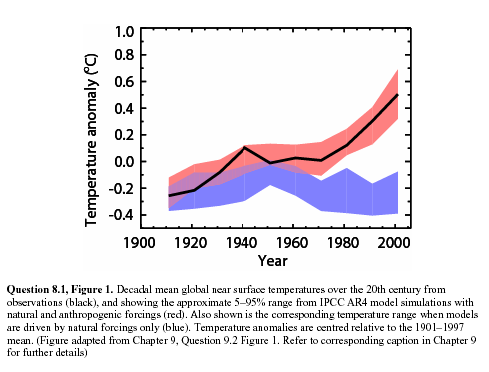
So a while back (before I even created this site) I was suspicious of this chart from the IPCC.  In this chart, the red is the “backcasting” of temperature history using climate models, the black line is the highly smoothed actuals, while the blue is a guess from the models as to what temperatures would have looked like without manmade forcings, particularly CO2.

ipcc1

As I wrote at the time:

I cannot prove this, but I am willing to make a bet based on my long, long history of modeling (computers, not fashion).  My guess is that the blue band, representing climate without man-made effects, was not based on any real science but was instead a plug.  In other words, they took their models and actual temperatures and then said “what would the climate without man have to look like for our models to be correct.”  There are at least four reasons I strongly suspect this to be true:

  1. Every computer modeler in history has tried this trick to make their models of the future seem more credible.  I don’t think the climate guys are immune.
  2. There is no way their models, with our current state of knowledge about the climate, match reality that well.
  3. The first time they ran their models vs. history, they did not match at all.  This current close match is the result of a bunch of tweaking that has little impact on the model’s predictive ability but forces it to match history better.  For example, early runs had the forecast run right up from the 1940 peak to temperatures way above what we see today.
  4. The blue line totally ignores any of our other understandings about the changing climate, including the changing intensity of the sun.  It is conveniently exactly what is necessary to make the pink line match history.  In fact, against all evidence, note the blue band falls over the century.  This is because the models were pushing the temperature up faster than we have seen it rise historically, so the modelers needed a negative plug to make the numbers look nice.

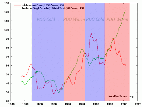
As you can see, the blue band, supposedly sans mankind, shows a steadily declining temperature. This never made much sense to me, given that, almost however you measure it, solar activity over the last half of the decade was stronger than the first half, but they show the natural forcings to be exactly opposite from what we might expect from this chart of solar activity as measured by sunspots (red is smoothed sunspot numbers, green is Hadley CRUT3 temperature).

temp_spots_with_pdo

By the way, there is a bit of a story behind this chart.  It was actually submitted by a commenter to this site of the more alarmist persuasion  (without the PDO bands), to try to debunk the link between temperature and the sun  (silly rabbit – the earth’ s temperature is not driven by the sun, but by parts per million changes in atmospheric gas concentrations!).  While the sun still is not the only factor driving the mercilessly complex climate, clearly solar activity in red was higher in the latter half of the century when temperatures in green were rising.  Which is at least as tight as the relation between CO2 and the same warming.

Anyway, why does any of this matter?  Skeptics have argued for quite some time that climate models assume too high of a sensitivity of temperature to CO2 — in other words, while most of us agree that Co2 increases can affect temperatures somewhat, the models assume temperature to be very sensitive to CO2, in large part because the models assume that the world’s climate is dominated by positive feedback.

One way to demonstrate that these models may be exaggerated is to plot their predictions backwards.  A relationship between Co2 and temperature that exists in the future should hold in the past, adjusting for time delays  (in fact, the relationship should be more sensitive in the past, since sensitivity is a logarithmic diminishing-return curve).  But projecting the modelled sensitivities backwards (with a 15-year lag) result in ridiculously high predicted historic temperature increases that we simply have never seen.  I discuss this in some depth in my 10 minute video here, but the key chart is this one:

feedback_projection

You can see the video to get a full explanation, but in short, models that include high net positive climate feedbacks have to produce historical warming numbers that far exceed measured results.  Even if we assign every bit of 20th century warming to man-made causes, this still only implies 1C of warming over the next century.

So the only way to fix this is with what modelers call a plug.  Create some new variable, in this case “the hypothetical temperature changes without manmade CO2,” and plug it in.  By making this number very negative in the past, but flat to positive in the future, one can have a forecast that rises slowly in the past but rapidly in the future.

Now, I can’t prove that this is what was done.  In fact, I am perfectly willing to believe that modelers can spin a plausible story with enough jargon to put off most layman, as to how they created this “non-man” line and why it has been decreasing over the last half of the century.   I have a number of reasons to disbelieve any such posturing:

  1. The last IPCC report spent about a thousand pages on developing the the “with Co2” forecasts.  They spent about half a page discussing the “without Co2” case.  These is about zero scientific discussion of how this forecast is created, or what the key elements are that drive it
  2. The IPCC report freely admits their understanding of cooling factors is “low”
  3. The resulting forecasts is WAY to good.  We will see this again in a moment.  But with such a chaotic system, your first reaction to anyone who shows you a back-cast that nicely overlays history almost exactly should be “bullshit.”  Its not possible, except with tuning and plugs
  4. The sun was almost undeniably stronger in the second half of the 20th century than the first half.  So what is the countervailing factor that overcomes both the sun and CO2?

The IPCC does not really say what is making the blue line go down, it just goes down (because, as we can see now, it has to to make their hypothesis work).  Today, the main answer to the question of what might be offsetting warming  is “aerosols,” particularly sulfur and carbon compounds that are man-made pollutants (true pollutants) from burning fossil fuels.  The hypothesis is that these aerosols reflect sunlight back to space and cool the earth  (by the way, the blue line above in the IPCC report is explicitly only non-anthropogenic effects, so at the time it went down due to natural effects – the manmade aerosol thing is a newer straw to grasp).

But black carbon and aerosols have some properties that create some problems with this argument, once you dig into it.  First, there are situations where they are as likely to warm as to cool.  For example, one reason the Arctic has been melting faster in the summer of late is likely due to black carbon from Chinese coal plants that land on the ice and warm it faster.

The other issue with aerosols is that they disperse quickly.  Co2 mixes fairly evenly worldwide and remains in the atmosphere for years.  Many combustion aerosols only remain in the air for days, and so they tend to be concentrated regionally.   Perhaps 10-20% of the earth’s surface might at any one time have a decent concentration of man-made aerosols.  But for that to drive a, say, half degree cooling effect that offsets CO2 warming, that would mean that cooling in these aerosol-affected areas would have to be 2.5-5.0C in magnitude.  If this were the case, we would see those colored global warming maps with cooling in industrial aerosol-rich areas and warming in the rest of the world, but we just don’t see that.  In fact, the vast, vast majority of man-made aerosols can be found in the northern hemisphere, but it is the northern hemisphere that is warming much faster than the southern hemisphere.  If aerosols were really offsetting half or more of the warming, we should see the opposite, with a toasty south and a cool north.

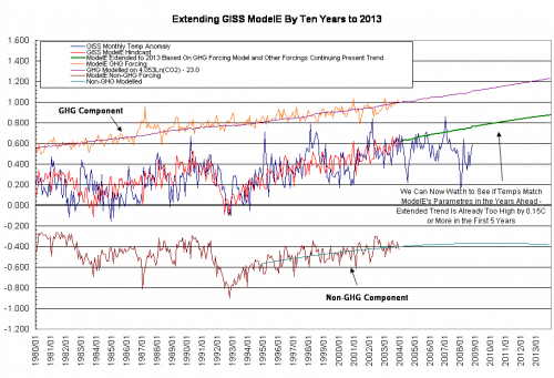
All of this is a long, long intro to a guest post on WUWT by Bill Illis.  He digs into one of the major climate models, GISS model E, and looks at the back-casts from this model.  What he finds mirrors a lot of what we discussed above:

modeleextraev0

Blue is the GISS actual temperature measurement.  Red is the model’s hind-cast of temperatures.  You can see that they are remarkably, amazingly, staggeringly close.  There are chaotic systems we have been modelling for hundreds of years (e.g. the economy) where we have never approached the accuracy this relative infant of a science seems to achieve.

That red forecasts in the middle is made up of a GHG component, shown in orange, plus a negative “everything else” component, shown in brown.  Is this starting to seem familiar?  Does the brown line smell suspiciously to anyone else like a “plug?”  Here are some random thoughts inspired by this chart:

  1. As with any surface temperature measurement system, the GISS system is full of errors and biases and gaps.  Some of these their proprietors would acknowledge, and such have been pointed out by outsiders.  Never-the-less, the GISS metric is likely to have an error of at least a couple tenths of a degree.  Which means the climate model here is perfectly fitting itself to data that isn’t even likely correct.  It is fitting closer to the GISS temperature number than the GISS temperature number likely fits to the actual world temperature anomaly, if such a thing could be measured directly.  Since the Hadley Center or the satellite guys at UAH and RSS get different temperature histories for the last 30-100 years, it is interesting that the GISS model exactly matches the GISS measurement but not these others.  Does that make anyone suspicious?  When the GISS makes yet another correction of its historical data, will the model move with it?
  2. As mentioned before, the sum total of time spent over the last 10 years trying to carefully assess the forcings from other natural and man-made effects and how they vary year-to-year is minuscule compared to the time spent looking at CO2.  I don’t think we have enough knowledge to draw the Co2 line on this chart, but we CERTAINLY don’t have knowledge to draw the “all other” line (with monthly resolution, no less!).
  3. Looking back over history, it appears the model is never off by more than 0.4C in any month, and never goes more than about 10 months before re-intersecting the “actual” line.  Does it bother anyone else that this level of precision is several times higher than the model has when run forward?  Almost immediately, the model is more than 0.4C off, and goes years without intercepting reality.

Global Warming “Accelerating”

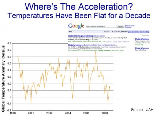
I have written a number of times about the “global warming accelerating” meme.  The evidence is nearly irrefutable that over the last 10 years, for whatever reason, the pace of global warming has decelerated (click below to enlarge)

hansenjan20091

This is simply a fact, though of course it does not necessarily “prove” that the theory of catastrophic anthropogenic global warming is incorrect.  Current results continue to be fairly consistent with my personal theory, that man-made CO2 may add 0.5-1C to global temperatures over the next century (below alarmist estimates), but that this warming may be swamped at times by natural climactic fluctuations that alarmists tend to under-estimate.

Anyway, in this context, I keep seeing stuff like this headline in the WaPo

Scientists:  Pace of Climate change Exceeds Estimates

This headline seems to clearly imply that the measured pace of actual climate change is exceeding previous predictions and forecasts.   This seems odd since we know that temperatures have flattened recently.  Well, here is the actual text:

The pace of global warming is likely to be much faster than recent predictions, because industrial greenhouse gas emissions have increased more quickly than expected and higher temperatures are triggering self-reinforcing feedback mechanisms in global ecosystems, scientists said Saturday.

“We are basically looking now at a future climate that’s beyond anything we’ve considered seriously in climate model simulations,” Christopher Field, founding director of the Carnegie Institution’s Department of Global Ecology at Stanford University, said at the annual meeting of the American Association for the Advancement of Science.

So in fact, based on the first two paragraphs, in true major media tradition, the headline is a total lie.  In fact, the correct headline is:

“Scientists Have Raised Their Forecasts for Future Warming”

Right?  I mean, this is all the story is saying, is that based on increased CO2 production, climate scientists think their forecasts of warming should be raised.  This is not surprising, because their models assume a direct positive relationship between CO2 and temperature.

The other half of the statement, that “higher temperatures are triggering self-reinforcing feedback mechanisms in global ecosystems” is a gross exaggeration of the state of scientific knowledge.  In fact, there is very little good understanding of climate feedback as a whole.  While we may understand individual pieces – ie this particular piece is a positive feedback – we have no clue as to how the whole thing adds up.  (see my video here for more discussion of feedback)

In fact, I have always argued that the climate models’ assumptions of strong positive feedback (they assume really, really high levels) is totally unrealistic for a long-term stable system.  In fact, if we are really seeing runaway feedbacks triggered after the less than one degree of warming we have had over the last century, it boggles the mind how the Earth has staggered through the last 5 billion years without a climate runaway.

All this article is saying is “we are raising our feedback assumptions higher than even the ridiculously high assumptions we were already using.”  There is absolutely no new confirmatory evidence here.

But this creates a problem for alarmists

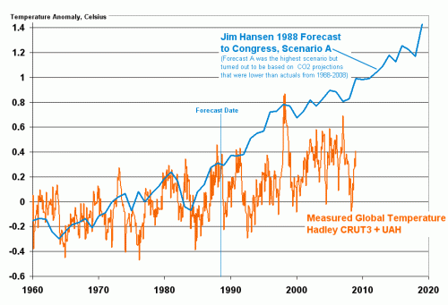
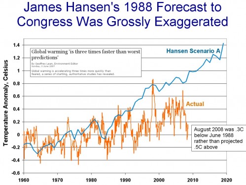
For you see, their forecasts have consistently demonstrated themselves to be too high.  You can see above how Hansen’s forecast to Congress 20 years ago has played out (and the Hansen A case was actually based on a CO2 growth forecast that has turned out to be too low).  Lucia, who tends to be scrupulously fair about such things, shows the more recent IPCC models just dancing on the edge of being more than 2 standard deviations higher than actual measured results.

But here is the problem:  The creators of these models are now saying that actual CO2 production, which is the key input to their model, is far exceeding their predictions.  So, presumably, if they re-ran their predictions using actual CO2 data, they would get even higher temperature forecasts. Further, they are saying that the feedback multiplier in their models should be higher as well.  But the forecasts of their models are already high vs. observations — this will even cause them to diverge further from actual measurements.

So here is the real disconnect of the model:  If you tell me that modelers underestimated the key input (CO2) in their models,  and have so far overestimated the key output (Temperature), I would have said the conclusion to this article is that climate sensitivity must be lower than what was embedded in the models.  But they are saying exactly the opposite.  How is this possible?

Postscript: I hope readers understand this, but it is worth saying because clearly reporters do not understand this:  There is no way that climate change from CO2 can be accelerating if global warming is not accelerating.  There is no mechanism I have ever heard by which CO2 can change the climate without the intermediate step of raising temperatures.  Co2–>temperature increase–>changes in the climate.

Update: Chart originally said 1998 forecast.  Has been corrected to 1988.

Update#2: I am really tired of having to re-explain the choice of using Hansen’s “A” forecast, but I will do it again.  Hansen had forecasts A, B, C, with A being based on more CO2 than B, and B with more CO2 than C.  At the time, Hansen said he thought the A case was extreme.  This is then used by his apologists to say that I am somehow corrupting Hansen’s intent or taking him out of context by using the A case, because Hansen himself at the time said the A case was probably high.

But the only difference between A, B, and C were not the model assumptions of climate sensitivity or any other variable — they only differed in the amount of Co2 growth and the number of volcano eruptions (which have a cooling effect via aerosols).  We can go back and decide for ourselves which case turned out to be the most or least conservative.   As it turns out, all three cases UNDERESTIMATED the amount of CO2 man produced in the last 20 years.  So, we should not really use any of these lines as representative, but Scenario A is by far the closest.  The other two are way, way below our actual CO2 history.

The people arguing to use, say, the C scenario for comparison are being disingenuous.  The C scenario, while closer to reality in its temperature forecast, was based on an assumption of a freeze in Co2 production levels, something that obviously did not occur.

What Other Discipline Does This Sound Like?

Arnold Kling via Cafe Hayek on macro-economic modelling:

We badly want macroeconometrics to work.  If it did, we could resolve bitter theoretical disputes with evidence.  We could achieve better forecasting and control of the economy.  Unfortunately, the world is not set up to enable macroeconometrics to work.  Instead, all macroeconometric models are basically simulation models that use data for calibration purposes.  People judge these models based on their priors for how the economy works.  Imposing priors related to rational expectations does not change the fact that macroeconometrics provides no empirical information to anyone except those who happen to share all of the priors of the model-builder.

Can you have a consensus if no one agrees what the consensus is?

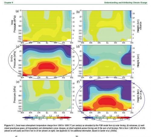
Over at the Blackboard, Lucia has a post with a growing set of comments about anthropogenic warming and the tropical, mid-tropospheric hotspot.  Unlike many who are commenting on the topic, I have actually read most of the IPCC AR4 (painful as that was), and came to the same conclusion as Lucia:  that the IPCC said the climate models predicted a hot spot in the mid-troposphere, and that this hot spot was a unique fingerprint of global warming (“fingerprint” being a particularly popular word among climate scientists).  Quoting Lucia:

I have circled the plates illustrating the results for well mixed GHG’s and those for all sources of warming combined. As you see, according to the AR4– a consensus document written for the UN’s IPCC and published in 2007 — models predict the effect of GHG’s as distinctly different from that of solar or volcanic forcings. In particular: The tropical tropospheric hotspots appears in the plate discussing heating by GHG’s and does not appear when the warming results from other causes.

hotspotar9_fordeepclimate

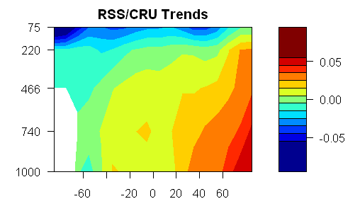
OK, pretty straight-forward.   The problem is that this hot spot has not really appeared.  In fact, the pattern of warming by altitude and latitude over the last thirty years looks nothing like the circled prediction graphs.  Steve McIntyre does some processing of RSS satellite data and produces this chart of actual temperature anomalies for the last 30 years by attitude and altitude  (Altitude is measured in these graphs by atmospheric pressure, where 1000 millibars is the surface and 100 millibars is about 10 miles up.

bigred50

The scientists at RealClimate (lead defenders of the climate orthodoxy) are not unaware that the hot spot is not appearing.  They responded about a year ago that 1)  The hot spot is not an anthropogentic-specific fingerprint at all, but will result from all new forcings

the pattern really has nothing to do with greenhouse gas changes, but is a more fundamental response to warming (however caused). Indeed, there is a clear physical reason why this is the case – the increase in water vapour as surface air temperature rises causes a change in the moist-adiabatic lapse rate (the decrease of temperature with height) such that the surface to mid-tropospheric gradient decreases with increasing temperature (i.e. it warms faster aloft). This is something seen in many observations and over many timescales, and is not something unique to climate models.

and they argued 2) that we have not had enough time for the hot spot to appear and they argued 3) all that satellite data really has a lot of error in it anyway.

Are the Real Climate guys right on this?  I don’t know.  That’s what they suck up all my tax money for, to figure this stuff out.

But here is what makes me crazy:  It is quite normal in science for scientists to have a theory, make a prediction based on this theory, and then go back and tweak the theory when data from real physical processes does not match the predictions.  There is certainly no shame in being wrong.  The whole history of science is about lurching from failed hypothesis to the next, hopefully improving understanding with each iteration.

But the weird thing about climate science is the sort of Soviet-era need to rewrite history.  Commenters on both Lucia’s site and at Climate Audit argue that the IPCC never said the hot spot was a unique fingerprint.  The fingerprint has become an un-person.

Why would folks want to do this?  After all, science is all about hypothesis – experimentation – new hypothesis.  Well, most science.  The problem is that climate science has been declared to be 1)  A Consensus and 2) Settled.    But settled consensus can’t, by definition, have disagreements and falsified forecasts.  So history has to be rewritten to protect the infallibility of the Pope the Presidium the climate consensus.  It’s a weird way to conduct science, but a logical outcome when phrases like “the science is settled” and  “consensus” are used as clubs to silence criticism.

More on the Sun

I wouldn’t say that I am a total sun hawk, meaning that I believe the sun and natural trends are 100% to blame for global warming. I don’t think it unreasonable to posit that once all the natural effects are unwound, man-made CO2 may be contributing a 0.5-1.0C a century trend (note this is far below alarmist forecasts).

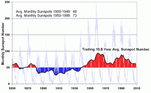
But the sun almost had to be an important fact in late 20th century warming. Previously, I have shown this chart of sunspot activity over the last century, demonstrating a much higher level of solar activity in the second half than the first (the 10.8 year moving average was selected as the average length of a 20th century sunspot cycle).
sunspot2

Alec Rawls has an interesting point to make about how folks are considering the sun’s effect on climate:

Over and over again the alarmists claim that late 20th century warming can’t be caused by the solar-magnetic effects because there was no upward trend in solar activity between 1975 and 2000, when temperatures were rising. As Lockwood and Fröhlich put it last year:

Since about 1985,… the cosmic ray count [inversely related to solar activity] had been increasing, which should have led to a temperature fall if the theory is correct – instead, the Earth has been warming. … This should settle the debate.

Morons. It is the levels of solar activity and galactic cosmic radiation that matter, not whether they are going up or down. Solar activity jumped up to “grand maximum” levels in the 1940’s and stayed there (averaged across the 11 year solar cycles) until 2000. Solar activity doesn’t have to keep going up for warming to occur. Turn the gas burner under a pot of stew to high and the stew will heat. You don’t have to keep turning the flame up further and further to keep getting heating!

Update: A commenter argues that I am simplistic and immature in this post.  I find this odd, I guess, for the following reason.  One group tends to argue that the sun is largely irrelevant to the past century’s temperature increases.  Another argues that the sun is the main or only driver.  I argue that the evidence seems to point to it being a mix, with the sun explaining some but not all of the 20th century increase, and I am the one who is simplistic?

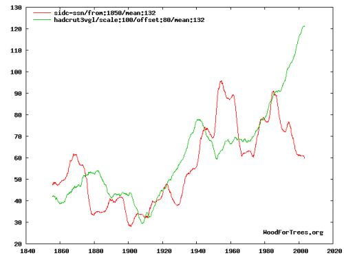
The commenter links to this graph, which I will include.  It is a comparison of the Hadley CRUT3 global temperature index (green) and sunspot numbers (red):

mean-132

Since I am so ridiculously immature, I guess I don’t trust myself to interpret this chart, but I would have happily used this chart myself had I had access to it originally.  Its wildly dangerous to try to visually interpret data and data correlations, but I don’t think it is unreasonable to say that there might be a relationship between these two data sets.  Certainly not 100%, but then again the same could easily be said of the relationship of temperature to Co2.  The same type of inconsistencies the commenter points out in this correlation could easily be made for Co2 (e.g., why, if CO2 was increasing, and in fact accelerating, were temps in 1980 lower than 1940?

The answer, of course, is that climate is complicated.  But I see nothing in this chart that is inconsistent with the hypothesis that the sun might have been responsible for half of the 20th century warming.  And if Co2 is left with just 0.3-0.4C warming over the last century, it is a very tough road to get from past warming to sensitivities as high as 3C or greater.  I have all along contended that Co2 will likely drive 0.5-1.0C warming over the next century, and see nothing in this chart that makes me want to change that prediction.

Update #2: I guess I must be bored tonight, because commenter Jennifer has inspired me to go beyond my usual policy of not mixing it up much in the comments section.  A lengthy response to her criticism is here.

Steve Chu: “Climate More Sensitive Than We Thought”

The quote in the title comes from Obama’s nominee to become energy secretary, Steven Chu.  Specifically,

Chu’s views on climate change would be among the most forceful ever held by a cabinet member. In an interview with The Post last year, he said that the cost of electricity was “anomalously low” in the United States, that a cap-and-trade approach to limiting greenhouse gases “is an absolutely non-partisan issue,” and that scientists had come to “realize that the climate is much more sensitive than we thought.”

I will leave aside of why hard scientists typically make bad government officials (short answer:  they have a tendency towards hubris in their belief in a technocrats ability to optimize complex systems.  If one thinks they can assign a 95% probability that a specific hurricane is due to man-made CO2, against the backdrop of the unimaginable chaos of the Earth’s climate, then they will often have similar overconfidence in regulating the economy and/or individual behavior).

However, I want to briefly touch on his “more sensitive” comment.

Using assumptions from the last IPCC report, we can disaggregate climate forecasts into two components:  the amount of warming from CO2 alone, and the multiplication of this warming by feedbacks in the climate.  As I have pointed out before, even by the IPCC’s assumptions, most of the warming comes not from CO2 alone, but from assumed quite large positive feedbacks.

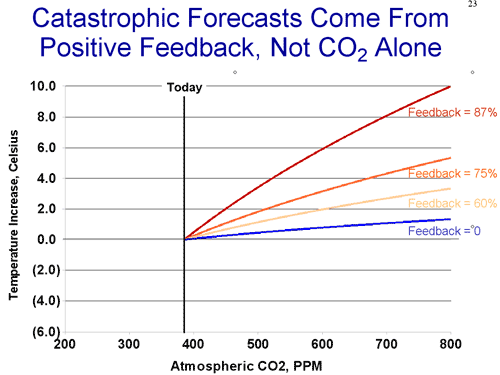
feedback1

This is based on the formula used by the IPCC (which may or may not be exaggerated)

T = F(C2) – F(C1) Where F(c) = Ln(1+1.2c+0.005c2+0.0000014c3)

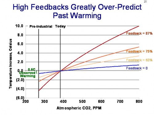
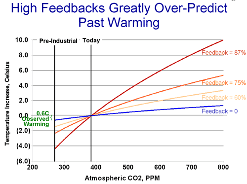
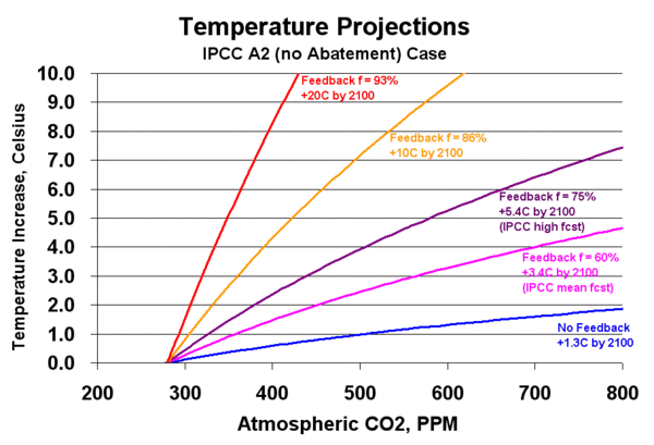
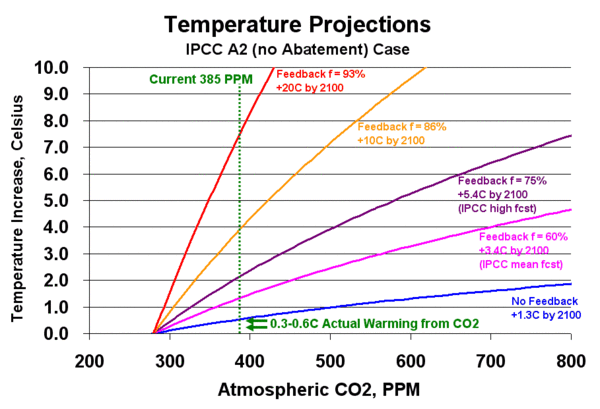
Plotting this formula, we get the blue no-feedback line above (which leads to about a degree of warming over the next century).  We then apply the standard feedback formula of Multiplier = 1/(1-feedback%)  to get the other lines with feedback.  It requires a very high 60% positive feedback number to get a 3C per century rise, close to the IPCC base forecast, and nutty 87% feedback to get temperature rises as high as 10C, which have been quoted breathlessly in the press.  It is amazing to me that any natural scientist can blithely accept such feedback numbers as making any sense at all, particularly since every other long-term stable natural process is dominated by negative rather than positive feedback.

By saying that climate is “more sensitive than we thought” means essentially that Mr. Chu and others are assuming higher and higher levels of positive feedback.  But even the lower feedback numbers are almost impossible to justify given past experience.  If we project these sensitivity numbers backwards, we see:

feedback2

The higher forecasts for the future imply that we should have seen 2-4C of warming over the last century, which we clearly have not.  Even if all the past warming of the last century is attributable to man’s CO2  (a highly unlikely assumption) past history only really justifies the zero feedback case  (yes, I know about damping and time delays and masking and all that — but these adjustments don’t come close to closing the gap).

In fact, there is good evidencethat at most, man’s CO2 is responsible for about half the past warming, or 0.3-0.4C.  But if that is the case, as the Reference Frame put it:

The authors looked at 750 years worth of the local ice core, especially the oxygen isotope. They claim to have found a very strong correlation between the concentration of this isotope (i.e. temperature) on one side and the known solar activity in the epoch 1250-1850. Their data seem to be precise enough to determine the lag, about 10-30 years. It takes some time for the climate to respond to the solar changes.

It seems that they also have data to claim that the correlation gets less precise after 1850. They attribute the deviation to CO2 and by comparing the magnitude of the forcings, they conclude that “Our results are in agreement with studies based on NH temperature reconstructions [Scafetta et al., 2007] revealing that only up to approximately 50% of the observed global warming in the last 100 years can be explained by the Sun.”…

Note that if 0.3 °C or 0.4 °C of warming in the 20th century was due to the increasing CO2 levels, the climate sensitivity is decisively smaller than 1 °C. At any rate, the expected 21st century warming due to CO2 would be another 0.3-0.4 °C (the effect of newer CO2 molecules is slowing down for higher concentrations), and this time, if the solar activity contributes with the opposite sign, these two effects could cancel.

Not surprisingly, then, given enough time to measure against them, alarmist climate forecasts, such as James Hansen’s below, tend over-estimate actual warming.  Which is probably why the IPCC throws out their forecasts and redoes them every 5 years, so no one can call them on their failures (click to enlarge chart below)

hansen

Because, at the end of the day, for whatever reason, warming has slowed or stopped over the last 10 years, even as CO2 concentrations have increased faster than ever in the modern period.  So it is hard to say what physical evidence one can have that tenperature sensitivity to CO2 is increasing.

last10

Update: First, to answer a couple of questions, the data above is from the UAH, not Hansen’s GISS.  To be fair to Hansen, it has been adjusted to be re-centered on his data for the period before 1988 (since all of the major data sets use different zero centers for their anomalies, they have to be re-centered to be compared, a step many often forget to take).

I have a number of issues with the quality and reliability of surface temperature data, and the GISS data in particular, so I think the satellite data is a better source (just as we abandoned observations by passing ships in favor of satellite measurement of sea ice extent, it is probably time to do the same for surface temperature measurement).    Second, if I understand one of the comments correctly, there is some implication that I am being nefarious is cutting off the data in August of 2008.   Hardly.  Unlike those who work at this full time, I do this as a hobby between crises in my day job,  so I tend to reuse charts for a few months until I have time to create new ones.  Certainly there is nothing in the Sep-Nov UAH temperature data, though, that magically validates Hansen’s forecast.  I think November was a few tenths higher than August (making it just about even with June 1988) but well short of Hansen’s forecast.

One thing I didn’t mention, but Hansen and his enablers are often dishonest in trying to explain away the above forecast.  They will say, well, the A case was extreme and not meant to conform to reality.  But the only differences between the forecasts was in their CO2 output assumptions, and in fact Hansen A actually understated CO2 production and growth since 1988.  If anything, it was conservative!

Polar Amplification

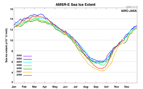
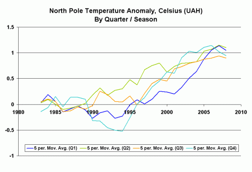
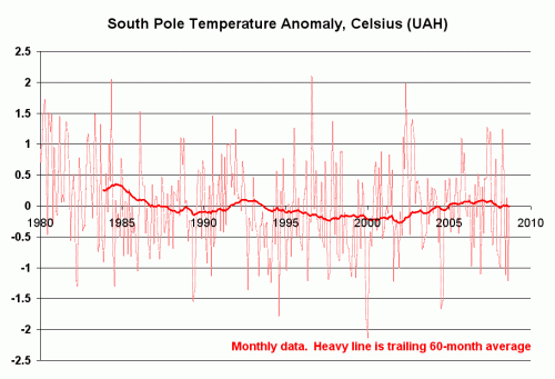
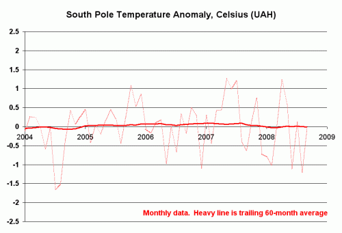
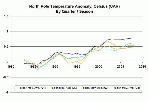
Climate models generally say that surface warming on the Earth from greenhouse gasses should be greater at the poles than at the tropics.  This is called “polar amplification.”  I don’t now if the models originally said this, or if it was observed that the poles were warming more so it was thereafter built into the models, but that’s what they say now.  This amplification is due in part to how climate forcings around the globe interact with each other, and in part due to hypothesized positive feedback effects at the poles.  These feedback effects generally center around increases in ice melts and shrinking of sea ice extents, which causes less radiative energy to be reflected back into space and also provides less insulation of the cooler atmosphere from the warmer ocean.

In response to polar amplification, skeptics have often shot back that there seems to be a problem here, as while the North Pole is clearly warming, it can be argued the South Pole is cooling and has seen some record high sea ice extents at the exact same time the North Pole has hit record low sea ice extents.

Climate scientists now argue that by “polar amplification” they really only meant the North Pole.  The South Pole is different, say some scientists (and several comm enters on this blog) because the larger ocean extent in the Southern Hemisphere has always made it less susceptible ot temperature variations.  The latter is true enough, though I am not sure it is at all relevant to this issue.  In fact, per this data from the Cryosphere today, the seasonal change in sea ice area is larger in the Antarctic than the Arctic, which might argue that the south should see more sea ice extent.  Anyway, even the realclimate folks have never doubted it applied to the Antarctic, they just say it is slow to appear.

Anyway, I won’t go into the whole Antarctic thing more (except maybe in a postscript) but I do want to ask a question about Arctic amplification.  If the amplification comes in large part due to decreased albedo and more open ocean surface, doesn’t that mean most of the effect should be visible in summer and fall?  This would particularly be our expectation when we recognize that most of the recent anomaly in sea ice extent in the Arctic has been in summer.  I will repeat this chart just to remind you:

sea_ice

You can see that July-August-September are the biggest anomaly periods.  I took the UAH temperature data for the Arctic, and did something to it I had not seen before — I split it up into seasons.  Actually, I split it up into quarters, but these come within 8 days or so of matching the seasons.  Here is what I found (I used 5 year moving averages because the data is so volatile it was hard to eyeball a trend;  I also set each of the 4 seasonal anomalies individually to zero using the period 199-1989 as the base period)

seasons1

I see no seasonal trend here.  In fact, winter and spring have the highest anomalies vs. the base period, but the differences are so small currently as to be insignificant.  If polar amplification were occurring and the explanation for the North Pole warming more than the rest of the Earth (by far) over the last 30 years, shouldn’t I see it in the seasonal data.  I am honestly curious, and would like comments.

Postscript: Gavin Schmidt (who else) and Eric Steig have an old article in RealClimate if you want to read their Antarctic apologia.   It is kind of a funny article, if one asks himself “how many of the statements do they make discounting Antarctic cooling are identical to the ones skeptics use in reverse?  Here are a couple of gems:

It is important to recognize that the widely-cited “Antarctic cooling” appears, from the limited data available, to be restricted only to the last two decades

Given that this was written in 2004, he means restricted to 1984-2004.  Unlike global warming? By the way, he would see it for much longer than 20 years if these NASA scientists were not so hostile to space technologies (ie satellite measurement)

south_pole

It gets better.  They argue:

Additionally, there is some observational evidence that atmospheric dynamical changes may explain the recent cooling over parts of Antarctica. .

Thompson and Solomon (2002) showed that the Southern Annular Mode (a pattern of variability that affects the westerly winds around Antarctica) had been in a more positive phase (stronger winds) in recent years, and that this acts as a barrier, preventing warmer air from reaching the continent.

Interestingly, these same guys now completely ignore the same type finding when it is applied to North Pole warming.  Of course, this finding was made by a group entire hostile to folks like Schmidt at NASA. It comes from…. NASA

A new NASA-led study found a 23-percent loss in the extent of the Arctic’s thick, year-round sea ice cover during the past two winters. This drastic reduction of perennial winter sea ice is the primary cause of this summer’s fastest-ever sea ice retreat on record and subsequent smallest-ever extent of total Arctic coverage. …

Nghiem said the rapid decline in winter perennial ice the past two years was caused by unusual winds. “Unusual atmospheric conditions set up wind patterns that compressed the sea ice, loaded it into the Transpolar Drift Stream and then sped its flow out of the Arctic,” he said. When that sea ice reached lower latitudes, it rapidly melted in the warmer waters

I think I am going to put this into every presentation I give.  They say:

First, short term observations should be interpreted with caution: we need more data from the Antarctic, over longer time periods, to say with certainly what the long term trend is. Second, regional change is not the same as global mean change.

Couldn’t agree more.  Practice what you preach, though.  Y’all are the same guys raising a fuss over warming on the Antarctic Peninsula and the Lassen Ice Shelf, less than 2% of Antarctica which in turn is only a small part of the globe.

I will give them the last word, from 2004:

In short, we fully expect Antarctica to warm up in the future.

Of course, if they get the last word, I get the last chart (again from those dreaded satellites – wouldn’t life be so much better at NASA without satellites?)

south_pole2

Update:  I ran the same seaonal analysis for may different areas of the world.  The one area I got a strong seasonal difference that made sense was for the Northern land areas above the tropics.

seasons2

This is roughly what one would predict from CO2 global warming (or other natural forcings, by the way).  The most warming is in the winter, when reduced snow cover area reduces albedo and so provides positive feedback, and when cold, dry night air is thought to be more sensitive to such forcings.

For those confused — the ocean sea ice anomaly is mainly in the summer, the land snow/ice extent anomaly will appear mostly in the winter.

Computer Models

Al Gore has argued that computer models can be trusted to make long-term forecasts, because Wall Street has been using such models for years.  From the New York Times:

In fact, most Wall Street computer models radically underestimated the risk of the complex mortgage securities, they said. That is partly because the level of financial distress is “the equivalent of the 100-year flood,” in the words of Leslie Rahl, the president of Capital Market Risk Advisors, a consulting firm.

But she and others say there is more to it: The people who ran the financial firms chose to program their risk-management systems with overly optimistic assumptions and to feed them oversimplified data. This kept them from sounding the alarm early enough.

Top bankers couldn’t simply ignore the computer models, because after the last round of big financial losses, regulators now require them to monitor their risk positions. Indeed, if the models say a firm’s risk has increased, the firm must either reduce its bets or set aside more capital as a cushion in case things go wrong.

In other words, the computer is supposed to monitor the temperature of the party and drain the punch bowl as things get hot. And just as drunken revelers may want to put the thermostat in the freezer, Wall Street executives had lots of incentives to make sure their risk systems didn’t see much risk.

“There was a willful designing of the systems to measure the risks in a certain way that would not necessarily pick up all the right risks,” said Gregg Berman, the co-head of the risk-management group at RiskMetrics, a software company spun out of JPMorgan. “They wanted to keep their capital base as stable as possible so that the limits they imposed on their trading desks and portfolio managers would be stable.”

Tweaking model assumptions to get the answer you want from them?  Unheard of!

Measuring Climate Sensitivity

As I am sure most of my readers know, most climate models do not reach catastrophic temperature forecasts from CO2 effects alone.  In these models, small to moderate warming by CO2 is multiplied many fold by assumed positive feedbacks in the climate system.  I have done some simple historical analyses that have demonstrated that this assumption of massive positive feedback is not supported historically.

However, many climate alarmists feel they have good evidence of strong positive feedbacks in the climate system.  Roy Spencer has done a good job of simplifying his recent paper on feedback analysis in this article.  He looks at satellite data from past years and concludes:

We see that the data do tend to cluster along an imaginary line, and the slope of that line is 4.5 Watts per sq. meter per deg. C. This would indicate low climate sensitivity, and if applied to future global warming would suggest only about 0.8 deg. C of warming by 2100.

But he then addresses the more interesting issue of reconciling this finding with other past studies of the same phenomenon:

Now, it would be nice if we could just stop here and say we have evidence of an insensitive climate system, and proclaim that global warming won’t be a problem. Unfortunately, for reasons that still remain a little obscure, the experts who do this kind of work claim we must average the data on three-monthly time scales or longer in order to get a meaningful climate sensitivity for the long time scales involved in global warming (many years).

One should always before of a result where the raw data yield one result but averaged data yields another.  Data averaging tends to do funny things to mask physical processes, and this appears to be no exception here.  He creates a model of the process, and finds that such averaging always biases the feedback result higher:

Significantly, note that the feedback parameter line fitted to these data is virtually horizontal, with almost zero slope. Strictly speaking that would represent a borderline-unstable climate system. The same results were found no matter how deep the model ocean was assumed to be, or how frequently or infrequently the radiative forcing (cloud changes) occurred, or what the specified feedback was. What this means is that cloud variability in the climate system always causes temperature changes that "look like" a sensitive climate system, no matter what the true sensitivity is.

In short, each time he plugged low feedback into the model, the data that emerged mimicked that of a high feedback system, with patterns very similar to what researchers have seen in past feedback studies of actual temperature data. 

Interestingly, the pattern is sort of a circular wandering pattern, shown below:Simplemodelradiativeforcing

I will have to think about it a while — I am not sure if it is a real or spurious comparison, but the path followed by his model system is surprisingly close to that in the negative feedback system I modeled in my climate video, that of a ball in the bottom of a bowl given a nudge (about 3 minutes in).

5% Chance? No Freaking Way

Via William Biggs, Paul Krugman is quoting a study that says there is a 5% chance man’s CO2 will raise temperatures 10C and a 1% chance man will raise global temperatures by 20 Celsius.  The study he quotes gets these results by applying various statistical tests to the outcomes from the IPCC climate models.

I am calling Bullshit.

There are any number of problems with the Weitzman study that is the basis for these numbers, but I will address just two.

The more uncertain the models, the more certain the need for action?

The first problem is in looking at the tail end (e.g. the last 1 or 5 percent) of a distribution of outcomes for which we don’t really know the mean and certainly don’t know the standard deviation.  In fact, the very uncertainty in the modeling and lack of understanding of the values of the most basic assumptions in the models creates an enormous standard deviation.  As a result, the confidence intervals are going to be huge, such that about every imaginable value may be within them. 

In most sciences, outsiders would use the fact of these very wide confidence intervals to deride the findings, arguing that the models were close to meaningless and they would be reluctant to make policy decisions based on these iffy findings.  Weitzman, however, uses this ridiculously wide range of potential projections and total lack of certainty to increase the pressure to take policy steps based on the models, by cleverly taking advantage of the absurdly wide confidence intervals to argue that the tail way out there to the right spells catastrophe.  By this argument, the worse the models and the more potential errors that exist, then the wider the distribution of outcomes and therefore the greater the risk and need for government action.  The less we understand anthropogenic warming, the more vital it is that we take immediate, economy-destroying action to combat it.  Following this argument to its limit, the risks we know nothing about are the ones we need to spend the absolute most money on.  By this logic, the space aliens we know nothing about out there pose an astronomical threat that justifies immediate application of 100% of the world’s GDP to space defenses. 

My second argument is simpler:  Looking at the data, there is just no freaking way. 

In the charts below, I have given climate alarmists every break.  I have used the most drastic CO2 forecast (A2) from the IPCC fourth assessment, and run the numbers for a peak concentration around 800ppm.  I have used the IPCC’s own formula for the effect of CO2 on temperatures without feedback  (Temperature Increase = F(C2) – F(C1) where F(c)=Ln (1+1.2c+0.005c^2 +0.0000014c^3) and c is the concentration in ppm).  Note that skeptics believe that both the 800ppm assumption and the IPCC formula above overstate warming and CO2 buildup, but as you will see, it is not going to matter.

The other formula we need is the feedback formula.  Feedback multiplies the temperature increase from CO2 alone by a factor F, such that F=1/(1-f), where f is the percentage of the original forcing that shows up as first order feedback gain (or damping if negative).

The graph below shows various cases of temperature increase vs. CO2 concentration, based on different assumptions about the physics of the climate system.  All are indexed to equal zero at the pre-industrial CO2 concentration of about 280ppm.

So, the blue line below is the temperature increase vs. CO2 concentration without feedback, using the IPCC formula mentioned above.  The pink is the same formula but with 60% positive feedback (1/[1-.6] = a 2.5 multiplier), and is approximately equal to the IPCC mean for case A2.  The purple line is with 75% positive feedback, and corresponds to the IPCC high-side temperature increase for case A2.  The orange and red lines represent higher positive feedbacks, and correspond to the 10C 5% case and 20C 1% case in Weitzman’s article.  Some of this is simplified, but in all important respects it is by-the-book based on IPCC assumptions.

Agwforecast1

OK, so what does this tell us?  Well, we can do something interesting with this chart.   We have actually moved part-way to the right on this chart, as CO2 today is now at 385ppm, up from the pre-industrial 280ppm.  As you can see, I have drawn this on the chart below.  We have also seen some temperature increase from CO2, though no one really knows what the increase due to CO2 has been vs. the increase due to the sun or other factors.  But the number really can’t be much higher than 0.6C, which is about the total warming we have recorded in the last century, and may more likely be closer to 0.3C.  I have drawn these two values on the chart below as well.

Agwforecast2

Again, there is some uncertainty in a key number (e.g. the amount of historic warming due to CO2) but you can see that it really doesn’t matter.  For any conceivable range of past temperature increases due to the CO2 increase from 280-385 ppm, the numbers are no where near, not even within an order of magnitude, of what one would expect to have seen if the assumptions behind the other lines were correct.  For example, if we were really heading to a 10C increase at 800ppm, we would have expected temperatures to have risen in the last 100 years by about 4C, which NO ONE thinks is even remotely the case.  And if there is zero chance historic warming from man-made CO2 is anywhere near 4C, then there is zero (not 5%, not 1%) chance future warming will hit 10C or 20C.

In fact, experience to date seems to imply that warming has been under even the no feedback case.  This should not surprise anyone in the physical sciences.  A warming line on this chart below the no feedback line would imply negative feedback or damping in the climate system.  And, in fact, most long term stable physical systems are dominated by such negative feedback and not by positive feedback.  In fact, it is hard to find many natural processes except for perhaps nuclear fission that are driven by positive feedbacks as high as one must assume to get the 10 and 20C warming cases.  In short, these cases are absurd, and we should be looking closely at whether even the IPCC mean case is overstated as well.

What climate alarmists will argue is that these curves are not continuous.  They believe that there is some point out there where the feedback fraction goes above 100%, and thus the gain goes infinite, and the temperature runs away suddenly.  The best example is fissionable material being relatively inert until it reaches critical mass, when a runaway nuclear fission reaction occurs. 

I hope all reasonable people see the problem with this.  The earth, on any number of occasions, has been hotter and/or had higher CO2 concentrations, and there is no evidence of this tipping point effect ever having occurred.  In fact, climate alarmists like Michael Mann contradict themselves by arguing (in the infamous hockey stick chart) that temperatures absent mankind have been incredibly stable for thousands of years, despite numerous forcings like volcanoes and the Maunder Minimum.  Systems this stable cannot reasonably be dominated by high positive feedbacks, much less tipping points and runaway processes.

Postscript:  I have simplified away lag effects and masking effects, like aerosol cooling.  Lag effects of 10-15 years barely change this analysis at all.  And aerosol cooling, given its limited area of effect (cooling aerosols are short-lived and so are geographically limited in area downwind of industrial areas) is unlikely to be masking more than a tenth or two of warming, if any.  The video below addresses all these issues in more depth, and provides more step-by-step descriptions of how the charts above were created

Update:  Lucia Liljegren of the Blackboard has created a distribution of the warming forecasts from numerous climate models and model runs used by the IPCC, with "weather noise" similar to what we have seen over the last few decades overlaid on the model mean 2C/century trend. The conclusion is that our experience in the last century is unlikely to be solely due to weather noise masking the long-term trend.  It looks like even the IPCC models, which are well below the 10C or 20C warming forecasts disused above, may themselves be too high.  (click for larger version)

Trendhistogramipccjune2008

While Weitzman was looking at a different type of distribution, it is still interesting to observe that while alarmists are worried about what might happen out to the right at the 95% or 99% confidence intervals of models, the world seems to be operating way over to the left.

Testing the IPCC Climate Forecasts

Of late, there has been a lot of discussion about the validity of the IPCC warming forecasts because global temperatures, particularly when measured by anyone but the GISS, have been flat to declining and have in any case been well under the IPCC median projections. 

There has been a lot of debate about the use of various statistical tests, and how far and for how long temperatures need to run well below the forecast line before the forecasts can be considered to be invalid.  Beyond the statistical arguments, part of the discussion has been about the actual physical properties of the system (is there a time delay?  is heat being stored somewhere?)  Part of the discussion has been just silly  (IPCC defenders have claimed the forecasts had really, really big error bars, such that they can argue the forecasts are still valid while at the same time calling into question their utility).

Roger Pielke offers an alternative approach to validating these forecasts.  For quite a while, he has argued that measuring the changes in ocean heat content is a better way to look for a warming signal than to try to look at a global surface temperature anomaly.  He argues:

Heat, unlike temperature at a single level as used to construct a global average surface temperature trend, is a variable in physics that can be assessed at any time period (i.e. a snapshot) to diagnose the climate system heat content. Temperature  not only has a time lag, but a single level represents an insignificant amount of mass within the climate system.

What he finds is a hell of a lot of missing heat.  In fact, he finds virtually none of the heat that should have been added over the last four years if IPCC estimates of forcing due to CO2 are correct.