Category Archives: Current Weather

I am Sure That This Will Get “Fixed”

From NPR:

Some 3,000 scientific robots that are plying the ocean have sent home a puzzling message. These diving instruments suggest that the oceans have not warmed up at all over the past four or five years. That could mean global warming has taken a breather. Or it could mean scientists aren’t quite understanding what their robots are telling them.

Of course it could also mean that the global warming theories are wrong, but far be it for NPR to jump that far based on real data.  The article is fairly hilarious in that it gets quotes from people on every possible explanation for this phenomenon except that we might be misinterpreting the reason for recent atmospheric warming.  In fact the only thing the quoted scientists can agree on is that this new data has nothing to say about the accuracy of global warming theories:

Trenberth and Willis agree that a few mild years have no effect on the long-term trend of global warming. But they say there are still things to learn about how our planet copes with the heat.

My prediction is that they will hand this data over to James Hansen and he will make some adjustments and homogenizations, and then they will hand it off to Michael Mann for some of his statistical magic, and suddenly the world’s oceans will have warmed a LOT over the last 5 years.  Don’t laugh, it has happened before.

By the way, it is kind of funny to search for "NPR ocean temperatures" because the first result is this:

In Florida, the effects of global warming are evident several feet below the ocean’s surface. Marine scientists say warming ocean temperatures are taking a toll on North America’s only coral reef—an underwater ecosystem just off Florida’s Atlantic Coast. At a reef that stretches from Palm Beach through the Florida Keys, rising temperatures have led to an increase in what scientists call "coral bleaching."

Hmm, but the oceans were cooling during this study, apparently. In fact, it is interesting in retrospect that the authors of the coral bleaching study presented absolutely no data on ocean temperatures – it was just OK to assume the ocean was warming because everyone believed it to be.  This is what happens when a consensus is declared that no one is allowed to challenge – assumptions get made without actually checking the facts.

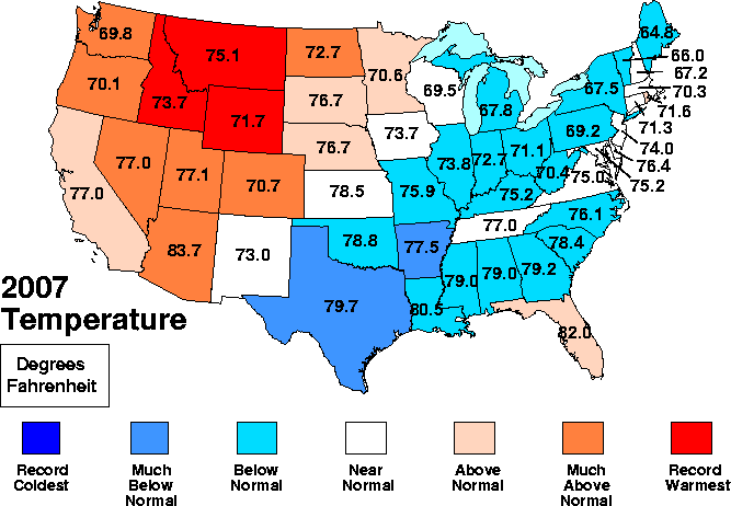
Brrrrrrr

Via Anthony Watt:

Of course we already have had a heads up from all the wire reports around the world talking about the significant winter weather events that have occurred worldwide in the last month, but until now, there hasn’t been a measure of how the planet was doing for the winter of 2007/2008.

Remote Sensing Systems of Santa Rosa just posted the latest MSU (Microwave Sounder Unit) data.

January posted a -.08°C near global anomaly between -70S and 82.5N latitude (the viewshed of the satellite sounder). That makes it the coldest month since January 2000, and the 2nd coldest January for the planet in 15 years. Both northern and southern hemispheres posted negative anomalies of -012°C and -.038°C respectively, happening for the first time since January 2000.

The United States posted a -.557°C anomaly for January 2008 and a -0.196°C anomaly for December 2007.

One can reasonably argue that this is a La Nina event and therefore cyclical rather than a sign of cooling or not-warming  (January 2000 was also in a La Nina).  Which is all well and good except for a couple of things.  First, scientists used to think that El Nino’s and La Nina’s didn’t heat or cool the world so much as redistribute it across the surface.  Now, with satellites being able to watch the whole world at the same time, they are being forced to rething this proposition. 

Second, while climate scientists can reasonably argue that current cold temperatures are cyclical rather than part of a longer trend because they are an La Nina, they did NOT make this same argument when the 1998 El Nino produced cyclically hotter temperatures.  All I remember about 1998 is Mann, Gore, Hansen and company all saying 1998 was the hottest year on record and proof of global warming.

Taking the World’s Temperature

I have gotten a couple of emails lately from people relatively new to the global warming topic who would just like to find a site that has updates on the earth’s actual temperature and CO2.  Unfortunately, that’s not quite as straightfoward as one might expect.  Measuring temperature, for example, is quite similar to the old proverb "he who has one clock always knows what time it is;  he who has two is never sure."

That being said, this is an excellent summary of temperature and CO2 from several sources, as well as a good overview of how these sources differ.  The person who puts the site together is a skeptic but the data sources are the actual data and he is careful to include even those data sources (such as the GISS) that skeptics think are exaggerated.

How Did Exxon Manage This?

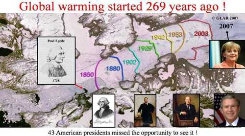
Somehow, man’s burning of fossil fuels in the late 20th century has caused glaciers to begin melting … starting in the 18th century. 

Courtesy of I Love My CO2, comes this map of the pretty steady retreat of a glacier in Greenland. 

Glacier_retreat_started_269_years_a

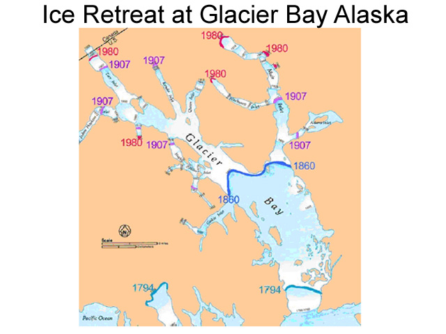
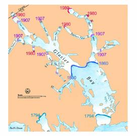
Unfortunately, I can’t find his source.  What makes me believe that this is accurate is this similar map of the glaciers at Glacier Bay, Alaska, from Alaska Geographic:

Image054

There is also pretty good evidence that the glaciers of Kilamanjaro were retreating before 1900 and most of their measured retreat has occured before 1950.  More here.

Antarctica

On Sunday, CBS claimed that Antarctica is melting.  In fact, once small portion of the Antarctic peninsula is warming and may be losing snow, while the rest of Antarctica has not been warming and in fact has been gaining ice cover.  The show visits an island off the Antarctic Peninsula which has about as much weather relevance and predictive power to the rest of Antarctica as Key West has to the rest of the United States.  Absolutely absurd.

Unfortunately, I have a real job and I don’t have time to restate all the rebuttals to the CBS show.  However, I took on the Antarctic issue in depth here, and this post at NC Media Watch has more.

How Much Are Sea Levels Rising?

This is a surprisingly tricky question.  It turns out sea level is much less of a static benchmark than we might imagine.  Past efforts to measure long-term trends in sea level have been frustrating.  For example, even if sea level is not changing, land level often is, via subsidence or the reverse.  The IPCC famously drew some of its most catastrophic sea level predictions from tide gages in Hong Kong that are on land that is sinking (thus imparting an artificial sea level rise in the data).

A new study tries to sort this out:

The article is published in Geophysical Research Letters, the authors are from Tulane University and the State University of New York at Stony Brook, and the work was not funded by any horrible industry group. Kolker and Hameed begin their article stating “Determining the rate of global sea level rise (GSLR) during the past century is critical to understanding recent changes to the global climate system. However, this is complicated by non-tidal, short-term, local sea-level variability that is orders of magnitude greater than the trend.”

Once again, we face the dual problems in climate measurement of 1. Sorting through long-term cyclical changes and 2. Very low signal to noise ratio in climate change data.

The authors further note that “Estimates of recent rates of global sea level rise (GSLR) vary considerably” noting that many scientists have calculated rates of 1.5 to 2.0 mm per year over the 20th century. They also show that other very credible approaches have led to a 1.1 mm per year result, and they note that “the IPCC [2007] calls for higher rates for the period 1993–2003: 3.1 ± 0.7.”…

Kolker and Hameed gathered long-term data regarding the Icelandic Low and the Azores High to capture variation and trend in atmospheric “Centers of Action” associated with the North Atlantic Oscillation which is regarded as “One potential driver of Atlantic Ocean sea level.” As seen in Figure 1, these large-scale features of atmospheric circulation vary considerably from year-to-year and appear to change through time in terms of latitude and longitude.

Kolker and Hameed used these relationships to statistically control for variations and trends in atmospheric circulation. They find that the “residual” sea level rise (that not explained by COA variability) in the North Atlantic lies somewhere between 0.49±0.25mm/yr and 0.93±0.39mm/yr depending on the assumptions they employ, which is substantially less than the 1.40 to 2.15 mm per year rise found in the data corrected for the glacial isostatic adjustment. This “residual” sea level rise includes both local processes such as sedimentation changes, as well as larger-scale processes such as rising global temperatures.

By the way, this forecast translates to 2-6 inches per century.  This falls slightly short of the 20+ feet Al Gore promised in his movie.

Sea Ice Rorschach Test

The chart below is from the Cryosphere Today and shows the sea ice anomaly for the short period of time (since 1979) we have been able to observe it by satellite.  The chart is large so you need to click the thumbnail below to really see it:

Sea_ice_jan_2008_2

OK, now looking at the anomaly in red, what do you see:

  1. A trend in sea ice consistent with a 100+ year warming trend?
  2. A sea ice extent that is remarkably stable except for an anomaly over the last three years which now appears to be returning to normal?

The media can only see #1.  I may be crazy, but it sure looks like #2 to me.

Observer Technology Bias in Hurricane Counts

A while back, I demonstrated how apparent increases in tornadoes in the US is entirely attributable to doppler radar and more storm observation points rather than any actual increase in tornadoes.  When one corrects for this measurement change, say by limiting the count only to very large tornadoes that were unlikely to escape detection even with older technology, the tornado count has actually gone down.

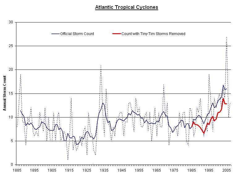
Steve McIntyre points out that the same effect exists for hurricanes.  In the early 1900’s, whole storms could easily be missed if no ship crossed paths with the storm and the storm never made landfall.  Better technology (e.g. satellites) bias current hurricane numbers upwards, but by how much.  In his post, he has a count of named Atlantic storms in just the last 20 years that would likely have escaped detection fifty years ago.  How many were there?

Frankly I was surprised. There are 52 storms on the list.That’s 52 out of the 252 storms in the official record, or 20% of the total. That’s 20% of the modern storms which lack a single classical (ship or shore) report of storm winds. Wow.

The obvious question is: how can one compare these satellite- and aircraft-based storms, which left no ship or shore evidence, with pre-1945 records which were based solely on ship and shore observations?

The result is a significant bias.  Below, he has only removed these 52 storms from the last 20 years.  Others post-WWII but before 1980 would have to be removed.  One can observe that nearly all of the increase in storms in the last half century seems to be due to this measurement bias, and not to, say, global warming:

1130073 click for larger version

What is Normal?

It seems that 29 years of satellite observation may in fact not be enough to fully understand climate cycles that can last tens, hundreds, or thousands of years:

A team of NASA and university scientists has detected an ongoing reversal in Arctic Ocean circulation triggered by atmospheric circulation changes that vary on decade-long time scales. The results suggest not all the large changes seen in Arctic climate in recent years are a result of long-term trend…

"Our study confirms many changes seen in upper Arctic Ocean circulation in the 1990s were mostly decadal in nature, rather than trends caused by global warming," said Morison….

The Arctic Oscillation was fairly stable until about 1970, but then varied on more or less decadal time scales, with signs of an underlying upward trend, until the late 1990s, when it again stabilized. During its strong counterclockwise phase in the 1990s, the Arctic environment changed markedly, with the upper Arctic Ocean undergoing major changes that persisted into this century. Many scientists viewed the changes as evidence of an ongoing climate shift, raising concerns about the effects of global warming on the Arctic.

Yes, the Artic is a degree or two warmer (it has for various reasons, understood and not yet understood) experienced the most warming worldwide.  In contrast, the southern hemisphere, and particularly the Antarctic, have not really warmed at all, and have seen all time highs in ice.

HT to Bruce Hall.  For this reason and many more, I titled my climate video "What is Normal?"  By the way, the video is over 2000 views on Google video and YouTube, and over 600 people have downloaded the movie.

Anatomy of a False Panic

OK, here is a great example of the media blithely accepting panicky catsrophism where none is warranted (Link HT to Maggies Farm)

Scientists welcomed Ban Ki Moon to Antarctica with a glass of Johnny Walker Black Label served “on the rocks” with 40,000-year-old polar ice. But the researchers delivered an alarming message to the UN Secretary-General about a potential environmental catastrophe that could raise sea levels by six metres if an ice sheet covering a fifth of the continent crumbles.

The polar experts, studying the effects of global warming on the icy continent that is devoted to science, fear a repeat of the 2002 collapse of the Larsen B ice shelf. The 12,000-year-old shelf was 220 metres (720ft) thick and almost the size of Yorkshire.

“I was told by scientists that the entire Western Antarctica is now floating. That is a fifth of the continent. If it broke up, sea levels may rise as much as six metres,” Mr Ban said after being briefed at the Chilean, Uruguayan and South Korean bases during a day trip to King George Island, at the tip of the Antarctic Peninsula. …

Eduardo Frei Montalva Air Force Base, a year-round settlement of corrugated-iron cabins belonging to Chile, lies in one of the world’s worst “hot spots” – temperatures have been rising 0.5C (0.9F) a decade since the 1940s.

I don’t even know where to start with this.  So I will just fire off some bullets:

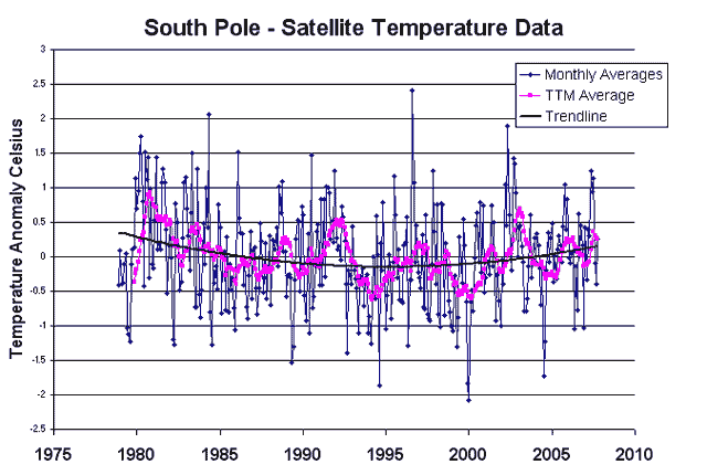
  • Over the last 30 years, satellites have found absolutely no warming trend in Antarctica  (from UAH via Steven Milloy):

South_pole_temperatures

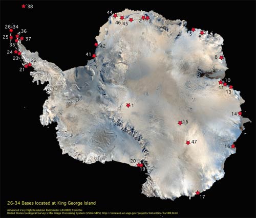
  • The tail is measuring the dog.  The Korean station couldn’t possibly be more irrelevent to measuring Antarctic temperatures.  It is on an island labelled 26-34 north of the tip of the Antarctic Penninsula.  This is a bit like measuring Colorado temperatures from Hawaii:

Antarcticastationsmap1s

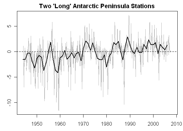
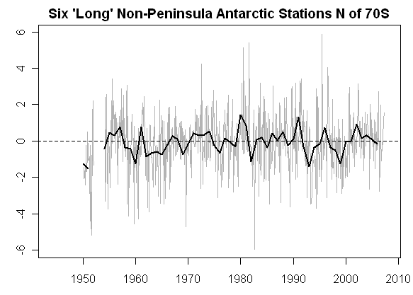
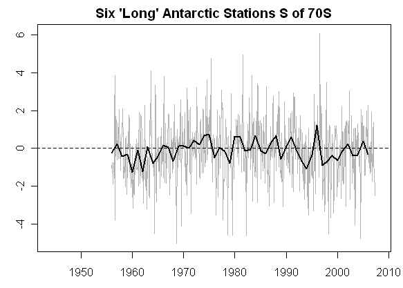
  • It is well known that the Antarctic Penninsula, representing 2% of Antactica’s area, is warming while the other 98% is cooling.  I discussed this more here.  Al Gore took the same disingenuous step in his movie of showing only the anomolous 2%.  The Antarctic Penninsula in the first graph below shows warming.  The rest of Antarctica shows none  (click to enlarge)

Antarc35_2 Antarc34 Antarc33_2

  • The IPCC predicts that with global warming, the Antarctic penninsula will see net melting while the rest of Antarctica will see net increases in ice.  The penninsula is affected more by the changing temperatures of sea currents in the surrounding seas than in global climate effects.  For most of Antarctica, temperatures will never concieveably warm enough to melt the ice sheets, since it is so cold even in the summer, and ice sheets are expected to expand as warming increases precipitation on the continent.
  • Scientists studying Antarctica have been there at most a few decades.  We know almost nothing about it or its histroy.  We certainly don’t know enough about "what is normal" to have any clue if activities on the Larson B ice shelf are anomolous or not.
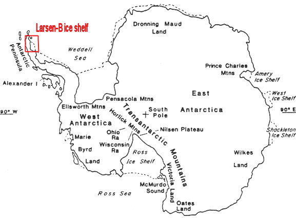
  • The UN Sec-gen said that this ice shelf represented a fifth of the continent.  Here, in actuality, is the Larsen ice shelf.  The red box below greatly exaggerates Larsen’s size, and Larsen-B is only a portion of the entire Larsen shelf.

Antarctic_map_larson_b

  • The statement that the entire Western Antarctic is floating is just absurd.  God knows what that is supposed to mean, but even if we ignore the word "floating", we can see from the map above we aren’t even talking about a significant portion of the Antarctic Pennninsula, much less of Western Antarctica.  Here are actual pictures of the 2002 event.  (by the way, if ice is really "floating", presumably in sea water, then it’s melting will have zero effect on ocean levels)
  • Such a feared collapse already happened 5 years ago, and sea levels did not budge.  But the next time it happens, sea levels are going to rise 20 feet??  Even the UN’s IPCC does not think sea levels will rise more than 8-12 inches in the next century due to their overblown temperature forecasts.

As always, you can consult my my book and my movie (both free online) for more details on all these topics.

Retreating Glaciers

No global warming catastrophe movie is complete without scenes of melting glaciers.  And it is true that many (but by no means all) of the world’s large glaciers have retreated over the last century.  The implication is that this retreat is due to man.

The reason I titled my climate video "What is Normal?" is because I am facinated with the hubris we have of observing climate for just a few decades, but suddenly declaring we know what is a "normal" or "abnormal" climate.  Such may be the case with retreating glaciers.

This is a picture published in Alaska Geographic Magazine, plotting the retreat of the famous glacier at Glacier Bay, Alaska.

Glacier1

As you can see, the vast majority of the retreat occured between 1794 and 1907, before man is generally blamed with substantially affecting the climate with CO2.  Yes, we have seen some retreats in the last 50 years, but in this context they look much more like a continuation of a natural trend than any new man-made phenomenon.  In fact, to claim that recent retreats are man-made, one would have to argue that the natural forces driving glacier retreats since 1794 would have had to halt around 1950, coincidently exactly when man’s impact began.  This kind of coincident occurance isn’t impossible, but certainly fails any Occam’s Razor smell test.

CO2 and Drought

One of the sloppier predictions about global warming is that is will cause massive droughts, and certainly we have seen this line of reasoning over the last week as the media attempts to hang the blame for Southern California fire damage on CO2, when in fact most of the blame lies on rapid home construction in areas known to have a high fire danger.

I suppose the layman’s logic is as follows:  Well, it is usually hot when we have droughts, and it is hot in deserts, so therefore if the world gets hotter, we will have droughts and deserts.  Of course, this logic is silly, but is none-the-less prevenlent (does no one remember that rain forests are hot too?)

In fact, one almost certain effect of global warming will be an increase in the evaporation rate of the oceans.  Megatons more water is put into the sky as temperatures of the air and oceans rise.  Presumably, much of this water will fall as rain somewhere, so it would probably be more logical to guess that warming would cause more rain rather than less.

As Steven Malloy points out, as temperatures have risen about 0.6C over the last century, rainfall in the US and Southern California have actually increased:

During the period 1900-2005, precipitation seems to have actually increased in areas above 30 degrees north latitude — including California and the rest of the U.S. — according to the most recent assessment from the United Nations’ Intergovernmental Panel on Climate Change.

This does not mean, of course, that droughts haven’t occurred in North America over the last 100 years, but it doesn’t support a link between rising global temperature and increased drought.

Examining the occurrence of drought in southern California since 1900 is also illuminating.

According to data maintained by the federal National Climatic Data Center, drought conditions are no stranger to southern California.

During the period 1900 to 2005, moderate-to-severe drought conditions occurred in Southern California during 34 of those 106 years — that is, about one-third of the time.

Comparing the southern California drought record against the global temperature record reveals the following:

— During the period 1900-1940, when most of the 20th century’s one-degree Fahrenheit temperature increase occurred, there were 7 years of moderate-to-severe drought.

— During the period 1941-1975, when global temperatures cooled, giving rise to concerns of a looming ice age, there were 11 years of moderate-to-severe drought.

— During the period 1976 to 1990, when global temperatures rose back to the 1940 level, there were 8 years of moderate-to-severe drought.

— Since 1991, when global temperatures rose slightly past the 1940 levels, there have been 7 years of drought.

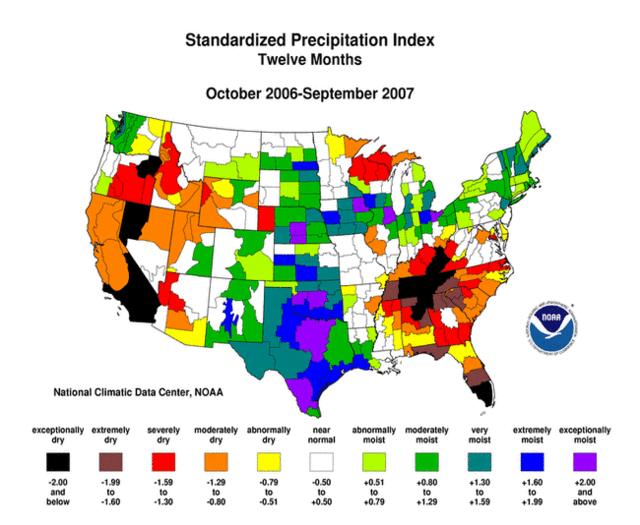
In fact, just last week I posted drought maps that showed that while Southern California has had drought conditions over the last year…

Spi12_200709_pg

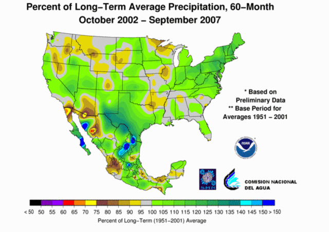
…they have had absolutely average rainfall over the last five years and Northa America has been downright soggy:

Usnmx20070960monpctpcppg

On Monday, I will be releasing my climate video tentatively titled "What is Normal?"  A recurring theme in that video is our current inability to accept extremes in the weather as "normal,"  which in fact they are.

Next Solar Cycle Looks Very Weak

Via Anthony Watts:

“All Quiet Alert” – That sounds like an oxymoron, and maybe it is, but the sun is extremely quiet right now, so much in fact that the Solar Influences Data Center in Belgium has issued an “All quiet alert” on October 5th. Since then, the sunspot number has remained at zero.

The sun is blank–no sunspots.

There is talk about of an extended solar minimum occurring, or perhaps a recurrence of a Dalton or Maunder type minimum. There are signs that the sun’s activity is slowing. The solar wind has been decreasing in speed, and this is yet another indicator of a slowing in the suns magnetic dynamo. Below are near real-time (updated hourly)dials of Solar Wind speed, Solar Wind Density, and Interplanetary Magnetic Field. …

One thing is certain, based on past climate history and solar history, if in fact the suns magnetic activity slows, or collapses and we enter a prolonged period of little or no sunspot activity, we’ll see a global cooling trend.

It is still too early to tell, but pretty interesting none-the-less.

Why They Renamed it “Climate Change”

Global Warming was renamed "climate change" so that any "unusual" weather could be grouped under the banner and blamed on man as part of the general panic.  And, more specifically in this case, be used as an excuse to fund a little mountain climbing every year:

The Alps’ tallest peak was measured at 4,810.90 metres on September 15 and 16 – a 2.15 metre increase in two years, surveyors from France’s Haute-Savoie region announced.

"The height as well as the volume of Mont Blanc has increased considerably, because the snow has massed on the summit over the last two years," expert Philippe Borel said at a meeting in the Alpine town Chamonix.

When skeptics refute that many shrinking glaciers, such as the ice pack on Kilamanjaro, are due to changing winds and precipitation patterns rather than warming, they get ignored.  However, when ice is increasing, then of course the press blames it on winds and precipitation rather than cooling:

"We’re registering a greater frequency of winds from the west which bring rain and higher temperatures."

In the summer the precipitation translates into snow sticking in regions over 4,000 metres in altitude that increases Mont Blanc’s volume and height, Mr Giezendanner said.

Interestingly, that sounds a lot like this explanation for shrinking Arctic Ice, which most of the press did not see the need to report.

By the way, this story is an awesome illustration of the point I frequently make — that is, the hubris we have of declaring some weather pattern to be "abnormal" when in fact we only have been observing climate in any depth for a few decades.  Or in this case, for about 4 years:

The volume of ice on Mont Blanc’s slopes over 4,800 metres high was first calculated at 14,600 cubic metres in 2003.

It dropped to 14,300 cubic metres two years later, but then almost doubled to 24,100 cubic metres in 2007.

So for the whole history of time, we have three data points over 4 years for ice depth on Mt. Blanc.  How is there a story here at all, one way or another?

Postscript:  When I was a consultant at McKinsey, I used to joke that it is better to have just one data point rather than many, because then you could draw whatever curve or trendline you wanted to through that one point.

Wind Patterns May Be Responsible for Arctic Sea Ice Loss

From the NASA webs site, with a hat tip to the Reference Frame:

A new NASA-led study found a 23-percent loss in the extent of the Arctic’s thick, year-round sea ice cover during the past two winters. This drastic reduction of perennial winter sea ice is the primary cause of this summer’s fastest-ever sea ice retreat on record and subsequent smallest-ever extent of total Arctic coverage. …

Nghiem said the rapid decline in winter perennial ice the past two years was caused by unusual winds. "Unusual atmospheric conditions set up wind patterns that compressed the sea ice, loaded it into the Transpolar Drift Stream and then sped its flow out of the Arctic," he said. When that sea ice reached lower latitudes, it rapidly melted in the warmer waters.

"The winds causing this trend in ice reduction were set up by an unusual pattern of atmospheric pressure that began at the beginning of this century," Nghiem said.

The Arctic Ocean’s shift from perennial to seasonal ice is preconditioning the sea ice cover there for more efficient melting and further ice reductions each summer. The shift to seasonal ice decreases the reflectivity of Earth’s surface and allows more solar energy to be absorbed in the ice-ocean system.

Climate is complicated, so there may still be more to the phenomenon than we understand today, but certainly this is a more satisfying answer the "global warming" since Antarctic sea ice was hitting a 30 year high at the same time Arctic ice was at a 30-year low.

One of my favorite topics in climate discussion is "what is normal?"  We have observed climate really intensely for maybe 30 years, and with any kind of reliable measurements for no more than about a hundred years.  So given that climate moves in hundred thousand and million year cycles, how can we be sure our reference point, given 30 years of observation, is really "normal."  One funny aspect of this is how often the headline has been flashed over the last few weeks that Arctic ice is at an "all-time" low.  Really?  You mean the lowest it has been in the 6 billion year history of earth?  Well, no, just the lowest since 1979 when we started measuring by sattelite.  (For those without a calculator, "since 1979" is really only 0.0000005% of "all-time.")

Update:  Anthony Watt has much more

Antarctic Sea Ice at Record High

It is almost impossible to avoid stories about Arctic sea at the lowest recorded level.  The National Geographic, who should know better, had the temerity to headline "Arctic Ice at All-Time Low".  All-time?  Really?  In the 6 billion year history of the earth, this is the least ice ever in the Arctic?  Well, no, it’s the least since we have started measuring it.  So when was that?  Only since about 1979 when we had sattelites that could make this measurement.  OK, so its the least ice in about 25-30 years.

To a one, scientists and media making this observation about Arctic sea ice use it as a leading indicator of catastrophic global warming.  The National Geographic even suggests it is evidence that we are at a tipping point, or a cusp of rapid acceleration of warming.

There is little doubt the Arctic has been warming the last 30 years or so, but some doubt whether it is warmer even than the 1940’s.  Be that as it may, last I checked there were two poles with sea ice.  It’s funny no one ever mentions the South Pole.  Do you think that they just forgot?  Or could it be that the facts don’t conviniently fit the storyline?  Luboš Motl picks up the story:

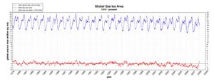
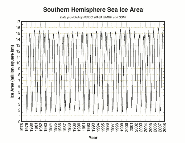
Some analysts have speculated that the new record could be evidence of global warming. But is it? Even though it may sound very complicated, it turns out that the Earth is round. At the global scale, there is not one polar region but, in fact, two. There is also sea ice on the Southern Hemisphere. It turns out that the Antarctic sea ice area reached 16.2 million squared kilometers in 2007 – a new absolute record high since the measurements started in 1979

The data is here:

Currentareasouths

If you watched An Inconvinient Truth, you will be saying, "this can’t be right."  In that movie, Al Gore and company showed compelling films of melting and warming in Antarctica.  Well, it turns out that most of Antarctica is seeing more snowfall and ice formation and the same or colder temperatures, but one small area, about 2% of the landmass on the Antarctic penninsula, is seeing warming.  Guess which area the movie chose to focus on? 

Even if the Antarctic were warming, most climate scientists expect snow and ice pack to increase there, not decrease.  Yes, warmer weather melts ice, but Antarctica is so freaking cold a few degrees are no more likely to melt ice than steel is to melt in the Arizona sunshine.  But warmer weather does vaporize more water, which is expected to fall as snowpack in Antarctica.  That is why despite Al Gore’s claims that oceans will rise 20 feet or more, serious scientists don’t expect much more than a foot, even with warming numbers far higher than I think are credible.  That’s because ice melting in Greenland and other glaciers is offset by increasing snow pack in Antarctica  (melting sea ice has no effect on ocean levels, since the ice floats, for the same reason that ice melting in your glass of water will not cause the glass to overflow).

By the way, since we are talking about retreating ice, here is a picture showing the retreat of the Glaciers at beautiful Glacier Bay, Alaska.Image054

So most of the retreat of the glaciers occured between 1794 and 1907, which is fairly hard to correlate with man’s use of fossil fuels or global CO2 levels.