Marc Morano, probably first up against the wall, had this post a while back with a number of public threats, from TPM, Joe Romm, Joe Kennedy, Grist Magazine, David Suzuki, and James Hansen, among others.
Category Archives: Climate Science Process
More on the Climate Pentagon Papers
The Bishop Hill Blog has a summary of a lot of the more interesting emails.
A search engine of the content is here.
John Hinderaker here.
FOIA for Me But Not For Thee
I thought this was one of the more interesting quotes unearthed so far from the Hadley CRU emails:
“When the FOI requests began here, the FOI person said we had to abide by the requests. It took a couple of half hour sessions – one at a screen, to convince them otherwise showing them what CA [Climate Audit] was all about. Once they became aware of the types of people we were dealing with, everyone at UEA (in the registry and in the Environmental Sciences school – the head of school and a few others) became very supportive. I’ve got to know the FOI person quite well and the Chief Librarian – who deals with appeals.”
I am not familiar with the ins and outs of the British FOI request process, but in the US such requests must be honored based on the content of the information requested, and NOT based on the views of the requester or the intended us of the information. Basically, what the FOI officer has determined here is that this was a perfectly legitimate request that had to be honored UNTIL it was learned that it came from a person or group who disagreed with the center’s scientific conclusions and wished to use the data to try to replicate and/or criticize their work — then it could be ignored. In the US, this would be a gross violation of FOIA rules. I am willing to be that it is not too kosher under British law either.
The Real Hockey Stick
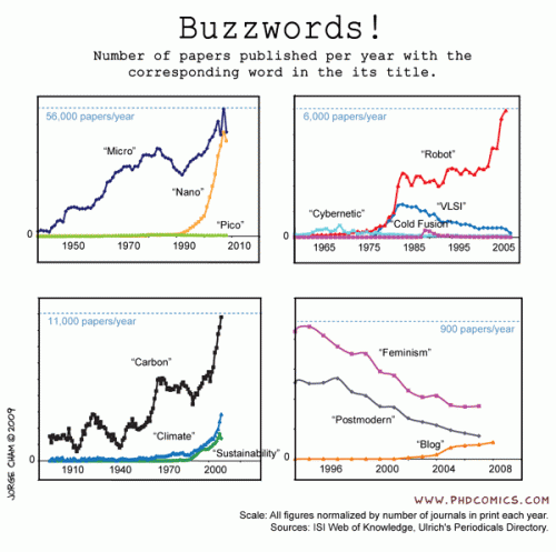
From PHD Comics via Flowing Data, check out the lower left.
Climate Pentagon Papers
An interesting development you have probably seen at other climate sites already (I am pretty conservative about posting this stuff), apparently someone may have hacked the servers at the Hadley Center Climate Research Unit (CRU) in the UK and copied a bunch of data and emails and dropped it into the public realm (via links in a number of site’s comment sections). I downloaded the file but have not checked it out. It is unclear if this is real or a skeptic spoof or even an alarmist-set trap, though initial reactions from the Hadley Center CRU seem to point to it being real. The ethics of the folks who grabbed this material are also seriously in question, though if it turns out to be real I have no problem using the material as it is public / government material that should have been in the public domain anyway (which is why I use the Pentagon Papers analogy).
Andrew Bolt has some background and excerpts from the material. The very first email he has from Phil Jones seems to confirm my suspicions about splicing thermometer data onto proxy series I expressed here. (Update: much more from Steve McIntyre here).
A lot of the stuff in Bolt’s post is really stuff we in the skeptic community already know. RealClimate ruthlessly purges comments of any dissenting or critical voices? Who’d have thunk it.
Followup on Antarctic Melt Rates
I got an email today in response to this post that allows me to cover some ground I wanted to cover. A number of commenters are citing this paragraph from Tedesco and Monaghan as evidence that I and others are somehow mischaracterizing the results of the study:
“Negative melting anomalies observed in recent years do not contradict recently published results on surface temperature trends over Antarctica [e.g., Steig et al., 2009]. The time period used for those studies extends back to the 1950’s, well beyond 1980, and the largest temperature increases are found during winter and spring rather than summer, and are generally limited to West Antarctica and the Antarctic Peninsula. Summer SAM trends have increased since the 1970s [Marshall, 2003], suppressing warming over much of Antarctica during the satellite melt record [Turner et al., 2005]. Moreover, melting and surface temperature are not necessarily linearly related because the entire surface energy balance must be considered [Liston and Winther, 2005; Torinesi et al., 2003].”
First, the point of the original post was not about somehow falsifying global warming, but about the asymmetry in press coverage to emerging data. It is in fact staggeringly unlikely that I would use claims of increasing ice buildup in Antarctica as “proof” that anthropogenic global warming theory as outlined, say, by the fourth IPCC report, is falsified. This is because the models in the fourth IPCC report actually predict increasing snowmass in Antarctica under global warming.
Of course, the study was not exactly increasing ice mass, but decreasing ice melting rates, which should be more correlated with temperatures. Which brings us to the quote above.
I see a lot of studies in climate that seem to have results that falsify some portion of AGW theory but which throw in acknowledgments of the truth and beauty of catastrophic anthropogenic global warming theory in the final paragraphs that almost contradict their study results, much like natural philosophers in past centuries would put in boiler plate in their writing to protect them from the ire of the Catholic Church. One way to interpret this statement is “I know you are not going to like these findings but I am still loyal to the Cause so please don’t revoke by AGW decoder ring.”
This particular statement by the authors is hilarious in one way. Their stated defense is that Steig’s period was longer and thus not comparable. The don’t outright say it, but they kind of beat around the bush at it, that the real issue is not the study length, but that most of the warming in Steig’s 50-year period was actually in the first 20 years. This is in fact something we skeptics have been saying since Steig was released, but was not forthrightly acknowledged in Steig. Here is some work that has been done to deconstruct the numbers in Steig. Don’t worry about the cases with different numbers of “PCs”, these are just sensitivities with different geographic regionalizations. Basically, under any set of replication approaches to Steig, all the warming is in the first 2 decades.
| Reconstruction |
1957 to 2006 trend |
1957 to 1979 trend (pre-AWS) |
1980 to 2006 trend (AWS era) |
| Steig 3 PC |
+0.14 deg C./decade |
+0.17 deg C./decade |
-0.06 deg C./decade |
| New 7 PC |
+0.11 deg C./decade |
+0.25 deg C./decade |
-0.20 deg C./decade |
| New 7 PC weighted |
+0.09 deg C./decade |
+0.22 deg C./decade |
-0.20 deg C./decade |
| New 7 PC wgtd imputed cells |
+0.08 deg C./decade |
+0.22 deg C./decade |
-0.21 deg C./decade |
Now, knowing this, here is Steig’s synopsis:
Assessments of Antarctic temperature change have emphasized the contrast between strong warming of the Antarctic Peninsula and slight cooling of the Antarctic continental interior in recent decades1. This pattern of temperature change has been attributed to the increased strength of the circumpolar westerlies, largely in response to changes in stratospheric ozone2. This picture, however, is substantially incomplete owing to the sparseness and short duration of the observations. Here we show that significant warming extends well beyond the Antarctic Peninsula to cover most of West Antarctica, an area of warming much larger than previously reported. West Antarctic warming exceeds 0.1 °C per decade over the past 50 years, and is strongest in winter and spring. Although this is partly offset by autumn cooling in East Antarctica, the continent-wide average near-surface temperature trend is positive. Simulations using a general circulation model reproduce the essential features of the spatial pattern and the long-term trend, and we suggest that neither can be attributed directly to increases in the strength of the westerlies. Instead, regional changes in atmospheric circulation and associated changes in sea surface temperature and sea ice are required to explain the enhanced warming in West Antarctica.
Wow – don’t see much acknowledgment that all the warming trend was before 1980. They find the space to recognize seasonal differences but not the fact that all the warming they found was in the first 40% of their study period? (And all of the above is not even to get into the huge flaws in the Steig methodology, which purports to deemphasize the Antarctic Peninsula but still does not)
This is where the semantic games of trying to keep the science consistent with a political position get to be a problem. If Steig et al had just said “Antarctica warmed from 1957 to 1979 and then has cooled since,” which is what their data showed, then the authors of this new study would not have been in a quandary. In that alternate universe, of course decreased ice melt since 1980 makes sense, because Steig said it was cooler. But because the illusion must be maintained that Steig showed a warming trend that continues to this date, these guys must deal with the fact that their study agrees with the data in Steig, but not the public conclusions drawn from Steig. And thus they have to jump through some semantic hoops.
Great Moments in Skepticism and “Settled Science”
The phrase shaken baby syndrome entered the pop culture lexicon in 1997, when British au pair Louise Woodward was convicted of involuntary manslaughter in the death of Massachusetts infant Matthew Eappen. At the time, the medical community almost universally agreed on the symptoms of SBS. But starting around 1999, a fringe group of SBS skeptics began growing into a powerful reform movement. The Woodward case brought additional attention to the issue, inviting new research into the legitimacy of SBS. Today, as reflected in the Edmunds case, there are significant doubts about both the diagnosis of SBS and how it’s being used in court.
In a compelling article published this month in the Washington University Law Review, DePaul University law professor Deborah Teurkheimer argues that the medical research has now shifted to the point where U.S. courts must conduct a major review of most SBS cases from the last 20 years. The problem, Teurkheimer explains, is that the presence of three symptoms in an infant victim—bleeding at the back of the eye, bleeding in the protective area of the brain, and brain swelling—have led doctors and child protective workers to immediately reach a conclusion of SBS. These symptoms have long been considered pathognomic, or exclusive, to SBS. As this line of thinking goes, if those three symptoms are present in the autopsy, then the child could only have been shaken to death.
Moreover, an SBS medical diagnosis has typically served as a legal diagnosis as well. Medical consensus previously held that these symptoms present immediately in the victim. Therefore, a diagnosis of SBS established cause of death (shaking), the identity of the killer (the person who was with the child when it died), and even the intent of the accused (the vigorous nature of the shaking established mens rea). Medical opinion was so uniform that the accused, like Edmunds, often didn’t bother questioning the science. Instead, they’d often try to establish the possibility that someone else shook the child.
But now the consensus has shifted. Where the near-unanimous opinion once held that the SBS triad of symptoms could only result from a shaking with the force equivalent of a fall from a three-story to four-story window, or a car moving at 25 mph to 40 mph (depending on the source), research completed in 2003 using lifelike infant dolls suggested that vigorous human shaking produces bleeding similar to that of only a 2-foot to 3-foot fall. Furthermore, the shaking experiments failed to produce symptoms with the severity of those typically seen in SBS deaths….
“When I put all of this together, I said, my God, this is a sham,” Uscinski told Discover. “Somebody made a mistake right at the very beginning, and look at what’s come out of it.”
Before I am purposefully misunderstood, I am not committing the logical fallacy that an incorrect consensus in issue A means the consensus on issue B is incorrect. The message instead is simple: beware scientific “consensus,” particularly when that consensus is only a decade or two old.
Evan Mills Response to My Critique of the Grid Outage Chart
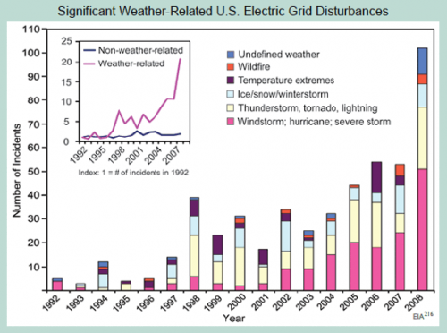
A month or two ago, after Kevin Drum (a leftish supporter of strong AGW theory) posted a chart on his site that looked like BS to me. I posted my quick reactions to the chart here, and then after talking to the data owner in Washington followed up here.
The gist of my comments were that the trend in the data didn’t make any sense, and upon checking with the data owner, it turns out much of the trend is due to changes in the data collection process. I stick by that conclusion, though not some of the other suppositions in those posts.
I was excited to see Dr. Mills response (thanks to reader Charlie Allen for the heads up). I will quote much of it, but to make sure I can’t be accused of cherry-picking, here is his whole post here. I would comment there, but alas, unlike this site, Dr. Mills chooses not to allow comments.
So here we go:
Two blog entries [1-online | PDF] [2-online | PDF] [Accessed June 18, 2009] mischaracterize analysis in a new report entitled Global Climate Change Impacts in the United States. The blogger (a self-admitted “amateur”) created a straw man argument by asserting that the chart was presented as evidence of global climate change and was not verified with the primary source. The blog’s errors have been propagated to other web sites without further fact checking or due diligence. (The use of profanity in the title of the first entry is additionally unprofessional.)
Uh, oh, the dreaded “amateur.” Mea Culpa. I am a trained physicist and engineer. I don’t remember many colleges handing out “climate” degrees in 1984, so I try not to overstate my knowledge. As to using “bullsh*t” in the title, the initial post was “I am calling bullsh*t on this chart.” Sorry, I don’t feel bad about that given the original post was a response to a post on a political blog.
The underlying database—created by the U.S. Department of Energy’s Energy Information Administration—contains approximately 930 grid-disruption events taking place between 1992 and 2008, affecting 135 million electric customers.
As noted in the caption to the figure on page 58 of our report (shown above)—which was masked in the blogger’s critique—
First, I am happy to admit errors where I make them (I wonder if that is why I am still an “amateur”). It was wrong of me to post the chart without the caption. My only defense was that I copied the chart from, and was responding to its use on, Kevin Drum’s site and he too omitted the caption. I really was not trying to hide what was there. I am on the road and don’t have the original but here it is from Dr. Mills’ post.
Anyway, to continue…
As noted in the caption to the figure on page 58 of our report (shown above)—which was masked in the blogger’s critique—we expressly state a quite different finding than that imputed by the blogger, noting with care that we do not attribute these events to anthropogenic climate change, but do consider the grid vulnerable to extreme weather today and increasingly so as climate change progresses, i.e.:
“Although the figure does not demonstrate a cause-effect relationship between climate change and grid disruption, it does suggest that weather and climate extremes often have important effects on grid disruptions.”
The associated text in the report states the following, citing a major peer-reviewed federal study on the energy sector’s vulnerability to climate change:
“The electricity grid is also vulnerable to climate change effects, from temperature changes to severe weather events.”
To Dr. Mills’ point that I misinterpreted him — if all he wanted to say was that the electrical grid could be disturbed by weather or was vulnerable to climate change, fine. I mean, duh. If there are more tornadoes knocking about, more electrical lines will come down. But if that was Dr. Mills ONLY point, then why did he write (emphasis added):
The number of incidents caused by extreme weather has increased tenfold since 1992. The portion of all events that are caused by weather-related phenomena has more than tripled from about 20 percent in the early 1990s to about 65 percent in recent years. The weather-related events are more severe…
He is saying flat out that the grid IS being disturbed 10x more often and more severely by weather. It doesn’t even say “reported” incidents or “may have” — it is quite definitive. So which one of us is trying to create a straw man? It is these statements that I previously claimed the data did not support, and I stand by my analysis on that.
And it’s not like there is some conspiracy of skeptics to mis-interpret Mr. Mills. Kevin Drum, a huge cheerleader for catastrophic AGW, said about this chart:
So here’s your chart of the day: a 15-year history of electrical grid problems caused by increasingly extreme weather.
I will skip the next bit, wherein it appears that Dr. Mills is agreeing with my point that aging and increased capacity utilization on the grid could potentially increase weather-related grid outages without any actual change in the weather (just from the grid being more sensitive or vulnerable)
OK, so next is where Mr. Mills weighs in on the key issue of the data set being a poor proxy, given the fact that most of the increase in the chart are due to better reporting rather than changes in the underlying phenomenon:
The potential for sampling bias was in fact identified early-on within the author team and—contrary to the blogger’s accusation—contact was in fact made with the person responsible for the data collection project at the US Energy Information Administration on June 10, 2008 (and with the same individual the blogger claims to have spoken to). At that time the material was discussed for an hour with the EIA official, who affirmed the relative growth was in weather-related events and that it could not be construed as an artifact of data collection changes, etc. That, and other points in this response, were re-affirmed through a follow up discussion in June 2009.
In fact, the analysis understates the scale of weather-related events in at least three ways:
- EIA noted that there are probably a higher proportion of weather events missing from their time series than non-weather ones (due to minimum threshold impacts required for inclusion, and under-reporting in thunderstorm-prone regions of the heartland).
- There was at least one change in EIA’s methodology that would have over-stated the growth in non-weather events, i.e., they added cyber attacks and islanding in 2001, which are both “non-weather-related”.
- Many of the events are described in ways that could be weather-related (e.g. “transmission interruption”) but not enough information is provided. We code such events as non-weather-related.
Dr. Mills does not like me using the “BS” word, so I will just say this is the purest caca. I want a single disinterested scientist to defend what Dr. Mills is saying. Remember:
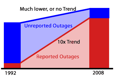
- Prior to 1998, just about all the data is missing. There were pushes in 2001 and 2008 to try to fix under reporting. Far from denying this, Dr. Mills reports the same facts. So no matter how much dancing he does, much of the trend here is driven by increased reporting, not the underlying phenomenon. Again, the underlying phenomenon may exist, but it certainly is not a 10x increase as reported in the caption.
- The fact that a higher proportion of the missing data is weather-related just underlines the point that the historic weather-related outage data is a nearly meaningless source of trend data for weather-related outages.
- His bullet points are written as if the totals matter, but the point of the chart was never totals. I never said he was overstating weather related outages today. The numbers in 2008 may still be (and probably are) understated. And I have no idea even if 50 or 80 is high or low, so absolute values have no meaning to me anyway. The chart was designed to portray a trend — remember that first line of the caption “The number of incidents caused by extreme weather has increased tenfold since 1992. ” — not a point on absolute values. What matters is therefore not how much is missing, but how much is missing in the early years as compared to the later years.
- In my original post I wrote, as Dr. Mills does, that the EIA data owner thinks there is a weather trend in the data if you really had quality data. Fine. But it is way, way less of a trend than shown in this chart. And besides, when did the standards of “peer reviewed science” stoop to include estimates of government data analysts as to what the trend in the data would be if the data weren’t corrupted so badly. (Also, the data analyst was only familiar with the data back to 1998 — the chart started in 1992.
- Dr. Mills was aware that the data had huge gaps before publication. Where was the disclosure? I didn’t see any disclosure. I wonder if there was such disclosure in the peer reviewed study that used this data (my understanding is that there must have been one, because the rules of this report is that everything had to come from peer-reviewed sources).
- I don’t think any reasonable person could use this data set in a serious study knowing what the authors knew. But reasonable people can disagree, though I will say that I think there is no ethical way anyone could have talked to the EIA in detail about this data and then used the 1992-1997 data.
Onward:
Thanks to the efforts of EIA, after they took over the responsibility of running the Department of Energy (DOE) data-collection process around 1997, it became more effective. Efforts were made in subsequent years to increase the response rate and upgrade the reporting form.
Thanks, you just proved my point about the trend being driven by changes in reporting and data collection intensity.
To adjust for potential response-rate biases, we have separated weather- and non-weather-related trends into indices and found an upward trend only in the weather-related time series.
As confirmed by EIA, if there were a systematic bias one would expect it to be reflected in both data series (especially since any given reporting site would report both types of events).
As an additional precaution, we focused on trends in the number of events (rather than customers affected) to avoid fortuitous differences caused by the population density where events occur. This, however, has the effect of understating the weather impacts because of EIA definitions (see survey methodology notes below).
Well, its possible this is true, though unhappily, this analysis was not published in the original report and was not published in this post. I presume this means he has a non-weather time series that is flat for this period. Love to see it, but this is not how the EIA portrayed the data to me. But it really doesn’t matter – I think the fact that there is more data missing in the early years than the later years is indisputable, and this one fact drives a false trend.
But here is what I think is really funny- — the above analysis does not matter, because he is assuming a reporting bias symmetry, but just a few paragraphs earlier he stated that there was actually an asymmetry. Let me quote him again:
EIA noted that there are probably a higher proportion of weather events missing from their time series than non-weather ones (due to minimum threshold impacts required for inclusion, and under-reporting in thunderstorm-prone regions of the heartland).
Look Dr. Mills, I don’t have an axe to grind here. This is one chart out of bazillions making a minor point. But the data set you are using is garbage, so why do you stand by it with such tenacity? Can’t anyone just admit “you know, on thinking about it, there are way to many problems with this data set to declare a trend exists. Hopefully the EIA has it cleaned up now and we can watch it going forward.” But I guess only “amateurs” make that kind of statement.
The blogger also speculated that many of the “extreme temperature” events were during cold periods, stating “if this is proof of global warming, why is the damage from cold and ice increasing as fast as other severe weather causes?” The statement is erroneous.
This was pure supposition in my first reaction to the chart. I later admitted that I was wrong. Most of the “temperature” effects are higher temperature. But I will admit it again here – that supposition was incorrect. He has a nice monthly distribution of the data to prove his point.
I am ready to leave this behind, though I will admit that Dr. Mills response leaves me more rather than less worried about the quality of the science here. But to summarize, everything is minor compared to this point: The caption says “The number of incidents caused by extreme weather has increased tenfold since 1992.” I don’t think anyone, knowing about the huge underreporting in early years, and better reporting in later years, thinks that statement is correct. Dr. Mills should be willing to admit it was incorrect.
Update: In case I am not explaining the issue well, here is a conceptual drawing of what is going on:
Update #2: One other thing I meant to post. I want to thank Dr. Mills — this is the first time in quite a while I have received a critique of one of my posts without a single ad hominem attack, question about my source of funding, hypothesized links to evil forces, etc. Also I am sorry I wrote “Mr.” rather than “Dr.” Mills. Correction has been made.
A Window Into the IPCC Process
I thought this article by Steve McIntyre was an interesting window on the IPCC process. Frequent readers of this site know that I believe that feedbacks in the climate are the key issue of anthropogenic global warming, and their magnitude and sign separate mild, nearly unnoticeable warming from catastrophe. McIntyre points out that the IPCC fourth assessment spent all of 1 paragraph in hundreds of pages on the really critical issue:
As we’ve discussed before (and is well known), clouds are the greatest source of uncertainty in climate sensitivity. Low-level (“boundary layer”) tropical clouds have been shown to be the largest source of inter-model difference among GCMs. Clouds have been known to be problematic for GCMs since at least the Charney Report in 1979. Given the importance of the topic for GCMs, one would have thought that AR4 would have devoted at least a chapter to the single of issue of clouds, with perhaps one-third of that chapter devoted to the apparently thorny issue of boundary layer tropical clouds.
This is what an engineering study would do – identify the most critical areas of uncertainty and closely examine all the issues related to the critical uncertainty. Unfortunately, that’s not how IPCC does things. Instead, clouds are treated in one subsection of chapter 8 and boundary layer clouds in one paragraph.
It turns out that this one paragraph was lifted almost intact from the work of the lead author of this section of the report. The “almost” is interesting, though, because every single change made was to eliminate or tone down any conclusion that cloud feedback might actually offset greenhouse warming. He has a nearly line by line comparison, which is really fascinating. One sample:
Bony et al 2006 had stated that the “empirical” Klein and Hartmann (1993) correlation “leads” to a substantial increase in low cloud cover, which resulted in a “strong negative” cloud feedback. Again IPCC watered this down: “leads to” became a “suggestion” that it “might be” associated with a “negative cloud feedback” – the term “strong” being dropped by IPCC.
Remember this is in the context of a report that generally stripped out any words that implied doubt or lack of certainty on the warming side.
Take A Deep Breath…
A lot of skeptics’ websites are riled up about the EPA’s leadership decision not to forward comments by EPA staffer Alan Carlin on the Endangerment issue and global warming because these comments were not consistent with where the EPA wanted to go on this issue. I reprinted the key EPA email here, which I thought sounded a bit creepy, and some of the findings by the CEI which raised this issue.
However, I think skeptics are getting a bit carried away. Let’s try to avoid the exaggeration and hype of which we often accuse global warming alarmists. This decision does not reflect well on the EPA, but let’s make sure we understand what it was and was not:
- This was not a “study” in the sense we would normally use the word. These were comments submitted by an individual to a regulatory decision and/or a draft report. The authors claimed to only have 4 or 5 days to create these comments. To this extent, they are not dissimilar to the types of comments many of us submitted to the recently released climate change synthesis report (comments, by the way, which still have not been released though the final report is out — this in my mind is a bigger scandal than how Mr. Carlin’s comments were handled). Given this time frame, the comments are quite impressive, but nonetheless not a “study.”
- This was not an officially sanctioned study that was somehow suppressed. In other words, I have not seen anywhere that Mr. Carlin was assigned by the agency to produce a report on anthropogenic global warming. This does not however imply that what Mr. Carlin was doing was unauthorized. This is a very normal activity — staffers from various departments and background submitting comments on reports and proposed regulations. He was presumably responding to an internal call for comments by such and such date.
- I have had a number of folks write me saying that everyone is misunderstanding the key email — that it should be taken on its face — and read to mean that Mr. Carlin commented on issues outside of the scope of the study or based document he was commenting on. An example might be submitting comments saying man is not causing global warming to a study discussing whether warming causes hurricanes. However, his comments certainly seem relevant to Endangerment question — the background, action, and proposed finding the comments were aimed at is on the EPA website here. Note in particular the comments in Carlin’s paper were totally relevant and on point to the content of the technical support document linked on that page.
- The fourth email cited by the CEI, saying that Mr. Carlin should cease spending any more time on global warming, is impossible to analyze without more context. There are both sinister and perfectly harmless interpretations of such an email. For example, I could easily imagine an employee assigned to area Y who had a hobbyist interest in area X and loved to comment on area X being asked by his supervisor to go back and do his job in area Y. I have had situations like that in the departments I have run.
What does appear to have happened is that Mr. Carlin responded to a call for comments, submitted comments per the date and process required, and then had the organization refuse to forward those comments because they did not fit the storyline the EPA wanted to put together. This content-based rejection of his submission does appear to violate normal EPA rules and practices and, if not, certainly violates the standards we would want such supposedly science-based regulatory bodies to follow. But let’s not upgrade this category 2 hurricane to category 5 — this was not, as I understand it, an agency suppressing an official agency-initiated study.
I may be a cynical libertarian on this, but this strikes me more as a government issue than a global warming issue. Government bureaucracies love consensus, even when they have to impose it. I don’t think there is a single agency in Washington that has not done something similar — ie suppressed internal concerns and dissent when the word came down from on high what the answer was supposed to be on a certain question they were supposed to be “studying.”** This sucks, but its what we get when we build this big blundering bureaucracy to rule us.
Anyway, Anthony Watt is doing a great job staying on top of this issue. His latest post is here, and includes an updated version of Carlin’s comments. Whatever the background, Carlin’s document is well worth a read. I have mirrored the document here.
**Postscript: Here is something I have observed about certain people in both corporate and government beauracracies. I appologize, but I don’t really have the words for this and I don’t know the language of psychology. There is a certain type of person who comes to believe, really believe, their boss’s position on an issue. We often chalk this up from the outside to brown-nosing or an “Eddie Haskell” effect where people fake their beliefs, but I don’t think this is always true. I think there is some sort of human mental defense mechanism that people have a tendency to actually adopt (not just fake) the beliefs of those in power over them. Certainly some folks resist this, and there are some issues too big or fundamental for this to work, but for many folks their mind will reshape itself to the beaucracracy around it. It is why sometimes organizations cannot be fixed, and can only be blown up.
Update: The reasons skeptics react strongly to stuff like this is that there are just so many examples:
Over the coming days a curiously revealing event will be taking place in Copenhagen. Top of the agenda at a meeting of the Polar Bear Specialist Group (set up under the International Union for the Conservation of Nature/Species Survival Commission) will be the need to produce a suitably scary report on how polar bears are being threatened with extinction by man-made global warming….
Dr Mitchell Taylor has been researching the status and management of polar bears in Canada and around the Arctic Circle for 30 years, as both an academic and a government employee. More than once since 2006 he has made headlines by insisting that polar bear numbers, far from decreasing, are much higher than they were 30 years ago. Of the 19 different bear populations, almost all are increasing or at optimum levels, only two have for local reasons modestly declined.
Dr Taylor agrees that the Arctic has been warming over the last 30 years. But he ascribes this not to rising levels of CO2 – as is dictated by the computer models of the UN’s Intergovernmental Panel on Climate Change and believed by his PBSG colleagues – but to currents bringing warm water into the Arctic from the Pacific and the effect of winds blowing in from the Bering Sea….
Dr Taylor had obtained funding to attend this week’s meeting of the PBSG, but this was voted down by its members because of his views on global warming. The chairman, Dr Andy Derocher, a former university pupil of Dr Taylor’s, frankly explained in an email (which I was not sent by Dr Taylor) that his rejection had nothing to do with his undoubted expertise on polar bears: “it was the position you’ve taken on global warming that brought opposition”.
Dr Taylor was told that his views running “counter to human-induced climate change are extremely unhelpful”. His signing of the Manhattan Declaration – a statement by 500 scientists that the causes of climate change are not CO2 but natural, such as changes in the radiation of the sun and ocean currents – was “inconsistent with the position taken by the PBSG”.
Creepy, But Unsurprising
I am late on this, so you probably have seen it, but the EPA was apparently working hard to make sure that the settled science remained settled, but shutting up anyone who dissented from its conclusions.
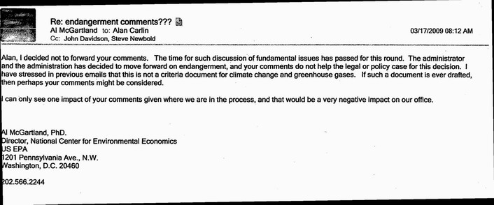
From Odd Citizen. More at Watts Up With That.
Though less subtle than I would have expected, this should come as no surprise to readers of my series on the recent government climate report. All even-handed discussion or inclusion of data that might muddy the core message have been purged from a document that is far more like an advocacy group press release than a scientific document.
Update: More here.
Update #2: I understand those who are skeptical of this, and feel this may have been some kind of entirely justified rebuff. I have folks all the time sending me emails begging me to post their articles as guest authors on this blog and I say no to them all, and there is no scandal to that. Thomas Fuller, and environmental writer for the San Francisco Examiner, was skeptical at first as well. His story here.
GCCI #10: Extreme Example of Forcing Observation to Fit the Theory
In the last post, I discussed forcing observations to fit the theory. Generally, this takes the form either of ignoring observations or adding “adjustment” factors to the data. But here is an even more extreme example from page 25:
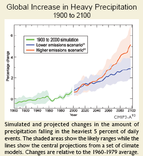
A quick glance at this chart, and what do we see? A line historically rising surprisingly in parallel with global temperature history, and then increasing in the future.
But let’s look at that chart legend carefully. The green “historic” data is actually nothing of the sort – it is simulation! The authors have created their own history. This entire chart is the output of some computer model programmed to deliver the result that temperature drives heavy precipitation, and so it does.
GCCI Report #1: Overall Tone
The first thing one needs to recognize about the GCCI report is that it is not a scientific document — it is a 170-page long press release from an advocacy group, with all the detailed, thorough science one might expect in a press release from the Center of Science and Public Interest writing about the threat to mankind from Twinkies. By the admission of the Obama administration, this is a document that has been stripped of its scientific discussion and rewritten by a paid PR firm that specialized in environmental advocacy.
I have not read every word, but it is pretty clear that there is no new science here on the causes or magnitude of warming. In fact, if I had to describe the process used to prepare the first part of the report, it was to take past IPCC reports, strip out any wording indicating uncertainty, and then portray future forecasts using the IPCC mean forecasts as the lowest possible warming and whatever model they could find that spit out the highest forecast as the “worst case scenario.” Then, the rest of the report (about 90%) creates a variety of hypothesized disaster movie plots based on this worst case scenario.
You know that this is an advocacy document and not science right of the bat when they write this:
1. Global warming is unequivocal and primarily human-induced.
Global temperature has increased over the past 50 years. This observed increase is due primarily to humaninduced
emissions of heat-trapping gases.
Just look in wonder at the false religion-like certainty. Name three other scientific findings about horribly complex natural processes that have been studied in depth for only 20 years or so that one would use the word “unequivocal” for. OK, name even one.
If you can’t read the whole report, read the list of disasters on page 12. If I had shown this to you blind, and told you it from from a Paul Ehrlich the-world-will-end-in-a-decade book from the 1970s, you would probably have believed me.
This entire report assumes global warming to exist, assumes it is man-made, and assumes its future levels are as large or larger than those projected in the last IPCC report. The first four or five pages merely restate this finding with no new evidence. The majority of the report then takes this assumption, cranks it through various models, and generates scary potential scenarios about the US and it would be like if temperatures really rose 11F over the next century.
Re-Energized
For some months now, I have struggled with this site.
In the political and economics arena, there never seems to be any shortage of stuff to write about. That is in large part because when I and others take a position, folks who disagree will respond, and interesting discussions rage back and forth between blogs.
For some years on this site, I have endeavored as a layman to help other laymen understand the key issues in the science. When I first started, I had assumed my role would be pure journalism, simplifying complex arguments for a wider audience. But I soon found that my background in modelling dynamic systems (both physical and social) allowed me to spot holes in the science on my own as well.
But of late I began to run down. Unlike in the political / economic world, there is little cross-talk between blogs on different sides of issues. I could flood the site with stupid media misinterpretations of the site, but it is not what I am trying to do here and besides Tom Nelson has that pretty well covered.
As in the political world, I try to read blogs on all sides of the debate, but in the climate world there was far less interaction. There is only so long I can go on repeating the same arguments in different ways. The problem is not that these arguments and holes in the science get quickly dispatched on other sites, it is that they get ignored. Both sides are guilty of this, but alarmists in particular thrive on knocking down straw men and refusing to address head on the best skeptics’ arguments (which is not to say that certain skeptic sites don’t have the same problem).
But the new Global Climate Change Impacts Report (pdf) released yesterday has re-energized me. This document represents such an embarrassment that it simply begs to be critiqued in depth. So over the coming weeks I will work through the report, in semi-random order, picking out particularly egregious omissions and inaccuracies.
So Much For That Whole Commitment To Science We Were Promised
Today’s release of the study, titled Global Climate Change Impacts in the United States, was overseen by a San Francisco-based media consulting company…
The nearly 200-page study was scrubbed of the usual scientific jargon, and was given a high-profile release by Obama’s science advisor, John Holdren, and the head of the National Oceanic and Atmospheric Administration (NOAA), Jane Lubchenco.
Wow, that’s sure how I learned to handle a scientific report back when I was studying physics – scrub it of the science and give it to an activist PR firm! Do you need any more evidence that climate science has become substantially dominated by post-modernist scientists, where ideological purity and staying on message is more important than actually having the science right?
I saw a draft of this report last year, but I am still trying to download this new version. I expect to be sickened. Here is a taste of where they are coming down:
If today’s generation fails to act to reduce the carbon emissions that cause global warming, climate models suggest temperatures could rise as much as 11F by the end of the century.
11F is about 6.1C. I don’t know if they get this by increasing the CO2 forecast or by increasing the sensitivity or both, but it is vastly higher than the forecasts even of the over-apocalyptic IPCC. I think one can fairly expect two things, though — 1) More than 2/3 of this warming will be due to positive feedback effects rather than Co2 acting alone and 2) There will be little or no discussion of the evidence that such positive feedback effects actually dominate the climate.
Apparently the report will make up for having all the science stripped out by spending a lot of time on gaudy worst case scenarios:
That translates into catastrophic consequences for human health and the economy such as more ferocious hurricanes in coastal regions – in the Pacific as well as the Atlantic, punishing droughts to the south-west, and increasingly severe winter storms in the north-east and around the Great Lakes.
The majority of North Carolina’s beaches would be swallowed up by the sea. New England’s long and snowy winters might be cut short to as little as two weeks. Summers in Chicago could be a time of repeated deadly heat waves. Los Angelenos and residents of other big cities will be choking because of deteriorating air quality.
Future generations could face potential food shortages because of declining wheat and corn yields in the breadbasket of the mid-west, increased outbreaks of food poisoning and the spread of epidemic diseases.
This strikes me as roughly equivilent to turning in a copy of Lucifer’s Hammer in response to a request for a scientific study of the physics of comets.
How to Manufacture the Trend You Want
I thought this post by Steve McIntyre at Climate Audit was pretty amazing, even by the standards of climate science.
We begin with a felt need by fear mongers to link CO2 and global warming to bad stuff, in this case a decline of growth or calcification rates on the Great Barrier Reef. So, abracadabra, some scientist-paladins generate this, which is eaten up by the media:
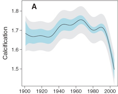
Wow, that looks bad. And if we stop there, we can write a really nice front-page article full of doom and gloom. Or we can do some actual science. First, lets pull back and look at a longer trend:
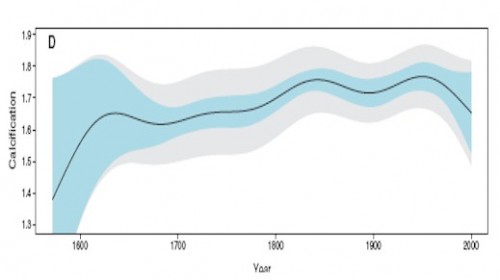
Hmmm. That looks kind of different. Like the recent decline is by no means unprecedented, and that in fact one might call the 1850-1950 levels, rather than the recent drop, the anomaly. This latter is a tough question, of course, in all of climate science. Just what is normal?
Anyway, we can go further. McIntyre notices the plot looks awfully smooth. What if we were to move out of USA Today mode and look at the raw data rather than a pleasantly smooth graph. This is what we would see:
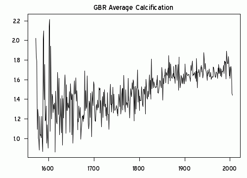
Wow, that looks really different. That must be some amazing smoothing algorithm they used. Because what I see is a generally increasing trend in reef growth, with a single low number in 2005. Rather than being some change in slope in the whole trend, as portrayed in the smoothing, this is a single one-year low data point. (It turns out there are several smoothing approaches one can take that put inordinate value on the end point — this was a trick first found in Mann’s hockey stick trying to make hay of the 1998 high temperature anomaly).
I think just looking at the raw data would cause any reasonable person to shake their head and determine that the author’s were grossly disingenuous in their smoothing and conclusions. But, as they say on TV, “Wait, there’s more.”
Because it turns out the 2005 drop seems to be less a function of any real drop but in fact due to serious gaps in the data set. The black line is a close-up of the raw growth data, while the pink area is the size of the measurement data set used, with its scale on the right.
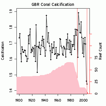
Just by the strangest of coincidences, the large drop in 2005 occurs at the same time the number of data points in the data set drops down to 2! While most of the data has been driven by measurement of 40 or more reefs, the key two years that drive the entire conclusion come from just 2 reefs? This is the worst possible science. Most real scientists would have dropped out the last several years and probably would have dropped all the data since about 1990. Or else go out and get themselves some more freaking data. It is easily possible, in fact quite likely, that the 2005 drop was due to mix, as high growth measurement site were dropped out of the data set, leaving only lower growth sites in the average. These changes in mix say absolutely nothing about underlying growth rates.
I am just visually integrating the pink curve, but its reasonable to guess that there are about 600 measurements in the post 1980 period when the averaged trend in the first chart above turns down. Somehow these guys have come up with a methodology that allows 4-5 measurements in 2004-5 to grossly outweigh the other 600 and pull the whole curve down. Unless there is something I do not understand, this borders on outright fraud. This can’t be accidental – the authors simply had to understand the game they were playing here.
Update: Here is another interesting one — An apparent increase spike in ocean heat content:
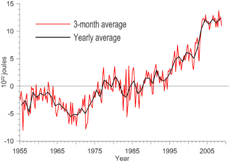
Just coincidentally turns out to exactly coincide with a change in the source for the data. The jump occurs exactly at the splice between two data sets. And everyone just blithely accepts this jump as a physical fact??

This is particularly hard to accept, as the ARGO data set (the newer data) has shown flat to declining ocean heat content since the day it was turned on. So what is the justification for the spike at the splice?
Irony
I try really, really hard not to get pulled into the ad hominem attacks that fly around the climate debate. So the following is just for fun on a Friday, and is not in any way meant to be a real climate argument. However, since so many alarmists like to attack skeptics as being anti-science, I thought I would have a bit of fun.
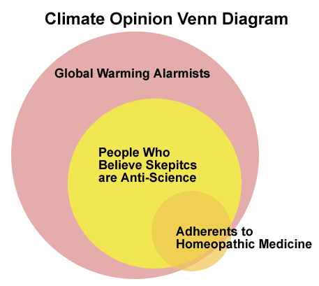
This diagram was spurred by this post from Reason’s Radley Balko:
The Science Blogs are having fun with the “wellness editor” at the Huffington Post, a woman who claims to have a “doctorate in homeopathic medicine.” An odd choice for a lefty website that makes such hay of the right’s hostility to science. I like this comment: “…a doctorate in homeopathic medicine would be a blank piece of paper soaked in a 1:10,000,000 tincture made from the ink of an actual doctor’s diploma.”
Just to head off the obvious, I have no doubt a similar Venn diagram could be created for skeptics and people who believe the world is only 4000 years old. Both arguments are equally meaningless when it comes down to whether the science is correct.
Two Scientific Approaches
This could easily be a business case: Two managers. One sits in his office, looking at spreadsheets, trying to figure out if the factory is doing OK. The other spends most of his time on the factory floor, trying to see what is going on. Both approaches have value, and both have shortcomings.
Shift the scene now to the physical sciences: Two geologists. One sits at his computer looking at measurement data sets, trying to see trends through regression, interpolation, and sometimes via manual adjustments and corrections. The other is out in the field, looking at physical evidence. Both are trying to figure out sea level changes in the Maldives. The local geologist can’t see global patterns, and may have a tendency to extrapolate too broadly from a local finding. The computer guy doesn’t know how his measurements may be lying to him, and tends to trust his computer output over physical evidence.
It strikes me that there would be incredible power from merging these two perspectives, but I sure don’t see much movement in this direction in climate. Anthony Watts has been doing something similar with temperature measurement stations, trying to bring real physical evidence to improve computer modellers correction algorithms, but there is very little demand among the computer guys for this help. We’ve reached an incredible level of statistical hubris, that somehow we can manipulate tiny signals from noisy and biased data without any knowledge of the physical realities on the ground (“bias” used here in its scientific, not its political/cultural meaning)
Climate Change = Funding
Any number of folks have achnowleged that, nowadays, the surest road to academic funding is to tie your pet subject in with climate change. If, for example, you and your academic buddies want funding to study tourist resort destinations (good work if you can get it), you will have a better chance if you add climate change into the mix.
John Moore did a bit of work with the Google Scholar search engine to find out how many studies referencing, say, surfing, also referenced climate change. It is a lot. When you click through to the searches, you will find a number of the matches are spurious (ie matches to random unrelated links on the same page) but the details of the studies and how climate change is sometimes force-fit is actually more illuminating than the summary numbers.
Making Science Proprietary
I have no idea what is driving this, whether it be a crass payback for campaign contributions (as implied in the full article) or a desire to stop those irritating amateur bloggers from trying to replicate “settled science,” but it is, as a reader said who sent it to me, “annoying:”
There are some things science needs to survive, and to thrive: eager, hardworking scientists; a grasp of reality and a desire to understand it; and an open and clear atmosphere to communicate and discuss results.
That last bit there seems to be having a problem. Communication is key to science; without it you are some nerd tinkering in your basement. With it, the world can learn about your work and build on it.
Recently, government-sponsored agencies like NIH have moved toward open access of scientific findings. That is, the results are published where anyone can see them, and in fact (for the NIH) after 12 months the papers must be publicly accessible. This is, in my opinion (and that of a lot of others, including a pile of Nobel laureates) a good thing. Astronomers, for example, almost always post their papers on Astro-ph, a place where journal-accepted papers can be accessed before they are published.
John Conyers (D-MI) apparently has a problem with this. He is pushing a bill through Congress that will literally ban the open access of these papers, forcing scientists to only publish in journals. This may not sound like a big deal, but journals are very expensive. They can cost a fortune: The Astrophysical Journal costs over $2000/year, and they charge scientists to publish in them! So this bill would force scientists to spend money to publish, and force you to spend money to read them.
I continue to be confused how research funded with public monies can be “proprietary,” but interestingly this seems to be a claim pioneered in the climate community, more as a way to escape criticism and scrutiny than to make money (the Real Climate guys have, from time to time, argued for example that certain NASA data and algorithms are proprietary and cannot be released for scrutiny – see comments here, for example.)

