Given all the activity of late challenging various aspects of the IPCC’s work, I wanted to remind folks of probably the most important assumption in the IPCC (and related climate models) that seldom makes the media.
Greenhouse gas theory alone does not give us a catastrophe. By the IPCC numbers, originally I think from Michael Mann in 1998, greenhouse warming from CO2 should be about 1.2C per doubling of CO2 concentrations. But the IPCC gets a MUCH higher final number than this. The reason is positive feedback. This is a second theory, that the Earth’s temperature system is dominated by very strong net positive feedback effects. Even if greenhouse gas theory is “settled,” it does not get us a catastrophe. The catastrophe comes from the positive feedback theory, and this is most definitely not settled.
I usually put it this way to laymen: Imagine the Earth’s climate is a car. Greenhouse gas theory says CO2 will only give the car a nudge. In most cases, this nudge will only move the car a little bit, because a lot of forces work to resist the nudge. Climate theory, however, assumes that the car is actually perched precariously at the very top of a steep hill, such that a small nudge will actually start the car rolling downhill until in crashes. This theory that the Earth is perched precariously on the top of the hill is positive feedback theory, and is far from settled. In fact, a reasonable person can immediately challenge it by asking the sensible question — “well, how has the climate managed to avoid a nudge (and resulting crash) for hundreds of millions of years?”
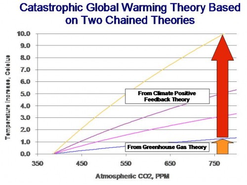
I got to thinking about all this because I saw a chart of mine in Nicola Scafetta’s SPPI report on climate change, where he uses this chart:
I am happy he chose this chart, because it is one of my favorites. It shows that most of the forecast warming from major alarmist models comes from the positive feedback theory, and not from greenhouse gas theory. Let me explain how it is built.
The blue line at the bottom is based on an equation right out of the Third IPCC Report (the Fourth Report seems to assume it is still valid but does not include it anywhere I can find). The equation seems to be from Mann 1998, and is for the warming effect from CO2 without feedbacks. The equation is:
∆T = F(C2) – F(C1)
Where F(C) = Ln(1+1.2c+0.005c^2+0.0000014c^3)
So the blue line is just this equation where C1=385ppm and C2 is the concentration on the X axis.
The other lines don’t exist in the IPCC reports that I can find, though they should**. What I did was to take various endpoint forecasts in the IPCC and from other sources and simply scale the blue line up, which implicitly assumes feedback acts uniformly across the range of concentrations. So, for example, a forecast after feedback of 4.8C of warming around 800ppm was assumed to scale the blue no feedback line up by a uniform factor of 4.8/1.2 = 4x. For those who know the feedback formula, we can back into the implied feedback fraction (again not to be found anywhere in the IPCC report) which would be 4=1/(1-f) so f=75%, which is a quite high factor.
** This seems like a totally logical way to show the warming effect from CO2, but the IPCC always insists on showing just warming over time. But this confuses the issue because it is also dependent on expected CO2 emissions forecasts. I know there are issues of time delays, but I think a steady-state version of this chart would be helpful.

