Over at Coyote Blog, we are having a NCAA bracket competition. Everyone is welcome, and entry is free.
All posts by admin
You Mean There is a Cost?
EPA’s analysis of the Lieberman-Warner (LW) global warming bill is out — and it ain’t pretty.
EPA estimates that LW may reduce GDP by $2.9 trillion in 2050 while reducing atmospheric CO2 by around 25 ppm by 2095.
What a bargain — reduce GDP by an estimated 6.9 percent for no meaningful change in atmospheric CO2!
The Catastrophe Comes from Feedback
I am going to be out enjoying some snow skiing this week, but I will leave you with a thought that was a prominent part of this video:
The catastrophe that Al Gore and others prophesy as a result of greenhouse gasses is actually not, even by their admission, a direct result of greenhouse gas emissions. Even the IPCC believes that warming directly resulting from manmade CO2 emissions is on the order of 1 degree C for a doubling of CO2 levels in the atmosphere (and many think it to be less).
The catastrophe comes, not from a mere 1 degree of warming, but from the multiplication for this warming 3,4,5 times or more by hypothesized positive feedback effects in the climate. Greenhouse gas theory gives us warming numbers we might not even be able to find amidst the natural variations of our climate; it is the theory of strong positive climate feedback that gives us the apocalypse.
So, In a large sense, the proposition that we face environmental Armageddon due to CO2 rests not on greenhouse gas theory, which is pretty well understood, but on the theory that our climate system is dominated by strong positive feedbacks. This theory of positive feedback is almost never discussed publicly, in part because it is far shakier and less understood than greenhouse gas theory. In fact, it is very probable that we have the sign, much less the magnitude, of major feedback effects wrong. But if we are considering legislation to gut our economies in order to avoid a hypothesized climate catastrophe, we should be spending a lot more time putting scrutiny on this theory of positive feedback, rather than just greenhouse gas theory.
Tom Nelson quotes an email from S. Fred Singer that states my position well:
I believe a fair statement is that the GH [greenhouse] effect of CO2 etc must exist (after all, CO2 is a GH gas and is increasing) but we cannot detect it in the record of temp patterns.
So we must conclude that its contribution to climate change is swamped by natural changes.
Why do models suggest a much larger effect? Because they all incorporate a positive feedback from WV [water vapor], which in actuality is more likely to be negative. Empirical evidence is beginning to support this explanation.
My Answer to Andrew Revkin
"A question for climate skeptics: I presume you agree there’s at least a chance you could be wrong, just as you assert those pointing to a clearcut climate apocalypse have little basis for their claims. On that front, I’d be curious to know what you’d propose as a backup plan if the climate’s sensitivity to CO2 turns out to be higher than you think?"
We are not talking about one potential disaster but two: Potential Disaster #1 is some sort of climate apocalypse from CO2-caused warming. Potential Disaster #2 is an economic apocalypse via contracting economies and drastically reduced energy consumption that result from aggresive CO2 abatement programs.
In all but the most dire climate forecasts, the economic disaster from aggressive CO2 abatement is at least as large in terms of its contribution to human misery as any hypothesized climate disaster from not abating CO2.
This statement might be open to debate, but here is one that is not: No matter which disaster is worse, what we know for sure is that the economic disaster is orders of magnitude more likely than the climate disaster. Because if there is a 0-5-10% chance of a apocalyptic climate disaster from inaction on CO2, there is a near 100% chance that efforts that truly abate CO2 (current recommendations are to reduce it in 30 years by 80-100%) will result in an economic disaster which will cause untold human misery — particularly if alarmists refuse to accept nuclear as a viable abatement option. We may actually not experience the disaster so much in the US — after all, as a nation we are quite rich. But the disaster in terms of lost opportunity for the billions of people who for the first time in millenia have the chance to escape grinding starvation-level poverty will be absolute.
This is what climate alarmists and their lapdogs in the press always fail to explain — in order to avoid a hypothesized climate disaster we have to set ourselves up for almost certain economic disaster. And the only way that this might not happen is if some new technology, like solar energy panels that are two orders of magnitude cheaper, comes along to bail us out of this tradeoff. But if that occurs, there is still little need for drastic action, since the market would adopt such a technology in seconds with or without a climate disaster looming.
Why Do We Only Look At Skeptic’s Money?
I would be happy to leave funding sources and related ad hominem attacks out of climate discourse completely, but, given these attacks seem to be an element of, oh say, 99% of all media articles on the topic, why is the scrutiny completely directed at skeptics? Sure, ExxonMobil has probably spent a couple of million dollars funding skeptics. But here is an example of $1.3 billion put behind the alarmist position. And this is just one such example. Gore just raised a $5 billion fund whose success or failure entirely depends on alarmists winning the political debate. These are direct incentives powerful people now have to lobby the government for climate "action" of some sort, whether or not it makes sense, just as ADM lobbies Congress for corn ethanol subsidies that have been proven to make no sense environmentally or economically.
Great Description of the Climate Debate
The environmental movement has also been astonishingly successful in co-opting education systems, and highly skillful at exploiting universal psychological tendencies to social conformity and deference to "authority." The suggestion that climate change is primarily a "moral" problem has been a masterstroke, of which the masterstroker is Al Gore.
Invoking morality is a powerful weapon in shutting off debate. It employs the so-called "psychology of taboo" to place some claims — for example, that climate change may be natural, beneficial, or practically unstoppable — beyond the pale. Those who promote such notions must therefore be evil, or psychologically unbalanced, or in the pay of powerful corporations.
Invoking the authority of science and the democratic value of "consensus" are again both designed to cut off rational analysis. This leads to the strange phenomenon of the discussion of policy alternatives becoming delinked from likely results, as with the responses to Mr. Baird’s announcement this week. Thus the finer points of carbon taxation and/or cap-and-trade systems are debated with little or no concern about the fact that they will achieve little or nothing in terms of changing the global climate.
It is clear that American public opinion is an outlyer in this great march towards green socialism. Often, climate alarmists ascribe this to America’s supposed disinterest in environmental issues. But this argument does not stand up when one looks at the facts. The US over the last 40 years has a much better environmental record than, say, the more pious Western Europe. Our water and air are cleaner, our forests continue to expand, and the only reason Europe doesn’t discuss problems with endangered species as much as the US is because they have already killed all theirs.
No, the real reason the US is an outlyer in opinion is that it does not have the culture of blind deference to public authority that Europe has, which has led Europeans into the hands of one authoritarian after another over the last centuries. In 1808 it was Napolean; in 1908 it was the Kaiser, and later Lenin and Hitler; in 2008 it is Al Gore.
Quality Science
There once was a scientist who was testing a frog. He said, "jump frog," and the frog jumped 8 feet. He pulled out his handy scientific notebook and wrote "Frog, four legs, jumps 8 feet."
The scientist then cut off one of the frog’s legs. "Jump frog," he said, and the frog jumped 6 feet. He wrote in his book "Frog, cut off one leg, jumps 6 feet."
He then proceeded to cut off another leg. "Jump frog." He measured and wrote in his book "Frog, cut off two legs, jumps 3 feet."
He then cut off another leg. Again he said "jump frog," and the frog jumped one foot. He wrote, "frog, three legs cut off, jumps 1 foot."
Finally, he cut off the last leg. "Jump frog." No response. "Jump Frog!" No movement. So he pulled out his notebook at wrote, "cut off all four legs, frog goes deaf."
Which brings us to this story: Drive your SUV, fish goes deaf.
HT: Tom Nelson (the bad joke is all mine)
Weighting Sample Sites in Mann’s Hockey Stick
Posting has been light, because I have been very busy at work and because I just have not seen that much science of late that was interesting to report, and there is only so much of the political yada yada on the subject of climate I can stomach.
But I learned something the other day in this post by Steve McIntyre. He as a nice way of cutting through all the BS about various statistical transforms that are used to create Mann’s hockey stick chart when he writes:
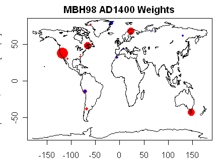
Whenever there is any discussion of principal components or some such multivariate methodology, readers should keep one thought firmly in their minds: at the end of the day – after the principal components, after the regression, after the re-scaling, after the expansion to gridcells and calculation of NH temperature – the entire procedure simply results in the assignment of weights to each proxy. This is a point that I chose to highlight and spend some time on in my Georgia Tech presentation. The results of any particular procedural option can be illustrated with the sort of map shown here – in which the weight of each site is indicated by the area of the dot on a world map. Variant MBH results largely depend on the weight assigned to Graybill bristlecone chronologies – which themselves have problems (e.g. Ababneh.)
In effect, while Mann used 50,60 proxy sets, just four determined about 90% of the answer. Often, Mann has been challenged by historians who argue that the historical written record stands in opposition to his proxy work, since the historical record is clear about a Medieval warm period (where grapes were grown further north than they are today and Greenland was green) and a little ice age (where rivers froze that seldom froze before or since). Mann has always responded that written records are limited to Europe and north Africa, while his hockey stick is global, but this chart tends to put the lie to that assertion. And that is before we even discuss how bad trees are as thermometers.
Something I Have Been Saying for a While
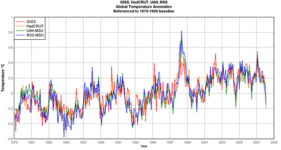
While I am big proponent of the inherent superiority of satellite temperature measurement over surface temperature measurement (at least as currently practiced), I have argued for a while that the satellite and surface temperature measurement records seem to be converging, and in fact much of the difference in their readings is based on different base periods used to set the "zero" anomoly.
I am happy to see Anthony Watt has done this analysis, and he does indeed find that, at least for the last 20 years or so, that the leading surface and satellite temperature measurement systems are showing about the same number for warming (though by theory I think the surface readings should be rising a bit slower, if greenhouse gasses are the true cause of the warming). The other interesting conclusion is that the amount of warming over the last 20 years is very small, and over the last ten years is nothing.
Interesting
This is interesting, but yet to be reproduced by others:
"Runaway greenhouse theories contradict energy balance equations," Miskolczi states. Just as the theory of relativity sets an upper limit on velocity, his theory sets an upper limit on the greenhouse effect, a limit which prevents it from warming the Earth more than a certain amount.
How did modern researchers make such a mistake? They relied upon equations derived over 80 years ago, equations which left off one term from the final solution.
Miskolczi’s story reads like a book. Looking at a series of differential equations for the greenhouse effect, he noticed the solution — originally done in 1922 by Arthur Milne, but still used by climate researchers today — ignored boundary conditions by assuming an "infinitely thick" atmosphere. Similar assumptions are common when solving differential equations; they simplify the calculations and often result in a result that still very closely matches reality. But not always.
So Miskolczi re-derived the solution, this time using the proper boundary conditions for an atmosphere that is not infinite. His result included a new term, which acts as a negative feedback to counter the positive forcing. At low levels, the new term means a small difference … but as greenhouse gases rise, the negative feedback predominates, forcing values back down.
My scientific intuition has always rebelled at the thought of runaway positive feedback.
By the way, James Hansen has claimed that he is being censored at NASA by the Bush Administration, and that the government should not interfere with scientists work. So how did he react to this work?
NASA refused to release the results. Miskolczi believes their motivation is simple. "Money", he tells DailyTech. Research that contradicts the view of an impending crisis jeopardizes funding, not only for his own atmosphere-monitoring project, but all climate-change research. Currently, funding for climate research tops $5 billion per year.
Miskolczi resigned in protest, stating in his resignation letter, "Unfortunately my working relationship with my NASA supervisors eroded to a level that I am not able to tolerate. My idea of the freedom of science cannot coexist with the recent NASA practice of handling new climate change related scientific results."
I argued a while back that Hansen should do the same if he thought he was being censored. Certainly you do not have to convince this libertarian of the contradiction between a government agency and the concept of free scientific inquiry.
Inspecting the Sausage Factory
A very interesting discussion about the foibles of climate modelling. Here is but a taste:
A major thrust of the debate was because Schlesinger had put the same data into the five models and each produced results that he claimed were meaningful. Somebody pointed out that the results differed considerably from model to model. For example, they differed by 180° in their predictions for large areas. Schlesinger’s reply was the models were not accurate for small regions. The person pointed out that the small regions were continental in their dimension. Much laughter at this point. Schlesinger then said the models were not quantitatively correct but they were qualitatively correct. When asked to explain what he meant he said well they all showed global warming with increased CO2. It was quickly pointed out that if you program them to have temperature increase with a CO2 increase (ceteris paribus) then that was an inevitable result of the programming not the reality. The noise volume increased at which point a bizarre incident occurred.
During Schlesinger’s presentation, titled, "Model projections of the Equilibrium and Transient Climatic Changes induced by Increased Atmospheric CO2" there were general rumblings in the audience about the nature and assertiveness of the presentation, something that I had come to know as normal for modelers. This erupted in the question period. However, prior to that there were strange noises coming from behind me. I did not want to look around based on my experience at english soccer matches. In the question period voices were raised and frustrations expressed about the inadequacy of the models. Suddenly at the height of the din a shoe flew upon to the platform from behind me. There was shocked silence and a strange voice said, "I didn’t have a towel." He then asked permission to go onto the platform. It turned out the strange noises were from the shoe thrower who had a voice box. He explained he had two Ph.Ds one in Atmospheric Physics and proceeded to put a formula on the blackboard. Schlesinger agreed it was the formula for the atmosphere at the basis of his models. The man then eliminated variables one at a time, each time having Schlesinger agree he eliminated them from the final model. The man then said what you have left no longer represents the atmosphere and any results from such as model were meaningless.
Asymmetry in Press Coverage
It would be perfectly acceptable to me to solely cover the science associated with global warming, rather than having dueling ad hominem attacks. However, since as hominem attacks and press coverage based on funding sources has become a staple of at least one side of the climate debate, I must observe the following irony: Scientists who receive $2 million from Exxon are tainted. But Al Gore is not, despite the fact that his net worth has increased by at least $35 million, mostly from being paid to speak on global warming or from investing in companies whose value depends on the expectation of government action on global warming.
Either leave the money out of the discussion altogether (my preference) or at least be symmetrical in whose money is being investigated.
Warming and Civilization
I am taking a course in the history of the High Middle Ages in Europe, say between 1000AD and 1300. One of the demographic drivers of the Middle Ages is the fact that population, while flat before 1000 and declining after 1300, actually doubled in Europe between 1000 and 1300. One of the key drivers was a very warm period that caused agriculture to flourish.
The funny part was listening to the professor try to present this section to today’s audience. He had to keep saying "I know you may find this hard to believe, but warming was very beneficial to European civilization." It was clear the audience was so programmed to think warming=bad, that listeners had a hard time accepting the historical fact that warming created a boom, including a population boom, in Middle Age Europe.
A Timely Post on Phoenix UHI
Steve McIntyre, in a timely post for this site given the recent project on Phoenix urban heat islands, has a post on the Phoenix adjustment in the GISS database and Hansen’s dicussion of Phoenix UHI in his 1999 paper.
One is left to wonder whether a station that has a 2.5C error-corection adjustment tacked on should even be included in a data set that is attempting to measure a warming signal on the order of magnitude of 0.5C, particularly since any reasonable person would argue that the 2.5C adjustment likely has an error bar of at least plus or minus 0.5C. I stand by my point that the signal to noise ratio in surface temperature measurement is terrible.
However, many GISS adjustments for site location and urbanization are negative, meaning urbanization has been reduced at the location since 1900, certainly an odd proposition. In fact, if memory serves, the total net adjustment of all stations in the GISS system is negative for site location and urbanization. I know, from here, the net USHCN adjustment for combined site location and urbanization is negative, adding 0.15F to current temperatures as compared to those in 1900, implying that site location quality has improved over time. Anyway, McIntyre promises to tackle this issue tomorrow, which I look forward to.
More Evidence Climate Scientists Can’t Measure Anything Correctly
Note this from Davos via Tom Nelson:
Friedman adds that Exxon Mobil has “done a number” on the debate with PR. Brilliant says that their role is to get information to people, as much information as they can. Page says that success is the best message — that is, if they had three-cent power, everyone would come.
Gore, from the audience, takes issue with Brilliant, saying that getting information out is no longer sufficient. “That’s the way the world used to work. The world doesn’t work that way anymore. The reason that the tobacco industry was able to continue killing people for 40 years ater the surger General’s report…. they understood the power of strategic persuasion. They went about it in a very careful, organized, and well-funded way.” He says we are “vulnerable to strategic persuasion campaigns if the other side assumes that we should just get the information out there.” He says Exxon Mobil has funded 40 front groups to “in their own words position global warming as theory rather than fact.” He concludes: “We need to take them on, Goddamnit.”
Using what rational metric could anyone argue that ExxonMobil and the oil/power industry is winning or dominating the PR war on global warming? Gore and company are leading this race 1000:1. Every media story is sympathetic to their side. Every public school course teaches it their way. The entire scientific grant process is tilted to make sure only global warming believers get funding. Exxon has been outspent thousands to one in funding research. Only a few lone bloggers and scientists even keep the skeptic’s issues alive. If climate scientists really have such a warped perspective on measurement, can we really trust them to be measuring temperature correctly?
Gore’s frustration is that, despite this 1000:1 PR advantage, his side is still losing the hearts and minds of average Americans, who are far less likely to think in lockstep with their country’s "elites" than are Europeans. His definition of Exxon controlling the debate is having Exxon be able to excercise its free speech rights at all. And since he "takes them on" at every turn, my guess is what he means by this exhortation is to actually use the coercive power of the government to shut Exxon and other skeptics up completely.
But of Course, Money Only Influences Skeptics
Pollack (2005) addresses the first ethic, noting that the paramount motivational factor for scientists today is the competition to survive. A scientist’s most pressing need, which supersedes the scientific pursuit of truth, is to get her grant funded – to pay her salary and that of her staff, to pay department bills, and to obtain academic promotion. The safest way to generate grants is to avoid any dissent from orthodoxy. Grant-review Study Sections whose members’ expertise and status are tied to the prevailing view do not welcome any challenge to it. A scientist who writes a grant proposal that dissents from the ruling paradigm will be left without a grant. Speaking for his fellow scientists Pollack writes, "We have evolved into a culture of obedient sycophants, bowing politely to the high priests of orthodoxy."
…
The grant system fosters an Apollonian approach to research. The investigator does not question the foundation concepts of biomedical and physical scientific knowledge. He sticks to the widely held belief that the trunks and limbs of the trees of knowledge, in, for example, cell physiology and on AIDS, are solid. The Apollonian researcher focuses on the peripheral branches and twigs and develops established lines of knowledge to perfection. He sees clearly what course his research should take and writes grants that his peers are willing to fund. Forced by the existing grant system to follow such an approach, Pollack (2005) argues that scientists have defaulted into becoming a culture of believers without rethinking the fundamentals.
It’s like a Whole New Post
If you have not visited my post lately on my son’s experiment on urban heat islands, go check it out, its like a whole new post. Sixty comments and at least five updates.
I appologize to all the climate alarmist posters who have found my son’s project (to measure the Phoenix urban heat island) to be insufficiently rigorous. I am sure all your baking-soda-and-vinegar volcanoes in 8th grade were much better done.
More on Temperature Adjustments
With what facts / justification / data is the GISS reducing measuremet temperatures prior to the 1970’s? Climate Audit has more. Whatever the justification, the adjustments are increasing station temperatures by as much as 3C, a signal correction that is far in excess of the signal (0.6 degrees C or so of warming).
More on adjustments here and signal to noise ratio in temperature measurement here.
Updates
In response to some emails, I have posted updates to the Phoenix urban heat island post.
Measuring the Phoenix Urban Heat Island
Note Updates at the Bottom. Could we please agree to actually read the whole post and the updates before commenting? All commenters welcome, and I never delete comments except in the case of outright advertisement spam
This is a project my son did for Science Fair to measure the urban heat island effect in Phoenix. The project could also be called "Disproving the IPCC is so easy, a child could do it." The IPCC claims that the urban heat island effect has a negligible impact, even on surface temperature stations located within urban areas. After seeing our data, this claim will be very hard to believe.
In doing the test, we tried to follow as closely as possible the process used in the Nyuk Hien Wong and Chen Yu study of Singapore as published in Habitat International, Volume 29, Issue 3 , September 2005, Pages 547-558. We used a LogTag temperature data logger. My son used a map and a watch to mark our times, after synchronizing clocks with the data logger, so he could match times to get temperature at each location. I called out intersections as we passed them and he wrote down the times. At the same time, I actually had a GPS data logger where I gathered GPS data for location vs. time, but I did not share this with him because he wanted to track locations himself on the map. My data below uses the GPS data, which was matched with the temperature data in an Excel spreadsheet using simple Vlookup calls.
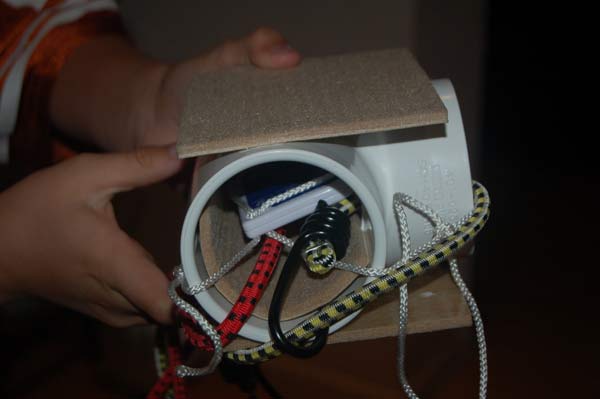
To protect the data logger from the 60mph wind (we tried to drive at exactly 60 so my son could interpolate distances between intersections) we put the datalogger in a PVC Tee:
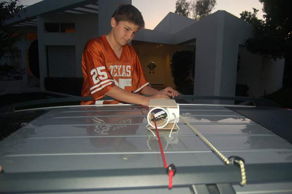
We added some insulation to reduce the effect of heat from the car’s roof, and then strapped the assembly to the roof with the closed part of the Tee facing forward (the nose of the car is to the left in this picture).
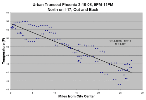
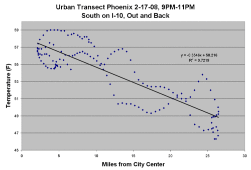
We drove transects two nights in a row. Both nights were cloudless with winds below 5 mph. Ideally, we would have driven between midnight and 6 AM, but this was my kid’s science project and he needs to get to bed so we did it from about 9PM to 11PM. We were concerned that the air might still be cooling during the test, such that as we drove out from town, it might be easy to mix up cooling with time and cooling with location. Our idea for correcting this was to drive and gather data on an entire loop, starting in the center of town, going about 30 miles out, and then returning to the starting point. That way, with data taken in both directions, the results could be averaged and the cooling rate would cancel out. As it turned out, we didn’t even bother to do the averaging. The two trips can be seen in the plots, but the urban heat island shows through pretty clearly in the data and the slope of the line between temperature and distance was about the same on the inbound and outbound legs.
I used the GPS lat/long points to calculate the distance (as the crow flies) from the center of town (My son did it the hard way, using a tool on Google maps).
The first night we went north (click to enlarge):
The second night we went south. The urban profile going south is a little squirrellier, as the highway we were traveling tends to dip in and out of the urbanization.
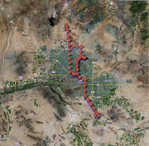
Here is the total route over the two nights. I’m still trying to figure out the best way to plot the temperatures on the map (again, click to enlarge)
You can see the results. Even at the too-early time of 9-11PM, the temperature fell pretty linearly by about 0.2-0.3 degrees F per mile from the city center (as the crow flies).
I would really love to do is to go down to Tucson and run this same test starting at the USHCN weather station there and driving outwards. That may have to wait a few weeks until my job calms down a bit.
Update: Per some emails I have received, it is theoretically possible for the urban heat island effect to be real and to have integrity in the surface temperature record. The first way this could happen is if the official measurement stations are well sited and outside of growing urban heat islands. I know for a fact by direct observation that this is not the case. A second way this might be the case is if one argues that urban heat islands exist but their effect is static over time, so that they may bias temperatures but not the warming signal. I also don’t think this is very credible, give growth of urban areas over the last 50 years.
A better argument might be that because most US temperature stations are arriving at daily temperature averages from just measuring daily min and max temperatures. It might be arguable that while urban temperatures cool more slowly at night, they still reach the same Tmin in the early morning as the surrounding countryside. Unfortunately, I do not think this is the case — studies like this one taken at 5AM have seen the same results. But this is something I may pursue later, redoing the results at whatever time of day Phoenix usually hits its minimum temperature.
A good argument for the integrity of the surface temperature measurement system is NOT that scientists blind to local station installation details can use statistical tools to correct for urban biases. After looking at two stations in the Arizona area, one urban (Tucson) and one rural (Grand Canyon) it appears the GISS statistical method, whatever this double-secret process may be [insert rant about government-funded research by government employees being kept secret] it actually tends to average biased sites with non-biased sites, which does nothing to get the urban bias out of the measured surface warming signal – it just spreads it around a little. It reminds me a lot of my kids spreading the food they don’t like in a thin layer all over the plate, hoping that it will be less noticeable than when it sits in one place in a big pile.
Again, I have not inspected their procedure, but looking at the results there seems to be a built-in assumption in the GISS algorithms that they expect an equal chance of a site being biased upwards vs. downwards. In fact, I seem to see more GISS corrections fixing imagined downwards biases than upwards biases. I just don’t see how this is a valid assumption. The reality is that biases in outdoor temperature measurement are much more likely to be upwards than downwards, particularly over the last 50 years of urbanization and even more particularly given the fact that the preferred measuremnt technology, the MMTS station, has a very very short cable length that nearly gaurantees an installation near buildings, pavement, etc.
Update #2: To this last point, consider this situation: Thermometer one in the city shows 2 degrees of warming. Thermometer two a few hundred kilometers away shows no warming. Someone aware of urban biases without a dog in the hunt would, without other data to guide them, likely put their money on the rural site being correct and the urban site exaggerated or biased. The urban site should be thrown out, not averaged in. However, the folks putting the GISS numbers together are strong global warming believers. They EXPECT to find warming, so when looking at the same situation, absolutely sure in their hearts there should be warming, the site with the 2 degrees of warming looks correct to them and the no warming site looks anomalous. It is for this reason that the GISS methodology should be as public as possible, subject to full criticism by everyone.
Update #3: I know that many commenters see one line or even a title to a post and jump to the comment section to bang out their rebuttal without reading the post. I typcally do not respond to such folks, but there are just so many here I feel the need to say: Yes, the IPCC knows urban heat islands exist. What I said, and I think it is true, is that the IPCC does not believe urban heat islands substantially bias the surface temperature record, and, if they do, their effect can be statistically corrected by approaches like that used by the GISS and discussed above in Update #1. I admit that this experiment alone, even if the quality was perfect, would not disprove that notion, but it has to make one suspicious (skeptical, even?) By the way, if you want to yell "Peterson!" at this point, see here. The volume of interest, pro and con, on this post I think is going to motivate me to go down to Tucson and run the same test with this USHCN station as the urban starting point, and then we’ll see.
By the way, my point is clearly not, as some skeptical supporters might make out, that urban heat biases in surface temperature measurement account for all historical warming. Clearly that is not true, as satellites, which do not have this urban bias problem, have measured real global warming, though at a lower rate than the surface temperature record.
Update #4: To some of you commenters: give me a break. This is a junior high school science project funded with a $65 temperature logger and a half tank of gas. I am sure the error bars are enormous and the R-squared probably has little meaning (to tell the truth, Excel just put it there when I asked it to draw a trend line through the data). Some of the data on the second run in particular looks weird to me and I would want to do a lot more work with it before I presented it to my PhD review board. That being said, I would be happy to put it in front of said board next to the typical junior high baking soda and vinegar volcano project.
Given our constraints, I think we did a moderately thoughtful job of structuring the project– better, in fact, than the published Singapore study we emulated. In particular, the fact that we did the run both ways tends to help us weed out the evening cooling effect as well as any progressive heating effect from the car itself. I honestly had zero idea what we would find when we downloaded the data to the computer. I kind of thought it would be a mess — remember, we were not really doing this at the right time of day. It was not until my son did the charts using his position log he took by hand that I thoughy, "wow, there is a big effect here." That is when I decanted the data from my GPS logger to check his results using a little more accurate position vs. time data and produced the charts here. As I said, I really should have averaged position data for the forward and reverse runs, but I think the charts were fairly compelling.
Update #5: The other half of my son’s project was to participate in the SurfaceStations.org survey of USHCN temperature stations. He did a photo survey of two sites. Below is a picture from the USHCN station at Miami, AZ. Left as an exercise to the commenters who are defending the virtue of the US surface temperature netork: Explain how siting the temperature instrument within six feet of a reflective metal building that is perfectly positioned to reflect the afternoon sun from the SW onto the instrument does not introduce any measurement biases. As extra credit, explain why the black gravel and asphalt road and the concrete building 6 feet away don’t store heat in the day to then to warm up the air around the instrument at night as the heat re-radiates.

