All posts by admin

Someone Really Needs to Drive A Stake In This

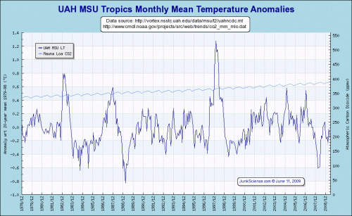
Isn’t there someone credible in the climate field that can really try to sort out the increasing divergence of satellite vs. surface temperature records?  I know there are critical studies to be done on the effect of global warming on acne, but I would think actually having an idea of how much the world is currently warming might be an important fact in the science of global warming.

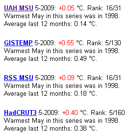
The problem is that surface temperature records are showing a lot more warming than satellite records.  This is a screen cap. from Global Warming at a Glance on JunkScience.com.  The numbers in red are anomalies, and represent deviations from a arbitrary period whose average is set to zero  (this period is different for the different metrics).  Because the absolute values of the anamolies are not directly comparable, look at the rankings instead:

temps

Here is the connundrum — the two surface records (GISTEMP and Hadley CRUT3) showed May of 2009 as the fifth hottest in over a century of readings.  The two satellite records showed it as only the 16th hottest in 31 years of satellite records.  It is hard to call something settled science when even a basic question like “was last month hotter or colder than average” can’t be answered with authority.

Skeptics have their answer, which have been shown on this site multiple times.  Much of the surface temperature record is subject to site location biases, urban warming effects, and huge gaps in coverage.  Moreover, instrumentation changes over time have introduced biases and the GISS and Hadley Center have both added “correction” factors of dubious quality that they refuse to release the detailed methodology or source code behind.

There are a lot of good reasons to support modern satellite measurement.  In fact, satellite measurement has taken over many major climate monitoring functions, such as measurement of arctic ice extent and solar irradiance.  Temperature measurement is the one exception.  One is left with a suspicion that the only barrier to acceptance of the satellite records is that alarmists don’t like the answer they are giving.

If satellite records have some fundamental problem that exceeds those documented in the surface temperature record, then it is time to come forward with the analysis or else suck it up and accept them as a superior measurement source.

Postscript: It is possible to compare the absolute values of the anamolies if the averages are adjusted to the same zero for the same period.  When I did so, to compare UAH and Hadley CRUT3, I found the Hadley anamoly had to be reduced by about 0.1C to get them on the same basis.  This implies Hadley is reading about 0.2C more warming over the last 20-25 years, or about 0.1C/decade.

Update #2 On GCCI Electrical Grid Disruption Chart

Update: Evan Mills, apparently one author of the analysis, responds and I respond back.

Steve McIntyre picks up my critique on the electrical grid disruption chart (here and here) and takes it further.  Apparently, this report (which I guess I should be calling the Climate Change Synthesis Report or CCSP) set rules for itself that all the work in the report had to be from peer-reviewed literature.  McIntyre makes a grab at the footnotes for this section of the report for any peer-reviewed basis, but comes up only with air.   He also references a hurricane chart in the report apparently compiled by the same person who compiled the grid outage report.  Roger Pielke rips up this hurricane report, and I have it on my list to address in a future post as well.

GCCI #11: Changing Wet and Dry Weather

From the GCCI report on page 24:

Increased extremes of summer dryness and winter wetness are projected for much of the globe, meaning a generally greater risk of droughts and floods. This has already been observed, and is projected to continue. In a warmer world, precipitation tends to be concentrated into heavier events, with longer dry periods in between.

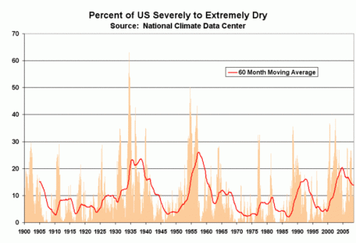
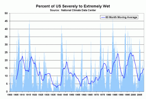
Later in the report they make the same claims for the US only.  I can’t speak for the rest of the world, but I don’t know what data they are using.  This is from the National Climate Data Center, run by the same folks who wrote this report:

dry_2

wet

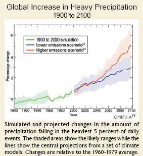
Maybe my Mark I eyeball is off, but it sure doesn’t look like any trend here, or that there we are currently at any particularly unprecedented levels today.  Of course, the main evidence they have of increasing extreme rainfall is in this chart — but of course this is “simulated” history, rather than actual, you know, observations.

GCCI #10: Extreme Example of Forcing Observation to Fit the Theory

In the last post, I discussed forcing observations to fit the theory.  Generally, this takes the form either of ignoring observations or adding “adjustment” factors to the data.  But here is an even more extreme example from page 25:

simulation

A quick glance at this chart, and what do we see?  A line historically rising surprisingly in parallel with global temperature history, and then increasing in the future.

But let’s look at that chart legend carefully.  The green “historic” data is actually nothing of the sort – it is simulation!  The authors have created their own history.  This entire chart is the output of some computer model programmed to deliver the result that temperature drives heavy precipitation, and so it does.

GCCI #9: Forcing Observation to Fit the Theory

Let me digress a bit.  Just over 500 years ago, Aristotelian physics and mechanical models still dominated science.  The odd part about this was not that people were still using his theories nearly 2000 years after his death — after all, won’t people still know Isaac Newton’s contributions a thousand years hence?  The strange part was that people had been observing natural effects for centuries that were entirely inconsistent with Aristotle’s mechanics, but no one really questioned the underlying theory.

But folks found it really hard to question Aristotle.  The world had gone all-in on Aristotle.  Even the Church had adopted Aristotle’s description of the universe as the one true and correct model.  So folks assumed the observations were wrong, or spent their time shoe-horning the observations into Aristotle’s theories, or just ignored the offending observations altogether.  The Enlightenment is a complex phenomenon, but for me the key first step was the willingness of people to start questioning traditional authorities (Aristotle and the church) in the light of new observations.

I am reminded of this story a bit when I read about “fingerprint” analyses for anthropogenic warming.  These analyses propose to identify certain events in current climate (or weather) that are somehow distinctive features of anthropogenic rather than natural warming.  From the GCCI:

The earliest fingerprint work focused on changes in surface and atmospheric temperature. Scientists then applied fingerprint methods to a whole range of climate variables, identifying human-caused climate signals in the heat content of the oceans, the height of the tropopause (the boundary between the troposphere and stratosphere, which has shifted upward by hundreds of feet in recent decades), the geographical patterns of precipitation, drought, surface pressure, and the runoff from major river basins.

Studies published after the appearance of the IPCC Fourth Assessment Report in 2007 have also found human fingerprints in the increased levels of atmospheric moisture (both close to the surface and over the full extent of the atmosphere), in the decline of Arctic sea ice extent, and in the patterns of changes in Arctic and Antarctic surface temperatures.

This is absolute caca.  Given the complexity of the climate system, it is outright hubris to say that things like the “geographical patterns of precipitation” can be linked to half-degree changes  in world average temperatures.  But it is a lie to say that it can be linked specifically to human-caused warming, vs. warming from other causes, as implied in this statement.   A better name for fingerprint analysis would be Rorschach analysis, because they tend to result in alarmist scientists reading their expectation to find anthropogenic causes into every single weather event.

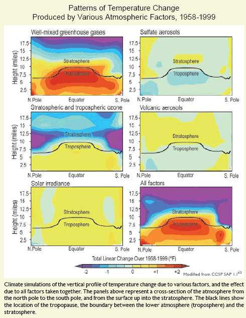
But there is one fingerprint prediction that was among the first to be made and is still probably the most robust of this genre:  that warming from greenhouse gasses will be greatest in the upper troposphere above the tropics.  This is demonstrated by this graph on page 21 of the GCCI

fingerprint

This has always been a stumbling block, because satellites, the best measures we have on the troposphere, and weather balloons have never seen this heat bubble over the tropics.  Here is the UAH data for the mid-troposphere temperature — one can see absolutely no warming in a zone where the warming should, by the models, be high:

mid-trop

Angell in 2005 and Sterin in 2001 similarly found from Radiosonde records about 0.2C of warming since the early 1960s, below the global surface average warming when models say it should be well above.

But fortunately, the GCCI solves this conundrum:

For over a decade, one aspect of the climate change story seemed to show a significant difference between models and observations.

In the tropics, all models predicted that with a rise in greenhouse gases, the troposphere would be expected to warm more rapidly than the surface. Observations from weather balloons, satellites, and surface thermometers seemed to show the opposite behavior (more rapid warming of the surface than the troposphere). This issue was a stumbling block in our understanding of the causes of climate change. It is now largely resolved.   Research showed that there were large uncertainties in the satellite and weather balloon data. When uncertainties in models and observations are properly accounted for, newer observational data sets (with better treatment of known problems) are in agreement with climate model results.

What does this mean?  It means that if we throw in some correction factors that make observations match the theory, then the observations will match the theory.  This statement is a pure out and out wishful thinking.  The charts above predict a 2+ degree F warming in the troposphere from 1958-1999, or nearly 0.3C per decade.  No study has measured anything close to this  – Satellites show 0.0C per decade and radiosondes about 0.05C per decade.    The correction factors to make reality match the theory would have to be 10 times the measured anomaly.  Even if this were the case, the implied signal to noise ratio would be so low as to render the analysis meaningless.

Frankly, the statement by these folks that weather balloon data and satellites have large uncertainties is hilarious.  While this is probably true, these uncertainties and inherent biases are DWARFED by the biases, issues, uncertainties and outright errors in the surface temperature record.  Of course, the report uses this surface temperature record absolutely uncritically, ignoring a myriad of problems such as these and these.  Why the difference?  Because observations from the flawed surface temperature record better fit their theories and models.  Sometimes I think these guys should have put a picture of Ptolemy on their cover.

GCCI #8: A Sense of Scale

In this post I want to address a minor point on chartsmanship.  Everyone plays this game with scaling and other factors to try to make his or her point more effective, so I don’t want to make too big of a deal about it.   But at some point the effort becomes so absurd it simply begs to be highlighted.

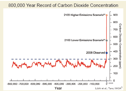
Page 13 of the GCCI report has this chart I have already seen circulating around the alarmist side of the web:

co2

There are two problems here.

One, the compression of the X axis puts the lower and upper scenario lines right on top of each other.  This really causes the higher scenario  (which, at 900ppm, really represents a number higher than we are likely to see even in a do-nothing case) to visually dominate.

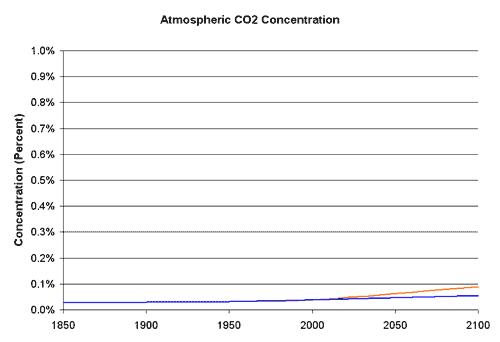
The other issue is that the Y-axis covers a very, very small range, such that small changes are magnified visually.  The scale runs from 0% of the atmosphere up to 0.09% of the atmosphere.  If one were to run the scale to cover a more reasonable range, he would get this  (with orange being the high emissions case and blue being the lower case):

co2a

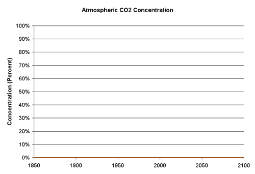
Even this caps out at just 1% of the atmosphere.  If we were to look at the total composition of the atmosphere, we would get this:

co2b

GCCI #7: A Ridiculously Narrow Time Window – The Sun

In a number of portions of the report, graphs appear trying to show climate variations in absurdly narrow time windows.  This helps the authors  either a) blame long-term climate trends on recent manmade actions or b) convert natural variation on decadal cycles into a constant one-way trend.  In a previous post I showed an example, with glaciers, of the former.  In this post I want to discuss the latter.

Remember that the report leaps out of the starting gate by making the amazingly unequivocal statement:

1. Global warming is unequivocal and primarily human-induced. Global temperature has increased over the past 50 years. This observed increase is due primarily to human induced emissions of heat-trapping gases.

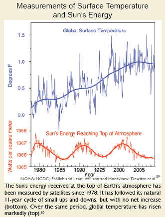
To make this statement, they must dispose of other possible causes, with variations in the sun being the most obvious.  Here is the chart they use on page 20:

sun-short

Wow, this one is even shorter than the glacier chart.  I suppose they can argue that it is necessarily so, as they only have satellite data since 1978.  But there are other sources of data prior to 1978 they could have used**.

I will show the longer view of solar activity in a minute, but let’s take a minute to think about the report’s logic.  The chart tries to say that the lack of a trend in the rate of solar energy reaching Earth is not consistent with rising temperatures.  They are saying – See everyone, flat solar output, rising temperatures.  There can’t be a relationship.

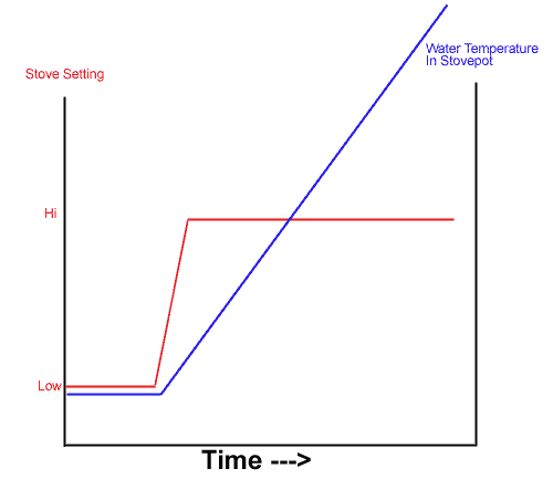
Really?  Did any of these guys take basic thermodynamics?  Let’s consider a simple example from everyone’s home — a pot on a stove.  The stove is on low, and the water has reached an equilibrium temperature, well below boiling.  Now we turn the stove up — what happens?

water-stove1

In this chart, the red is the stove setting, and we see it go from low to high.  Prior to the change in stove setting, the water temperature in the pot, shown in blue, was stable.  After the change in burner setting, the water temperature begins to increase over time.

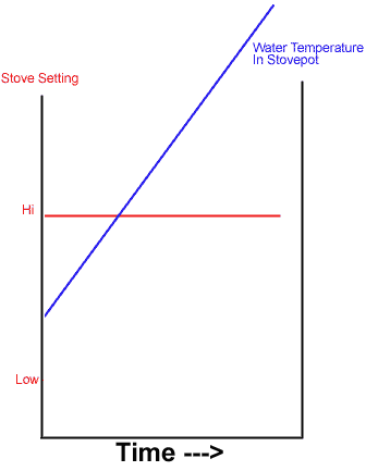
If we were to truncate this chart, so we only saw the far right side, as the climate report has done with the sun chart, we would see this:

water-stove2

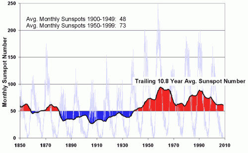
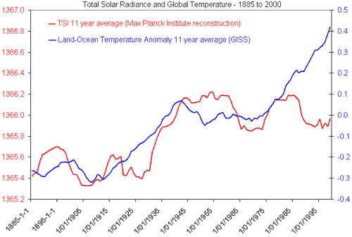
Doesn’t this look just a little like the solar chart in the report?  The fact is that the chart from the report is entirely consistent both with a model where the sun is causing most of the warming and one where it is not.  The key is whether the level of the sun’s output from 1987 to present is a new, higher plateau that is driving temperature increases over time (like the higher burner setting) or whether the sun’s output recently is consistent with, and no higher than, its level over the last 100 years.  What we want to look for, in seeking the impact of the sun, is a step-change in output near when temperature increases of the last 50 years began.

Does such a step-change exist?  Yes.  One way to look at the sun’s output is to use sunspots as a proxy for output – the more spots in a given 11 year cycle, the greater the sun’s activity and likely output.  Here is what we see for this metric:

sunspot2-500x310

And here is the chart for total solar irradiance (sent to me, ironically, by someone trying to disprove the influence of the sun).

unsync

Clearly the sun’s activity and output experienced an upwards step-change around 1950.  The average monthly sunspots in the second half of the century were, for example, 50% higher than in the first half of the century.

The real question, of course, is whether these changes result in large or small rates of temperature increase.  And that is still open for debate, with issues like cloud formation thrown in for complexity.  But it is totally disingenuous, and counts on readers to be scientifically illiterate, to propose that the chart in the report “proves” that the sun is not driving temperature changes.

**By this logic, they should only have temperature data since 1978 for the same reason, though by one of those ironies I am starting to find frequent in this report, all the charts, including this one, use flawed surface temperature records rather than satellite data.  Why didn’t they use satellite data for the temperature as well as the solar output for this chart?  Probably because the satellite data does not include upward biases and thus shows less warming.  Having four or five major temperature indices to choose from, the team writing this paper chose the one that gives the highest modern warming number.

GCCI #6: A Ridiculously Narrow Time Window – Glaciers

In a number of portions of the report, graphs appear trying to show climate variations in absurdly narrow time windows.  This helps the authors of this scientific report advocacy press release either a) blame long-term climate trends on recent manmade actions or b) convert natural variation on decadal cycles into a constant one-way trend.  In this post we will look at an example of the former, while in the next post we will look at the latter.

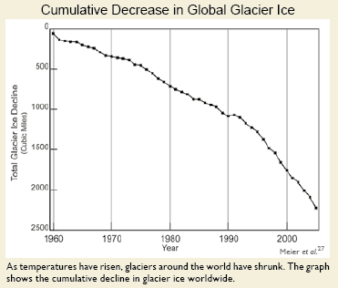
Here is the melting glacier chart from right up front on page 18, in the section on sea level rise (ironic, since if you really read the IPCC report closely, sea level rise comes mainly from thermal expansion of the oceans – glacier melting is offset in most models by increased snow in Antarctica**).

glaciers-recent

Wow, this looks scary.  Of course, it is clever chartsmanship, making it look like they have melted down to zero by choice of scale.   How large is this compared to the total area of glaciers?  We don’t know from the chart — percentages would have been more helpful.

Anyway, I could criticize these minor chartsmanship games throughout the paper, but on glaciers I want to focus on the selected time frame.  What, one might ask, were glaciers doing before 1960?  Well, if we accept the logic of the caption that losses are driven by temperature, then I guess it must have been flat.  But why didn’t they show that?  Wouldn’t that be a powerful chart, showing flat glacier size with this falloff to the right?

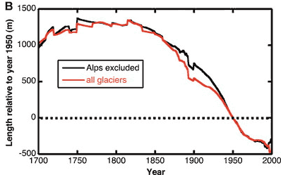
Well, as you may have guessed, the truncated time frame on the left side of this chart is not flat.  I can’t find evidence that Meier et al looted back further than 1960, but others have, including Oerlemans as published in Science in 2005.  (The far right hand side really should be truncated by 5-10 years, as they are missing a lot of datapoints in the last 5 years, making the results odd and unreliable).

glaciers-long

OK, this is length rather than volume, but they should be closely related.  The conclusion is that glaciers have been receding since the early 19th century, LONG before any build-up of CO2, and coincident with a series of cold decades in the last 18th century  (think Valley Forge and Napoleon in Russia).

I hope you can see why it is unbelievably disingenuous to truncate the whole period from 1800-1960 and call this trend a) recent and b) due to man-made global warming.  If it is indeed due to man-made global warming since 1960, then there must have been some other natural effect shrinking glaciers since 1825 that fortuitously shut off at the precise moment anthropogenic warming took over.  Paging William of Occam, call your office please.

Similarly, sea levels have been rising steadily for hundreds, even thousands of years, and current sea level increases are not far off their average pace for the last 200 years.

** The climate models show warming of the waters around Antarctica, creating more precipitation over the climate.  This precipitation falls and remains as snow or ice, and is unlikely to melt even at very high numbers for global warming as Antarctica is so freaking cold to begin with.

Update on GCCI Post #4: Grid Outage Chart

Update: Evan Mills, apparently one author of the analysis, responds and I respond back.

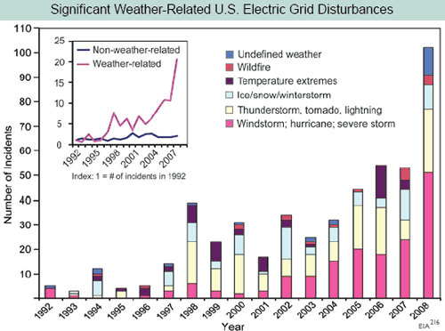
Yesterday I called into question the interpretation of this chart from the GCCI report where the report used electrical grid outages as a proxy for severe weather frequency:

electrical-outage1

I hypothesized:

This chart screams one thing at me:  Basis change.  Somehow, the basis for the data is changing in the period.  Either reporting has been increased, or definitions have changed, or there is something about the grid that makes it more sensitive to weather, or whatever  (this is a problem in tornado charts, as improving detection technologies seem to create an upward incidence trend in smaller tornadoes where one probably does not exist).   But there is NO WAY the weather is changing this fast, and readers should treat this whole report as a pile of garbage if it is written by people who uncritically accept this chart.

I had contacted John Makins of the EIA who owns this data set yesterday, but I was too late to catch him in the office.  He was nice enough to call me today.

He said that there may be an underlying upward trend out there (particularly in thunderstorms) but that most of the increase in this chart is from improvements in data gathering.  In 1997, the EIA (and Makins himself) took over the compilation of this data, which had previously been haphazard, and made a big push to get all utilities to report as required.  They made a second change and push for reporting in 2001, and again in 2007/2008.  He told me that most of this slope is due to better reporting, and not necessarily any underlying trend.   In fact, he said there still is some under-reporting by smaller utilities he wants to improve so that the graph will likely go higher in the future.

Further, it is important to understand the nature of this data.  The vast majority of weather disturbances are not reported to the EIA.  If the disturbance or outage remains local with no impact on any of the national grids, then it does not need to be reported.  Because of this definitional issue, reported incidents can also change over time due to the nature of the national grid.  For example, as usage of the national grid changes or gets closer to capacity, local disturbances might cascade to national issues where they would not have done so 20 years ago.  Or vice versa – better grid management technologies might keep problems local that would have cascaded regionally or nationally before.  Either of these would drive trends in this data that have no relation to underlying weather patterns.

At the end of the day, this disturbance data is not a good proxy for severe weather.  And I am left wondering at this whole “peer-reviewed science” thing, where errors like this pass into publication of major reports — an error that an amateur like myself can identify with one phone call to the guy listed by this data set on the web site.  Forget peer review, this isn’t even good basic editorial control  (apparently no one who compiled the report called Makins, and he was surprised today at the number of calls he was suddenly getting).

Postscript: Makins was kind enough to suggest some other data bases that might show what he believes to be a real increase in thunderstorm disturbances of electrical distribution grids.  He suggested that a number of state PUC’s keep such data, including the California PUC under their reliability section.  I will check those out, though it is hard to infer global climate trends from one state.

GCCI #5: The Dog That Didn’t Bark

The GCCI is mainly focused on creating a variety of future apocalyptic narratives.  However, it was interesting none-the-less for what was missing:  No hockey stick, and no Co2/temperature 600,000 year ice core chart.  Have we finally buried these chestnuts, or were they thought unnecessary as the report really expends no effort defending the existence of warming.

GCCI #4: I Am Calling Bullsh*t on this Chart

Update#2: Evan Mills, apparently one author of the analysis, responds and I respond back.

UPDATE: I obtained more information from the EIA.  My hypothesis below is correct.   Update here.

For this next post, I skip kind of deep into the report because Kevin Drum was particularly taken with the power of this chart from page 58.

electrical-outage

I know that skepticism is a lost art in journalism, so I will forgive Mr. Drum.  But in running a business, people put all kinds of BS analyses in front of me trying to get me to spend my money one way or another.  And so for those of us for whom data analysis actually has financial consequences, it is a useful skill to be able to recognize a steaming pile of BS when one sees it.  (Update: I regret the snarky comment about Kevin Drum — though I disagree with him a lot, he is one of the few folks on either side of the political aisle who is willing to express skepticism for studies and polls even when they support his position.  Mr. Drum has posted an update to his original post after I emailed him this information).

First, does anyone here really think that we have seen a 20-fold increase in electrical grid outages over the last 15 years but no one noticed?  Really?

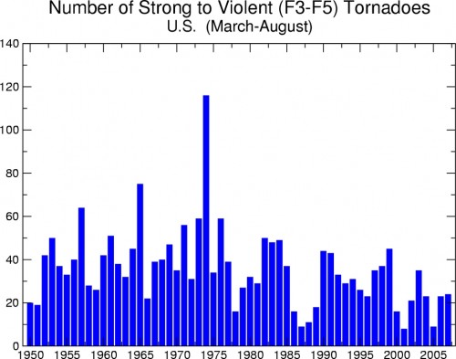
Second, let’s just look at some of the numbers.  Is there anyone here who thinks that if we are seeing 10-20 major outages from thunderstorms and tornadoes (the yellow bar) in the last few years, we really saw ZERO by the same definition in 1992?  And 1995?  And 1996?  Seriously?  This implies there has been something like a 20-fold increase in outages from thunderstorms and tornadoes since the early 1990’s.  But tornado activity, for example, has certainly not increased since the early 1990’s and has probably decreased (from the NOAA, a co-author of the report):

tornadotrend

All the other bars have the same believability problem.  Take “temperature extremes.”  Anyone want to bet that is mostly cold rather than mostly hot extremes?  I don’t know if that is the case, but my bet is the authors would have said “hot” if the data had been driven by “hot.”  And if this is proof of global warming, then why is the damage from cold and ice increasing as fast as other severe weather causes?

This chart screams one thing at me:  Basis change.  Somehow, the basis for the data is changing in the period.  Either reporting has been increased, or definitions have changed, or there is something about the grid that makes it more sensitive to weather, or whatever  (this is a problem in tornado charts, as improving detection technologies seem to create an upward incidence trend in smaller tornadoes where one probably does not exist).   But there is NO WAY the weather is changing this fast, and readers should treat this whole report as a pile of garbage if it is written by people who uncritically accept this chart.

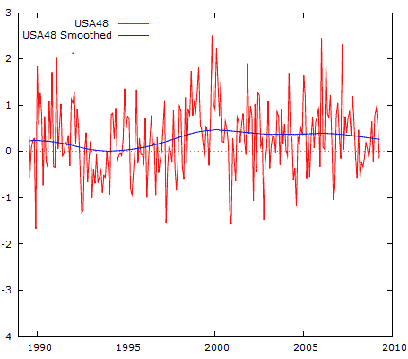
Postscript: By the way, if I want to be snarky, I should just accept this chart.  Why?  Because here is the US temperature anomaly over the same time period (using the UAH satellite data as graphed by Anthony Watt, degrees C):

usa-temp

From 1998 to today, when the electrical outage chart was shooting up, the US was actually cooling slightly!

This goes back to the reason why alarmists abandoned the “global warming” term in favor of climate change.   They can play this bait and switch, showing changes in climate (which always exist) and then blaming them on CO2.  But there is no mechanism ever proposed by anyone where CO2 can change the climate directly without going through the intermediate step of warming.  If climate is changing but we are not seeing warming, then the change can’t be due to CO2. But you will never see that fact in this helpful government propaganda piece.

GCCI Report #3: Warming and Feedback

One frequent topic on this blog is that the theory of catastrophic anthropogenic global warming actually rests on two separate, unrelated propositions.  One, that increasing CO2 in the atmosphere increases temperatures.  And two, that the Earth’s climate is dominated by positive feedbacks that multiply the warming from Co2 alone by 3x or more.  Proposition one is well-grounded, and according to the IPCC (which this report does not dispute) the warming from Co2 alone is about 1.2C per doubling of Co2 concentrations.  Proposition two is much, much iffier, which is all the more problematic since 2/3 or more of the hypothesized future warming typically comes from the feedback.

We have to do a little legwork, because this report bends over backwards to not include any actual science.  For example, as far as I can tell, it does not actually establish a range of likely climate sensitivity numbers, but we can back into them.

The report uses CO2 concentrations numbers for “do nothing” scenarios (no global warming legislation) of between 850 and 950 ppm in 2100.  These are labeled as the IPCC A2 and A1F1 scenarios.  For these scenarios, between 2000 and 2100 they show warming of 6F and 7F respectively.   Now, I need to do some conversions.  850 and 950 ppm represent about 1.25 and 1.5 doublings from 2000 levels.  The temperatures for these are 3.3C and 3.9C.  This means that the assumed sensitivity in these charts (as degrees Celsius per doubling) is around 2.6, though my guess is that there are time delays in the model and the actual number is closer to 3.  This is entirely consistent with the last IPCC report.

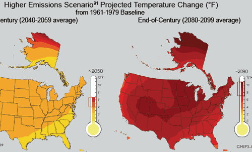
OK, that seems straight forward.  Except having used these IPCC numbers on pages 23-25, they quickly abandon them in favor of higher numbers.    Here for example, is a chart from page 29:

us-future-temps2

Note the map on the right, which is the end of century projection for the US.  The chart shows a range of warming of 7-11 degrees F for a time period centered on 2090  (they boxed that range on the thermometer, not me), but the chart on page 25 shows average warming in the max emissions case in 2090 to be about 7.5F against the same baseline (you have to be careful, they keep moving the baseline around on these charts).  It could be that my Mark I integrating eyeball is wrong, but that map sure looks like more than an average 7.5F increase.  It could be that the US is supposed to warm more than the world average, but the report never says so that I can find, and the US (even by the by the numbers in the report) has warmed less than the rest of the globe over the last 50 years.

The solution to this conundrum may be on page 24 when they say:

Based on scenarios that do not assume explicit climate policies to reduce greenhouse gas emissions, global average temperature is projected to rise by 2 to 11.5°F by the end of this century90 (relative to the 1980-1999 time period).

Oddly enough (well, oddly for a science document but absolutely predictably for an advocacy paper) the high end of this range, rather than the median, seems to be the number used through the rest of the report.  This 11.5F probably implies a climate sensitivity around 5 C/doubling.  Using the IPCC numaber of 1.2 for CO2 alone, means that this report is assuming that as much as 75% of the warming comes from positive feedback effects.

So, since most of the warming, and all of the catastrophe, comes from the assumption that the climate system is dominated by net positive feedback, one would assume the report would address itself to this issue.  Wrong.

I did a search for the word “feedback” in the document just to make sure I didn’t miss anything.  Here are all the references in the main document (outside of footnotes) to feedback used in this context:

  • P15:  “However, the surface warming caused by human-produced increases in other greenhouse gases leads to an increase in atmospheric water vapor, since a warmer climate increases evaporation and allows the atmosphere to hold more moisture. This creates an amplifying “feedback loop,” leading to more warming.”
  • P16:  “For example, it is known from long records of Earth’s climate history that under warmer conditions, carbon tends to be released, for instance, from thawing permafrost, initiating a feedback loop in which more carbon release leads to more warming which leads to further release, and so on.”
  • P17:  “For example, it is known from long records of Earth’s climate history that under warmer conditions, carbon tends to be released, for instance, from thawing permafrost, initiating a feedback loop in which more carbon release leads to more warming which leads to further release, and so on.

That’s it – the entire sum text of feedbacks.  All positive, no discussion of negative feedbacks, and no discussion of the evidence how we know positive feedbacks outweight negative feedbacks.  The first one of the three is particularly disengenuous, since most serious scientists will admit that we don’t even know the sign of the water vapor feedback loop, and there is good evidence the sign is actually negative (due to albedo effects from increased cloud formation).

GCCI Report #2: Climate Must Be Dead Stable Without Man

The other underlying assumption in the GCCI report is that without man, climate would be dead stable.  Year in and year out, decade after decade, every location would get the same rain it got the year before and the decade before, the same number of storms, the same number of tornadoes, the same start date for Spring, etc.

Now, the authors might object to that and say, “we don’t believe that.”  But in fact they must, since in the report, any US climate trend in the last 20 years (more rain, less rain, more storms, fewer storms, more snow, less snow, etc) is all blamed on man.   Why else discuss a given trend in climate in a report on man-made climate change except to create the impression that each and every trend in climate is due to man, and can therefore be extrapolated a hundred years in to the future?

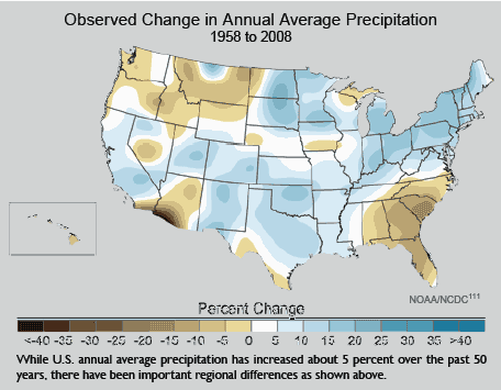
I am going to take on many of these charts in this series, but here is an example from page 30:

precipitation-change

So what?   Do you really think there is a single 50-year period in the history of North America where you wouldn’t see this kind of effect?  Where, sans man, the chart would be all white with no changes?  And even trying to pull regional conclusions out of this is almost impossible — for example, the brown in the Southeast is heavily driven by the 2008 endpoint with a big drought.  Shift the period by even a few years and the chart has the same mixture of blue and brown, but distributed differently.

Of course,this assumption of underlying stability is absurd.  History is full of short, medium, and long-term climate cycles.  An honest scientific discussion would look at the degree of variation over time, say hundreds or thousands of years, and then put recent variations in this context.  Are recent changes unprecedented, or not?  Well, we’ll never know from this report.

GCCI Report #1: Overall Tone

The first thing one needs to recognize about the GCCI report is that it is not a scientific document — it is a 170-page long press release from an advocacy group, with all the detailed, thorough science one might expect in a press release from the Center of Science and Public Interest writing about the threat to mankind from Twinkies.  By the admission of the Obama administration, this is a document that has been stripped of its scientific discussion and rewritten by a paid PR firm that specialized in environmental advocacy.

I have not read every word, but it is pretty clear that there is no new science here on the causes or magnitude of warming.  In fact, if I had to describe the process used to prepare the first part of the report, it was to take past IPCC reports, strip out any wording indicating uncertainty, and then portray future forecasts using the IPCC mean forecasts as the lowest possible warming and whatever model they could find that spit out the highest forecast as the “worst case scenario.”  Then, the rest of the report (about 90%) creates a variety of hypothesized disaster movie plots based on this worst case scenario.

You know that this is an advocacy document and not science right of the bat when they write this:

1. Global warming is unequivocal and primarily human-induced.
Global temperature has increased over the past 50 years. This observed increase is due primarily to humaninduced
emissions of heat-trapping gases.

Just look in wonder at the false religion-like certainty.  Name three other scientific findings about horribly complex natural processes that have been studied in depth for only 20 years or so that one would use the word “unequivocal” for.  OK, name even one.

If you can’t read the whole report, read the list of disasters on page 12.  If I had shown this to you blind, and told you it from from a Paul Ehrlich the-world-will-end-in-a-decade book from the 1970s, you would probably have believed me.

This entire report assumes global warming to exist, assumes it is man-made, and assumes its future levels are as large or larger than those projected in the last IPCC report.  The first four or five pages merely restate this finding with no new evidence.  The majority of the report then takes this assumption, cranks it through various models, and generates scary potential scenarios about the US and it would be like if temperatures really rose 11F over the next century.

Re-Energized

For some months now, I have struggled with this site.

In the political and economics arena, there never seems to be any shortage of stuff to write about.  That is in large part because when I and others take a position, folks who disagree will respond, and interesting discussions rage back and forth between blogs.

For some years on this site, I have endeavored as a layman to help other laymen understand the key issues in the science.  When I first started, I had assumed my role would be pure journalism, simplifying complex arguments for a wider audience.  But I soon found that my background in modelling dynamic systems (both physical and social) allowed me to spot holes in the science on my own as well.

But of late I began to run down.  Unlike in the political / economic world, there is little cross-talk between blogs on different sides of issues.  I could flood the site with stupid media misinterpretations of the site, but it is not what I am trying to do here and besides Tom Nelson has that pretty well covered.

As in the political world, I try to read blogs on all sides of the debate, but in the climate world there was far less interaction.  There is only so long I can go on repeating the same arguments in different ways.  The problem is not that these arguments and holes in the science get quickly dispatched on other sites, it is that they get ignored.  Both sides are guilty of this, but alarmists in particular thrive on knocking down straw men and refusing to address head on the best skeptics’ arguments  (which is not to say that certain skeptic sites don’t have the same problem).

But the new Global Climate Change Impacts Report (pdf) released yesterday has re-energized me.  This document represents such an embarrassment that it simply begs to be critiqued in depth.  So over the coming weeks I will work through the report, in semi-random order, picking out particularly egregious omissions and inaccuracies.

So Much For That Whole Commitment To Science We Were Promised

From the Guardian:

Today’s release of the study, titled Global Climate Change Impacts in the United States, was overseen by a San Francisco-based media consulting company…

The nearly 200-page study was scrubbed of the usual scientific jargon, and was given a high-profile release by Obama’s science advisor, John Holdren, and the head of the National Oceanic and Atmospheric Administration (NOAA), Jane Lubchenco.

Wow, that’s sure how I learned to handle a scientific report back when I was studying physics – scrub it of the science and give it to an activist PR firm!   Do you need any more evidence that climate science has become substantially dominated by post-modernist scientists, where ideological purity and staying on message is more important than actually having the science right?

I saw a draft of this report last year, but I am still trying to download this new version.  I expect to be sickened.  Here is a taste of where they are coming down:

If today’s generation fails to act to reduce the carbon emissions that cause global warming, climate models suggest temperatures could rise as much as 11F by the end of the century.

11F is about 6.1C.  I don’t know if they get this by increasing the CO2 forecast or by increasing the sensitivity or both, but it is vastly higher than the forecasts even of the over-apocalyptic IPCC.  I think one can fairly expect two things, though — 1) More than 2/3 of this warming will be due to positive feedback effects rather than Co2 acting alone and 2) There will be little or no discussion of the evidence that such positive feedback effects actually dominate the climate.

Apparently the report will make up for having all the science stripped out by spending a lot of time on gaudy worst case scenarios:

That translates into catastrophic consequences for human health and the economy such as more ferocious hurricanes in coastal regions – in the Pacific as well as the Atlantic, punishing droughts to the south-west, and increasingly severe winter storms in the north-east and around the Great Lakes.

The majority of North Carolina’s beaches would be swallowed up by the sea. New England’s long and snowy winters might be cut short to as little as two weeks. Summers in Chicago could be a time of repeated deadly heat waves. Los Angelenos and residents of other big cities will be choking because of deteriorating air quality.

Future generations could face potential food shortages because of declining wheat and corn yields in the breadbasket of the mid-west, increased outbreaks of food poisoning and the spread of epidemic diseases.

This strikes me as roughly equivilent to turning in a copy of Lucifer’s Hammer in response to a request for a scientific study of the physics of comets.

Is it “Green” or Is It Just Theft?

This is reprinted from my other blog.  I usually confine my posts on this blog to issues with the science of global warming rather than policy issues, but I know I get a lot of folks with science backgrounds here and I would honestly like to see if there is something in this I am missing:

From Greenlaunches.com (via Engadget) comes a technology that I have written about before to leech energy from cars to power buildings:

shoppers_car

Now when you shop, your can be responsible to power the supermarket tills. As in with the weight of your vehicles that run over the road plates the counter tills can be given power. How? Well, at the Sainsbury’s store in Gloucester, kinetic plates which were embedded in the road are pushed down every time a vehicle passes over them. Due to this a pumping action is initiated through a series of hydraulic pipes that drive a generator. These plates can make up to 30kw of green energy in one hour which is enough to power the store’s checkouts.

The phrase “there is no such thing as a free lunch” applies quite well in physics.  If the system is extracting energy from the movement of the plates, then something has to be putting at least as much energy into moving the plates.  That source of energy is obviously the car, and it does not come free.  The car must expend extra energy to roll over the plates, and this energy has to be at least as great (and due to losses, greater) than the energy the building is extracting from the plates.  Either the car has to expend energy to roll up onto an elevated plate to push it down, or else if the plates begin flush, then it has to expend energy to pull itself out of the small depression where it has pushed down the plate.

Yes, the are small, almost unmeasurable amounts of energy for the car, but that does not change the fact that this system produces energy by stealing or leeching it from cars.  It reminds me of the scheme in the movie “Office Space” when they were going to steal money by rounding all transactions down to the nearest cent and taking the fractional penny for themselves.  In millions of transactions, you steal a lot but no one transaction really notices.

I have seen this idea so many times now portrayed totally uncritically that I am almost beginning to doubt my sanity.  Either a) the media and particular green advocates have no real understanding of science or b) I am missing something.  In the latter case, commenters are free to correct me.

By the way, if I am right, then this technology is a net loss on the things environmentalists seem to care about.  For example, car engines are small and much less efficient at converting combustion to usable energy than a large power station.  This fact, plus the energy losses in the system, guarantee that installation of this technology increases rather than decreases CO2 production.

Postscript: One of the commenters on my last post on this topic included a link to this glowing article about a “green family” that got rid of their refrigerator:

About a year ago, though, she decided to “go big” in her effort to be more environmentally responsible, she said. After mulling the idea over for several weeks, she and her husband, Scott Young, did something many would find unthinkable: they unplugged their refrigerator. For good.

How did they do it?  Here was one of their approaches:

Ms. Muston now uses a small freezer in the basement in tandem with a cooler upstairs; the cooler is kept cold by two-liter soda bottles full of frozen water, which are rotated to the freezer when they melt. (The fridge, meanwhile, sits empty in the kitchen.)

LOL.  We are going to save energy from not having a refrigerator by increasing the load on our freezer.  Good plan.  Here is how another woman achieved the same end:

Ms. Barnes decided to use a cooler, which she refilled daily during the summer with ice that she brought home from an ice machine at her office.

Now that’s going green!  Don’t using electricity at home to cool your groceries, steal it from work!

Update: The one place one might get net energy recovery is in a location where cars have to be breaking anyway, say at a stop sign or on a downhill ramp of a garage.  The plates would be extracting speed/energy from the car, but the car is already shedding this energy via heat from its brakes.  Of course, this is no longer true as we get more hybrids with dynamic breaking, since the cars themselves are recovering some of the braking energy.  Also, I have never seen mention in any glowing article about this technology that placement is critical to having the technology make any sense, so my guess is that they are not being very careful.

Its all About the Feedback

If frequent readers get any one message from this site, it should be that the theory of catastrophic global warming from CO2 is actually based on two parallel and largely unrelated theories:

  1. That CO2 acts as a greenhouse gas and can increase global temperatures as concentrations increase
  2. That the earth’s climate is dominated by strong positive feedback that multiplies the effect of #1 3,4,5 times or more.

I have always agreed with #1, and I think most folks will accept a number between 1-1.2C for a doubling of CO2 (though a few think its smaller).  #2 is where the problem with the theory is, and it is no accident that this is the area least discussed in the media.  For more, I refer you to this post and this video.  (higher resolution video here, clip #3).

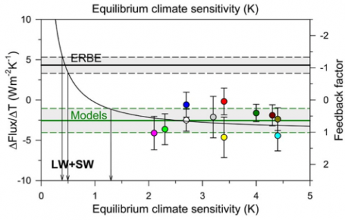
In my video and past posts, I have tried to back into the feedback fraction f that models are using.  I used a fairly brute force approach and came up with numbers between 0.65 and 0.85.  It turns out I was pretty close.  Dr Richard Lindzen has this chart showing the feedback fractions f used in models, and the only surprise to me is how many use a number higher than 1 (such numbers imply runaway reactions similar to nuclear fission).

lindzen_graph_icccjune09

Lindzen thinks the true number is closer to -1, which is similar to the number I backed into from temperature history over the last 100 years.  This would imply that feedback actually works to reduce the net effect of greenhouse warming, from a sensitivity of 1.2 to one something like 0.6C per doubling.

How to Manufacture the Trend You Want

I thought this post by Steve McIntyre at Climate Audit was pretty amazing, even by the standards of climate science.

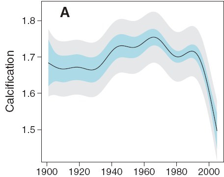
We begin with a felt need by fear mongers to link CO2 and global warming to bad stuff, in this case a decline of growth or calcification rates on the Great Barrier Reef.  So, abracadabra, some scientist-paladins generate this, which is eaten up by the media:

de_ath_figure2a

Wow, that looks bad.  And if we stop there, we can write a really nice front-page article full of doom and gloom.  Or we can do some actual science.  First, lets pull back and look at a longer trend:

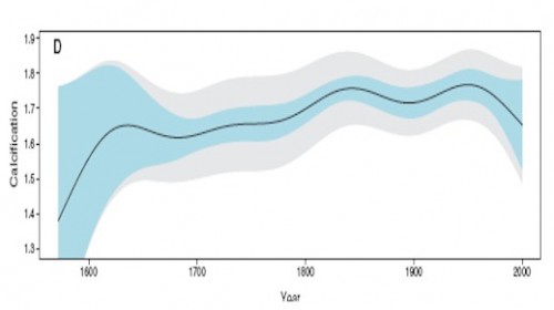
de_ath_figure2d

Hmmm.   That looks kind of different.  Like the recent decline is by no means unprecedented, and that in fact one might call the 1850-1950 levels, rather than the recent drop, the anomaly.  This latter is a tough question, of course, in all of climate science.  Just what is normal?

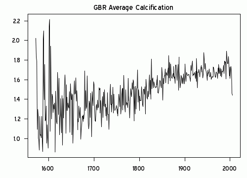
Anyway, we can go further.  McIntyre notices the plot looks awfully smooth.  What if we were to move out of USA Today mode and look at the raw data rather than a pleasantly smooth graph.  This is what we would see:

calcification_ts

Wow, that looks really different.  That must be some amazing smoothing algorithm they used.  Because what I see is a generally increasing trend in reef growth, with a single low number in 2005.  Rather than being some change in slope in the whole trend, as portrayed in the smoothing, this is a single one-year low data point.  (It turns out there are several smoothing approaches one can take that put inordinate value on the end point — this was a trick first found in Mann’s hockey stick trying to make hay of the 1998 high temperature anomaly).

I think just looking at the raw data would cause any reasonable person to shake their head and determine that the author’s were grossly disingenuous in their smoothing and conclusions.  But, as they say on TV, “Wait, there’s more.”

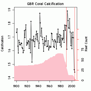
Because it turns out the 2005 drop seems to be less a function of any real drop but in fact due to serious gaps in the data set.  The black line is a close-up of the raw growth data, while the pink area is the size of the measurement data set used, with its scale on the right.

calcification_ts1900

Just by the strangest of coincidences, the large drop in 2005 occurs at the same time the number of data points in the data set drops down to 2!  While most of the data has been driven by measurement of 40 or more reefs, the key two years that drive the entire conclusion come from just 2 reefs?  This is the worst possible science.  Most real scientists would have dropped out the last several years and probably would have dropped all the data since about 1990.   Or else go out and get themselves some more freaking data.   It is easily possible, in fact quite likely, that the 2005 drop was due to mix, as high growth measurement site were dropped out of the data set, leaving only lower growth sites in the average.  These changes in mix say absolutely nothing about underlying growth rates.

I am just visually integrating the pink curve, but its reasonable to guess that there are about 600 measurements in the post 1980 period when the averaged trend in the first chart above turns down.  Somehow these guys have come up with a methodology that allows 4-5 measurements in 2004-5 to grossly outweigh the other 600 and pull the whole curve down.  Unless there is something I do not understand, this borders on outright fraud.  This can’t be accidental – the authors simply had to understand the game they were playing here.

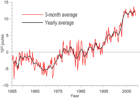
Update: Here is another interesting one — An apparent increase spike in ocean heat content:

ocean_heat_spike

Just coincidentally turns out to exactly coincide with a change in the source for the data.  The jump occurs exactly at the splice between two data sets.  And everyone just blithely accepts this jump as a physical fact??

ocean_heat_spike2

This is particularly hard to accept, as the ARGO data set (the newer data) has shown flat to declining ocean heat content since the day it was turned on.  So what is the justification for the spike at the splice?

Forgetting About Physical Reality

Sometimes in modeling and data analysis one can get so deep in the math that one forgets there is a physical reality those numbers are supposed to represent.  This is a common theme on this site, and a good example was here.

Jeff Id, writing at Watts Up With That, brings us another example from Steig’s study on Antarctic temperature changes.  In this study, one step Steig takes is to reconstruct older, pre-satellite continental temperature  averages from station data at a few discrete stations.  To do so, he uses more recent data to create weighting factors for the individual stations.  In some sense, this is basically regression analysis, to see what combination of weighting factors times station data since 1982 seems to be fit with continental averages from the satellite.

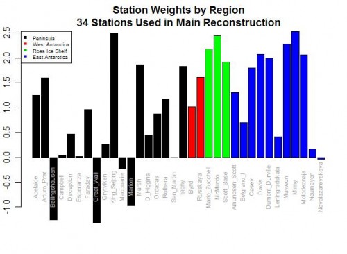
Here are the weighting factors the study came up with:

bar-plot-station-weights

Do you see the problem?  Five stations actually have negative weights!  Basically, this means that in rolling up these stations, these five thermometers were used upside down!  Increases in these temperatures in these stations cause the reconstructed continental average to decrease, and vice versa.  Of course, this makes zero sense, and is a great example of scientists wallowing in the numbers and forgetting they are supposed to have a physical reality.  Michael Mann has been quoted as saying the multi-variable regression analysis doesn’t care as to the orientation (positive or negative) of the correlation.  This is literally true, but what he forgets is that while the math may not care, Nature does.

For those who don’t follow, let me give you an example.  Let’s say we have market prices in a number of cities for a certain product, and we want to come up with an average.  To do so, we will have to weight the various local prices based on sizes of the city or perhaps populations or whatever.  But the one thing we can almost certainly predict is that none of the individual city weights will be negative.  We won’t, for example, ever find that the average western price of a product goes up because one component of the average, say the price in Portland, goes down.  This flies in the face of our understanding of how an arithmetic average should work.

It may happen that in a certain time periods, the price in Portland goes down in the same month as the Western average went up, but the decline in price in Portland did not drive the Western average up — in fact, its decline had to have actually limited the growth of the Western average below what it would have been had Portland also increased.   Someone looking at that one month and not understanding the underlying process might draw the conclusion that prices in Portland were related to the Western average price by a negative coefficient, but that conclusion would be wrong.

The Id post goes on to list a number of other failings of the Steig study on Antarctica, as does this post.  Years ago I wrote an article arguing that while the GISS and other bodies claim they have a statistical method for eliminating individual biases of measurement stations in their global averages, it appeared to me that all they were doing was spreading the warming bias around a larger geographic area like peanut butter.  Steig’ study appears to do the same thing, spreading the warming from the Antarctic Peninsula across the whole continent, in part based on its choice to use just three PC’s, a number that is both oddly small and coincidentally exactly the choice required to get the maximum warming value from their methodology.