All posts by admin

Example #3 of the Need for Replication: Temperature Station Adjustments

I have written a number of times about what appear to be arbitrary or extreme manual adjustments to surface temperature records.  These adjustments are typically positive (ie they make the temperature trend more positive) and often their magnitude outweighs the underlying temperature signal being measured, raising serious issues about the signal to noise ratio in temperature measurement.  Willis Eschenbach on Anthony Watts’ site brings us one of the most extreme examples I have seen, this time from Australia.

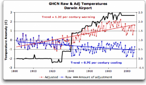
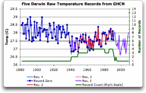
I will leave it to you to click through for the whole story, but here are graphs of the Darwin temperature station before and after adjustments.  First the raw data (this, by the way, is what the CRU so famously threw out, so we can’t do this analysis for CRU adjustments)

darwin_zero5

I would be willing to believe the splice-discontinuity around 1940 is an artifact of the data, and one might either throw out the data before 1940 or re-zero it consistent with later data.  Or it might be real.  We really don’t know, we can only guess.  We need to be careful how frequently we guess, as each guess corrupts the data, no matter how much we are trying to improve things.    We might get clues from other nearby thermometers, which is discussed in the article, but thermometers are few and far between in 1920’s Australia.

The other guess we might make is looking around the town of Darwin, seeing the growth of the urban area, we might want to adjust current temperatures down a bit to correct for the urban heat island effect.  Again, we have to be careful, because we are just guessing.

Here is what the GHCN actually does to adjust the data. The black line is the amount manually added to temperatures, resulting in the red line.

darwin_zero7

Wow! Instant global warming.  We’ve suddenly added 2C per century to the Darwin warming trend.

So, why does the black line look like this?  We don’t know, because climate scientists play these games in secret and claim that anyone trying to audit their fine work is just distracting them from more weighty pursuits.   Nominally, the GHCN claims the adjustments are based on comparisons with other local thermometers, but there are not other local thermometers in their data base and the closest ones (hundreds of kilometers away) do not display any behavior that might justify this adjustment.

It is time that we demand the ability to audit and replicate these adjustments.

Example #2 Of Work That Needs To Be Replicated: Dendroclimatology

For anyone who has paid attention, the dendroclimatology field has been rife with bad practices for years – cherry picking data sets, hiding modern data that shows “the wrong answer,” using bizarre statistical approaches, flipping data sets upside down, and utter resistance to data requests and any attempts at replication.   Most of the really damning CRU emails are about various dendroclimatology studies, and Keith Briffa, lead author of this section of the last IPCC report, is right in the middle of it all.

The Bishop Hill blog has the story of Briffa’s Yamal data set that has many of these elements.  I have been following this story for years at Steve McIntyre’s blog, but this is a very readable narrative.  It will really put a lot of what in in the CRU emails in context.  I highly recommend it.  Seriously.  In fact, I would go read some of John Holdren’s testimony in front of Congress on Climategate first, then read the Bishop Hill piece to get a sense for the whitewash.

Postscript: I have to laugh — when you see insiders in the alarmist community discussing the resistance to data sharing that really has no excuse, the excuse they use nonetheless among themselves to salve their conscience is the meme that “the FOIA’s were meant to be just harassing them and aimed at reducing the time they had to do real work” — ie they were (as the meme goes with skeptics) based on anti-science rather than any real desire to do science.

Here are a couple of bits from the Bishop Hill piece.

Meanwhile, however, McIntyre could begin to look at what Briffa had done elsewhere. It was not to be plain sailing. For a start, Briffa had archived data in an obsolete data format, last used in the era of punch-cards. This was inconvenient, and apparently deliberately so, but it was not an insurmountable problem — with a little work, McIntyre was able to move ahead with his analysis. Briffa had also thrown a rather larger spanner in the works though: while he had archived the tree ring measurements, he had not supplied any metadata to go with it — in other words there was no information about where the measurements had come from. All there was was a tree number and the measurements that went with it. However, McIntyre was well used to this kind of behaviour from climatologists and he had some techniques at hand for filling in some of the gaps….

Eventually, though, Briffa’s hand was forced, and in late September 2009, a reader pointed out to McIntyre that the remaining data was now available. It had been quietly posted to Briffa’s webpage, without announcement or the courtesy of an email to Mcintyre. It was nearly ten years since the initial publication of Yamal and three years since McIntyre had requested the measurement data from Briffa. Now at last some of the questions could be answered.

25, Not 2500

I am going to violate my own rule for one post.  I council everyone I know not to get pulled into the absolutely pointless activity of engaging in dueling headcounts of scientists in the climate debate.  This has zero utility, and means virtually nothing.  Science is not settled like a football game, or an election.

But since I keep getting the “2500” scientists number thrown at me by alarmists, I am starting to believe the number is closer to 25, not 2500.  Sure there are many folks who have participated in work that has become a part of the IPCC, but it is old news that though those folks are counted as believers, many reject key aspects of the IPCC findings.  It is becoming increasingly clear than when people talk about the consensus, it is a position being espoused and communicated and driven by a handful of folks over and over in different outlets.  The same folks were advisors on Gore’s movie and run Realclimate and are advisors of the President and  were leaders of the IPCC process and were featured in many of the CRU emails.

Myron Ebell has an interesting article on this:

But when asked about some of his own extreme statements and predictions, Holdren replied that scientific research had moved on from the latest UN assessment report in 2007. The most up-to-date scientific research was contained in a report written by some of the world’s leading climate scientists and released last summer. Holdren mentioned and referred to this report, Copenhagen Diagnosis, several times during the course of the hearing….

I’m sure it will come as a shock that the two groups largely overlap. The “small group of scientists” up to their necks in Climategate include 12 of the 26 esteemed scientists who wrote the Copenhagen Diagnosis. Who would have ever guessed that forty-six percent of the authors of Copenhagen Diagnosis belong to the Climategate gang?  Small world, isn’t it?

The existence of this small core does nothing to prove or disprove catastrophic anthropogenic global warming.  The same statement about, say, string theory could be made about thousands of scientists working around the margin of the problem but a handful driving the train.  But it does mean that the CRU email scandal is not an irrelevant sideshow involving less than 1% of the climate community — it is a window on poor scientific profess engaged in by a group that makes up perhaps a third or half of the core driving the “consensus”.  Which makes it a big deal.

Example of Climate Work That Needs to be Checked and Replicated

When someone starts to shout “but its in the peer-reviewed literature” as an argument-ender to me, I usually respond that peer review is not the finish line, meaning that the science of some particular point is settled. It is merely the starting point, where now a proposition is in the public domain and can be checked and verified and replicated and criticized and potentially disproved or modified.

The CRU scandal should, in my mind, be taken exactly the same way. Unlike what more fire-breathing skeptics have been saying, this is not the final nail in the coffin of catastrophic man-made global warming theory. It is merely a starting point, a chance to finally move government funded data and computer code into the public domain where it has always belonged, and start tearing it down or confirming it.

To this end, I would like to share a post from year ago, showing the kind of contortions that skeptics have been going through for years to demonstrate that there appear to be problems in key data models — contortions and questions that could have been answered in hours rather than years if the climate scientists hadn’t been so afraid of scrutiny and kept their inner workings secret. This post is from July, 2007. It is not one of my most core complaints with global warming alarmists, as I think the Earth has indeed warmed over the last 150 years, though perhaps by less than the current metrics say. But I think some folks are confused why simple averages of global temperatures can be subject to hijinx. The answer is that the averages are not simple:

A few posts back, I showed how nearly 85% of the reported warming in the US over the last century is actually due to adjustments and added fudge-factors by scientists rather than actual measured higher temperatures. I want to discuss some further analysis Steve McIntyre has done on these adjustments, but first I want to offer a brief analogy.

Let’s say you had two compasses to help you find north, but the compasses are reading incorrectly. After some investigation, you find that one of the compasses is located next to a strong magnet, which you have good reason to believe is strongly biasing that compass’s readings. In response, would you

  1. Average the results of the two compasses and use this mean to guide you, or
  2. Ignore the output of the poorly sited compass and rely solely on the other unbiased compass?

Most of us would quite rationally choose #2. However, Steve McIntyre shows us a situation involving two temperature stations in the USHCN network in which government researchers apparently have gone with solution #1. Here is the situation:

He compares the USHCN station at the Grand Canyon (which appears to be a good rural setting) with the Tucson USHCN station I documented here, located in a parking lot in the center of a rapidly growing million person city. Unsurprisingly, the Tucson data shows lots of warming and the Grand Canyon data shows none. So how might you correct Tucson and the Grand Canyon data, assuming they should be seeing about the same amount of warming? Would you

average them, effectively adjusting the two temperature readings

towards each other, or would you assume the Grand Canyon data is cleaner

with fewer biases and adjust Tucson only? Is there anyone who would not choose the second option, as with the compasses?

The GISS data set, created by the Goddard Center of NASA, takes the USHCN data set and somehow uses nearby stations to correct for anomalous stations. I say somehow, because, incredibly, these government scientists, whose research is funded by taxpayers and is being used to make major policy decisions, refuse to release their algorithms or methodology details publicly. They keep it all secret! Their adjustments are a big black box that none of us are allowed to look into (and remember, these adjustments account for the vast majority of reported warming in the last century).

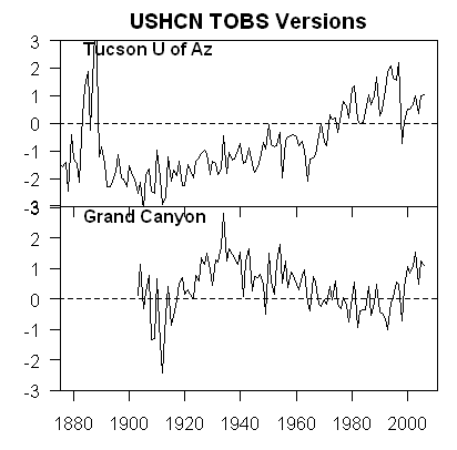
We can, however, reverse engineer some of these adjustments, and McIntyre does. What he finds is that the GISS appears to be averaging the good and bad compass, rather than throwing out or adjusting only the biased reading. You can see this below. First, here are the USHCN data for these two stations with only the Time of Observation adjustment made (more on what these adjustments are in this article).
Grand_12

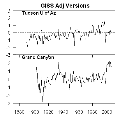
As I said above, no real surprise – little warming out in undeveloped nature, lots of warming in a large and rapidly growing modern city. Now, here is the same data after the GISS has adjusted it:

Grand_15

You can see that Tucson has been adjusted down a degree or two, but Grand Canyon has been adjusted up a degree or two (with the earlier mid-century spike adjusted down). OK, so it makes sense that Tucson has been adjusted down, though there is a very good argument to be made that it should be been adjusted down more, say by at least 3 degrees**. But why does the Grand Canyon need to be adjusted up by about a degree and a half? What is biasing it colder by 1.5 degrees, which is a lot? The answer: Nothing. The explanation: Obviously, the GISS is doing some sort of averaging, which is bringing the Grand Canyon and Tucson from each end closer to a mean.

This is clearly wrong, like averaging the two compasses. You don’t average a measurement known to be of good quality with one known to be biased. The Grand Canyon should be held about the same, and Tucson adjusted down even more toward it, or else thrown out. Lets look at two cases. In one, we will use the GISS approach to combine these two stations– this adds 1.5 degrees to GC and subtracts 1.5 degrees from Tucson. In the second, we will take an approach that applies all the adjustment to just the biases (Tucson station) — this would add 0 degrees to GC and subtract 3 degrees from Tucson. The first approach, used by the GISS, results in a mean warming in these two stations that is 1.5 degrees higher than the more logical second approach. No wonder the GISS produces the highest historical global warming estimates of any source! Steve McIntyre has much more.

** I got to three degrees by applying all of the adjustments for GC and Tucson to Tucson. Here is another way to get to about this amount. We know from studies that urban heat islands can add 8-10 degrees to nighttime urban temperatures over surrounding undeveloped land. Assuming no daytime effect, which is conservative, we might conclude that 8-10 degrees at night adds about 3 degrees to the entire 24-hour average.

Postscript: Steve McIntyre comments (bold added):

These adjustments are supposed to adjust for station moves – the procedure is described in Karl and Williams 1988 [check], but, like so many climate recipes, is a complicated statistical procedure that is not based on statistical procedures known off the island. (That’s not to say that the procedures are necessarily wrong, just that the properties of the procedure are not known to statistical civilization.) When I see this particular outcome of the Karl methodology, my mpression is that, net of the pea moving under the thimble, the Grand Canyon values are being blended up and the Tucson values are being blended down. So that while the methodology purports to adjust for station moves, I’m not convinced that the methodology can successfully estimate ex post the impact of numerous station moves and my guess is that it ends up constructing a kind of blended average.

LOL. McIntyre, by the way, is the same gentleman who helped call foul on the Mann hockey stick for bad statistical procedure.

A Total Bluff

Gavin Schmidt has absolutely no evidence for this:  (via Tom Nelson)

Gavin [Schmidt],

In your opinion, what percentage of global warming is due to human causes vs. natural causes?

[Response: Over the last 40 or so years, natural drivers would have caused cooling, and so the warming there has been (and some) is caused by a combination of human drivers and some degree of internal variability. I would judge the maximum amplitude of the internal variability to be roughly 0.1 deg C over that time period, and so given the warming of ~0.5 deg C, I’d say somewhere between 80 to 120% of the warming. Slightly larger range if you want a large range for the internal stuff. – gavin]

This is a complete bluff.  There is no way he or anyone else knows this.  I could reverse his numbers and say 0-20% for CO2 and have just as much justification (actually more, see below).  We have devised no good way to parse the temperature changes into any reliable division between various drivers given the complexity of climate.  The only way climate scientists claim to do it is with their highly flawed temperature models, which is a fit of hubris that is unfathomable.

But, beyond the fact that he simply can’t know the answer, his guess here is just awful.  It does not reality check at all.   Here are a few pointers:

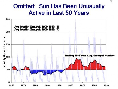
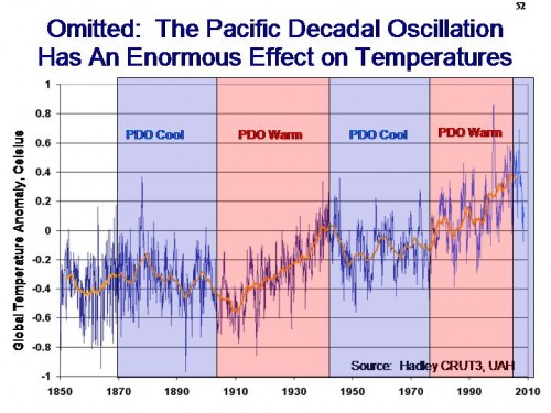
1.  Over the last 40 years, or at least over the portion from 1975-1995 when we saw most of the temperature increase, the sun was at its most active this century, as measured by sunspot numbers.  The PDO, which has close links to temperature, was in its warm cycle.  We likely were continuing to see long-term cyclical recovery from the little ice age.  And anthropogenic land use changes were increasing both urban and rural temperatures.  But he claims that the net effect of non-CO2 factors would have been negative?  This is roughly equivalent to Obama’s jobs claims numbers, saying that he saved jobs that would otherwise have been lost.  It’s appeal is that it makes a useful political point while being impossible to prove.

2.  Hansen is basically repeating the IPCC position that there could be no possible natural explanation for the the 0.2C per decade temperature increases from 1975-2000  — ie that such a pace of temperature increase has to be due to CO2 alone (80-120% in my mind equates to CO2 alone).  But world temperatures increased from 1910 to 1940 by 0.2C per decade, in a period almost certainly only minimally influenced by CO2  (see below).  So natural effects can cause warming in the 1930’s but not in the 1980’s because, why?

temperature-chart1

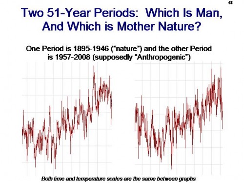
I often use this chart with audiences:

slide48

3.  I am positive that Hansen would argue that natural effects are currently (and temporarily) canceling out some of the warming.  He would say this as a way to deflect criticism that the world has stopped warming over the last decade (something the CRU emails admit they don’t understand, though they won’t admit this publicly**).  But Hansen et al. think we should be seeing 0.2C a decade or more in CO2 warming that is apparently being overcome by natural effects.  So natural effects have enough variability to cancel out 0.2C of warming but not enough to cause 0.2C of warming?  Huh?

This is sort of a special theme this week on this blog, as the topic keeps coming up.  In short, climate scientists need the climate to be alternately sensitive and insensitive, unstable and stable, driven by nature and not driven by nature, all depending on the period they are trying to explain.   All these wildly contradictory assumptions are required to try to keep the hypothesis of very high sensitivities to CO2 alive.

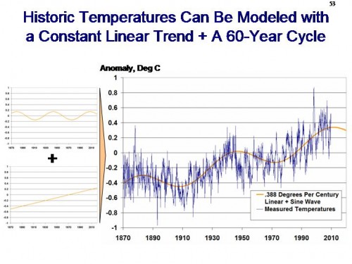
Here, by the way, was my attempt to explain the last 100 years of temperature with a cyclical wave plus a small linear trend:

slide53

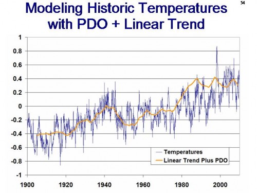
Not bad, huh?  Here is a similar analysis using a linear trend plus the PDO

slide54

My answer seems at least as plausible as Gavin’s.  Here is where I did this analysis in more depth. If I really had an official climate scientist decoder ring, I would blame the gap between measured temperatures and my simplified model in orange during the 1980’s on aerosols.  I don’t know how much if any they affect the climate, but neither do climate scientists and that does not stop them from using it as the universal model plug to improve historic correlations.

By the way, for reference, here is the sunspot cycle:

slide51

Here is the world temperature graph overlayed with the PDO

slide52

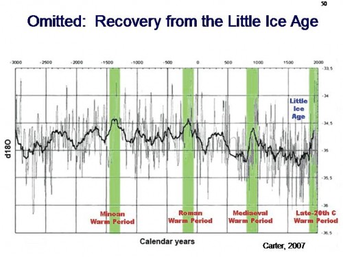
And finally here is some evidence (from ice core analysis) that we may just still be recovering from a period that could well have been the coldest period in the last 5000 years  (notice the regular millennial trend as well).

slide50

But CO2 explains 80-120% of the warming?  The time is hopefully coming when smart people stop taking such statements on faith and demand proof.

**Postscript-  Last year I attended a fantastic series of lectures and discussions at ASU called the Origins Conference.  One thing that I observed there was the scientists, in talking about things like the origins of the universe, were quick to admit where they didn’t understand things — in fact they sort of were gleeful about it, like something that they didn’t understand was a new toy under the Christmas tree.  And for real scientists, I suppose it is.  This is not at all what we see in the CRU emails.

Missing the Main Arguments

Are skeptic’s really bad at making their case.  Or are warming alarmists purposely avoiding the skeptic’s best arguments?  That’s the question I am left  with after reading this Scientific American article supposedly shooting down the skeptic’s best 7 arguments.   Let’s walk very briefly through all seven.  If you don’t want to go through these individually, I will preview the ending or you can skip to it:  None of these seven include any of the most powerful or central arguments of skeptics.  At the end of this article I offer seven competing skeptics claims that never seem to get addressed.

Claim 1: Anthropogenic CO2 can’t be changing climate, because CO2 is only a trace gas in the atmosphere and the amount produced by humans is dwarfed by the amount from volcanoes and other natural sources. Water vapor is by far the most important greenhouse gas, so changes in CO2 are irrelevant.

I have never really relied on this argument, so I am not going to bother with this one.

Claim 2: The alleged “hockey stick” graph of temperatures over the past 1,600 years has been disproved. It doesn’t even acknowledge the existence of a “medieval warm period” around 1000 A.D. that was hotter than today is. Therefore, global warming is a myth.

Without digging into the detail of proxies and statistical methods, it is nearly impossible to discuss the hockey stick in 3 paragraphs.  But in the end it doesn’t matter because the author and I agree that it doesn’t matter.  The author writes:

But hypothetically, even if the hockey stick was busted… what of it? The case for anthropogenic global warming originally came from studies of climate mechanics, not from reconstructions of past temperatures seeking a cause. Warnings about current warming trends came out years before Mann’s hockey stick graph. Even if the world were incontrovertibly warmer 1,000 years ago, it would not change the fact that the recent rapid rise in CO2 explains the current episode of warming more credibly than any natural factor does—and that no natural factor seems poised to offset further warming in the years ahead.

Leaving off the very end, where he goes sailing into the aether by saying incontrovertibly that the rise in CO2 explains our current episode of warming, he says that the hockey stick isn’t really evidence at all, no matter what it says.  I agree.  But skeptics weren’t the ones who brought it up as relevant evidence, the alarmists did.  If they are walking away from it, fine.  [By the way, this is an absolutely core technique of climate science – defend a flawed analysis like a mother bear, claim it is the smoking gun that proves everything, and then when forced to finally accept that it is flawed say that it doesn’t matter.]

Claim 3: Global warming stopped a decade ago; the earth has been cooling since then.

His answer here is really an amazing bit of cognitive dissonance.   He writes:

Anyone with even a glancing familiarity with statistics should be able to spot the weaknesses of that argument. Given the extended duration of the warming trend, the expected (and observed) variations in the rate of increase and the range of uncertainties in the temperature measurements and forecasts, a decade’s worth of mild interruption is too small a deviation to prove a break in the pattern, climatologists say….

If a lull in global warming continues for another decade, would that vindicate the contrarians’ case? Not necessarily, because climate is complex.

So even a 20 year lack of warming does not disprove that CO2 is causing 0.2C – 0.25C per decade of warming or more, because natural variations could mask this or offset it somehow (offsetting therefore as much as 0.5C by natural variation in the cooling direction over two decades).

Some might ask, can’t the warming be hiding or taking some time off?  First, if the theory is right, it can’t be taking time off.  It has to warm, year in and year out.  It can hide in the deep oceans, but new technologies like the ARGO floats since 2002 have shown no increase in ocean heat content in the 6-7 years.  This is why scientists are stuck positing there is some natural phenomenon offsetting the heating with cooling.

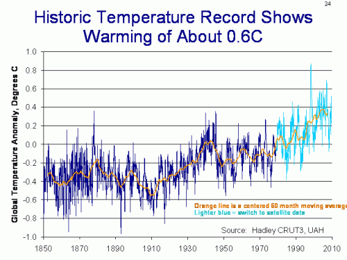
But here is the problem, not that any warming scientists are honest enough to raise it.  Their entire argument that recent warming has been driven by CO2 (as the author confidently asserted above) is that scientists are unable to explain the warming since 1950 any other way (ie it can’t be explained by natural factors).  Leave aside that this assertion is based solely on runs of their flawed models – we will get to that later.  Look at the temperature curve for the past decades:
temperature-chart

From this we see two things.  First, warming since 1950 really means warming since about 1975-1980, since there was a flat period before that.  And, this warming over the two decades of the 80’s and 90’s was between 0.4 and 0.5C.

So, do you see the problem?  The entire foundation of global warming alarmism is based on the fact that their computer models can’t imagine anything natural that would warm things by as much as 0.4-0.5C over two decades.  But now, to save the theory, they are positing that there are natural cooling effects that will offset 0.4-0.5C over two decades.   Either natural effects can move temperatures a half degree over two decades or they can’t  (by the way, if you want a hint, look at 1910-1940, where temperatures moved 0.6C over three decades long before man put much CO2 in the air.)

Claim 4: The sun or cosmic rays are much more likely to be the real causes of global warming. After all, Mars is warming up, too.

A couple of issues here.  First, here is a great example of assuming your conclusion.

The IPCC notes that between 1750 and 2005, the radiative forcing from the sun increased by 0.12 watts/square-meter—less than a tenth of the net forcings from human activities [pdf] (1.6 W/m2).

Skeptic’s think that the net forcing numbers from human activities are over-stated, mainly due to over-assumptions of positive feedback effects.  Rather than address this issue, he just assumes the forcing number is right and then says this “proves” skeptics are wrong.

He goes on to say that Svensmark’s cosmic ray theory of cloud formation is not well proven.  I would agree with him that it is a formative theory and needs a lot more evidence and authentication before I am ready to say it represents how the world works.  Which is one reason you will see me sometimes reporting on updates on his theory but you won’t find it in my core arguments on the topic.

But the interesting thing to me is that all the arguments the author makes against Svensmark could equally well apply to anthropogenic greenhouse gas warming theories.  Both have been demonstrated in the laboratory, but it is unclear how either works in the complex climate system.  Both have a few correlations going for it historically, but no smoking gun of causation.  It is interesting the asymmetry of skepticism applied to Svensmark’s evidence vs. that of CO2 warming.

Claim 5: Climatologists conspire to hide the truth about global warming by locking away their data. Their so-called “consensus” on global warming is scientifically irrelevant because science isn’t settled by popularity.

*Shrug* Ad hominem argument, don’t really care. I have tried to be careful in all the CRU email flap to be clear that the substantial failures of scientific process don’t prove or disprove anything – they just mean that the science is not as settled as has been portrayed and that we need more transparency to let the evidence get battle-tested. I personally think a lot of it will collapse, but we actually have to still disprove it — just because it came from unethical folks does not make it wrong, any more than guys who took money from Exxon 20 years ago are automatically wrong either.

Claim 6: Climatologists have a vested interest in raising the alarm because it brings them money and prestige.

I actually think the author is naive or disingenuous to try to argue against this.  Twenty years ago, climate science was a backwater with no money and no prestige.  Now governments of the world spend billions, and Presidents know their names.  Just the fact that average people know the names James Hansen and Phil Jones and Michael Mann disproves the authors point.

However, I am more than happy to totally leave this point behind and just forget about it, if I am allowed just one playground rejoinder – you guys started it.  I am wondering why this argument was OK for years when it was skeptics and a few thousands of Exxon’s money but is now totally irrelevant when the alarmists are getting most of the funding, and the money runs up into the billions.  But, as I said, if we want to declare a truce on ad hominem funding arguments, fine by me.

Claim 7: Technological fixes, such as inventing energy sources that don’t produce CO2 or geoengineering the climate, would be more affordable, prudent ways to address climate change than reducing our carbon footprint.

I am not a big fan of geoengineering climate, any more than I am of micromanaging economics.  The same problems apply — where systems are complex and chaotic, the potential for unintended consequences are high.

Here is what he left out

So now its my turn.  I will propose my own seven skeptic’s claims that are much more at the heart of our argument but which you never, ever see addressed in these type articles.  By the way, if you think I am somehow moving the bar, see my climate speech, published before the Scientic American article, which highlights the claims below.  Or see Richard Lindzen’s excellent summary article in the WSJ.

Claim A: Nearly every scientist, skeptic and alarmist alike, agree that the first order warming from CO2 is small.  Catastrophic forecasts that demand immediate government action are based on a second theory that the climate temperature system is dominated by positive feedback.  There is little understanding of these feedbacks, at least in their net effect, and no basis for assuming feedbacks in a long-term stable system are strongly net positive.   As a note, the claim is that the net feedbacks are not positive, so demonstration of single one-off positive feedbacks, like ice albedo, are not sufficient to disprove this claim.  In particular, the role of the water cycle and cloud formation are very much in dispute.

Claim B: At no point have climate scientists ever reconciled the claims of the dendroclimatologists like Michael Mann that world temperatures were incredibly stable for thousands of years before man burned fossil fuels with the claim that the climate system is driven by very high net positive feedbacks.   There is nothing in the feedback assumptions that applies uniquely to CO2 forcing, so these feedbacks, if they exist today, should have existed in the past and almost certainly have made temperatures highly variable, if not unstable.

Claim C: On its face, the climate model assumptions (including high positive feedbacks) of substantial warming from small changes in CO2 are inconsistent with relatively modest past warming.  Scientists use what is essentially an arbitrary plug variable to handle this, assuming anthropogenic aerosols have historically masked what would be higher past warming levels.  The arbitrariness of the plug is obvious given that most models include a cooling effect of aerosols in direct proportion to their warming effect from CO2, two phenomenon that should not be linked in nature, but are linked if modelers are trying to force their climate models to balance.  Further, since aerosols are short lived and only cover about 10% of the globe’s surface in any volume, nearly heroic levels of cooling effects must be assumed, since it takes 10C of cooling from the 10% area of effect to get 1C cooling in the global averages.

Claim D: The key issue is the effect of CO2 vs. other effects in the complex climate system.  We know CO2 causes some warming in a lab, but how much on the real earth?  The main evidence climate scientists have is that their climate models are unable to replicate the warming from 1975-1998 without the use of man-made CO2 — in other words, they claim their models are unable to replicate the warming with natural factors alone.  But these models are not anywhere near good enough to be relied on for this conclusion, particularly since they admittedly leave out any number of natural factors, such as ocean cycles and longer term cycles like the one that drove the little ice age, and admit to not understanding many others, such as cloud formation.

Claim E: There are multiple alternate explanations for the 1975-1998 warming other than manmade CO2.  All likely contributed (along with CO2) but it there is no evidence to give most of the blame to Co2.  Other factors include ocean cycles (this corresponded to a PDO warm phase), the sun (this corresponded to the most intense period of the sun in the last 100 years), mankind’s land use changes (driving both urban heating effects as well as rural changes with alterations in land use), and a continuing recovery from the Little Ice Age, perhaps the coldest period in the last 5000 years.

Claim F: Climate scientists claim that the .4-.5C warming from 1975-1998 cannot have been caused natural variations.  This has never been reconciled with the fact that the 0.6C warming from 1910 to 1940 was almost certainly due mostly to natural forces.  Also, the claim that natural forcings could not have caused a 0.2C per decade warming in the 80’s and 90’s cannot be reconciled with the the current claimed natural “masking” of anthropogenic warming  that must be on the order of 0.2C per decade.

Claim G: Climate scientists are embarrassing themselves in the use of the word “climate change.”  First, the only mechanism ever expressed for CO2 to change climate is via warming.  If there is no warming, then CO2 can’t be causing climate change by any mechanism anyone has ever suggested.   So saying that “climate change is accelerating” (just Google it) when warming has stopped is disingenuous, and a false marketing effort to try to keep the alarm ringing.  Second, the attempts by scientists who should know better to identify weather events at the tails of the normal distribution and claim that these are evidence of a shift in the mean of the distribution is ridiculous.  There are no long term US trends in droughts or wet weather, nor in global cyclonic activity, nor in US tornadoes.  But every drought, hurricane, flood, or tornado is cited as evidence of accelerating climate change (see my ppt slide deck for the data).  This is absurd.
Cognitive Dissonance

Mann’s got an interesting problem.  His various hockey sticks show incredibly low temperature variability until about 1850 or so.  But his and his counterparts models assume the climate temperature system is dominated by very high positive feedbacks that multiply even tiny changes to forcings into large temperature swings.  These two points of view are extraordinarily hard to reconcile.

Similarly, climate alarmists assume that some sort of natural phenomenon is hiding or masking warming for the last decade.  Given their forecasts, this has to be a pretty muscular phenomenon, but at the same time they have to argue that natural factors are not muscular enough to have cause much or any of the temperature increases in the 1980s and 1990s.

The ability to handle cognitive dissonance is important in climate science.

CRU Emails: Responding to the Responses

Finem Respice takes on a number of the insider responses of the “nothing to see here, move along” type.  My favorite:

“The language used by scientists in the emails in question is indicative of scientists under a great deal of political pressure from the outside.”

The heart bleeds with an anguish and despair so palpable, so imbued with the darkly iridescent and sickly sweet venom of suffering that it is plainly visible out to 50 meters as a colorful aura, brightly fluorescing through the ribcage, glowing like a beacon of sorrow to any empath with the skill level of a Freshman at Vassar who thinks she remembers once reading a book on shamanism.

As a group one rarely sees scientists (or, indeed, any vocational group other than politicians) so deeply in love with the by-hook-or-by-crook of politics, the grand import of jetting off to Nice for the next climate meeting and the limelight that accompanies all these world-saving goings on as those few, those lucky few exposed in the CRU emails. (Just throw in a bit of expense scandal and you might as well be in the House of Commons- oh, wait a second….) It is all but impossible not to come away with a sense of what is plainly a naked lust for naked ambition simply oozing out of those texts. I am utterly devoid of sympathy for any such that later claim to have been forced to compromise their composure, their decorum or their data because of the unfortunate realities of politics.

When I think back to all the thousands of words I have written on positive feedback on this site, only to have it all said in two lines of a post at the same site:

On Positive Feedback

Name three positive feedback systems in nature. Get back to me on that when you’re done.

I might have said added “long-term stable” between name and three, but its pretty close.

Where Was the CRU’s Outrage

The issue of non-publication agreements has come up before as an excuse for EAU-CRU not to release FOIA’d data.

The U-turn by the university follows a week of controversy after the emergence of hundreds of leaked emails, “stolen” by hackers and published online, triggered claims that the academics had massaged statistics.

In a statement welcomed by climate change sceptics, the university said it would make all the data accessible as soon as possible, once its Climatic Research Unit (CRU) had negotiated its release from a range of non-publication agreements.

This excuse had a certain credibility problem even before the email release, as it was something like the fifth or sixth excuse, used only when the others failed.  Now we see from the emails it was more of a “strategy” for avoiding scrutiny rather than a real concern.

These aren’t corporations arguing over iPod code.  These are universities and public institutions.  Where was the outrage from East Anglia?  Where was the guy saying “What do you mean non-publication agreement – this is scientific information gathered at public expense affecting enormous public policy decisions — of course its going to be freaking published.”  Instead, EAU’s response to the request for non-publication seems to be “good, that gives us another excuse not to release anything so that skeptic’s can pick us apart.”

The Enablers of Fraud

From Hugo Rifkind

‘But there were these climate scientists at the University of East Anglia,’ you’ll chirrup, excitedly. ‘And leaked emails show that they were conspiring to conceal research that…’ Yeah, whatever. Not interested. So some of them are crooks. It’s like giving up on doctors because of Harold Shipman. I appreciate that you lot don’t like to be called ‘climate change deniers’ because of the implied Holocaust equivalence but, melodramatic as it is, the comparison hasn’t come from nowhere. You are the forces of anti-science, anti-reason and anti-fact. Your natural bedfellows are the 9/11 Truthers — people who believe that the way to deal with something frightening which they don’t understand is to recast it as part of a convoluted fantasy which they do. Go back a few hundred years, and it’s people like you who would have cried ‘witch’ and run for the kindling when the village crone predicted that bad things might happen if you shagged your sister.

Translation: I don’t care if he is beating his wife, she probably deserved it.

I will bet a million dollars this guy has not even spent 5 minutes at a science-based skeptics site. He is basically saying “once I willfully ignore all science-based skeptics, I come to the conclusion there are no science-based skeptics.”

Mr. Rifkind and his lot are welcome to send my any critiques of my video on the science of the skeptics position. Operators are standing by.

Today’s Double-Speak Translation

As a public service, I will translate the double speak coming out of Phil Jones and the CRU

SCIENTISTS at the University of East Anglia (UEA) have admitted throwing away much of the raw temperature data on which their predictions of global warming are based.

It means that other academics are not able to check basic calculations said to show a long-term rise in temperature over the past 150 years.

The UEA’s Climatic Research Unit (CRU) was forced to reveal the loss following requests for the data under Freedom of Information legislation.

The data were gathered from weather stations around the world and then adjusted to take account of variables in the way they were collected. The revised figures were kept, but the originals — stored on paper and magnetic tape — were dumped to save space when the CRU moved to a new building…

In a statement on its website, the CRU said: “We do not hold the original raw data but only the value-added (quality controlled and homogenised) data.”

By “value-added,” the CRU means raw data where arbitrary scaling factors and adjustments have been added to the data in a totally opaque and non-replicable sort of way.  From past experience in other locations (see this post on New Zealand and the US), the adjustments to the raw data tend to drive 80-100% of the global warming signal.  In other words, in areas where we have been able to check, these data adjustments account for 80+% of what the scientists call “global warming.”  Without these adjustments, warming has been more modest or non-existent.

By destroying the raw data and thereby hiding the amount of massaging and adjustment that has been made to the data (“value add”) we are therefore unlike to be able to scrutinize the source of 80% of the warming signal.  More from Anthony Watts here.

Update:  This does not mean that there has been no warming, just that it has been exaggerated.  Satellites have shown warming over the last 30 years and are unaffected by the same biases and issues as at the CRU.  But the whole point is the exaggeration.  Skeptics generally don’t think there is no warming from man’s CO2, just that it is greatly exaggerated.  And this matters.  Ten degrees of warming vs. a half degree of warming over the next century have very very different policy implications.  See my video here for more.

Roy Spencer: Top 10 Annoyances in the Climate Debate

Excellent.  Hard to excerpt because it is all so spot on.  I will give two examples:

2. “Climate change denier”. A first cousin to the first annoyance. Again, thirty years ago, “climate change denier” would have meant someone who denied that the Medieval Warm Period ever happened. Or that the Little Ice Age ever happened. What a kook fringe thing to believe that would have been! And now, those of us who still believe in natural climate change are called “climate change deniers”?? ARGHH….

6. A lack of common sense. Common sense can be misleading, of course. But when there is considerable uncertainty, sometimes it is helpful to go ahead and use a little anyway. Example: It is well known that the net effect of clouds is to cool the Earth in response to radiant heating by the sun. But when it comes to global warming, all climate models do just the opposite…change clouds in ways that amplify radiative warming. While this is theoretically possible, it is critical to future projections of global warming that the reasons why models do this be thoroughly understood. Don’t believe it just because group think within the climate modeling community has decided it should be so.

Yet More Stuff We Always Suspected But Its Nice To Have Proof

Many of us have argued for years that much of the measured surface temperature increase has actually been from manual adjustments made for opaque and largely undisclosed reasons by a few guys back in their offices.  (Update— corrected, I accidently grabbed the old version of the post that did not have the degree C/F conversion right.)

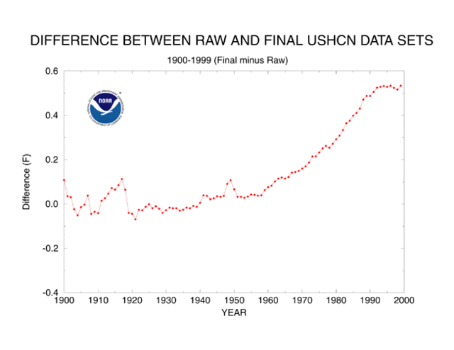
The US Historical Climate Network (USHCN) reports about a 0.6C temperature increase in the lower 48 states since about 1940.  There are two steps to reporting these historic temperature numbers.  First, actual measurements are taken.  Second, adjustments are made after the fact by scientists to the data.  Would you like to guess how much of the 0.6C temperature rise is from actual measured temperature increases and how much is due to adjustments of various levels of arbitrariness?  Here it is, for the period from 1940 to present in the US:

Actual Measured Temperature Increase: 0.3C
Adjustments and Fudge Factors: 0.3C
Total Reported Warming: 0.6C

Yes, that is correct.  About half the reported warming in the USHCN data base, which is used for nearly all global warming studies and models, is from human-added fudge factors, guesstimates, and corrections.

I know what you are thinking – this is some weird skeptic’s urban legend.  Well, actually it comes right from the NOAA web page which describes how they maintain the USHCN data set.  Below is the key chart from that site showing the sum of all the plug factors and corrections they add to the raw USHCN measurements:
Ushcn_corrections

I concluded that while certain adjustments like the one for time of observation make sense, many of the adjustments, such as the one for siting, seem crazy.  Against all evidence, the adjustment for siting implies a modern cooling bias, which is crazy given urbanization around sites and the requirement that modern MMTS stations (given maximum wire lengths) be nearer buildings than any manual thermometer had to be 80 years ago.

Even if we thought these guys were doing their best effort, can we really trust our ability to measure a signal that is substantially smaller than the noise we have to filter out?

Anyway, in the last week a similar example has been found in New Zealand, via Anthony Watts:

The New Zealand Government’s chief climate advisory unit NIWA is under fire for allegedly massaging raw climate data to show a global warming trend that wasn’t there.

The scandal breaks as fears grow worldwide that corruption of climate science is not confined to just Britain’s CRU climate research centre.

In New Zealand’s case, the figures published on NIWA’s [the National Institute of Water and Atmospheric research] website suggest a strong warming trend in New Zealand over the past century:

NIWAtemps

The caption to the photo on the NiWA site reads:

From NIWA’s web site — Figure 7: Mean annual temperature over New Zealand, from 1853 to 2008 inclusive, based on between 2 (from 1853) and 7 (from 1908) long-term station records. The blue and red bars show annual differences from the 1971 – 2000 average, the solid black line is a smoothed time series, and the dotted [straight] line is the linear trend over 1909 to 2008 (0.92°C/100 years).

But analysis of the raw climate data from the same temperature stations has just turned up a very different result:

NIWAraw

Gone is the relentless rising temperature trend, and instead there appears to have been a much smaller growth in warming, consistent with the warming up of the planet after the end of the Little Ice Age in 1850.

The revelations are published today in a news alert from The Climate Science Coalition of NZ:

Again, even before we consider the quality of the adjustment, we see the signal to noise — the adjustments for noise are equal to or greater than the signal they think exists in the data.

The obvious response is that these adjustments are somehow justified based on site location and instrumentation changes.  But we know from looking at US temeprature stations that the typical station has a warming bias over time due to urbanization and the warm bias of some modern temperature instruments, thus requiring a cooling adjustment and not a warming adjustment.  Watts provides such evidence for one New Zealand site here.

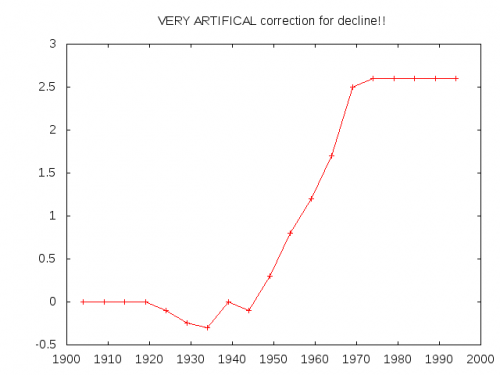
Update: Boy, this is certainly becoming a familiar curve shape.  It seems the main hockey stick curve is the shape of temperature adjustments coming out of these guys.  ESR (via TJIC)  took this code from a Briffa North American proxy reconstruction

;<p> ; Apply a VERY ARTIFICAL correction for decline!!<p> ;<p> yrloc=[1400,findgen(19)*5.+1904]<p> valadj=[0.,0.,0.,0.,0.,-0.1,-0.25,-0.3,0.,- 0.1,0.3,0.8,1.2,1.7,2.5,2.6,2.6,2.6,2.6,2.6]*0.75 ; fudge factor<p> if n_elements(yrloc) ne n_elements(valadj) then message,’Oooops!’<p> ;<p> yearlyadj=interpol(valadj,yrloc,timey)

and reproduced this curve, representing the “fudge factor” Briffa added, apparently to get the result he wanted:

esr_agw_gnuplot

“The Trick”

Steve McIntyre explains the “trick” referred to in the CRU emails.  The trick is subtle, which allows the scientists to weasel out, saying things that are technically true but in essence false and misleading.

Most of the proxy series are smoothed in some way.  Most smoothing algorithms adjust a data point by averaging in data both forwards and backwards in the series.  A simple algorithm puts high weights on nearby data points in this averaging and relatively lower weights on data points further away.

The problem occurs when the series reaches its end.  There are not points forward in the data series to average.  By the last point in the series, fully half the data necessary for smoothing does not exist.  There are various techniques for handling this, all of which have trade-offs and compromises (at the end of the day, you can’t create a signal when there is no data, no matter how clear one’s math tends to be).

The trick involved taking instrumental temperature records and using these records to provide data after the end point for smoothing purposes.  This tends to force the smoothed curves upwards at the end, when there is no such data in the proxy trend to substantiate this.  The perpetrators of this trick can argue with a semi-straight face that they did not “graft” the instrumental temperature record onto the data, but the instrumental temperature records does in fact affect the data series by contributing as much as half of the data for the smoothed curve in the end years.

Another Problem

I have always considered the “we-don’t-graft” claim disingenuous for another reason.  This is driven in large part because I have spent a lot of time not just manipulating data, but thinking about the most effective ways to represent it in graphical form.

To this end, I have always thought that while folks like Mann and Briffa have not technically grafted the instrumental data, they have effectively done so in their graphical representations — which is the form in which 99.9% of the population have consumed their data.

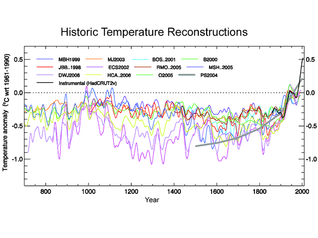
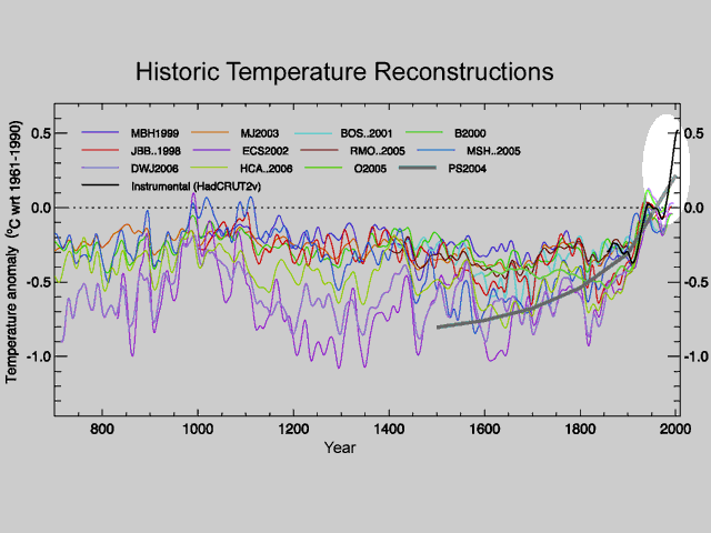
Below is the 1000-year temperature reconstruction (from proxies like tree rings and ice cores) in the Fourth IPCC Assessment.  It shows the results of twelve different studies, one of which is the Mann study famously named “the hockey stick.”

S_1000years

All the colored lines are the proxy (tree ring, ice cores, sediments, etc) study results.  The black line is the instrumental temperature record from the Hadley CRU.  There is no splice here – they have not joined proxy to instrument.  But they have effectively done so by overlaying the lines on top of each other.  The visual impact that says hockey stick is actually driven by this overlay.

S_1000years_inflection_high

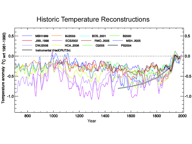
To prove it, lets remove the black instrumental temperature line as well as the gray line which I think is some kind of curve fitted to all of the above.  This is what we get:

S_1000years_inflection

Pretty different visual impact, huh?  The hockey stick is gone.  So in fact, the visual image of a hockey stick is driven by the overlay of the instrumental record on the proxies.  The hockey stick inflection point occurs right at the point the two lines join, raising the distinct possibility the inflection is due to incompatibility of the two data sources rather than a natural phenomenon.

More here.

Hide the Decline

A lot of folks have asked me why I wasn’t more energized initially about the climate emails.  One reasons is that they don’t really reveal much that I and others who did not go along blindly with the orthodoxy knew for years.  The emails are kind of like getting a written confession from OJ Simpson to Nicole Brown’s murder-  newsworthy, but it wouldn’t be confirming anything I didn’t already know.

Here is a good example.  I wrote this November 10, 2007:

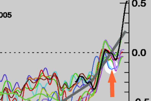
By the way, here is a little lesson about the integrity of climate science.  See that light blue line [in this graph from the IPCC Fourth Assessment]?  Here, let’s highlight it:

S_gwmovie_ff2

For some reason, the study’s author cut the data off around 1950.  Is that where his proxy ended?  No, in fact he had decades of proxy data left.  However, his proxy data turned sharply downwards in 1950.  Since this did not tell the story he wanted to tell, he hid the offending data by cutting off the line, choosing to conceal the problem rather than have an open scientific discussion about it.

The study’s author?  Keith Briffa, who the IPCC named to lead this section of their Fourth Assessment.

The recent data release apparently includes this chart of Briffa’s proxy data discussed above (from Steve McIntyre via Anthony Watts):

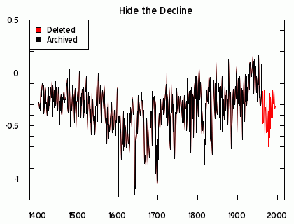
For the very first time, the Climategate Letters “archived” the deleted portion of the Briffa MXD reconstruction of “Hide the Decline” fame – see here. Gavin Schmidt claimed that the decline had been “hidden in plain sight” (see here. ). This isn’t true.

The post-1960 data was deleted from the archived version of this reconstruction at NOAA here and not shown in the corresponding figure in Briffa et al 2001. Nor was the decline shown in the IPCC 2001 graph, one that Mann, Jones, Briffa, Folland and Karl were working in the two weeks prior to the “trick” email (or for that matter in the IPCC 2007 graph, an issue that I’ll return to.)

A retrieval script follows.

For now, here is a graphic showing the deleted data in red.

briffa_recon
Figure 1. Two versions of Briffa MXD reconstruction, showing archived and climategate versions. The relevant IPCC 2001 graph, shown below, clearly does not show the decline in the Briffa MXD reconstruction.

Contrary to Gavin Schmidt’s claim that the decline is “hidden in plain sight”, the inconvenient data has simply been deleted.

I think his hockey stick looks a little flacid.  Fortunately someone invented Tiljander sediments, a form of data Viagra (as long as one flips it upside down) and such games were no longer necessary.

Good Summary of the Climate Pentagon Papers

From Lou Glazner via Anthony Watts

1. The scientists colluded in efforts to thwart Freedom of Information Act requests (across continents no less). They reference deleting data, hiding source code from requests, manipulating data to make it more annoying to use, and attempting to deny requests from people recognized as contributors to specific internet sites. Big brother really is watching you. He’s just not very good at securing his web site.

2. These scientists publicly diminished opposing arguments for lack of being published in peer-reviewed scientific journals. In the background they discussed black-balling journals that did publish opposing views, and preventing opposing views from being published in journals they controlled. They even mention changing the rules midstream in arenas they control to ensure opposing views would not see the light of day. They discuss amongst themselves which scientists can be trusted and who should be excluded from having data because they may not be “predictable”.

3. The scientists expressed concern privately over a lack of increase in global temperatures in the last decade, and the fact that they could not explain this. Publicly they discounted it as simple natural variations. In one instance, data was [apparently] manipulated to hide a decline in temperatures when graphed. Other discussions included ways to discount historic warming trends that inconveniently did not occur during increases in atmospheric CO2.

4. The emails show examples of top scientists working to create public relations messaging with favorable news outlets. It shows them identifying and cataloging, by name and association, people with opposing views. These people are then disparaged in a coordinated fashion via favorable online communities.

What the emails/files don’t do is completely destroy the possibility that global climate change is real. They don’t preclude many studies from being accurate, on either side of the discussion. And they should not be seen as discrediting all science.

The Heart of the Scandal

Free speech and transparency are meaningless unless they apply to the critics of the government as well as to its supporters.  Here is the heart of the scandal:

Wei-Chyung and Tom,

1. Think I’ve managed to persuade UEA to ignore all further FOIA requests if the people have anything to do with Climate Audit.
2. Had an email from David Jones of BMRC, Melbourne. [EMAIL NOT FOUND IN CRU EMAILS – Willis] He said they are ignoring anybody who has dealings with CA, as there are threads on it about Australian sites.
3. CA is in dispute with IPCC (Susan Solomon and Martin Manning) about the availability of the responses to reviewer’s at the various stages of the AR4 drafts. They are most interested here re Ch 6 on paleo.
Cheers
Phil [Phil Jones, head of the University of East Anglia CRU]

Climate Audit is a site dedicated to science.  You will seldom see any political polemic there, even in the comments.  Unlike sites like RealClimate, dissenting voices are not edited out of the comments.  And it is a site that has dedicated itself (thus the title) to backchecking, verifying, and attempting to replicate various climate studies, particularly historic temperature records and paleo-climatology work.

Essentially, Phil Jones is saying that, as a government official, he is going to ignore legal information requests under FOIA from certain groups that seek to hold him accountable — information requests, I might add, that should not have even been necessary in the first place by any reasonable rules of scientific openness.

Update: You really have to read the whole long post above.  It is a story of the CRU trying to stay one step ahead of those who want to make them accountable, as most scientists are to replication efforts.   One approach they took that really requires chutzpah – in response to the constant CRU stonewalling, more and more people began pinging them with FOIA’s.  Remember, this deluge of FOIA’s was only necessary due to the CRU’s constant stonewalling.  Their next tactic – use the volume of FOIA’s as evidence that it is somehow a concerted attack and therefore can be ignored:

I’ve saved all three threads as they now stand. No time to read all the comments, but I did note in “Fortress Met Office” that someone has provided a link to a website that helps you to submit FOI requests to UK public institutions, and subsequently someone has made a further FOI request to Met Office and someone else made one to DEFRA. If it turns into an organised campaign designed more to inconvenience us than to obtain useful information, then we may be able to decline all related requests without spending ages on considering them. Worth looking out for evidence of such an organised campaign

Update #2: I am curious how many other scientific fields support this attitude towards defending and replication one’s work

Dear Tom,

One of the problems is that I’m caught in a real Catch-22 situation. At present, I’m damned and publicly vilified because I refused to provide McIntyre with the data he requested. But had I acceded to McIntyre’s initial request for climate model data, I’m convinced (based on the past experiences of Mike Mann, Phil, and Gavin) that I would have spent years of my scientific career dealing with demands for further explanations,
additional data, Fortran code, etc. (Phil has been complying with FOIA requests from McIntyre and his cronies for over two years). And if I ever denied a single request for further information, McIntyre would have rubbed his hands gleefully and written: “You see – he’s guilty as charged!” on his website.

You and I have spent over a decade of our scientific careers on the MSU issue, Tom. During much of that time, we’ve had to do science in “reactive mode”, responding to the latest outrageous claims and inept science by John Christy, David Douglass, or S. Fred Singer. For the remainder of my scientific career, I’d like to dictate my own research agenda. I don’t want that agenda driven by the constant need to respond to Christy, Douglass, and Singer. And I certainly don’t want to spend years of my life interacting
with the likes of Steven McIntyre.

I hope LLNL management will provide me with their full support. If they do not, I’m fully prepared to seek employment elsewhere.

With best regards,
Ben [Ben Santer]

Missing the Point, Perhaps on Purpose

Anthony Watts has a statement from the American Meteorological Society about the Hadley CRU emails.  The basic message is “nothing to see here, move along:”

For climate change research, the body of research in the literature is very large and the dependence on any one set of research results to the comprehensive understanding of the climate system is very, very small. Even if some of the charges of improper behavior in this particular case turn out to be true — which is not yet clearly the case — the impact on the science of climate change would be very limited.

I sent this letter to their executive director:

I really believe your group’s statement is missing the point.  Your group’s position seems to be that this episode can be safely ignored as it taints only a small volume of a large mass of research.  But a large body of research is not useful if that body systematically excludes any work critical of the orthodoxy.  In fact, you should re-reread this paragraph from your own letter:

The beauty of science is that it depends on independent verification and replication as part of the process of confirming research results.  This process, which is tied intrinsically to the procedures leading to publication of research results in the peer-reviewed literature, allows the scientific community to confirm some results while rejecting others.

The Hadley emails describe a large conspiracy to corrupt exactly this process.  We see scientists conspiring to keep secret results and working papers that would have allowed their worked to be checked, verified, and replicated.  We see researchers working to prevent publication of any research that might falsify their work.

Sure, we see a few examples of researchers fudging their work.  But the issue is not necessarily the specific cases of fudging — in fact, I don’t care if its sloppiness or chicanery — from a science standpoint it almost doesn’t matter.  The problem here is the creation of a system and a culture where such fudging and sloppiness can occur without any of the independent scrutiny you seem to laud as part of the scientific process.  How much more exists?  We’ll never know, until organizations like yours stop enabling this climate Omerta and start demanding true scientific openness.