Cross-Posted from Coyoteblog
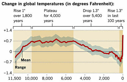
I won’t repeat the analysis, you need to see it here. Here is the chart in question:
My argument is that the smoothing and relatively low sampling intervals in the early data very likely mask variations similar to what we are seeing in the last 100 years — ie they greatly exaggerate the smoothness of history (also the grey range bands are self-evidently garbage, but that is another story).
Drum’s response was that “it was published in Science.” Apparently, this sort of appeal to authority is what passes for data analysis in the climate world.
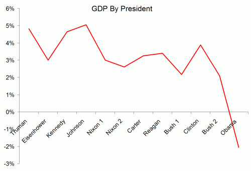
Well, maybe I did not explain the issue well. So I found a political analysis that may help Kevin Drum see the problem. This is from an actual blog post by Dave Manuel (this seems to be such a common data analysis fallacy that I found an example on the first page of my first Google search). It is an analysis of average GDP growth by President. I don’t know this Dave Manuel guy and can’t comment on the data quality, but let’s assume the data is correct for a moment. Quoting from his post:
Here are the individual performances of each president since 1948:
1948-1952 (Harry S. Truman, Democrat), +4.82%
1953-1960 (Dwight D. Eisenhower, Republican), +3%
1961-1964 (John F. Kennedy / Lyndon B. Johnson, Democrat), +4.65%
1965-1968 (Lyndon B. Johnson, Democrat), +5.05%
1969-1972 (Richard Nixon, Republican), +3%
1973-1976 (Richard Nixon / Gerald Ford, Republican), +2.6%
1977-1980 (Jimmy Carter, Democrat), +3.25%
1981-1988 (Ronald Reagan, Republican), 3.4%
1989-1992 (George H. W. Bush, Republican), 2.17%
1993-2000 (Bill Clinton, Democrat), 3.88%
2001-2008 (George W. Bush, Republican), +2.09%
2009 (Barack Obama, Democrat), -2.6%
Let’s put this data in a chart:
Look, a hockey stick , right? Obama is the worst, right?
In fact there is a big problem with this analysis, even if the data is correct. And I bet Kevin Drum can get it right away, even though it is the exact same problem as on his climate chart.
The problem is that a single year of Obama’s is compared to four or eight years for other presidents. These earlier presidents may well have had individual down economic years – in fact, Reagan’s first year was almost certainly a down year for GDP. But that kind of volatility is masked because the data points for the other presidents represent much more time, effectively smoothing variability.
Now, this chart has a difference in sampling frequency of 4-8x between the previous presidents and Obama. This made a huge difference here, but it is a trivial difference compared to the 1 million times greater sampling frequency of modern temperature data vs. historical data obtained by looking at proxies (such as ice cores and tree rings). And, unlike this chart, the method of sampling is very different across time with temperature – thermometers today are far more reliable and linear measurement devices than trees or ice. In our GDP example, this problem roughly equates to trying to compare the GDP under Obama (with all the economic data we collate today) to, say, the economic growth rate under Henry the VIII. Or perhaps under Ramses II. If I showed that GDP growth in a single month under Obama was less than the average over 66 years under Ramses II, and tried to draw some conclusion from that, I think someone might challenge my analysis. Unless of course it appears in Science, then it must be beyond question.


We emit gigatons of co2 per year and get the consequences for it. Which is warming of our climate. CO2 has the mechanism to warm our climate.
http://www.skepticalscience.com/empirical-evidence-for-global-warming.htm
Renewableguy – Perhaps you have not bothered to actually read this blog? Warren doesn’t deny that, all else equal, CO2 will warm the atmosphere. The question is whether or not most or all of the warming we’ve seen over the past century is a result of CO2.
You might also want to read up a little more on that greenhouse radiation chart. What’s important is the NET effect of the all gasses in atmosphere. Just because CO2 reflects a certain band doesn’t mean that taking out CO2 would eliminate or even substantially reduce net reflection if there is another gas present that also substantially reflects all or most of the same band. And guess what, there is (water vapor).
Yes, I do realize that there is not complete coverage of CO2 by H2O vapor. I make no claim that there is. I’m just saying that using the chart the way you did is just a little dishonest.
This is the co2 spectrum difference over a period of several years. If you look at the spectrum below, the co2 region has decreased, meaning more of it (infrared energy) is staying in the atmosphere.
http://www.skepticalscience.com/its-not-us-intermediate.htm
Figure 4: Change in spectrum from 1970 to 1996 due to trace gases. ‘Brightness temperature’ indicates the equivalent blackbody temperature (Harries 2001).
Dishonesty is intentional deceiving. That is the whole premise of the denial industry. For a complete picture of the climate, start with the IPCC AR5. Internet conversations have limited ability to get the whole picture across.