One of my pet peeves in the climate debate is how some folks will immediately describe differences in opinion or interpretation to the fact that someone is lying. I wanted to show an example of how reasonable people can disagree from the same data set. This is from a paper written by Vincent Gray (spsl3) in response to an analysis of South Seas sea levels in a series of SEAFRAME reports here. Mr. Gray believes the authors of the reports have exaggerated sea level rise, and I am sympathetic to his analysis, but I really wanted to show how multiple people can draw different conclusions from the same data.
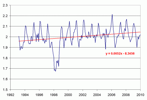
To begin, lets take the sea level data for Tuvalu from here. We will graph the raw data, and use Excel to plot a least squares linear fit (the scale on the left is in meters)
The trend we get is about 5.2mm per year of sea level rise — the actual study Gray is commenting on shows 6mm per year, but its data only went through 2008.
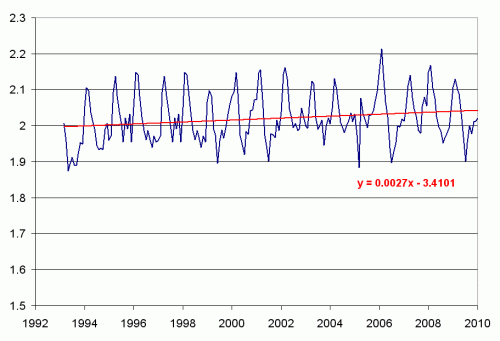
The most noticeable feature on this chart is the depression in 1998, which Gray attributes to the super strong el Nino of that year. So, I first took this anomalous data out by pasting in data for that period from a previous period (with the months synchronized)
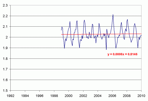
OK, this cut the sea level trend in half, to 2.7mm a year. Of course, this kind of data fill-in leaves much to be desired. It was simply an experiment on my part. I think a better test is to look at the trend since this anomalous event
The trend since the 1998 el Nino has been 0.6mm a year.
So, from the same data, we can reach trends that are an order of magnitude different, from 0.6mm to 5.4mm. I think the original authors of the study were remiss in not doing more sensitivity analysis, and it would be an interesting test to see if presented with such an anomaly that reduced rather than increased the trend, whether they would have handled it the same way.
Never-the-less, I hope you can see why even reasonable people can draw different conclusions from the same data set. Thanks to a reader for sending me the original link.


This points out one of climate sciences great problems – lack of data. If we have 1000 data points the anomaly does not matter. It is just one point among one thousand. But in so much of climate science we find only a few data points and anomalous data points cause real error.
This seems to be an intentional aspect of some climate scientist work. Tree rings come to mind.
Mark Sherman
To me, what this shows is that researchers have to make judgment calls when interpreting data. I suspect it’s pretty easy to make a string of judgment calls, each one defensible, which — when combined — slant your conclusions quite a bit in favor of the so-called “consensus.”
Gray says in several places that the 1997-8 el Nino had an affect. Why did the 1997-8 el Nino cause a ‘decrease’ in levels?
First thing I thought of to explain the anomaly was el Nino. During an el Nino period the sea level in the western and south Pacific decline. Reason: The trade winds slacken considerably and the sea surface water they have driven westward for years can now flow back eastward. Then there is that other phenomenon: thermal expansion of sea water still adjusting from the last ice age. Wonder if anyone has a model sophisticated to take all of that into account. Probably not.
How has the sea level data been generated and adjusted?
Specifically has the tidal component been completely removed ? This is something that is very easy to do and is a highly accurate process.
Has correction been made for atmospheric pressure changes? – these are significant on a regional scale. Lower mean pressure results in higher sea level. I see there is barometric pressure data as well. It may be quite interesting to scatterplot the pressure against the sea level
Just did the graphs myself.
There is a negative trend over time in air pressure
There is an inverse relationship between air pressure and sea level – lower air pressure, higher sea level
So not feeling particularly mathematical at present, how much of the sea level rise can be attributed to air pressure changes? – Given that (roughly) 10 metres of water are the equivalent of 1000mb
I’m not too keen on any of the methods of analysis presented — especially the ones that involve throwing away data. For one thing, I’m suspicious any time someone gives me a point estimate like this without error bars. More fundamentally, if you’re investigating whether there’s a trend, and you want to factor out other effects, then come up with a model and fit the data to it — don’t just “adjust” the data in various ad hoc ways to make it more amenable to a simple analysis. For example,
sea.level <- trend + cyclical.component + el.nino.effect
where trend is a linear function of time, cyclical.component is a period function of time, and I’m not sure how to model the El Niño effect. The parameters for trend would be a constant and a coefficient for time, the parameters for cyclical.component would be a magnitude and period. You could then run this model in WinBUGS or OpenBUGS (software that does MCMC estimation of Bayesian statistical models) to marginalize out the parameters you’re not interested in, and get a posterior distribution of possible values for the trend coefficient.
brazil84 writes:
“To me, what this shows is that researchers have to make judgment calls when interpreting data.”
This is one reason why I am such a big fan of Bayesian methods. With a Bayesian analysis, all the judgment calls are out in the open, in the definition of your model and its priors. None of this business of “adjusting” the data, throwing out presumed outliers, etc.
And hidden in the analysis is a whopping assumption that the land isn’t sinking.
1. Water extraction
2. It’s a coral atol atop a sea mount, that will be sinking.
Kevin raises something that is interesting. Consider the ruccus in New Zealand where assumptions about temperature changes were made when a site moved to a higher location. The assumption about lapse rate assumed a dry lapse rate for a maritime site. It doesn’t work.
The question is then can you make homogenity adjustments in a reasonable manner? My view is that you shouldn’t be making homogenity adjustments if you want to determine a trend. Just compute the trends for homogeneous data, and then aggregate the trends. No assumptions needed.
The current adjustment fiasco means that current temperatures are adjusted upwards, when the devices should be accurate. Feed this into the models where radiation effects are proportion to the absolute temperature to the power of 4!, and the errors are magnified.
Nick
Warren: Very much appreciated your analysis of sea level anomolies. Unlike some of the previous commentators on this article, I believe it is necessary to apply commonsense when interpreting data taken from nature. This is not a precise science, let alone an exercise in pure mathematics. When the statistical analysis does not correlate with reality (i.e. the seas are not rising anywhere near 5.6 mm per yr), use your brains and look for what has gone wrong or is misleading and make corrections. As an engineer, you automatically look for practical, real solutions, rather than take it for granted when “the computer says no!” that is the answer.
P.S. I am also a Mechanical/Aeronautical engineer and very much agree with your climate presentation.
Dear High School Graduate,
Wow. Do you really think you are doing “science?” You are taking data with breaks in it, from only one station, for only a 17 year range, cutting years of data out, and then, arbitrarily(is this word too big?), you insert data from the previous year to estimate the rate of sea level change around Tuvalu.
Also, I love how your idea of “sensitivity analysis” appears to involve no propagation of error and linear best-fit lines for such an obviously non-linear function.
Nonetheless, *I* would be remiss were I not to acknowledge the great amusement your blog provides me through your hilarious and birdbrained attempts to promote climate skepticism.
Give my regards to commenter Y.
The large el niño does have an inordinate effect on the data. I would have done the analysis with and without it myself. But I would not have “invented” data to take its place (as you did when you inserted other data from an earlier period). I would have simply removed the points from the analysis.
The effect is much the same. I got 5.1 mm/yr using the data with the el niño data intact, and 3.1 mm/yr removing it and leaving a gap. Similar to what you get with the fill-in data, but at least there’s a warm feeling of not having inserted other data to make it look better.
In his great collection of essays titled “The Scientist as Rebel” Freeman Dyson says that “Science is a mosaic of partial and conflicting visions” (p. 3).
As a non-scientist I am totally comfortable with the idea that, depending on your scientific expertise, your focus, your assumptions, and your chosen mathematical and statistical approaches you may well get a different result (and reach different conclusions), than the scientist next door.
Which is why I’m totally into this post. It’s annoying in the extreme that “some folks will immediately describe differences in opinion or interpretation to the fact that someone is lying.”
Calling other people liars, cheats, crooks, crackpots and frauds is playground stuff. We really do need a grown-up discussion – in which it’s acknowledged that smart, sincere people will sometimes come to different, good-faith conclusions.
What will the AGW true believers do now?
http://www.dailymail.co.uk/news/article-1250872/Climategate-U-turn-Astonishment-scientist-centre-global-warming-email-row-admits-data-organised.html?ITO=1490
1st time commenter, long time reader.
The post is great because it accurately depicts the give and take between scientists.
Technical question. The slopes are so small for these lines. Surely the R2 << 1 for these lines indicating that the slope is unneccesary for modeling the data. Is this the case? Even though this is not the purpose of the post, can you show the p-values for all three slopes? I suspect that neither the 0.6 nor the 5.2 is statistically significant (p < 0.05). This would at least point out that two scientists arguing over the differences in these slopes would be having a significantly negative argument over an insignificantly different answer.
Actually followed the link and calculated the p-values myself. Thanks for the links! It is nice not to have to issue a FOIA request (haha). That’s real openness.
I am surprised that the 5.2mm slope is “statistically significant” with a p-value = 0.00007. But that is with the large El Nino dip. The p-value for the trend since 1999 is 0.73 – meaning that this particular slope has a 73% probability of resulting from the “random” variability in the data.
A recently released study shows the sea level falling in the Pacific! How’s that for a poke in the eye with a blunt stick to the IPCC!
http://hockeyschtick.blogspot.com/