The other underlying assumption in the GCCI report is that without man, climate would be dead stable. Year in and year out, decade after decade, every location would get the same rain it got the year before and the decade before, the same number of storms, the same number of tornadoes, the same start date for Spring, etc.
Now, the authors might object to that and say, “we don’t believe that.” But in fact they must, since in the report, any US climate trend in the last 20 years (more rain, less rain, more storms, fewer storms, more snow, less snow, etc) is all blamed on man. Why else discuss a given trend in climate in a report on man-made climate change except to create the impression that each and every trend in climate is due to man, and can therefore be extrapolated a hundred years in to the future?
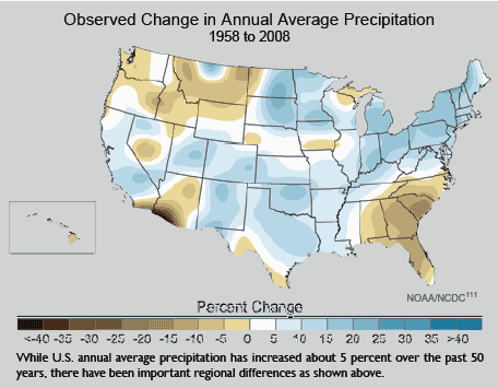
I am going to take on many of these charts in this series, but here is an example from page 30:

So what? Do you really think there is a single 50-year period in the history of North America where you wouldn’t see this kind of effect? Where, sans man, the chart would be all white with no changes? And even trying to pull regional conclusions out of this is almost impossible — for example, the brown in the Southeast is heavily driven by the 2008 endpoint with a big drought. Shift the period by even a few years and the chart has the same mixture of blue and brown, but distributed differently.
Of course,this assumption of underlying stability is absurd. History is full of short, medium, and long-term climate cycles. An honest scientific discussion would look at the degree of variation over time, say hundreds or thousands of years, and then put recent variations in this context. Are recent changes unprecedented, or not? Well, we’ll never know from this report.

Funny thing, Florida precipitation is shown to be declining over the period, but a look at the entire record tells quite a different story:
http://lwf.ncdc.noaa.gov/oa/climate/research/cag3/fl.html
increasing precipitation since 1900. Go figure. Someone really needs to ask “Why don’t you use all the data?”
In fairness, they do identify that their models distinguish between natural phenomena and man-made. P. 20, top left. The one with the HUGE uncertainties that are made to look aesthetic.
The public lobotomy continues…
“Shift the period by even a few years and the chart has the same mixture of blue and brown, but distributed differently.”
Prove it.
Hunter- You seem to forget that it is required that the Climate Change/Global Warming show it is happening. They also have to explain all the contradictory data. Belief that it is happening without being able to PROVE IT is Religion. The natural change side explains the various data nicely – Natural variations and cycles. Where is the CC/GW explanation? Other than Belief (i.e. Religious Certainty).
It would be interesting to see the algorithm by which this precipation chart was arrived. I believe that the trend to slightly more precipitation in the U.S. is consistent with numerous studies, and that conclusion is robust over various start and end points. My hunch is that Warren Meyer is right that you will get different brown and blue spots by shifting the start and end dates a few years. For example, the rainfall record in my Midwest farm would call for a brown color if we went from the 60s to this decade, instead of the blue indicated. Meanwhile, I have followed the drought in Georgia quite closely over the last few years, and the GCCI chart does show brown for 1958-2008. That intrigued me since the the 1950s probably had the worst drought in recorded Georgia history. Indeed, Georgia State Averaged Precipitation Data shows an increase from 44.84 in 1958 to 47.75 in 2008 according to SERCC. There must be some type of smoothing technique used by GCCI. 1957 and 1959 had quite a bit of rainfall while 1954 was the low point in Georgia rainfall. The first 8 years of this decade have averaged 48.5 inches up from the 45.9 average for the first 8 years of the 1950s. Therefore it seems likely that many browns and blue areas would be changed by picking differenct start & end dates and algorithms. (Furthermore, by the time that this decade ends, the increased rainfall average is likely be even more pronounced as 2009 has been quite wet in Georgia.)
who let hunter into the deep end of the pool? obviously over his head. my training in earth sciences taught me one lesson over all others, there is no “normal” in climate. there are averages over time, but these are essentially meaningless when attempting to determine what the climate should be now. somebody throw hunter a life vest, or not.
As always, one ~must~ remember: The effect can ~never~ overcome the cause.
Saw an interesting paper a couple of months ago on this issue, Climate, hydrology and freshwater: towards an interactive incorporation of hydrological experience into climate research, you can get it here, http://www.atypon-link.com/IAHS/doi/abs/10.1623/hysj.54.2.394
They raise some interesting points and detail some rather glaring flaws with the IPCC reports methods and conclusions, which is the basis for this report after all.
But, it’s just another paper right, lot’s of them out there.
…throw him an anvil.