In a number of portions of the report, graphs appear trying to show climate variations in absurdly narrow time windows. This helps the authors of this scientific report advocacy press release either a) blame long-term climate trends on recent manmade actions or b) convert natural variation on decadal cycles into a constant one-way trend. In this post we will look at an example of the former, while in the next post we will look at the latter.
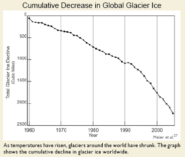
Here is the melting glacier chart from right up front on page 18, in the section on sea level rise (ironic, since if you really read the IPCC report closely, sea level rise comes mainly from thermal expansion of the oceans – glacier melting is offset in most models by increased snow in Antarctica**).
Wow, this looks scary. Of course, it is clever chartsmanship, making it look like they have melted down to zero by choice of scale. How large is this compared to the total area of glaciers? We don’t know from the chart — percentages would have been more helpful.
Anyway, I could criticize these minor chartsmanship games throughout the paper, but on glaciers I want to focus on the selected time frame. What, one might ask, were glaciers doing before 1960? Well, if we accept the logic of the caption that losses are driven by temperature, then I guess it must have been flat. But why didn’t they show that? Wouldn’t that be a powerful chart, showing flat glacier size with this falloff to the right?
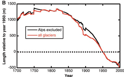
Well, as you may have guessed, the truncated time frame on the left side of this chart is not flat. I can’t find evidence that Meier et al looted back further than 1960, but others have, including Oerlemans as published in Science in 2005. (The far right hand side really should be truncated by 5-10 years, as they are missing a lot of datapoints in the last 5 years, making the results odd and unreliable).
OK, this is length rather than volume, but they should be closely related. The conclusion is that glaciers have been receding since the early 19th century, LONG before any build-up of CO2, and coincident with a series of cold decades in the last 18th century (think Valley Forge and Napoleon in Russia).
I hope you can see why it is unbelievably disingenuous to truncate the whole period from 1800-1960 and call this trend a) recent and b) due to man-made global warming. If it is indeed due to man-made global warming since 1960, then there must have been some other natural effect shrinking glaciers since 1825 that fortuitously shut off at the precise moment anthropogenic warming took over. Paging William of Occam, call your office please.
Similarly, sea levels have been rising steadily for hundreds, even thousands of years, and current sea level increases are not far off their average pace for the last 200 years.
** The climate models show warming of the waters around Antarctica, creating more precipitation over the climate. This precipitation falls and remains as snow or ice, and is unlikely to melt even at very high numbers for global warming as Antarctica is so freaking cold to begin with.


Bigger problem with the initial graph is that even in the shortened time frame it doesn’t support the AGW crowd’s claims. The decline appears to begin in 1960, 30 years before AGW is supposed to have really kicked in. The slope increases dramatically in ’91, but as it’s almost a straight line down, it doesn’t appear to have any relation to the temperature record at all, no spike in ’98, no leveling out in 2000… That graph could be used much easier as a evidence against AGW and its effect on the glaciers.
As always, one ~must~ remember: The effect can ~never~ overcome the cause.
Highlander,
“As always, one ~must~ remember: The effect can ~never~ overcome the cause.”
What?? No “FEEDBACKS!?!?!?!”
HAHAHAHAHAHAHAHAHAHAHA
Here is another of my favorite glacier graphics:
http://soundwaves.usgs.gov/2001/07/fieldwork2.html
Which shows how Glacier Bay, AK has seen glacial retreat since the late 1700’s.
A handy and unimpeachable survey of waxing and waning glaciers (at least in the eastern Alps) is Emanuel Le Roy Ladurie’s ‘Times of Feast, Times of Famine,’ which uses incontrovertible evidence (like shepherds’ chapels covered by ice) of the expansion and contraction of glaciers since 1000.
One thing clear from that is that over the past millenium (at least), glacial trends measured in segments shorter than about 300 years are meaningless.
(Le Roy Ledurie was not a climatologist. He was France’s leading historian. His book was published 30 years ago, well before Hansen began his misguided campaign. If more people had been aware of Le Roy Ladurie back then, Hansen would have been laughed out of town.)
Check out the Copenhagen report. They have a 5 year chart of glacier decline, with 2003 set at 0.
Which would be meaningless.
I visited Columbia Glacier in British Columbia a couple years ago. In the museum they had a series of pictures starting (IIRC) in 1850: the glacier has been continuously retreating over the entire period.
Exit Glacier, about 50 miles south of Anchorage, has signs marking the glacier’s terminus by decade since the mid-1800s. Same story — continuous retreat.
Either Warmenist report writers are idiots, or they think the rest of us are. (Actually, I suppose both could be simultaneously true.)
Not that it’s conclusive either way, but let’s not overlook the trend that glaciers are retreating virtually everywhere in the northern hemisphere at unprecedented rates… Typical waxing and waning of glaciers is more localized and slower…
If you care to check it out…: http://www.realclimate.org/index.php/archives/2005/03/worldwide-glacier-retreat/