Readers of this blog will be familiar with the many problems of surface temperature measurement – the measurement points are geographically spotty, of uneven quality, and are subject to a number of biases, the greatest of which is probably the encroachment of man-made urban environments on the measurement locations. I have discussed these issues many places, including at the 1:00 minute mark of this video, in my book, and in posts here, here, and here.
I have not posted much of late on this topic, becuase I am not sure there is a lot of new news. Satellites still make more sense than surface measurement, and the GISS still is working to tweak its numbers to show more and more warming, and Anthony Watts still finds a lot of bad measurement points.
In the last week, though, the story seems to be getting out further than just the online skeptic’s community. Steven Goddard has a good article in the UK Register online. I don’t think any of the issues he covers will be new to our readers, but it is a decent summary. He focuses in particular on the GISS restatements of history:
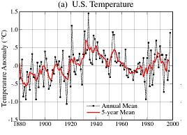
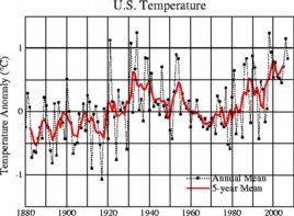
One clue we can see is that NASA has been reworking recent temperatures upwards and older temperatures downwards – which creates a greater slope and the appearance of warming. Canadian statistician Steve McIntyre has been tracking the changes closely on his Climate Audit site, and reports that NASA is Rewriting History, Time and Time Again. The recent changes can be seen by comparing the NASA 1999 and 2007 US temperature graphs. Below is the 1999 version, and below that is the reworked 2007 version.

NASA’s original data: 1999

NASA’s reworked data: 2007
This restatement is particularly hard to justify as direct inspection of the temperature measurement points reveals growing urban heat biases, which should imply, if anything, adjustments up in the past and/or down in the present, exactly opposite of the GISS work. I have written a number of letters and inquiries asking the GISS what systematic bias they are finding/assuming that biased measurements upwards in rural times but downwards in urban times, but I have never gotten a response, nor seen one anywhere online.
HT: Anthony Watts
Update: Similar article here
"Particularly troubling are the years from 1986-1998. In the 2007 version of the graph, the 1986 data was adjusted upwards by 0.4 degrees relative to the 1999 graph. In fact, every year except one from 1986-1998 was adjusted upwards, by an average of 0.2 degrees. If someone wanted to present a case for a lot of recent warming, adjusting data upwards would be an excellent way to do it.

Gosh, yes, look at those graphs! The second one goes much higher in recent times than the first!
Perhaps that’s because the first one stops in 2000, and the second one carries on into the warmest decade the world has seen for hundreds of years. Did you notice that? The differences in the common part are not very large.
I have written a number of letters and inquiries asking the GISS what systematic bias they are finding/assuming that biased measurements upwards in rural times but downwards in urban times, but I have never gotten a response, nor seen one anywhere online. – I think the phrase here is RTFM. Try reading the papers describing the data. They are all online. How could you have failed to notice this? While you have fixed in your head the idea that biases can only ever be upwards, in fact, if you compare urban trends to nearby rural trends, urban sites show cooling relative to rural in about 40% of cases.
As always, looking at the data (and trying to understand it, as far as you are actually capable of doing so) would be better than writing nonsense based on flawed assumptions.
Scientist,
RTGDM is more offensive!!! Try it out next time.
Anyway, I think the point of this post is to show how the data is being changed, in an upward fashion. I don’t think the 2000 has anything to do with that because the revised numbers are higher even for 1999.
Can you explain some more about why these are being adjusted upwards? I don’t have time to go look for the papers…
Does the fact that numbers are being “corrected” show that this is NOT settled science?
If you want to make an honest comparison, compare two graphs covering the same period.
Here’s more about adjustments made after the first graph ended. RTFP to learn more.
We compare the United States and global surface air temperature changes of the past century using the current Goddard Institute for Space Studies (GISS) analysis and the U.S. Historical Climatology Network (USHCN) record [Karl et al., 1990]. Changes in the GISS analysis subsequent to the documentation by Hansen et al. [1999] are as follows: (1) incorporation of corrections for time-of-observation bias and station history adjustments in the United States based on Easterling et al. [1996a], (2) reclassification of rural, small-town, and urban stations in the United States, southern Canada, and northern Mexico based on satellite measurements of night light intensity [Imhoff et al., 1997], and (3) a more flexible urban adjustment than that employed by Hansen et al. [1999], including reliance on only unlit stations in the United States and rural stations in the rest of the world for determining long-term trends. We find evidence of local human effects (“urban warming”) even in suburban and small-town surface air temperature records, but the effect is modest in magnitude and conceivably could be an artifact of inhomogeneities in the station records. We suggest further studies, including more complete satellite night light analyses, which may clarify the potential urban effect. There are inherent uncertainties in the long-term temperature change at least of the order of 0.1°C for both the U.S. mean and the global mean. Nevertheless, it is clear that the post-1930s cooling was much larger in the United States than in the global mean. The U.S. mean temperature has now reached a level comparable to that of the 1930s, while the global temperature is now far above the levels earlier in the century. The successive periods of global warming (1900-1940), cooling (1940-1965), and warming (1965-2000) in the 20th century show distinctive patterns of temperature change suggestive of roles for both climate forcings and dynamical variability. The U.S. was warm in 2000 but cooler than the warmest years in the 1930s and 1990s. Global temperature was moderately high in 2000 despite a lingering La Niña in the Pacific Ocean.
Does your use of scare quotes show that you are not approaching this issue with an open mind?
Thanks for linking that, now I can RTFP. I’ll have to dig through some of those reports that are cited, as well.
Scientist is correct. I overlaid these two graphs and they are virtually identical up until the mid 90’s. Any high school kid could read these graphs. You, sir, are making an ass of yourself here. Maybe you should “rework” your graphics for your blog. I do agree with you however that large shopping mall parking lot heat sinks are causing global warming.