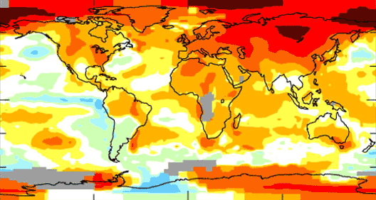
A week or so ago, I had an extended post on a number of issues I had with this chart from the GISS, showing "areas in 2007 that were warmer (reds) and colder (blues) than the mean annual temperature from 1951-1980:"
I had many issues with this chart, not the least of which was the fact that it fills in data for large swaths of the earth for which we have no data. However, another point I made was that the GISS is essentially fibbing here by using a straight cylindrical projection of the Earth. We all know from junior high school that there are a lot of ways to project the globe onto a flat sheet of paper, all of which are imperfect.
However, for a chart like this, one really needs an equal area projection. In an equal area projection, a square inch at the equator represents the same surface area as a square inch at the poles. The GISS is NOT using an equal area projection. In fact, in the projection they are using, the area at the poles is wildly exaggerated. Since the north pole is the area of the earth with the most anomolous measured warming, the chart visually overstates the amount of global warming.
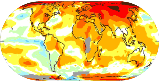
In my post, I did not know how to reproject the map, so I took a wild stab at it using manual skews in Photoshop. I thought maybe the GISS did not show the map correctly because it was hard to reproject the data. It turns out, though, that there are some good free tools available to do just this kind of task. With these tools I was able to convert the chart above to an equal-area projection (using the Eckert IV method):
One can see that the visual message is certainly different when projected correctly.
This tool was so simple it took me less than 10 seconds to make this reprojection. But here is the hilariously ironic part: The source of this fabulous tool that the GISS should have used is … the GISS! Here is the tool on the GISS site. Its free and a lot of fun.


