Well, posting has a been a bit light for what I hope is now a fairly obvious reason: I have been working overtime just to get my climate video published. Now that the video is out, I can get back to my backlog of climate material I want to post.
For a while, I have been fascinated with the topic of signal to noise ratio in climate measurement. For most purposes, the relevent "signal" we are trying to tease out is the amount of warming we have seen over the last decades or century. The "noise" consists of measurement inacuracies and biases.
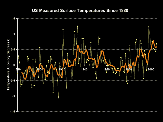
Here are the NASA GISS numbers for US temperature over the last century or so:
The warming trend is hard to read, with current temperatures relatively elevated vs. the last 120 years but still lower than the peaks of the 1930’s. But we can learn something by going below the surface of these numbers.
These numbers, and in fact all numbers you will ever see in the press, are not the raw instrument measurements – they include a number of manual adjustments made by climate scientists to correct for both time of observation as well as changing quality of the measurement site itself. These numbers include adjustments both from the NOAA, which maintains the US Historical Climate Network on which the nubmers are based, and from NASA’s GISS. All of these numbers are guesstimates at best.
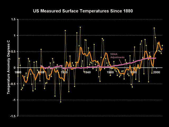
Though the GISS is notoriously secretive about revealing much about its temperature correction and aggregation methodologies, but the NOAA reveals theirs here. The sum total of these adjustments are shown on the following chart in purple:
There are a couple observations we can make about these adjustments. First, we can be relatively astonished that the sign on these adjustments is positive. The positive sign implies that modern temerpature measurement points are experiencing some sort of cooling bias vs. history which must be corrected with a positive add-on. It is quite hard to believe that creeping urbanization and poor site locations, as documented for example here, really net to a cooling bias rather than a warming bias (also see Steve McIntyre’s recut of the Peterson urban data here).
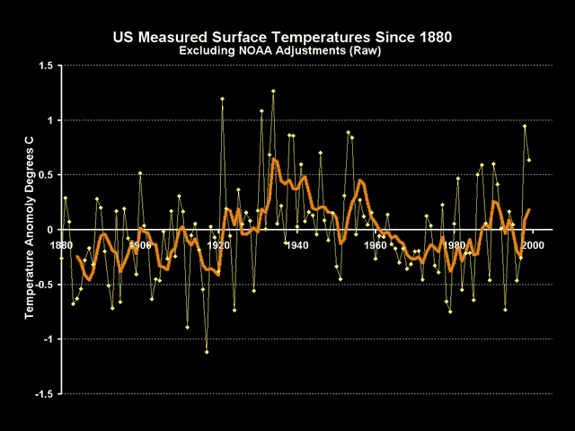
The other observation we can make is that the magnitude of these adjustments are about the same size as the warming signal we are trying to measure. Backing into the raw temperature measurements by subtracting out these adjustments, we get this raw signal:
When we back out these adjustments, we see there is basically no warming signal at all. Another way of putting this is that the entirety of the warming signal in the US is coming not from actual temeprature measurements, but from adjustments of sometimes dubious quality being made by scientists back in their offices. Even if these adjustments are justifiable, and some like the time of observation adjustment are important, the fact is that the noise in the measurement is at least as large as the signal we are trying to measure, which should substantially reduce our confidence that we really know what is going on.
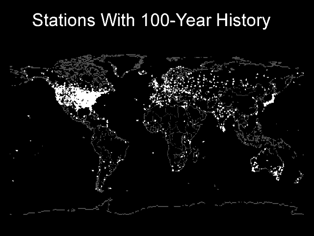
Postscript: Yes, I know the US is just one part of the world. But the US is the one part of the world with the best, highest quality temperature measurement system. If signal to noise ratios are low here, then how bad are they in the rest of the world? After all, we in the US do have some rural sites with 100 year temperature measurement histories. No one in 1900 was measuring temperatures in rural Africa or China or Brazil.


Thanks for those graphs.
I remember the late Augie Auer (ex Professor of Meteorology) mentioning in a presentation last year, an example of temperature recording over 100 years. He mentioned, among others, a site near Christchurch New Zealand that showed no increase in temperature over 100 years. In fact I think there was slight cooling. This site had never been moved or surrounded by concrete or other building construction.
Ah yes…did a search and found this article,
http://dougierants.blogspot.com/2007/02/global-warming-re-visited.html
which shows Invercargill with a 0.3 degree C drop in 60 years, and Christchurch with a flat trend over 140 years.
Climate Audit is up for Best Science Blog 2007 and could sure use everyone’s help in the voting…
http://2007.weblogawards.org/polls/best-science-blog-1.php
Climate Audit is up for Best Science Blog 2007 and could sure use everyone’s help in the voting…
http://2007.weblogawards.org/polls/best-science-blog-1.php
question on the temperature charts:
have those been corrected for NASA’s Y2K flaw or are they still the old data?
can you tell us where the graphs came from? or are they your own